It has always amazed me how several photographers can stand shoulder to shoulder and yet produce such different images. Of course lens choice and composition play a part, but a major part of a photographer’s style is in the processing of an image.
So for this four-part series I’ll have four different images (one from each photographer) processed by four photographers and ask them to describe what they did. My fellow photographers for this project are Bob Copeland, Bill Mueller, and Richard Smith.
For this first image, everyone is limited to editing in Lightroom only.
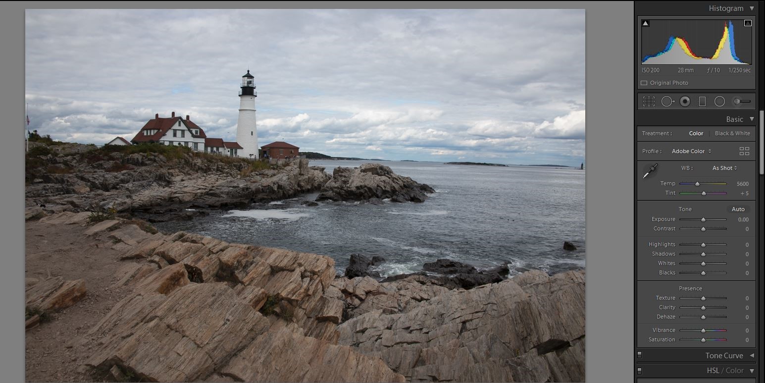
I provided the first image, and here it is exactly as it came out of the camera and into Lightroom. It is a raw image, so there is only minimal sharpening applied and no other changes. Notice that the histogram shows a well exposed image with exposure almost all the way to the right with no clipped highlights, and no blocked up shadows. The idea is to bring the best possible image file into Lightroom or Photoshop and improve them, not try to rescue a bad exposure. This was a cloudy day, so a single exposure was able to perfectly capture the whole range of tones. That makes it pretty easy to edit and may not produce a lot of variation, but we’ll see.
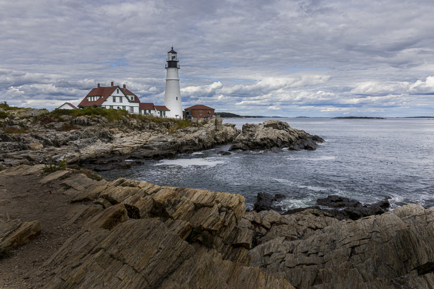
First I look for the things that bother me the most. I do this so they don’t keep distracting me as I edit. The crooked horizon bothered me, so I fixed that the level tool in the crop panel. I also cropped a bit from the left to remove the flag pole and from the right to remove the distant lighthouse and the small rock.
For my basic settings, I set the white and black points and decreased the highlights so there would be no blown out areas in the sky. I increased exposure to .36, and increased Contrast 60 +36. I increased clarity to +25, and because it was a flat, almost colorless day I increased vibrance to +20 and Saturation to +6. In the HSL panel I increased the saturation in the blue channel to add some color to the sky and water. I also turned on settings to remove chromatic aberration and lens profile to correct for lens distortion and vignetting.
For local adjustments I wanted to add drama to the clouds and pull attention to the lighthouse itself. So first I added a graduated filter to the sky with -.75 exposure and increased texture to +60 to bring out detail in the clouds. I used color masking to limit the graduated filter to the sky and not the buildings. Second I felt the light colored rocks in the foreground were too light, so I painted over them with a large soft adjustment brush with exposure set to -1.6 to darken them and texture cranked up to +84 to emphasize detail in the rocks. If I had been able to use Photoshop I would have removed the pointed rock coming in from the lower left. I tried, but the removal tool in Lightroom just wasn’t up to the task.
I really wanted to pull attention to the lighthouse, so using a small adjustment brush I painted over it with exposure at +.7.
My final step was sharpening with amount 40, radius .8 and detail 35, and no masking. Output sharpening would happen when I export the image, and depending on where it will be used I either select screen and amount high or the type of paper (matte or glossy) and amount high.
Overall this was a pretty mild edit for me, and not as wild as I’m used to going. But this image didn’t need wild, just a few basic and local adjustments. If I had been able to use Photoshop I would have cloned out the people at the lighthouse.
My final edit
Richard Smith’s Edit in his words
HOW I DID IT
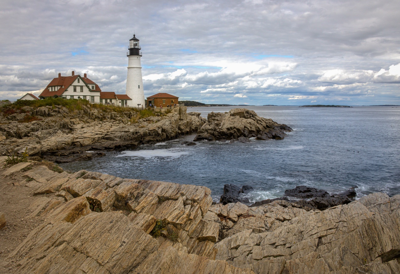
First I identified the subject of the image, which in this case is clearly the lighthouse. I wanted to process the image in a way that drew attention to the lighthouse and avoided distractions that might draw the eye away from the lighthouse.
Step 1 White Balance
Using the eyedropper I selected the white on the lighthouse as the point to set the white balance.
Step 2 Lens Correction Panel
I checked the boxes for “Remove Chromatic Aberrations” and “Enable Profile Corrections.” Under “Lens Profile,” I used the drop down menu to select Cannon as the make of lens.
Step 3 Transform Panel
I clicked on “Auto” to level the horizon.
Step 4 Cropping
I cropped the image slightly to place the lighthouse at the upper left intersection of the tic-tac-toe overlay.
Step 5 Global Adjustments
I set my black and white points using the “Whites, Blacks, Shadows and Highlights” in the Basic Panel. Usually I move the “ Whites” slider to the right, but here I had to move it the the left to correct the highlights clipping in the original image. Because I considered this to be a complex image, that was the extent of my global adjustments.
Step 6 Local Adjustments
There were 4 areas to which I applied local adjustments: the sky, the water, the rocks and the buildings.
The Sky:
Using the Graduated Filter, I dragged the crosshairs downward to the intersection of the horizon and the water. I checked the “Show Mask Overlay” box beneath the image to be sure that that the water was excluded from the area to be adjusted. The horizontal line included the buildings within the adjustment area. This I did not want. I fixed this by using the luminosity mask within the Graduated filter. I could have just used the eraser brush, but I find that once you get used to it the Range Mask filters (color and luminosity) are faster and more precise and the eraser brush is still available if you need it. I then used the “Dehaze” and “Clarity” sliders to bring out details in the sky. Reducing “Highlights” and “Whites” can sometimes also help.
The Water:
I used the Brush Tool to paint the water. I then used the Color Range Mask within the Brush Tool to select 5 areas that I thought represented the color range of the water. I then moved the temperature slider to the blue side (the left) and added some Clarity, Dehaze and a little saturation to get the hint of blue I wanted.
The Rocks
I painted the rocks quickly with the Brush Tool and then used the Color Range Mask eyedropper to make a more precise selection. I moved the Temperature a little to the right (Yellow) to add some warmth. To me the rocks cried out for contrast and texture. Since the rocks were a midtone color, I used the Clarity Slider to increase the contrast. I then took the Texture Slider all the way to right (100). I think that worked. Finally, I added some Sharpness and just a touch of Saturation.
The Buildings:
I used the Brush Tool and the Color Range Mask to select the buildings. I increased the Temperature (just a little), Texture, Clarity, Dehaze , Saturation (just a little) and Sharpness.
Step 7 Final Adjustments
Tone Curve
I took the Highlights to +21 and the Shadows to -19 to help give a more 3D appearance to the image.
Sharpening (Detail Panel)
I considered this to be a high frequency image (one with lots of edges). I set the amount at 50, Radius at 0.8, Detail at .20, and holding down the Option key (Alt on PC) moved the Masking Slider to the right until it showed that the water and clear patches of sky were black (unaffected by sharpening).
Effects (Vignette)
I moved the Amount Slider to -11 to create a slight vignette. Why ? Because Scott Kelby once told me to do that!
Warmth
I increased the temperature justly slightly to add a little warmth to the overall image.
Richard’s Final Edit
Bill Mueller’s edit in his words
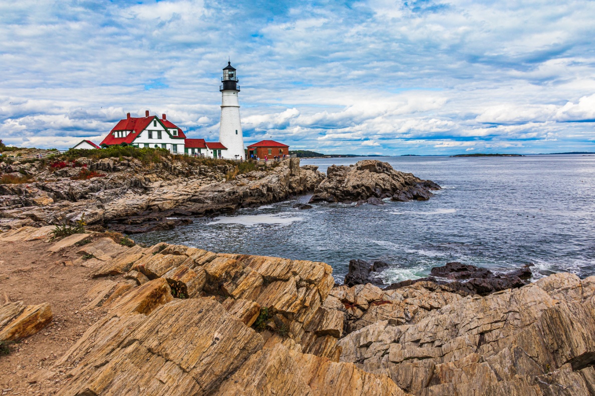
Global Adjustments
A couple of things to do before you start to edit any image is to make sure that the Remove Chromatic Aberration and the Enable Profile Corrections boxes are checked in the Lens Corrections panel so I checked those.
The next thing I always do is to check the Horizon line. Going to the Transform panel you have various options for straightening your image. In this case, the Auto button worked fine.
The next steps I take are to balance the exposure of the image
In the Basic panel, I used the eye dropper tool to get a reading on the image. The White Balance was fairly close and I made only minor adjustments raising the temperature from 5600 to 5800 and the tint from +5 to +7.
Right now, the image is fairly flat and is in desperate need of some contrast.
I added +60.
I reduced the Highlights by -100 and increased the blacks by +100
Next, I checked the White and Black points. Using the Alt key to determine the true White and Black points I added +17 to the Whites and -31 To the Blacks
The Presence sliders let you spice up the image. These are more a matter of personal taste and I ended up adding +26 of Texture, +21 of Clarity, +14 of Dehaze and +33 of Vibrance.
I moved to the Tone Curve and added a little more contrast by adjusting the Highlights to +21 and the darks to -18.
Next up was HSL panel or Hue, Saturation and Luminance. I wanted the red in the roof tops to stand out a little, so I dropped the Red Hue to -40. Carrying that into the Saturation, I upped the Red by +87. Moving on to the Luminance, I brightened the Reds up by +64. I thought the rocks in the foreground were too yellow, so I dropped the Yellow Saturation by -53. If you look closely, the trim on the building is green and there is also some green vegetation in the midground. I wanted these to stand out a little more, so I increased the green Saturation by +47.
Local Adjustments
I wanted a little more detail in the clouds, so I use the Graduated Filter adjustment and drew the filter about half-way down the image. I pumped the contrast up to +100. I also added +10 of dehaze to bring out a little touch of Blue in the clouds. These adjustments also seemed to add a little magenta into the clouds, so I adjusted the tint by -15 offsetting the magenta with a little green.
I wanted the Lighthouse to stand out a little more so using the adjustment brush, I painted the Lighthouse and buildings and increased the exposure by +.75.
The next step was some final sharpening. Going to the Detail panel and holding down the Alt button, I moved the Masking slider to the right to just sharpen the edges of the buildings and the crevices in the rocks. I slid the Sharpening slider up to 100. With the Mask adjustment, there’s no sharpening going on in the sky or in most of the water outside that little inlet.
That wraps it up for me. Here is my final edit.
Bob Copeland’s edit in his words
Global Adjustments
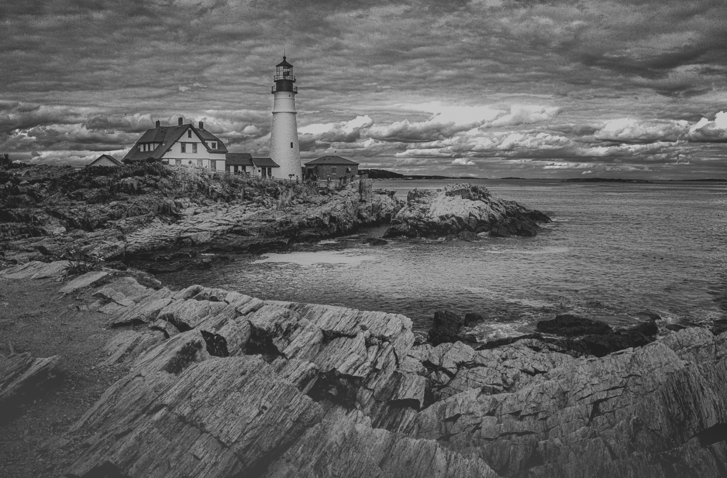
I wanted to create a very dramatic B&W image. A storm on the way. To accomplish this I first converted to B&W. I simply selected black and white, and did not use any of the profiles or presets. Then I adjusted exposure [-20], Contrast [+26], Highlights [-100], Shadows [+82], whites [-27] and blacks [-96].
Local Adjustments
The image was still a little flat so I used a radial filter set to invert (which affects the inside of the selection) on the lighthouse and building, to lighten by using exposure control. I also used a new radial filter [inverted] to lighten the water in the foreground. The foreground rocks still looked light so a third radial filter (inverted) was used to darken this area by using both exposure and contrast. Still not happy with the foreground so I used a graduated filter to darken the foreground to the current darkness. I then cropped the image to level the horizon and eliminate the flag on the left and the small lighthouse and rock on the right.
All in all this is the first time I have used Lightroom for a finished print.
Some closing thoughts
Everyone leveled the horizon, removed chromatic aberration and enabled lens profile correction. There must be a reason. One way or another, everyone increased contrast and did some overall sharpening of the image.
Notice how one of the major themes was identifying the main subject and making changes to draw the viewer’s eye toward it. Processing can actually be the final step in composition.