
Four Image Edits Part 2
by Mickey Rountree
This is the second of my series where 4 photographers submit an image and it is edited by all four. My fellow photographers for this project are Bob Copeland, Bill Mueller, and Richard Smith.
For this second image by Bill Mueller, once again everyone is limited to editing in Lightroom only.
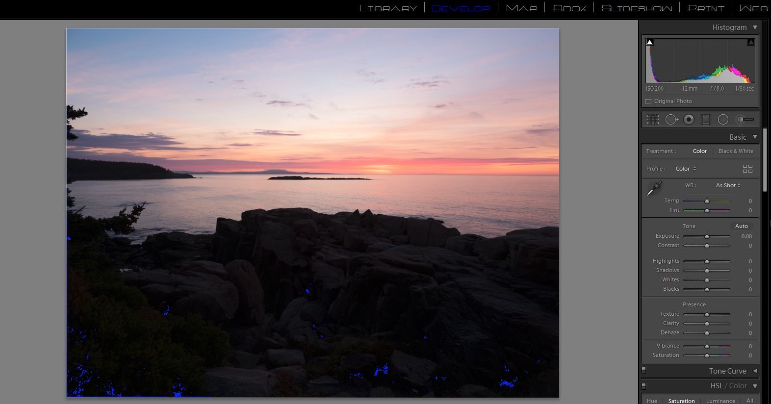
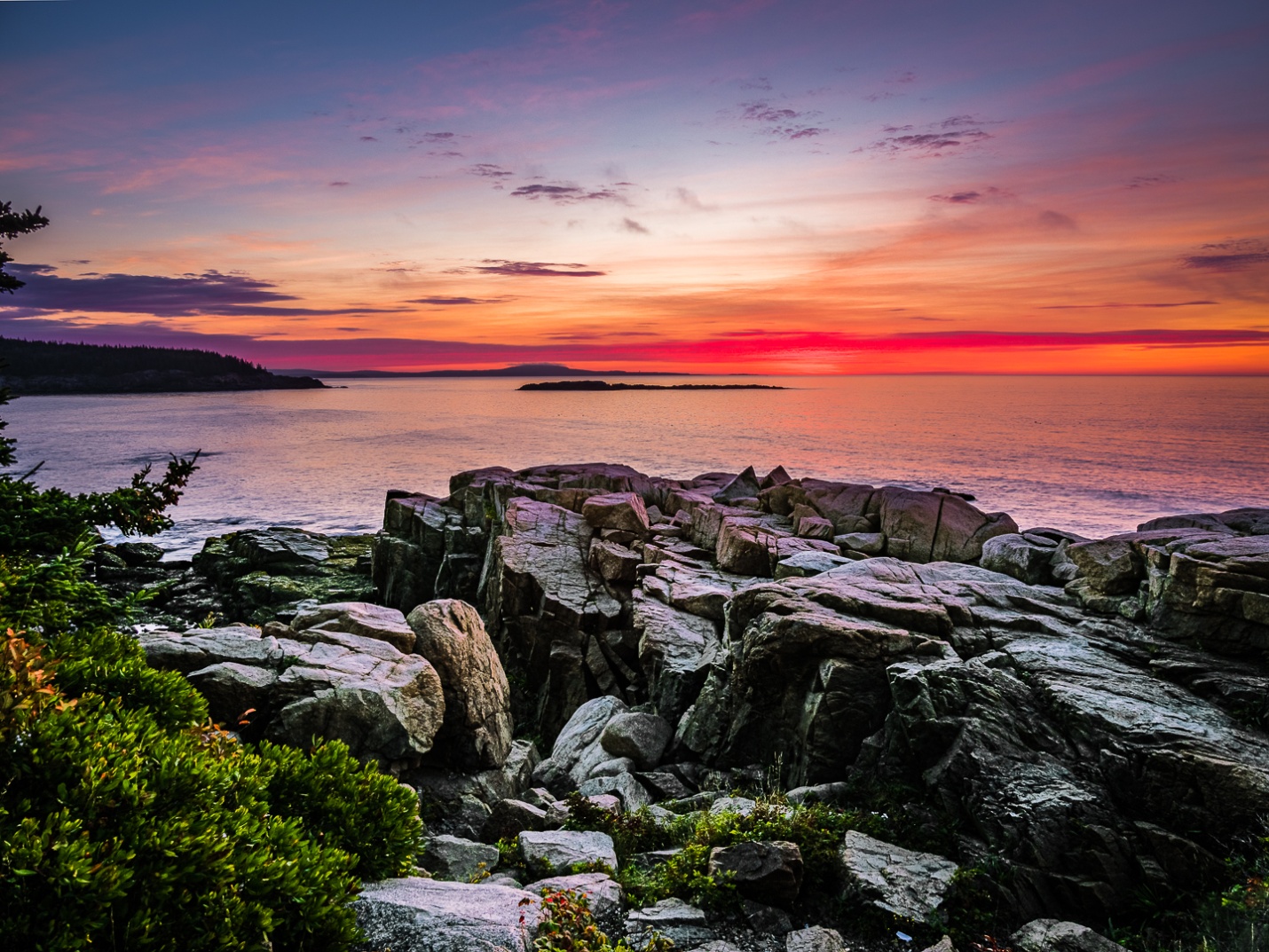
Bill created a DNG HDR in Lightroom but then exported it as a TIFF, so it doesn’t have the ability to use color profiles, and it doesn’t have the wide dynamic range of a HDR DNG. This is the completely unedited image, so there is only minimal sharpening applied and no other changes. Notice that the histogram shows an image with exposure almost all the way to the right with no clipped highlights, but some blocked up dark shadows. The blocked up shadows are shown in blue on this image from Lightroom. We’ll see if we can fix those.
Original Image
My Edit
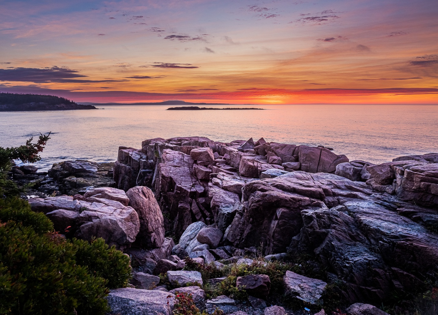
Global Adjustments
I increased the overall exposure to +.80 to brighten the rocks, and open up the shadows. I increased contrast to +31, Highlights to -62, Shadows to +90, whites to -2 and blacks to -7. There are still some totally black shadows, but they are small and appropriate to the image. I could remove them completely by increasing the shadows to +100, but that seemed a bit flat and unnatural to me. Since Bill sent this as a TIFF, I could not apply a lens profile, but I did check “remove chromatic aberration.”
Also because this was a TIFF, I could not apply a camera matching color profile. The image feels a bit magenta, but there was a lot of magenta in the sky that morning, and some of the rocks have a natural pink tint. Trying to color balance using the rocks as a gray point produced a noticeably green image. The feel of the morning was better represented by leaving the color balance alone.
I added +33 Clarity, +20 Vibrance, and +12 Saturation. I sharpened with my typical scenic sharpening settings of amount 60, Radius .8, and detail 35 with no masking.
I used the level tool in the cropping panel to make a very minor correction to level the horizon.
Local Adjustments
For the sky I used a graduated filter with exposure -.9, highlights -20, and texture +35 to bring out the clouds a bit. I used the color range mask to limit the adjustment to the sky and not the land on the left.
I used the adjustment brush and painted over the rocks with Texture 100, Clarity 40 to really bring out detail in the rocks. This seemed to darken the shadows, so I also increased shadows to+50.
I cropped from the left and top to remove the limbs coming in from the left, and to get the horizon line further from the center.
As a final touch I used a new large, soft adjustment brush set to -1.0 and darkened down the lower corners, and a bit of the bottom center, to help pull attention up toward the center of the image. I used the adjustment brush, because using a vignette would have darkened the corners of the sky, which I don’t like to do.
If I could use Photoshop, I would probably remove the branch protruding from the left, but Lightroom’s spot removal tool couldn’t come close to removing it.
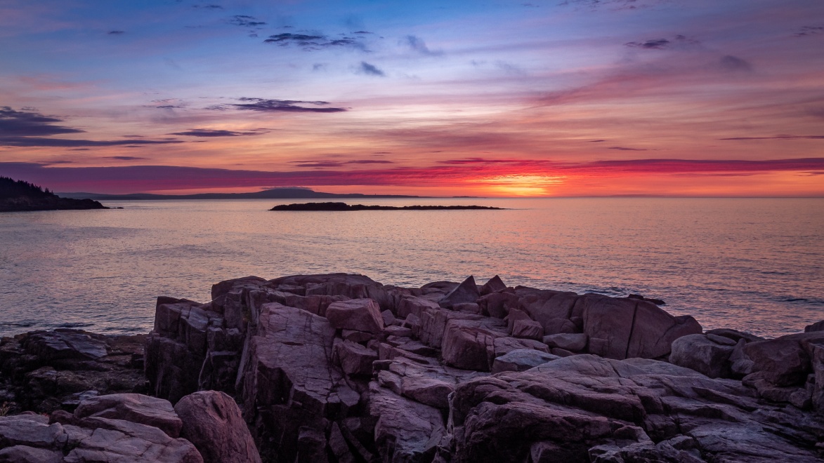
My Final Edit (#1)
My Edit Part 2
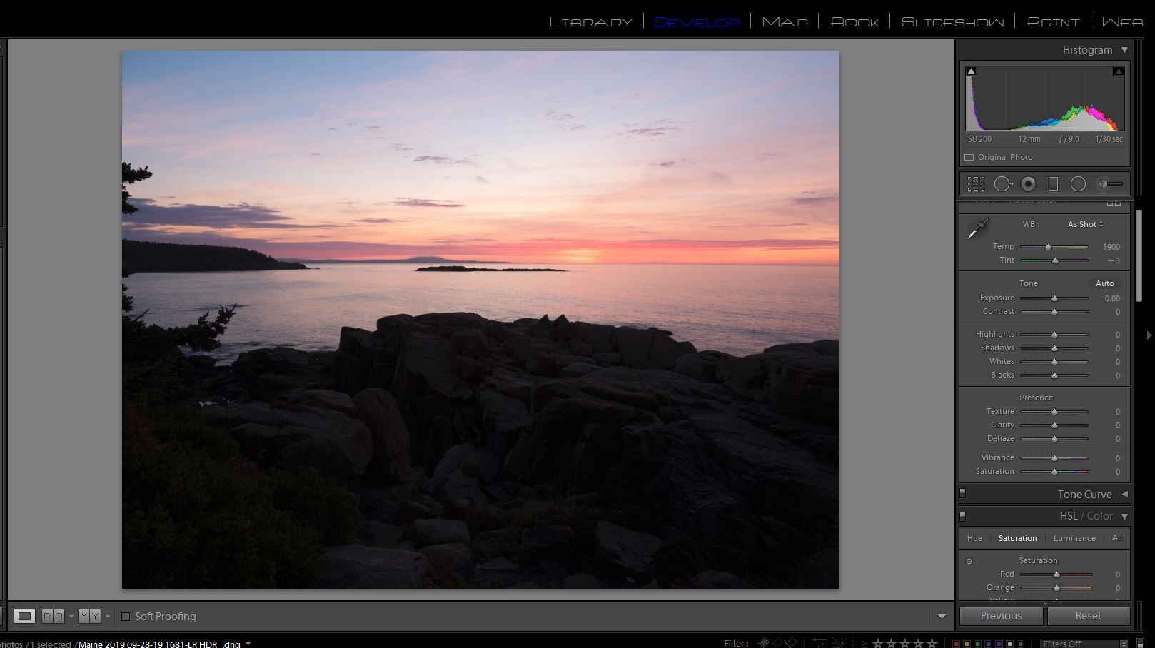
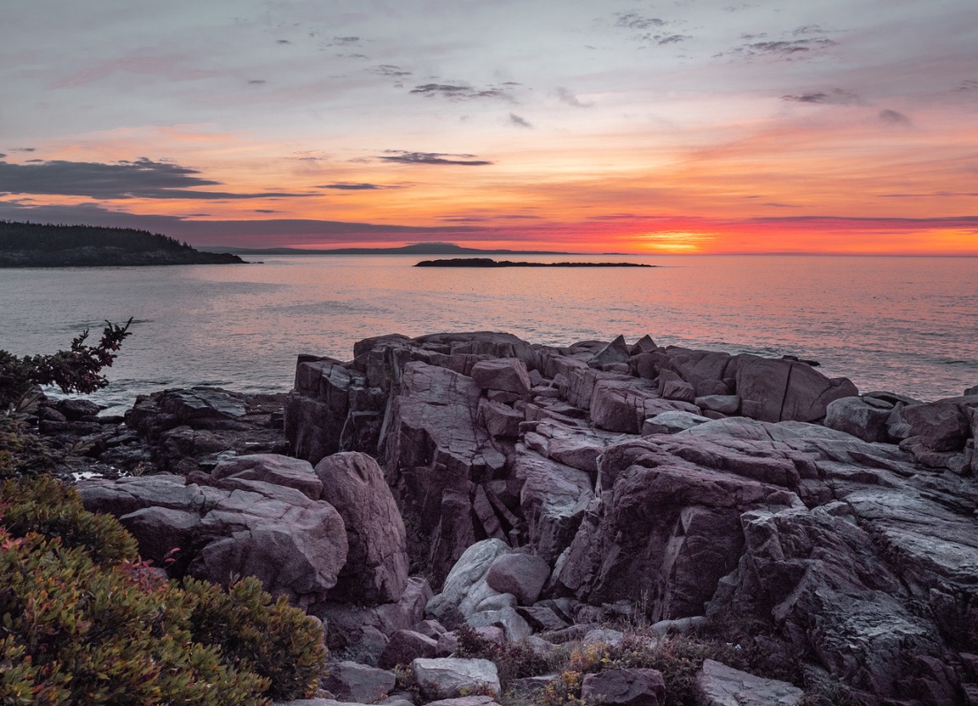
Although it was not planned, the fact that Bill originally sent a TIFF allowed us to look at the difference in a Lightroom HDR DNG compared to the TIFF. The first Image Bill sent was a TIFF of the HDR created in Lightroom, but not the actual DNG file. It did not have the large dynamic range of the DNG, so he re-sent the three original raw files and I created a HDR DNG in Lightroom. Immediately when I opened this the larger dynamic range was apparent because there was no clipping at all in the shadows. And I had a much larger range of adjustments possible as well as the ability to change color profiles. Here is the HDR DNG with no editing and you can see there is no highlight or shadow clipping.
Global Adjustments
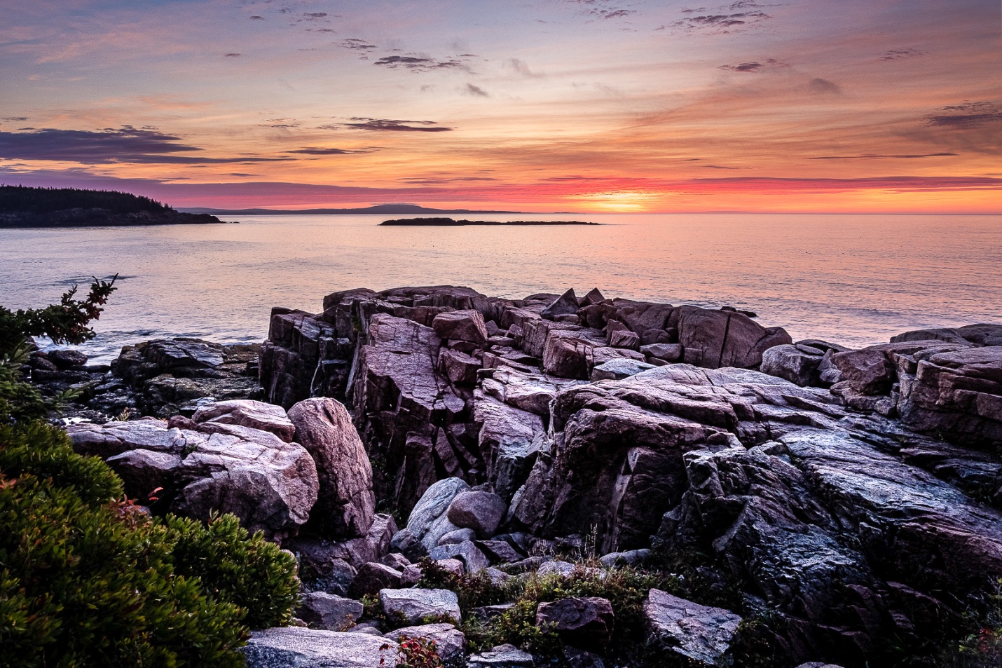
I increased the overall exposure to +.80 to brighten the rocks, and open up the shadows. I increased contrast to +33, Highlights to -77, Shadows to +74, whites to +21 and blacks to -15. At this point there are no clipped highlights or shadows. I could not find a lens profile to apply, but I did check “remove chromatic aberration.”
I changed the color from Adobe Color to Adobe Landscape, and this made a big difference in the image. I added +33 Clarity, +20 Vibrance, and +12 Saturation. I sharpened with my typical scenic sharpening settings of amount 60, Radius .8, and detail 35 with no masking.
I used the level tool in the cropping panel to make a very minor correction to level the horizon.
Local Adjustments
For the sky I used a graduated filter with exposure -.8, highlights -15, and texture +40 to bring out the clouds a bit. I used the color range mask to limit the adjustment to the sky and not the land on the left.
I used the adjustment brush and painted over the rocks with Texture 100, Clarity 40 to really bring out detail in the rocks. This seemed to darken the shadows, so I also increased shadows to+50.
I cropped from the left and top to remove the limbs coming in from the left, and to get the horizon line further from the center.
As a final touch I used a new large, soft adjustment brush set to -1.0 and darkened down the lower corners, and a bit of the bottom center, to help pull attention up toward the center of the image. I used the adjustment brush, because using a vignette would have darkened the corners of the sky, which I don’t like to do.
If I could use Photoshop, I would probably remove the branch protruding from the left, but Lightroom’s spot removal tool couldn’t come close to removing it.
So here is my second final edit. I prefer it to the first image because I was able to change color profiles, and I started with an image that did not have blocked up shadows. Whether it was the landscape color profile, or the HDR DNG file vs. a TIFF file the colors are much more pleasing to me.
My Final Edit(#2)
Bill Mueller’s edit in his words
Global Adjustments
To start off, this image was a set of three shots taken at 3 different exposure settings: as metered, 2 stops over exposed and 2 stops under exposed. They were merged to HDR in Lightroom. The Lightroom HDR merge gives you all the dynamic range of HDR without the Harry Potter look that’s typically associated with HDR. To give you a specific example, if you take one of the individual images and adjust the Exposure slider you have a range of + or – 5. With the HDR image you have a range of + or – 10.
As always, the first things I did was to straighten the horizon using the Transform adjustment and check the Chromatic Aberration and Profile Correction boxes in the Lens Corrections section. Then it’s back to the Basic Panel to set up the image. I adjusted the Whites and Blacks moving there respective sliders to +52 and +21. I Dropped the Highlights to -100 and increased the shadows to +100. I also pumped up the Contrast to +50. Next I moved to the Tone Curve and set it for Medium Contrast.
Local Adjustments
My next area to work on was the sky. I wanted to darken that sunrise up a little bit. I used the Gradient tool and started the gradient at the Horizon and dropped it to the edge of the water. I used a Luminance mask with a range adjustment to mask out the rocks, trees and islands from the adjustment. I then dropped the exposure by ¾ of a stop, added 20 points of Clarity and 10 points of Dehaze. Finally, I added about 40 points of Contrast. Remember we’re just working on the sky here, everything else is masked out.
Now we’ll move on to the rocks. I drew another gradient but this time I started at the water’s edge and drew up past the Tree branch at the top. I used another Luminance mask with a range adjustment to mask out the sky and water. First, I moved the Tint slider to – 100 to remove all the magenta from the rocks. I increased the exposure by +1, I increased the highlights by 39 and upped the shadows to 52. Because they were rocks and trees, I upped the Texture to 72, upped clarity to 61 and added 15 points of Dehaze. Finally, I noticed a little noise showing up in the rocks so I increased Noise to 24. I wanted to increase the brightest areas of the trees and rocks so I drew another gradient, this time starting at the water’s edge but only going up to the edge of the rocks. Using a Luminance mask, I adjusted the range so that everything but the bright tips of the trees and the brightest tops of the rocks was masked out. I increased the exposure by +2.
There seemed to be a little Teal color tint in the rocks so I went to the HSL panel and reduced the Aqua saturation by 100 and the Blue by 40.
To finish it off I went to the Effects Panel and added a Vignette in the amount of -10. Then in the detail panel a added some sharpening by increasing the Masking to 199 (this eliminates any sharpening in the sky) and the amount to 63.
Bill’s Final edit
Richard Smith’s Edit in his words
Even though Bill provided three brackets, I decided not to create an HDR file, but just work on the normal exposure.
Global Adjustments
Lens Correction
I checked the boxes for “Remove Chromatic Aberration” and “Enable Profile Correction.” Under “Lens Profile” the Lightroom program said “Built-in.” Bill shoots with an Olympus camera, but that was not listed on the drop down menu, so I went with “Built-in.”
Transform
I checked “Auto” to make sure the horizon was level.
Crop
One of the most important decisions a photographer makes is what to include within the frame. In this case I made significant crops in from the left and up from the bottom. To me the subject of this image is the predawn sky, particularly near the horizon. The rocks provide foreground interest, an important supporting element in this image. Cropping benefits the image in two ways: 1) It simplifies the image and 2) It makes the two most important elements in the image (i.e., where the sun would rise and the rocks) larger and, therefore, more predominant. I decided to crop to a 16 x 9 aspect ratio, with the brightest spot on the horizon off-centered to the right, giving this landscape image a panoramic effect that works well.
I thought the trees on the left were a distraction, drawing attention from the two most important elements in the image. I considered removing the trees using the Spot Removal tool, but I was not able to get a good match from the water background using either the “Clone” or “Heal” options. Removal of distractions is one area where I think Photoshop is superior to Lightroom. In Photoshop, the intruding trees could have been easily removed, using either the “Healing Brush” of “Content Aware.” This was another reason to crop this image from the left.
These adjustments affect the entire image. When I first began using Lightroom, most of the adjustments to my images were of the global type. As time passed and I became more experienced with Lightroom, and as the program itself evolved, I have shifted to mostly local adjustments in editing my images. One global adjustment I still do is setting my white and black points. Usually I do this by holding down the Option key (Alt on a PC),clicking on the “Whites” cursor and moving it to the right until I see clipping on the right side and then moving the cursor back to the left until the clipping is gone. I then hold down the Option ( Alt) key again and click on the “Blacks” cursor and move it to the left until I see clipping on the left. I may allow a little clipping of the Blacks to remain if I think it helps the image.
In this image, however, I employed an alternative way to set the black and white points that is often more effective with landscape images. I simply moved the “Highlights” slider to -100 and the “Shadows” slider to +100. I then used the Whites and Blacks sliders as a finishing tool to make smaller adjustments. That was it for global adjustments.
Local Adjustments
In this image there were three areas that required different adjustment schemes
Sky
I first applied a “Graduated Filter” to select the sky. Because the sky was significantly brighter than the water I used a “Luminosity Range Mask” to assist in making a more exact separation of the sky from the water. The “Dehaze” slider does a good job of bringing out detail in clouds, so I set it at +20. Because I consider sunrises to be cool and sunsets to be warm, I moved the “Temperature Slider” to the left towards the blue range at -15. To bring out more of the magenta in the sky, I moved the “Tint Slider” to the right +18. Next, I switched to the “Bush Tool” and made two passes with the brush overlapping the orange and yellow parts of the sky at the horizon level and then moved the “Texture Slider” to the right to +23 to show the detail in the bottom of clouds being illuminated by the sun just below the horizon. I used the Brush Tool again; first, clicking on “New” so that my adjustments at the horizon would be unaffected by the further application of this tool. Then I made two passes with the brush tool across the sky at the top of the image and moved the “Temperature” slider to -32, the “Dehaze” Slider to +13 and the “Clarity” slider to +18 to further modify that area of the image.
The brilliance of the colors in sunrises and sunsets make them tricky subjects. They are easy to oversaturate, which makes them look fake. Not enough saturation, however, can make it seem that it really wasn’t worth getting out of bed early to get the shot. The luminance and hue of the colors also play an important role. Here I went into the “HSL/Color” panel and made adjustments to the hue, luminance and saturation levels of the red, orange, blue and magenta colors. I then went to bed, got up the next morning and proceeded to change everything I had done the night before. At some point you have to say enough! If you have Obsessive Compulsive Disorder (OCD), this could be a real danger area.
Water
I first painted the water with the “Brush Tool” and then applied a “Color Range Mask” to complete a precise selection of the area. I then used the sliders in the “Brush Tool Panel” to make the following adjustments: Temperature (-13), Highlights (+36), Shadows (-30), Whites (+30), Blacks (-30), Texture (+30), Clarity (+20), Sharpness (-35). These were purely subjective choices ( “because it felt right”). If I started over afresh, I doubt the specific values would be exactly the same. On close inspection there were some objects in the water that were probably water fowl of some kind. Since these objects were not clear, and since this image is not about birds, I used the “Spot Removal Tool” to eliminate them.
Rocks
Coming up from the bottom, I applied a “Graduated Filter” to the rocks. Including all of the rocks in the selection meant that some areas of the water were also selected. I used the “Luminance Range Mask” to create a mask that precisely excluded the brighter water from the darker rocks. I was aggressive in applying “Texture” (+83) and “Clarity” (+43) to the rocks. I increased “Shadows” (+21) and decreased “Temperature” (-13). I did not want the reflected color in the rocks to compete with the color of the sky so I decided to completely desaturated them, moving the “Saturation” slider left to -100. I then added “Sharpness” (+30).
Finishing Adjustments
Sharpening
In the “Detail Panel” I set ‘Amount’ at 70, “Radius” at 1.0, “Detail” at 25, and “Masking” at 57. In “Noise Reduction” I set the “Luminance” at 10.
Vignette
In the “Effects Panel” I set the Amount at -11. Why? Because Scott Kelby told me to do that.
Richard’s Final edit
Bob Copeland’s edit in his words
Global Adjustments
I chose to work on the single normal exposure. After opening the image in Lightroom I decided that the sky should be darker and the foreground rocks lighter. I would also need to crop into the image for a tighter look.
Since I print my own images I knew I would need full coverage in the histogram with no clipping. I want printable details in both shadows and highlights. I adjusted the white and black points to eliminate clipped highlights or shadows. The image now looks light in the sky and still dark in the foreground.
I added 8 points of Clarity and 15 points of Dehaze to add contrast. I then added 11 points of sharpening.
Finally I cropped off the left side to remove most of the tree branches. I cropped both the top , bottom and right side moving the horizon to a 1/3 and eliminating some foreground and left side.
Local Adjustments
I used a graduated filter to darken the sky and a graduated filter to lighten the foreground.
Bob’s Final Edit
Some closing thoughts
We all edited this picture more consistently than the first, but you can see we all had a slightly different final look, and took different paths to get there.