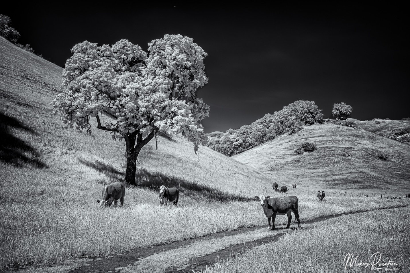
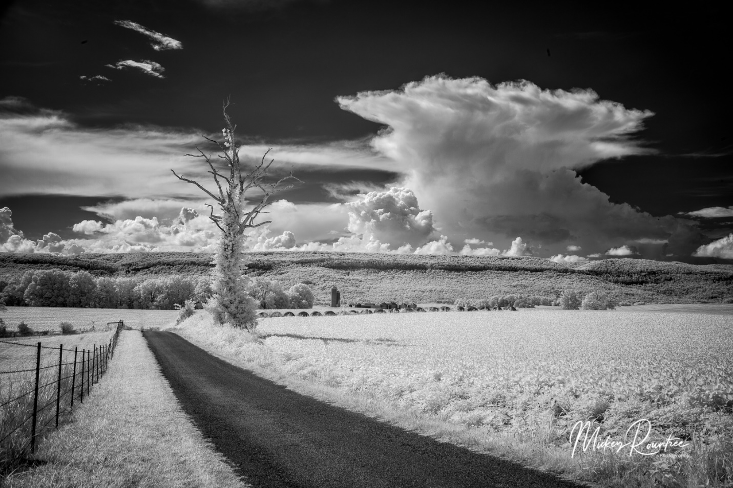
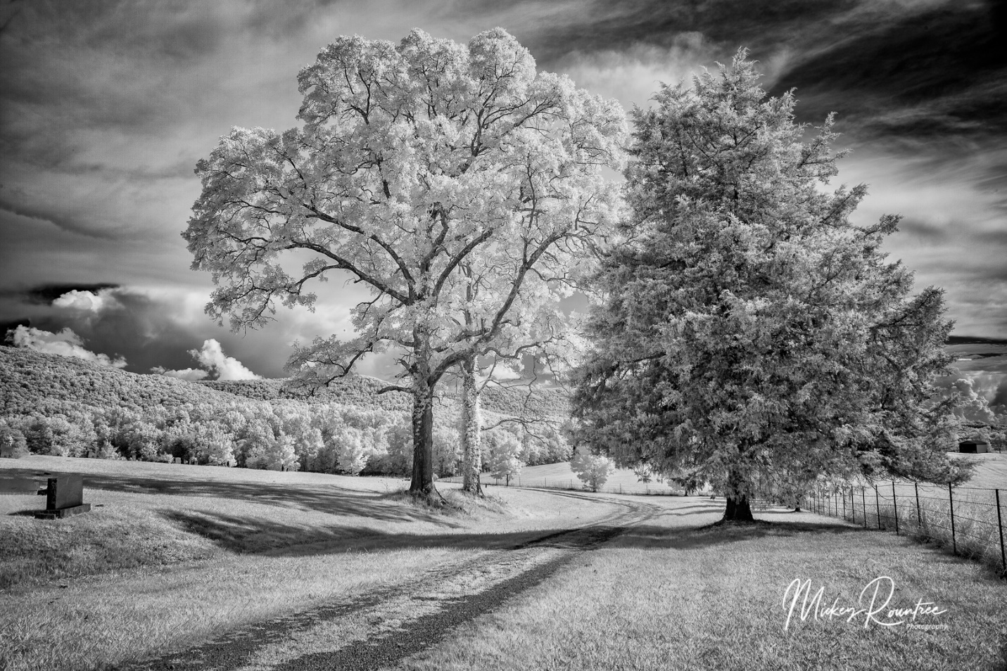
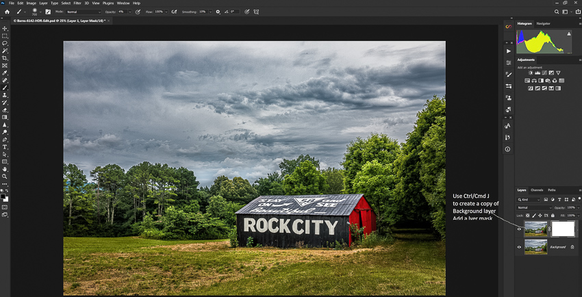
I’ve gotten several questions lately about some of my infrared images and how they are made. So here is a quick primer on digital infrared photography.
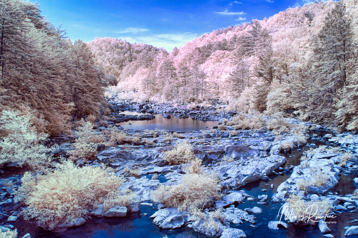
Infrared (IR) light is invisible to the eye and has wavelengths longer than about 750 nm (nanometers) up to 1000 nm. By comparison visible light has wavelengths between 380 and 740 nm. Digital camera sensors are sensitive to infrared light, but camera manufacturers use filters to block the infrared light, so that it doesn’t interfere with image production on the sensor by visible light. So to photograph in infrared a camera must be converted by having the IR filter removed, and replaced by a filter that lets IR light pass through. Some filters will allow a mixture of visible and IR to pass through, while others block almost all visible light. Depending on the wavelength of the filter we either get colored infrared (lower wavelength filter) or almost pure black and white (higher wavelength filters).
There are a number of companies providing IR conversions, but the one I am most familiar with is LifePixel (https://www.lifepixel.com/). Years ago I had my old Canon 20D converted to their “super color” filter (590 nm), and last year I had my old Canon 5D Mark II converted to their “Deep Infra Red” 830 nm.
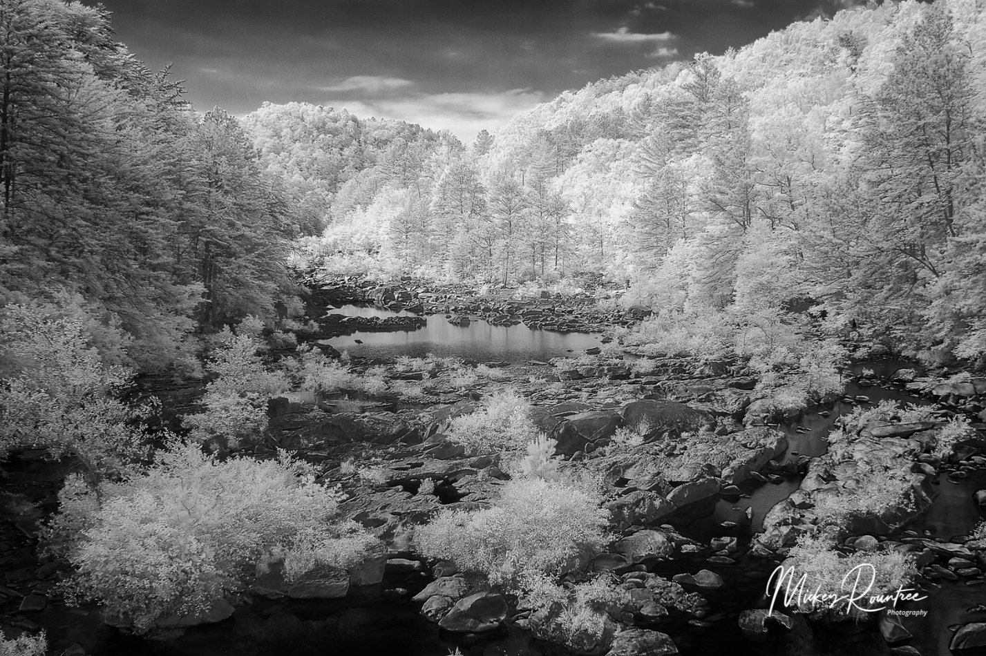
I found that I didn’t really like the color IR option. It requires a lot of manipulation, including shooting a custom color balance, swapping the red and blue channels in Photoshop, and the effects are somewhat unpredictable. I really like the look of the deep infrared black and white. Of course it is possible to convert a color infrared image to B&W in Lightroom or Photoshop.
A color IR from my “super Color” converted Canon 20D after Red and Blue channel swap and color balance adjustments.
A Black and White conversion form the color shot above.
Another color IR after Red and Blue channel swap.
There are lots of tutorials available on the LifePixel site for both color and black and white, with tips on shooting and processing. But here I’ll give you some tips I have learned shooting with the deep Infrared (B&W) filter.
The first issue is exposure. The meter is still sensitive to some visible light, and the balance between visible and IR light in a scene affects the meter’s accuracy. Consider the meter a starting point, and look at the LCD and histogram. I find that I generally have to dial in +2 stops of compensation. I cover myself by shooting brackets for HDR, so with +2 compensation, my brackets are generally 0/+2/+4. In a scene with a higher ratio of IR, I may only use +1 or even no compensation. My eye still isn’t trained enough to know how a scene will meter, so I watch the LCD and histogram after each shot. And of course, shoot at the lowest possible ISO.
IR light focuses differently from visible light. At the factory after conversion the camera focus is calibrated to a specific lens, usually the 50mm or normal lens. Other lenses may not focus as accurately, so I cover myself by shooting at f/11 or f/16.
Even with the 830 nm filter, the sensor still receives some visible light and it comes into Lightroom with a strong reddish cast. I solved this by creating an import filter that automatically converts the image to Adobe Monochrome color profile.
I find the IR images are very flat and low contrast. So why do I shoot HDR when it wouldn’t seem to be needed? I have two reasons. First it helps compensate for slight exposure errors, and second I add a LOT of contrast, texture, clarity and sometimes dehaze, and the HDR image keeps the noise in the shadows from becoming excessive, and keeps highlights from blowing out details.
After processing in Lightroom, I send the image to Photoshop. Here I do some mild high pass sharpening, and then use the tonal contrast filter in NIK Color Efex. I then use the NIK Silver Efex Black and White conversion program. Yes, the image is already black and white, but Silver Efex gives me more control over the final image. I find the most useful presets are high structure smooth or harsh, and full dynamic range smooth or harsh. I’ll often process one layer smooth, and another layer harsh, and blend them to keep the sky smooth while bringing out detail in the main subject.
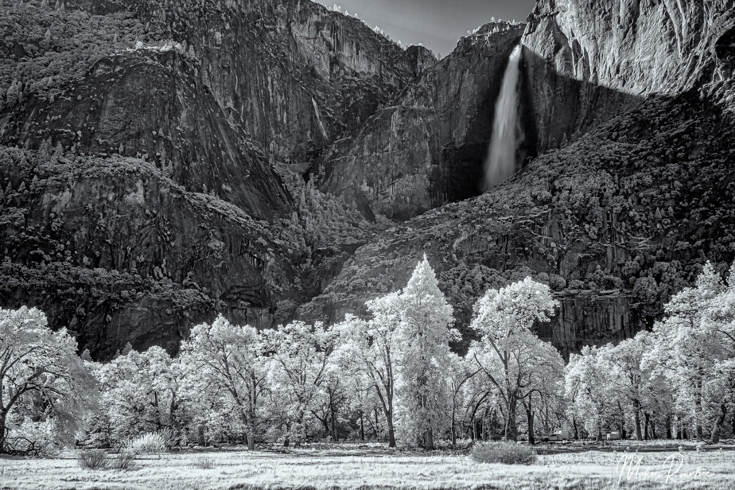
For me, the subjects that just scream B&W infrared are scenes with deep blue skies with puffy white clouds, and lots of trees with green leaves (chlorophyll reflects a lot of IR), and even better if the leaves are backlit. On my recent trip to Yosemite I actually shot more infrared than color. But in the towns of Santa Barbra and Carmel it didn’t come out of the bag. I don’t find IR pleasing for tight portraits, but it can be interesting for an environmental portrait.
Some of you joined in last night to watch our April program, Lisa Langell’s zoom presentation on high key photography. Those of you who weren’t there missed a good presentation. Lisa covered types of lighting and subjects that work well for high key, and her favorite light is an even cloudy sky that is lighter than the main subject acting as a backlight.
So this morning when I looked out the window and saw cloudy skies, and also saw some pale purple irises blooming, I decided to put her ideas to the test. For 30 years I’ve really considered myself mostly a studio photographer. I like all the control I have over light, background, and composition in my studio. So today I’m comparing my studio results with some shots done outdoors against the cloudy sky. Let’s see which images win. I did an article last year on shooting high key flowers without the comparison.
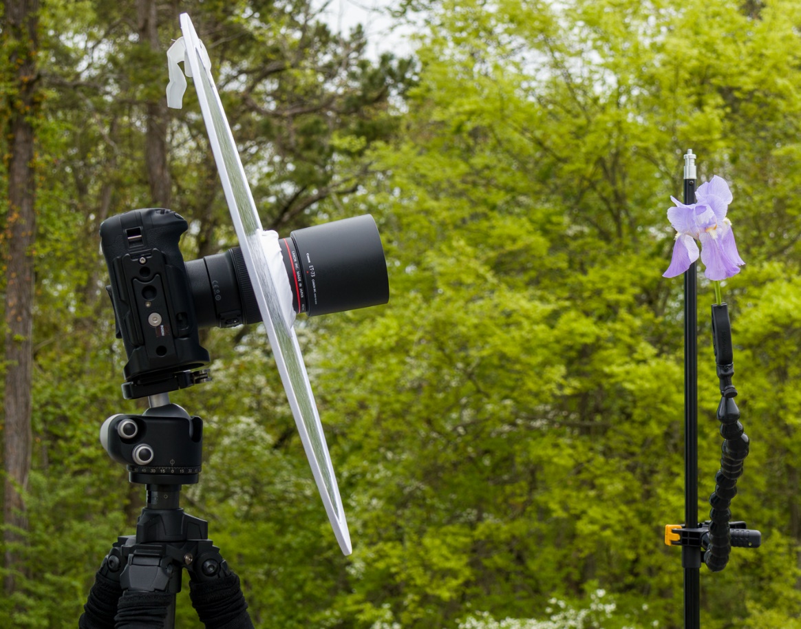
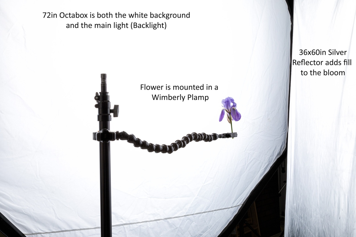
The Outdoor Setup
I used a camera with a 100mm macro lens on a tripod. I also placed a silver reflector over my lens for an even fill. I found that it easiest to aim the camera at the brightest part of the sky first, and then position the flower where it needed to be. The flower was held in place with a Wimberly “Plamp” which is standard equipment for flower photographers.
This was my first set up. While the light worked, what I couldn’t control was the breeze, the enemy of flower photographers worldwide.
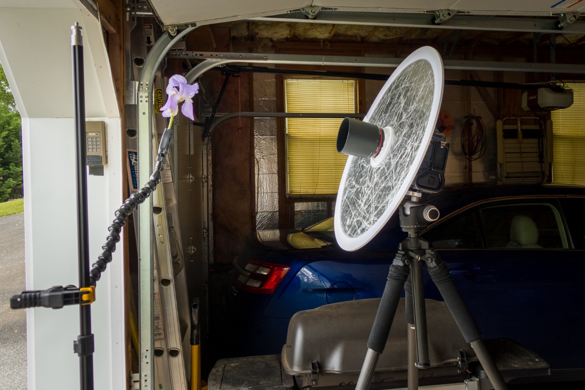
Even though my normal instinct would be to retreat to the studio, I only retreated as far as the garage. It’s the same setup, still using the sky as backlight, only it’s just a couple of feet inside the garage so the wind is blocked.
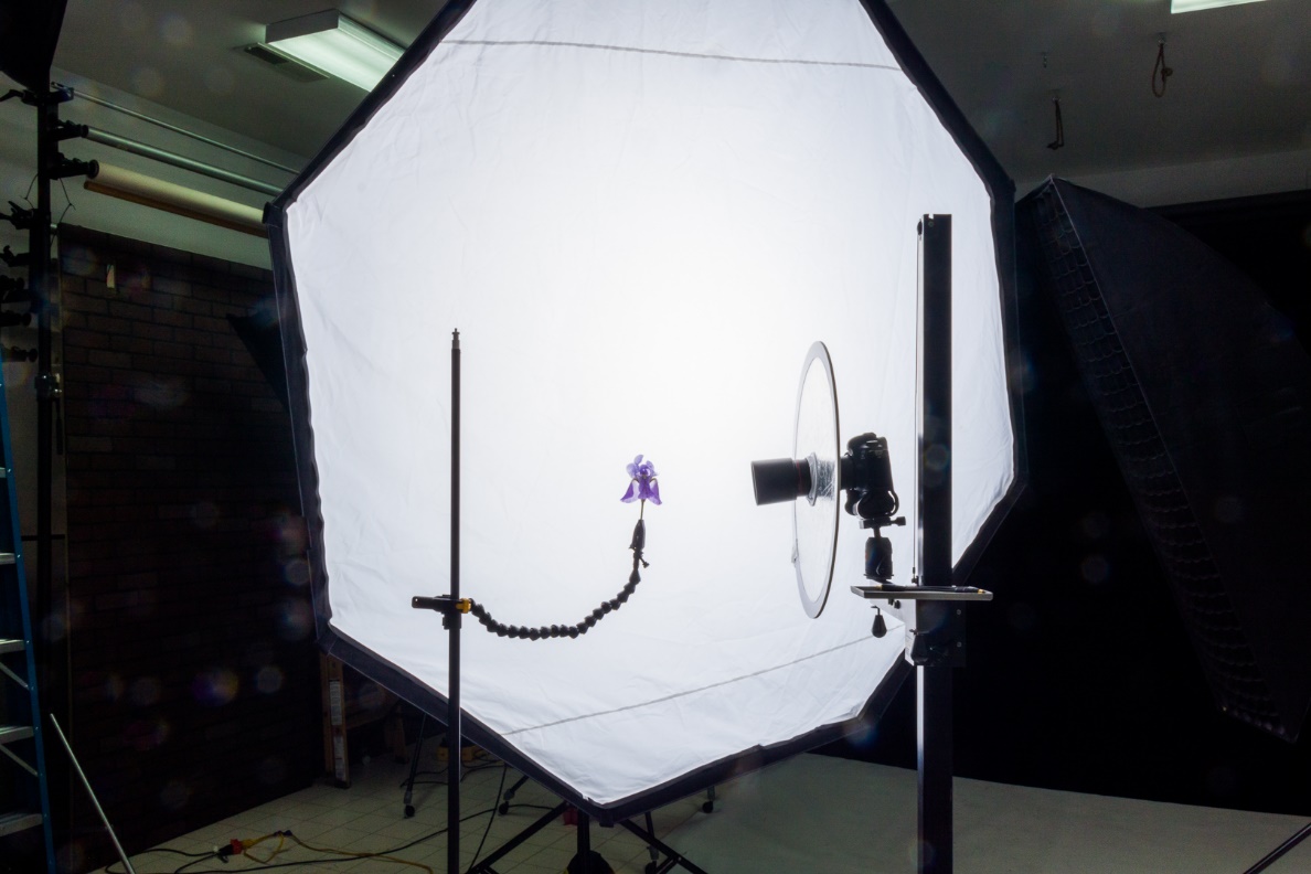
The Studio Setup
Here is my studio setup. The only difference is that I’ve replaced a cloudy sky with a large softbox.
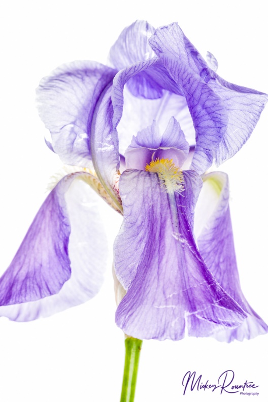
So how did my studio and outdoors shots compare? Can I tell the studio shots from the outdoor shots? To quote Dirty Harry Callahan, “Well to tell you the truth, in all this excitement, I kind of lost track myself.” Actually I can tell, but only by looking at the EXIF information. Also Lisa mentioned that these images lend themselves well to textures so I played around with Topaz texture effects, and also adding my own textures.
Here is a studio shot and an outdoor shot. These needed only minimal editing in Lightroom. I’ll bet you can’t tell which is which. And no I’m not telling you; feel free to guess.
For our March 2021 PSC program, Knoxville professional photographer Colby McLemore did a presentation on why to enter photography contests, and as part of that he did several image critiques. Several times while critiquing images, Colby mentioned color balance that didn’t look quite right. In some of my earlier articles I discussed the use of a gray card (see March 2020 newsletter) and creating and using camera color profiles (see April 2020 newsletter). These two steps will get your images into your editing software with good color balance. Today we’ll talk about step three which is calibrating your monitor so that your computer monitor actually reflects the accurate colors that steps one and two produced in your editing software. If you print, step four is using color profiles for your printer that fine tune your prints to match your monitor. If you don’t do your own printing or, if like many of us, your work is mainly shown onscreen, the first three steps are all you need.
There are two monitor calibration tools in common use. I use the Datacolor Spyder X and the other is the X-Rite i1 Display Pro (its older version was called the Color Munki). Both of these come with software for both Windows and Mac computers. Basically both of these units use their software to create images of known color onscreen and the sensor reads it, compares it to what it should be, and after sampling a large range of colors, it creates a monitor profile that your computer loads at startup to create accurate colors. As monitors change with age this calibration needs to be repeated every few months (I recalibrate every three months). A calibrator is under $200, and closer to $100 if you find a good sale. That’s a bargain when you consider it will help every picture you take.
One of the first questions people ask is “Why should I calibrate my monitor if other people seeing my images may not be using a calibrated monitor?” First, that may be true. Someone may be looking at your image on a monitor with horrible color balance and brightness. There’s not much you can do about that, but at least you know you sent out the best possible image. Second, truly serious photographers, and that includes photo judges, will be using calibrated monitors. So if your color balance is off, they will know it.
The next question is “I already use camera profiles and a gray card, so why do I need to calibrate my monitor?”. Even with profiles and gray cards, if your monitor is not calibrated, your color balance will look wrong to you on screen. If you then make adjustments by eye, you will be undoing the accuracy of the profiles and gray cards. And it’s not just the color balance, but the exposure that can suffer.
Whichever calibrator you use it is important that you calibrate and edit with consistent ambient lighting. Most calibrators have an adjustment for the ambient brightness, but if you edit in light that is too bright or direct light hits your screen, the software will have you increase the brightness of your monitor (just as you have to turn up your phone’s screen brightness in bright sun). So then an image that looks good on your monitor will look dark on a calibrated monitor in properly dim ambient light. Also prints you send to a lab will probably be a bit too dark. My editing computer is in my studio with very bright fluorescent lighting. To edit, I turn off the overhead fluorescents and use two tabletop LED lamps positioned so that no light hits the monitors. Don’t overlook this ambient light part of the equation; it’s critical.
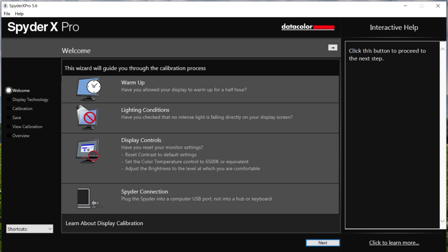
It’s also important to warm up your monitor, set the contrast to default or 50% if it’s adjustable, and set your monitor’s color temperature (if it’s adjustable) to the setting recommended by your calibrator.
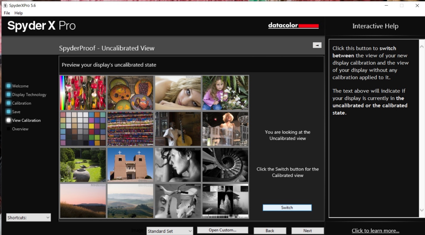
This is the opening screen of the Spyder X software which I use. It reminds you to warm up, check ambient light, and reset some basic monitor settings before calibrating.
Be sure your ambient lighting is not too bright, and the first step will be for the calibrator to measure the ambient light and tell you how to properly set your monitor’s brightness.
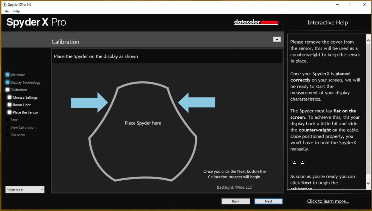
The next step will be to place the monitor on the screen while the software displays various colors for the unit to read. Typically, this takes several minutes, depending somewhat on the speed of your computer.
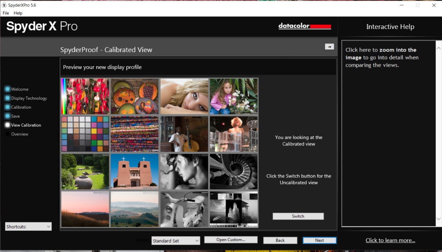
After reading all of the colors, the software will create a color profile, and ask you to give it a name. It will also show you a before and after comparison image so you can see the effect of the calibration. My before and after changes are pretty subtle, and may not reproduce well in the newsletter PDF, but they make a real difference in the final edit of my images.
Here is the image before calibration:
And the image after calibration.
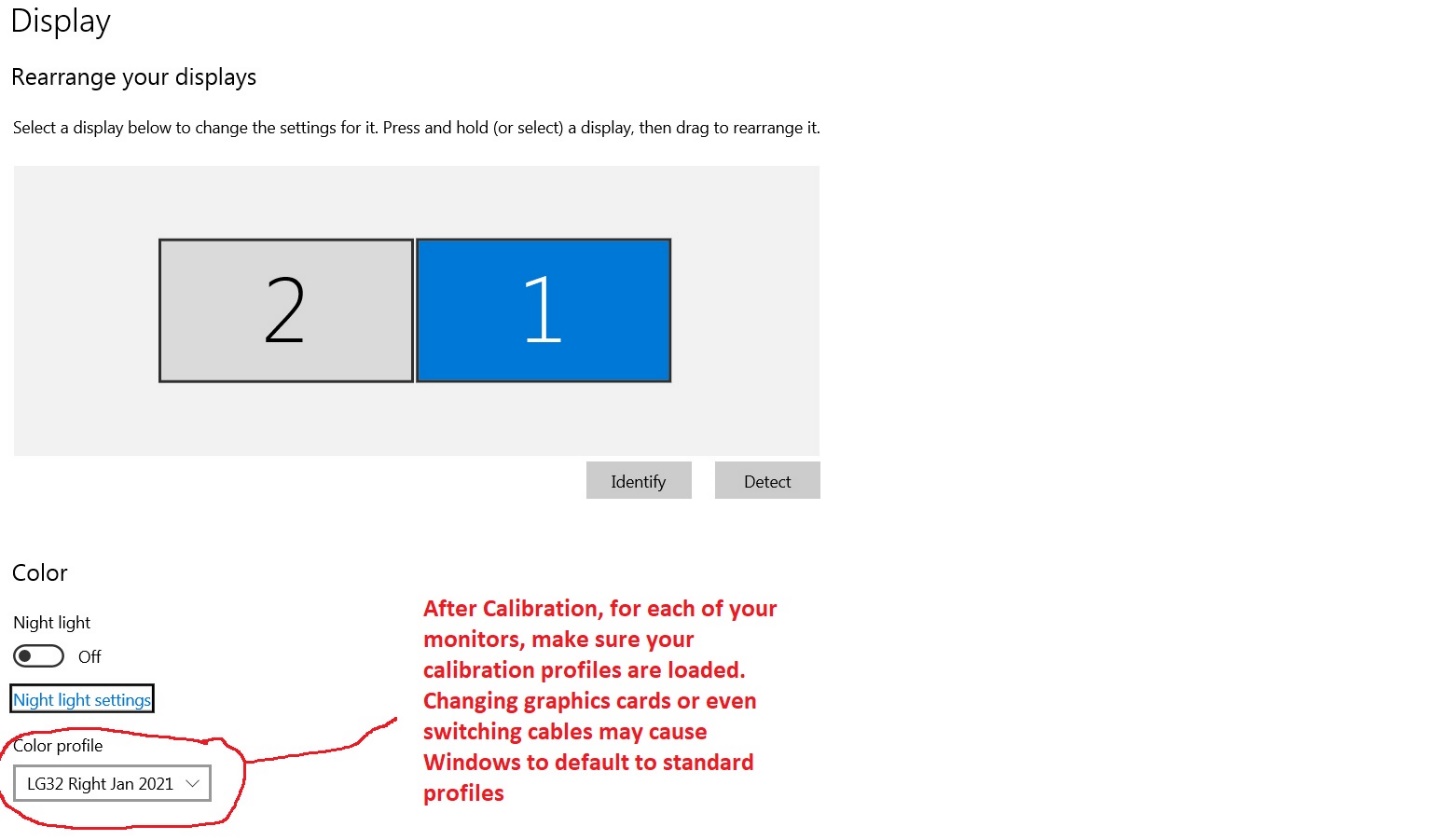
If you have two monitors, you will have to calibrate each one separately. I also name my profiles to include whether it is the left or right monitor and the date it was created. Now every time you start your computer, these profiles will load in place of the computer’s default profile. On a Windows machine, you can right click the screen, and choose display properties and you can verify that the correct profile(s) loaded. I have found that changing graphics card (no surprise there) or even replacing the monitor cable (that was a surprise!) will cause your computer to switch back to its default profiles. Just for peace of mind, it’s a good idea to periodically check that the right drivers are loading. There is probably a way to check on a Mac machine, but I’m not familiar with them.
So if you use all three steps, that is camera profiles, gray cards, and monitor calibration, your colors should be pretty much spot on. Certainly it should be good enough that color balance issues shouldn’t hurt your scoring in a competition. Oh and those people looking at your images on their un-calibrated monitors? That’s their problem, but now you know it’s not yours.
You’ve had a good couple of years of photography, made some really nice images, won some awards, and gained some new skills. And then one day you look at your images and ask yourself “How can you pretend to be a photographer? You’re not good enough to call yourself a photographer, you just don’t have the skills.” Or you’re on stage playing in a band, when it hits you that you don’t belong up there. You don’t play well enough, and everyone in the band and the audience knows it.
You’ve just experienced the “Imposter Syndrome” and most people will experience at least brief imposter feelings at some point in their lives.
First, let me say that I’m not a psychiatrist, or psychologist and I couldn’t even play one on TV. I barely passed Psych 101 with a “C”, though I did make an “A” in Abnormal Psych (I guess I could relate). I just want you to know that if you’ve had these doubts and fears you aren’t alone.
Imposter syndrome was first described in the 1970’s and is the feeling that you are not as competent as you should be, or as others see you. Any minute now people will see you for the fraud you are. This is in contrast to all objective evidence of your skills, talents and accomplishments. Common characteristics are: self-doubt, inability to accept your own skills and achievements, underrating yourself, fearing that you don’t meet the expectations of others, being driven to overachieve, setting impossible goals, and then feeling bad when you don’t reach them.
Often imposter syndrome happens to very high achievers, such as executives, doctors and other healthcare workers (the context in which I first heard the term), and creatives such as actors, musicians, and, yes, even photographers. Most of my friends are photographers and/or musicians and almost everybody I know has had these self-doubts at least briefly, so in my limited experience, creatives seem particularly vulnerable. In fact, my examples above are due to the fact that there is a huge correlation between photography and music. I think creatives may be even more at risk because it is difficult to evaluate the arts like photography, music, painting, etc. objectively. That also makes it easier to subjectively devalue your own skills and accomplishments.
For most people these symptoms are temporary, but if they persist or feel like they are controlling your life, you may need to see a professional. If you just get those occasional doubts, here are several things that may help.
Talk to other people in your field. You may be surprised to find out that you are not alone in these feelings. Just recognizing that others have the same self-doubts may help reassure you that that you aren’t as bad off as you think.
Learn to evaluate yourself objectively without self-criticism.
Have someone whose opinion you trust and value, critique your work, and help you see your strengths.
If someone critiques your work and points out a flaw, or suggests an improvement, it doesn’t mean that you are terrible or worthless. Do consider the merits of what they tell you.
Accept that there is always someone better. Stop comparing yourself against the best of the best. Don’t forget that even they sometimes have these thoughts too.
Don’t expect to reach perfection, and certainly don’t expect instant success. Appreciate that steady small improvements are a much more practical and achievable goal. And give yourself credit for the improvements you do make.
Let these feelings inspire you to work to improve, but don’t let them drive you to an incessant quest for perfection that burns you out and only adds to your feelings of frustration, exhaustion, and unworthiness.
Don’t let these feelings keep you from working. Start a new project or shake up something in your work to get you moving and keep you motivated.
If you see someone else struggling with self-doubt, try to do something to help them. You will probably find that it helps you as much as it helps them.
If these feelings are persistent, debilitating, or dominate your life and keep you from functioning get help from a professional.
The other day a picture on 500PX caught my eye and I liked the effect the photographer used. Since it’s not my image, I won’t put it here, but rather I’ll give you the link below.
I liked it so much, I decided to steal the idea, figure out how to reproduce the effect, but still make it my own. When you see an image you like, figure out what it is that caught your attention. It might be lens selection, viewpoint, lighting, color or post processing. Whatever it is try to duplicate it. By that I don’t mean copy it exactly. Besides being virtually impossible, that’s also unethical, especially if you try to pass it off as you own. But using another photographer’s image as a starting point isn’t really stealing, it’s just being inspired. Many times when you see an effect you like, you may be able to search for it on Google and find instructions or even videos. The hardest part may be how to describe it in Google to get relevant results.
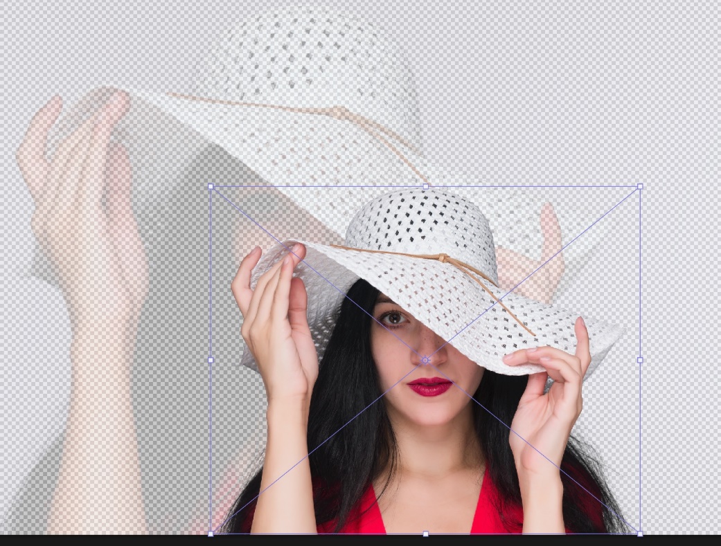
What caught my eye in the image I liked was the faded looking background that was large with a normal looking smaller image in front. It’s almost like the subject is casting a large colored shadow. You’ve probably seen similar effects in product shots, but you don’t often see it with people shots. So that was the key concept I “stole” for my attempts. This one was easy enough to figure out on my own, and I’ll give you the basic steps below.
I started by looking for some high key portraits. I didn’t visualize this working with low key subjects, but as you’ll see below, it really can work.
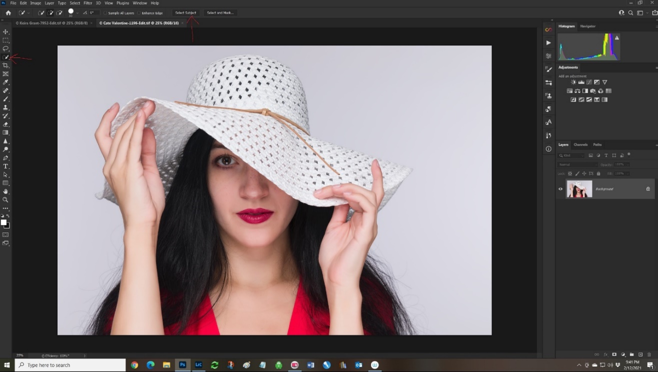
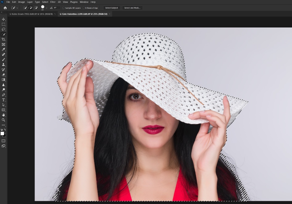
Step 1 Open the image and select the subject.
I won’t go into a lot of detail on making a selection, since there are lots of good tutorials out there. I selected the quick selection tool, and then clicked on “select subject”.
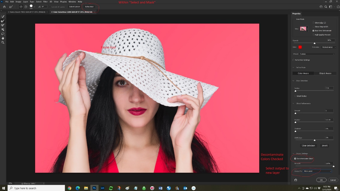
Step 2 Refine the selection
“Select subject” did a pretty good rough selection, but you’ll see it missed a lot of the loose hair. I clicked on “select and mask”, “refine hair”, and most importantly checked the box to “decontaminate color”. I selected on “output to new layer” and clicked OK. I had a pretty good selection faster than you read these directions. Just a couple of years ago this would have taken me 20 or 30 minutes.
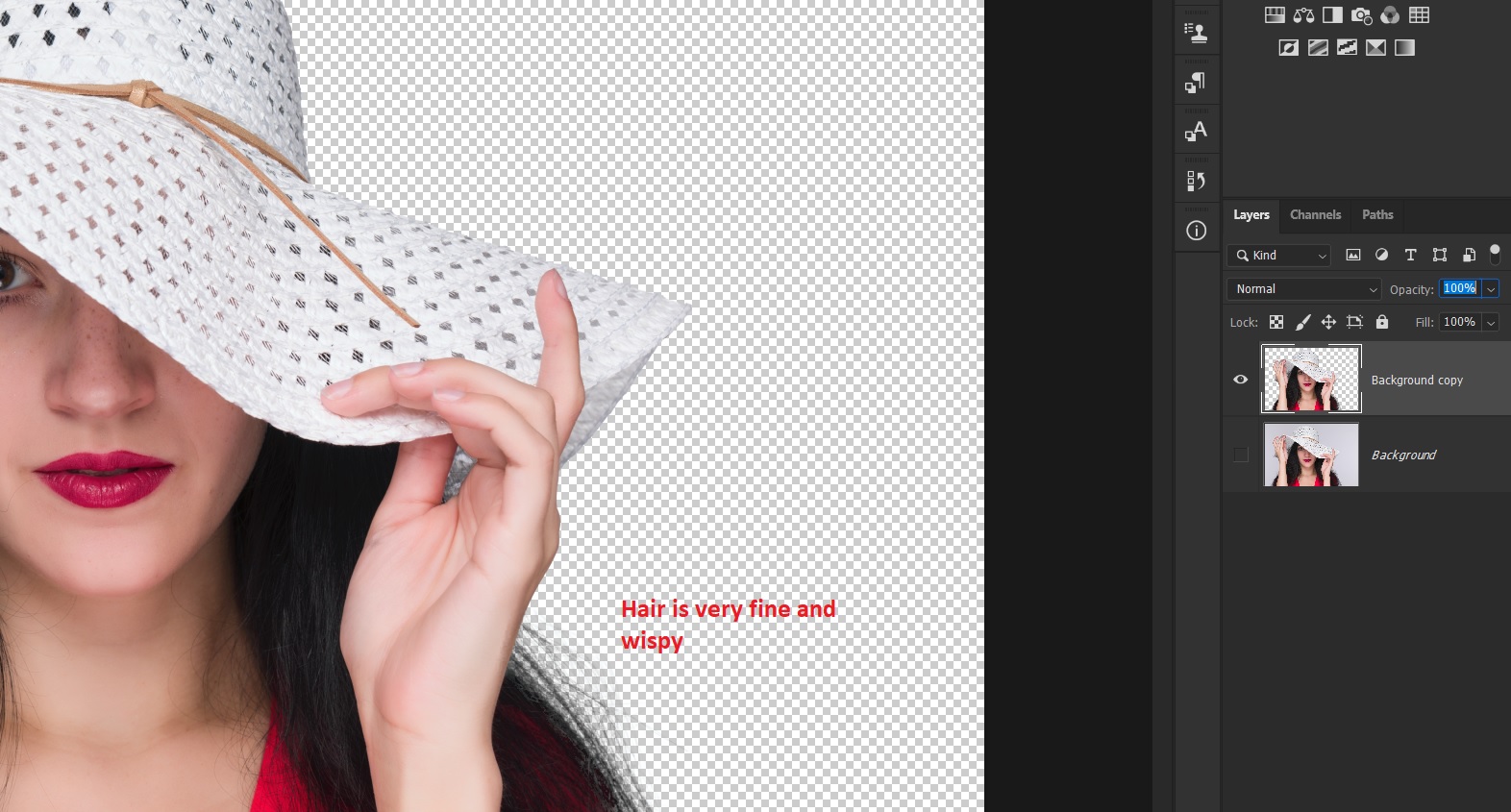
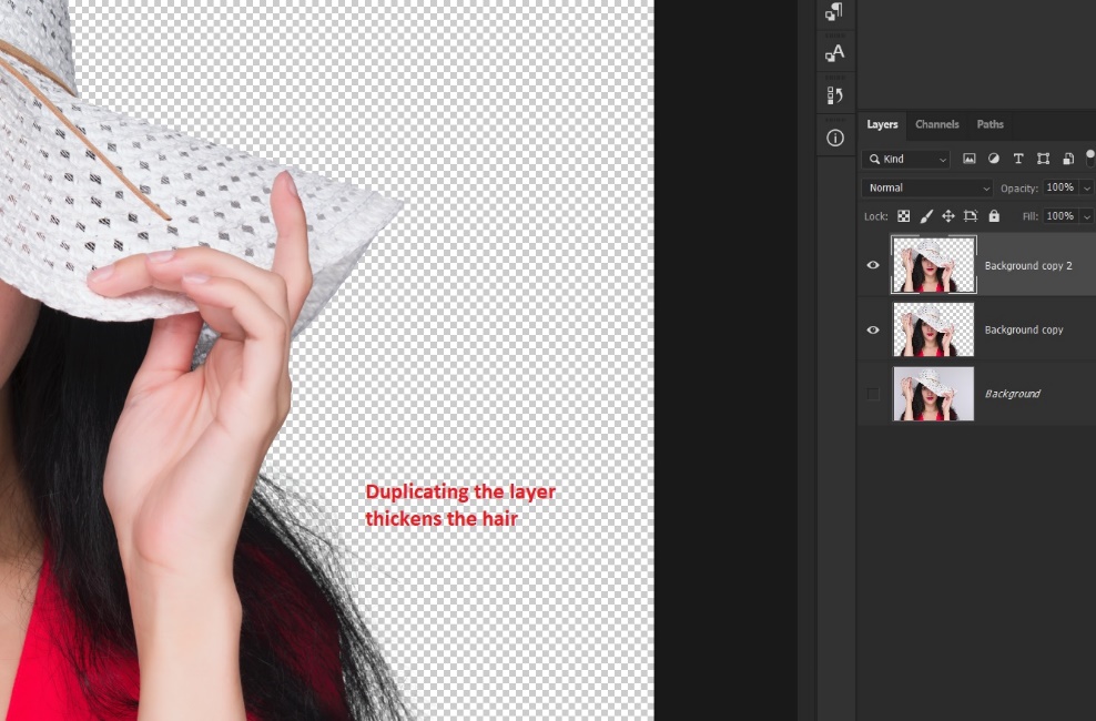
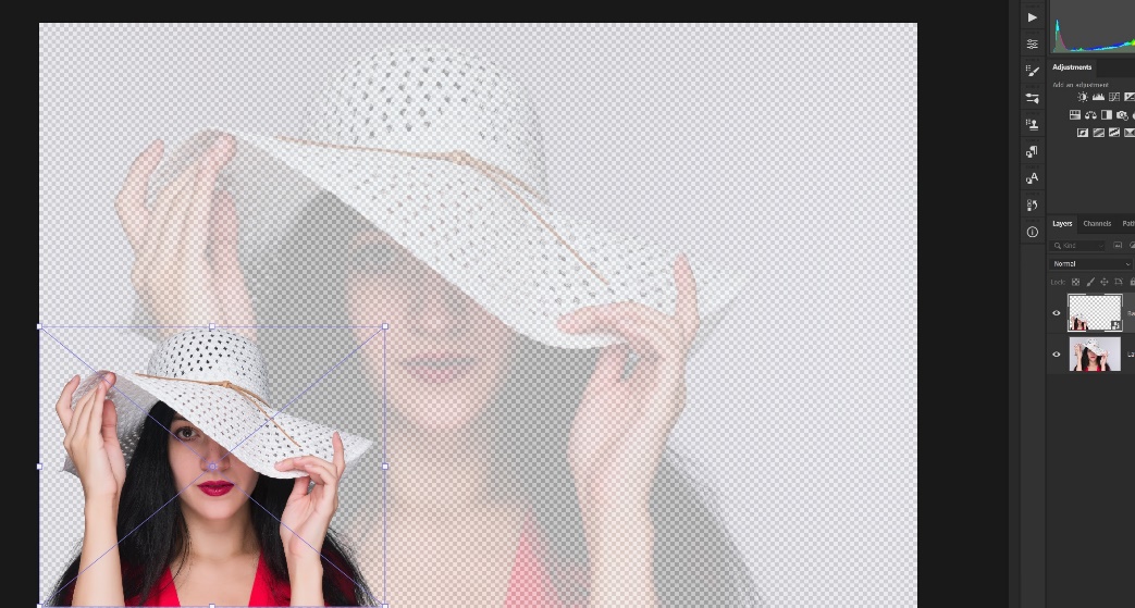
Step 3 Duplicate this layer
Simply duplicating this layer with Ctrl-J makes the wispy hairs become thicker. Then merge this layer with Ctrl-E.
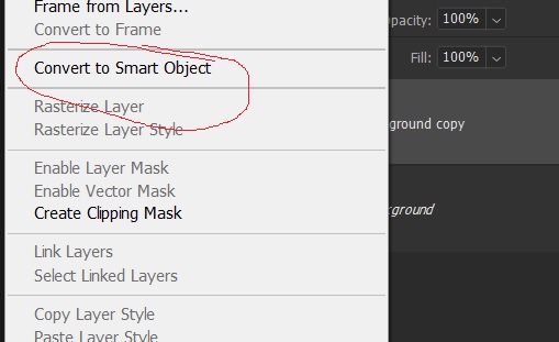
Step 4 (Optional) Convert the subject layer to a smart object.
Do this either from the layer menu or right clicking on the layer and choosing create smart object. The advantage of creating a smart object is that in a later step when we resize the subject, if we reduce it and save it and then change our mind and enlarge it, it will lose detail with each resizing. This doesn’t happen if the subject layer is a smart object. If you’re decisive and always get it just right on the first try you can skip this step.
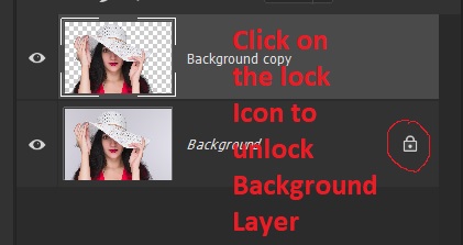
Step 5 Unlock the background layer.
You can’t change the opacity of the background layer because it is locked. To unlock it, just click on the lock icon.
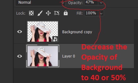
Step 6 Decrease the opacity of the background Layer.
This is personal taste, but I find something between 40 and 55% usually works. You’ll see the gray and white checkerboard pattern that represents transparency.
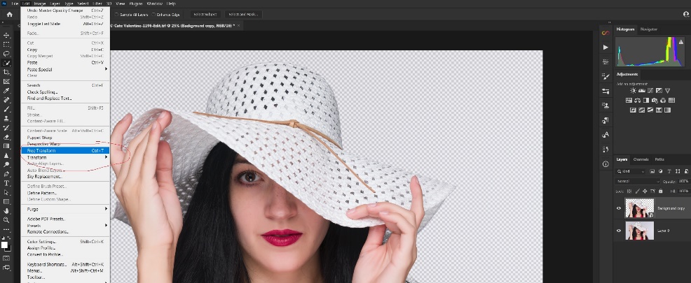
Step 7 Resize and reposition your subject
Select the subject layer and Ctrl-T to open free transform. Scale your subject down to the size you want and hit “enter” to complete the change. Use the move tool to reposition it. If you decide you need to resize it again, you’ll be glad you created a smart object.
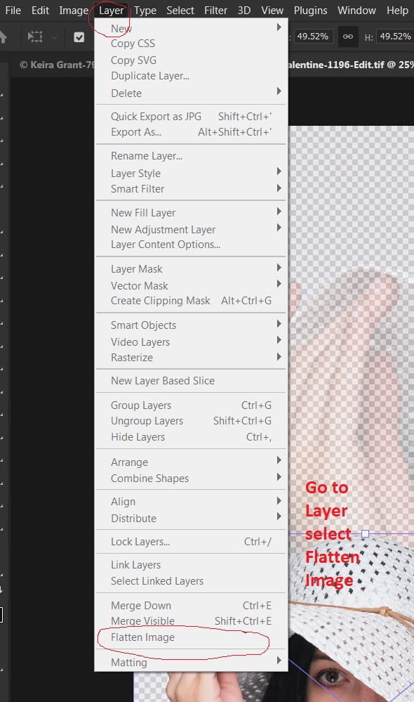
Step 8 Flatten the image.
Go to layers/flatten image. By the way, you won’t really see the full effect until you’ve flattened the image. I’ve done it enough to visualize the results, but you may find it helpful to create a new blank layer, move it to the bottom and fill it with white. Then the effect will look more like the final image, even before you flatten it.
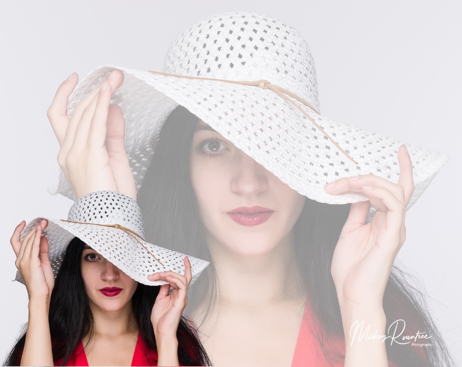
Here is my final image and a couple of other attempts.
At first I started out by using the same subject both large and small. But it works just as well with two (or even more) different images.
When I first starting working with this technique I visualized images with white or light gray backgrounds. But just to see what would happen, I tried it with a black background and it worked well. So far I’ve done this technique mainly with portraits, but it would work with products, cityscapes and maybe even landscapes with some imagination.
This article might be a bit beyond basic, but only because it involves Photoshop and the use of layers and layer masks. Even if you have never used layers, you should be able to follow along and make this work for you.
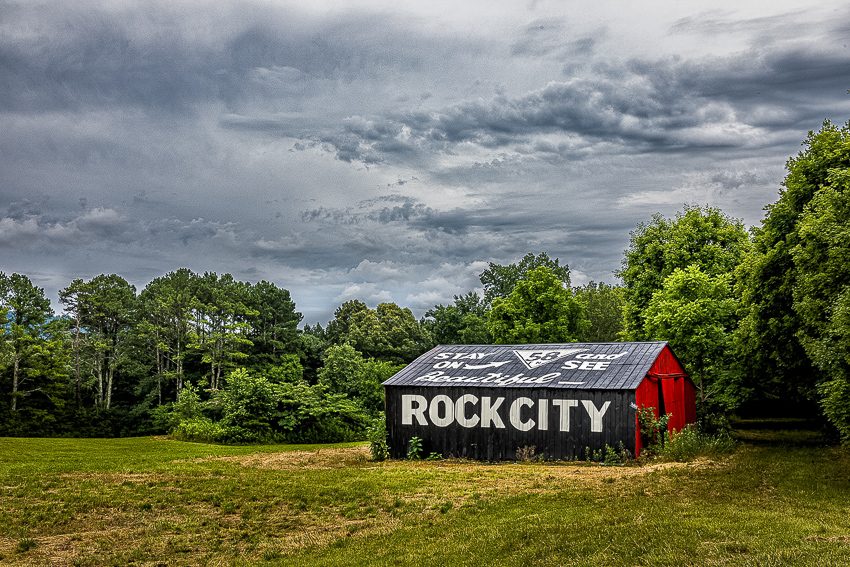
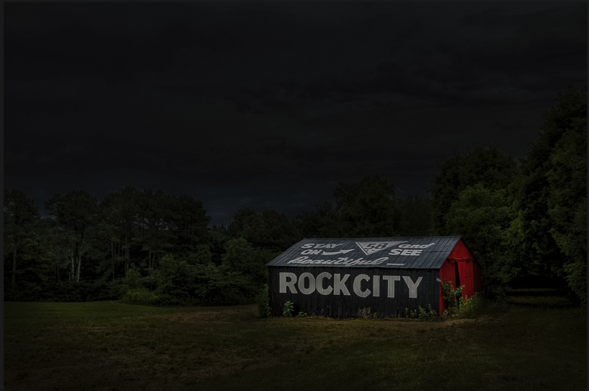
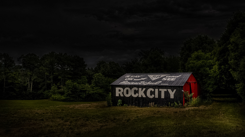
I’m a fan of light painting, and the photographers who do it well. However, I find that I don’t have the patience or opportunities to learn and do it well. Traditionally, light painting is difficult, requiring light painting with flashlights during a single long exposure, or using speedlites or flashlights to light small segments of an object in multiple shots and then combining and blending them in Photoshop. The single shot is particularly difficult as the exposure on different parts of the subject requires counting the different exposures and rushing to get it done in one 30 second exposure. If even a part of the image is not properly exposed, you have to repeat the whole procedure, hoping you fix the bad part, and don’t produce any new errors. And then there is the issue of obtaining access to places and subjects at night which may not be convenient or possible.
So I have tried to come up with a way to produce a light painting effect in Photoshop that doesn’t require working in the dark, long exposures or merging and blending dozens of layers. This works on subjects that you wouldn’t be able to access at night, moving subjects like people, and you can work on your existing images.
Start with an image (of course I usually use an HDR image) and edit it as you normally would. I usually do my basic editing in Lightroom and then move the image over to Photoshop. After whatever edits you do in Photoshop, flatten the image. Here is my starting image.
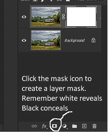
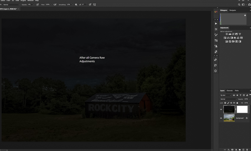
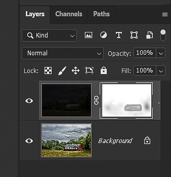
Use the shortcut ctrl-J (cmd-J on Mac) to copy the base layer and add a layer mask.
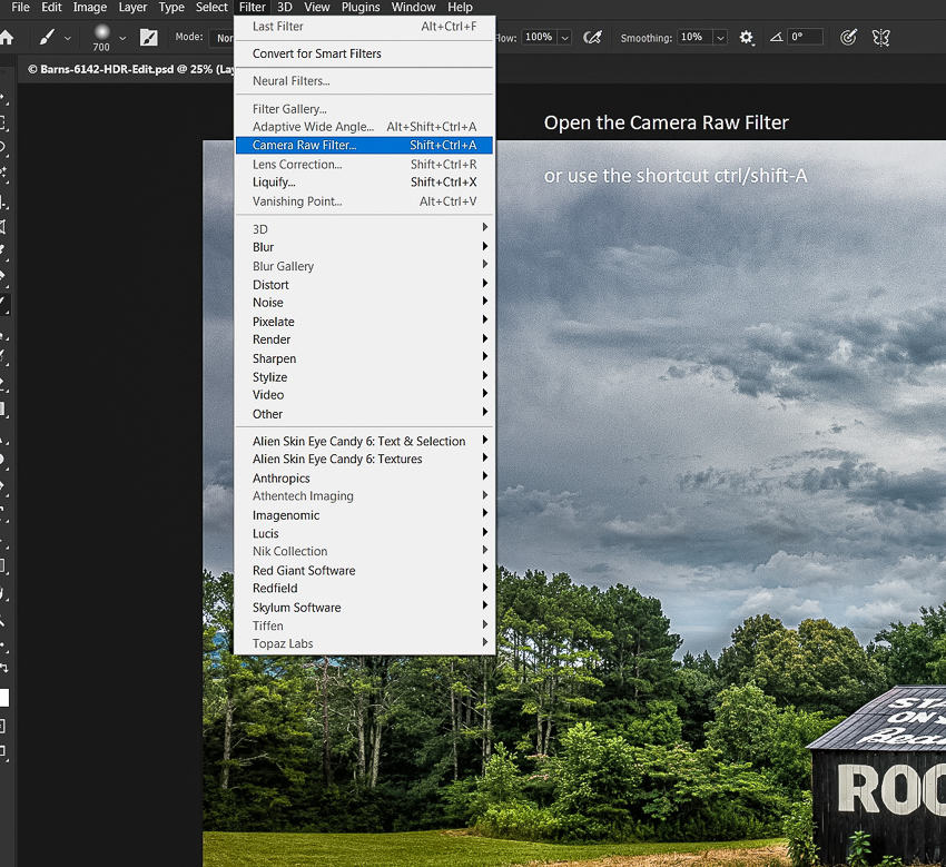
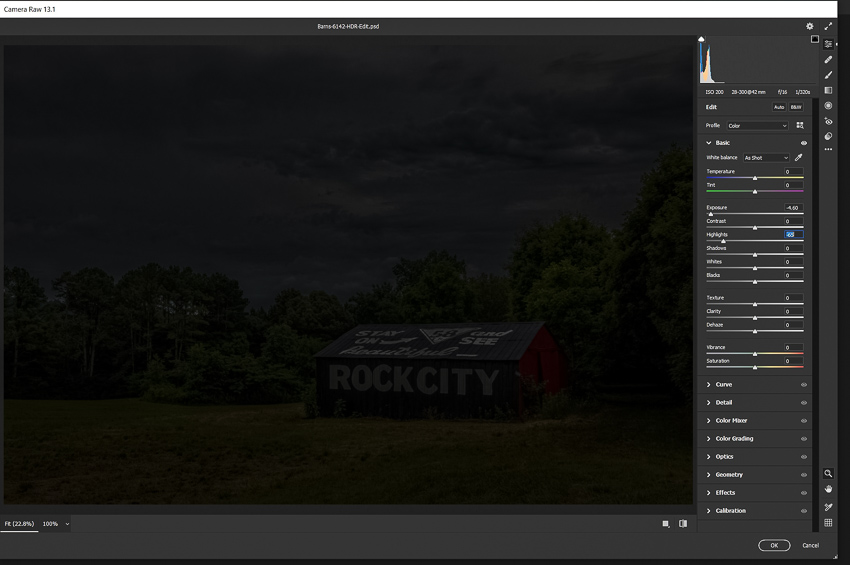
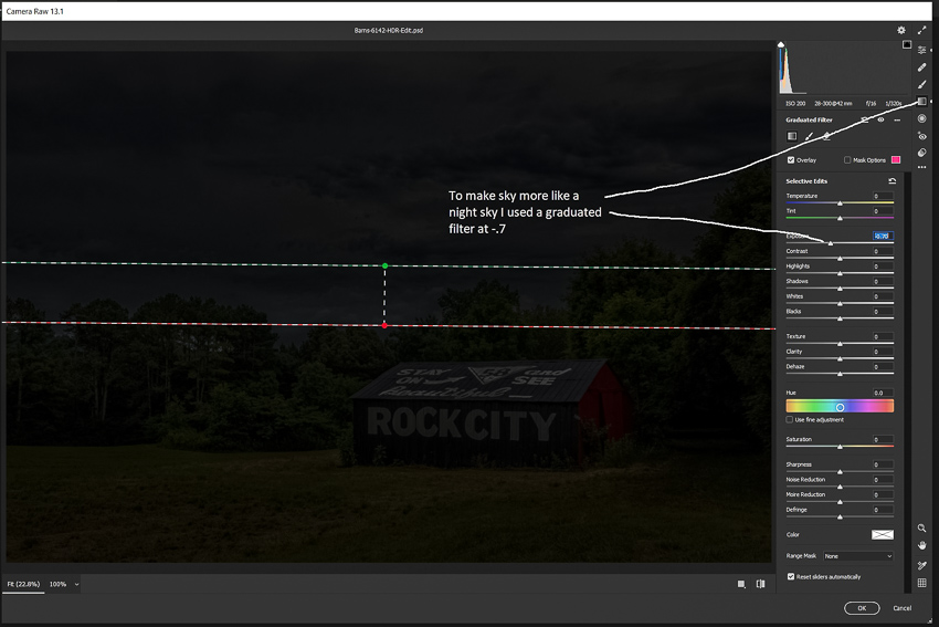
Next, use the camera raw filter (filter/camera raw or the shortcut ctrl/shift-A) to drastically drop the exposure of this layer, until it looks like night or is very dark. It doesn’t have to be solid black, but it should look like at least very late twilight. I find I usually decrease the exposure somewhere between -3 and -4.5. I usually also decrease highlights, and if there is a bright sky I may also use a graduated filter. Underexposure exposure increases saturation, so you may also need to decrease it.
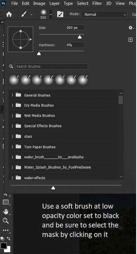
Select the layer mask by clicking on it, and use a soft, black brush at a low opacity like 10 or 15% to paint on the mask to begin lighting the subject. Vary the brush size depending on the size of what you need to paint. It’s better to use multiple painting strokes to build up the lighting rather than trying to add a lot of light quickly with high opacity brushes. Using low opacity also makes it easier to vary the exposure in different parts of the image. As you paint on the mask, you’ll see the objects you paint over begin to lighten. The more opacity you build on the mask, the lighter they become. Don’t overdo this. The goal is to have a picture that looks like a night scene with some light added selectively.
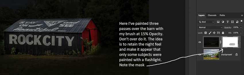
Below I’ve painted over the barn, lightly over the grass, and made some dabs on the surrounding trees. You can see the effect and the corresponding mask. Try not to light the sky, since that wouldn’t happen in real life night painting unless you have an aircraft search light. If you make a mistake, switch to white, paint over your mistake, then switch back to black, check your opacity, and continue.
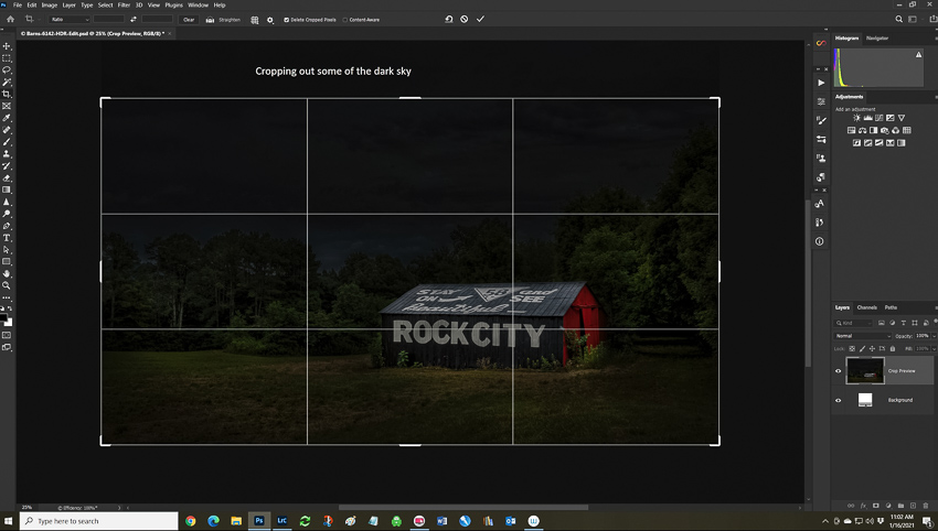
After my light painting I decided on a couple of finishing touches. First I cropped some of the sky off since while it was dramatic in the daytime shot, it was just black dead space in the night shot. You might also notice the rule of thirds coming into play.
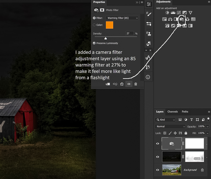
Next I added a photo filter adjustment layer. I chose an 85 orange at about 25% to warm things up a bit as an old tungsten flashlight would. Or you might even prefer a blue filter; it’s all personal taste.
And here is the final image below. I would suggest that you don’t flatten your image and that you save it in Photoshop format (.PSD). That way if you decide later to change the image you won’t have to start over from scratch.
I’ve found that this technique works well on landscapes, Old Car City Cars, still lifes, flowers, low key portraits, and almost anything else you can think of. You can see some of my other examples at:
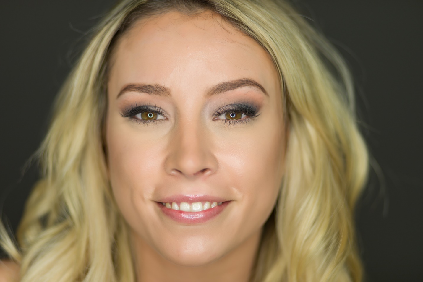
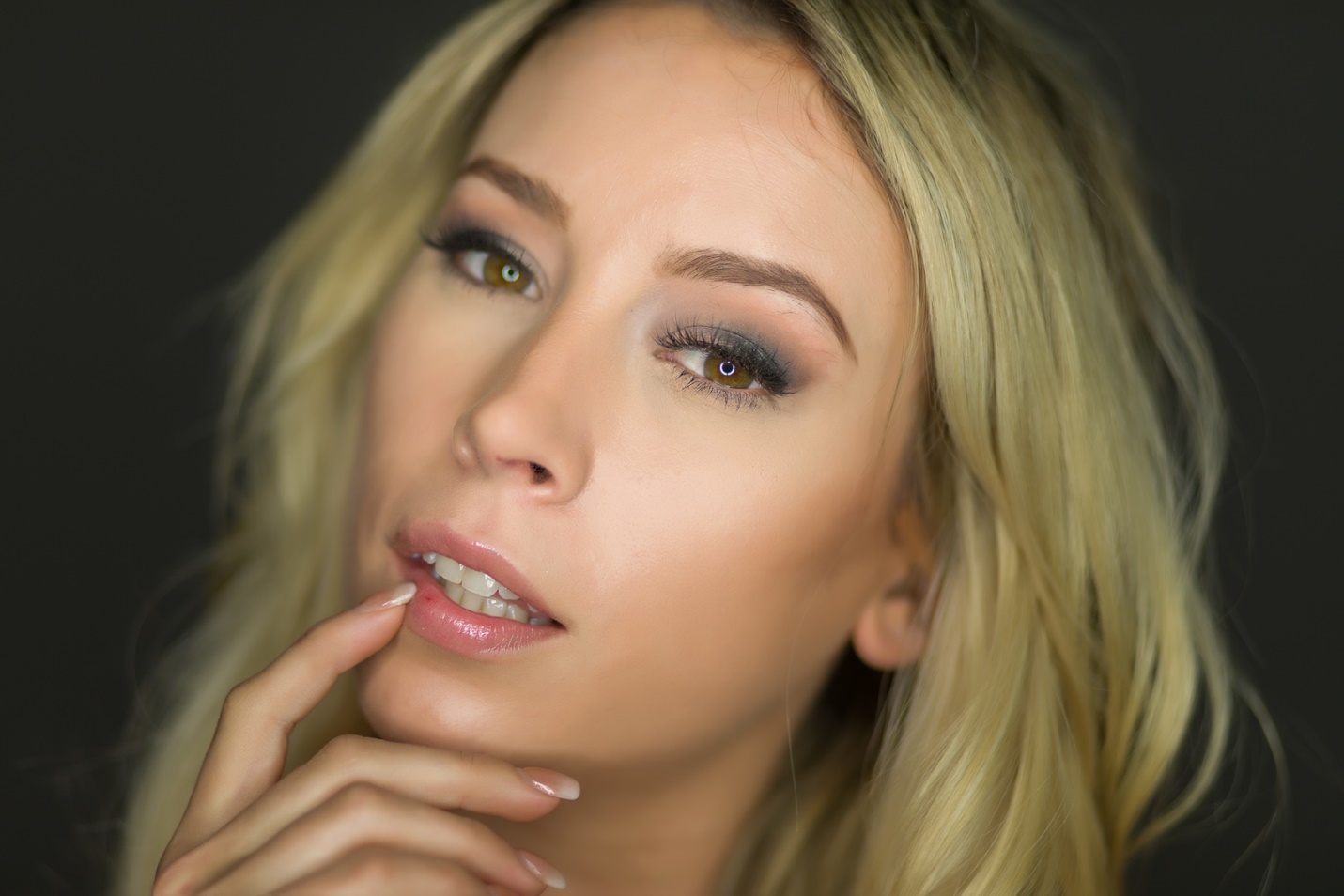
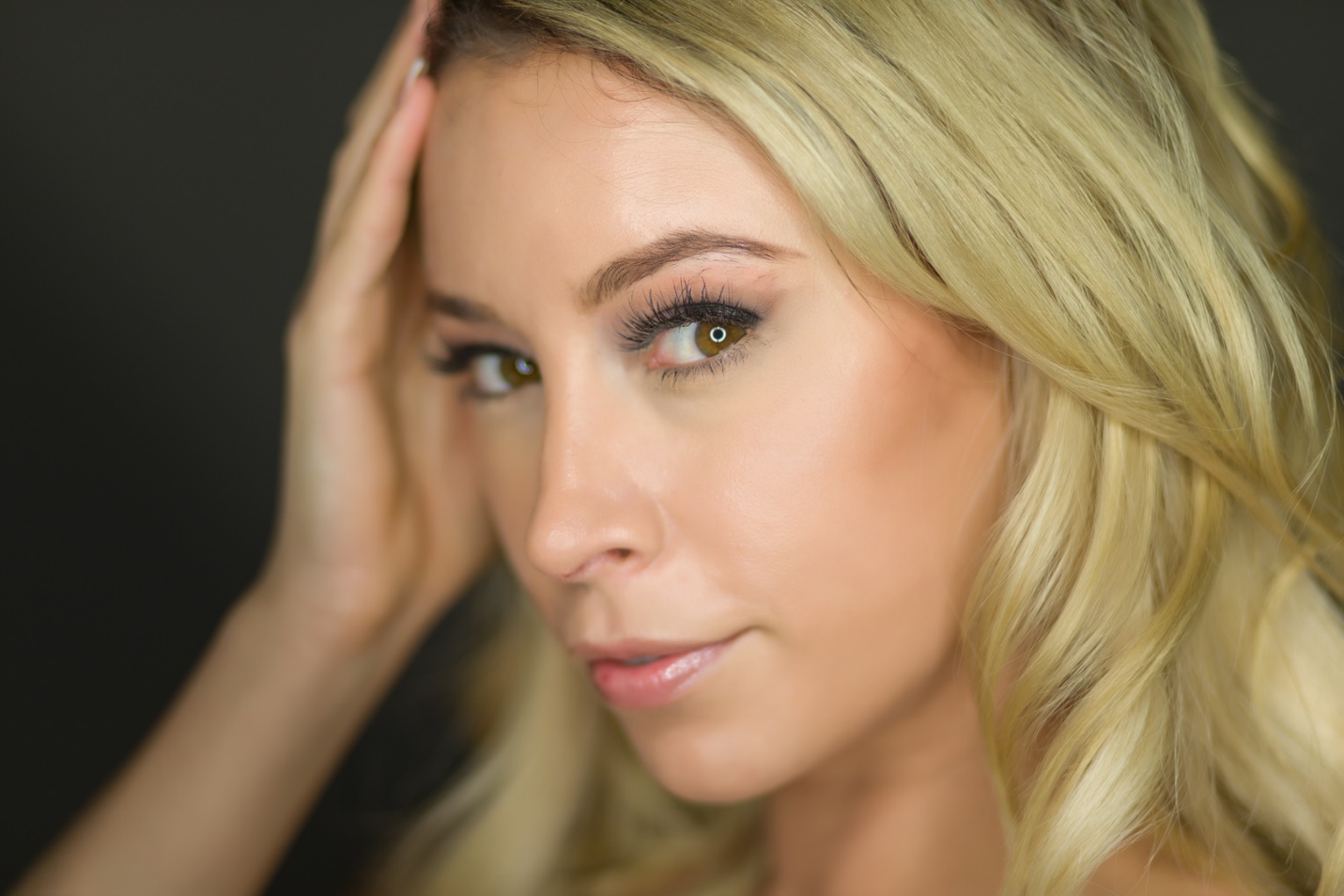
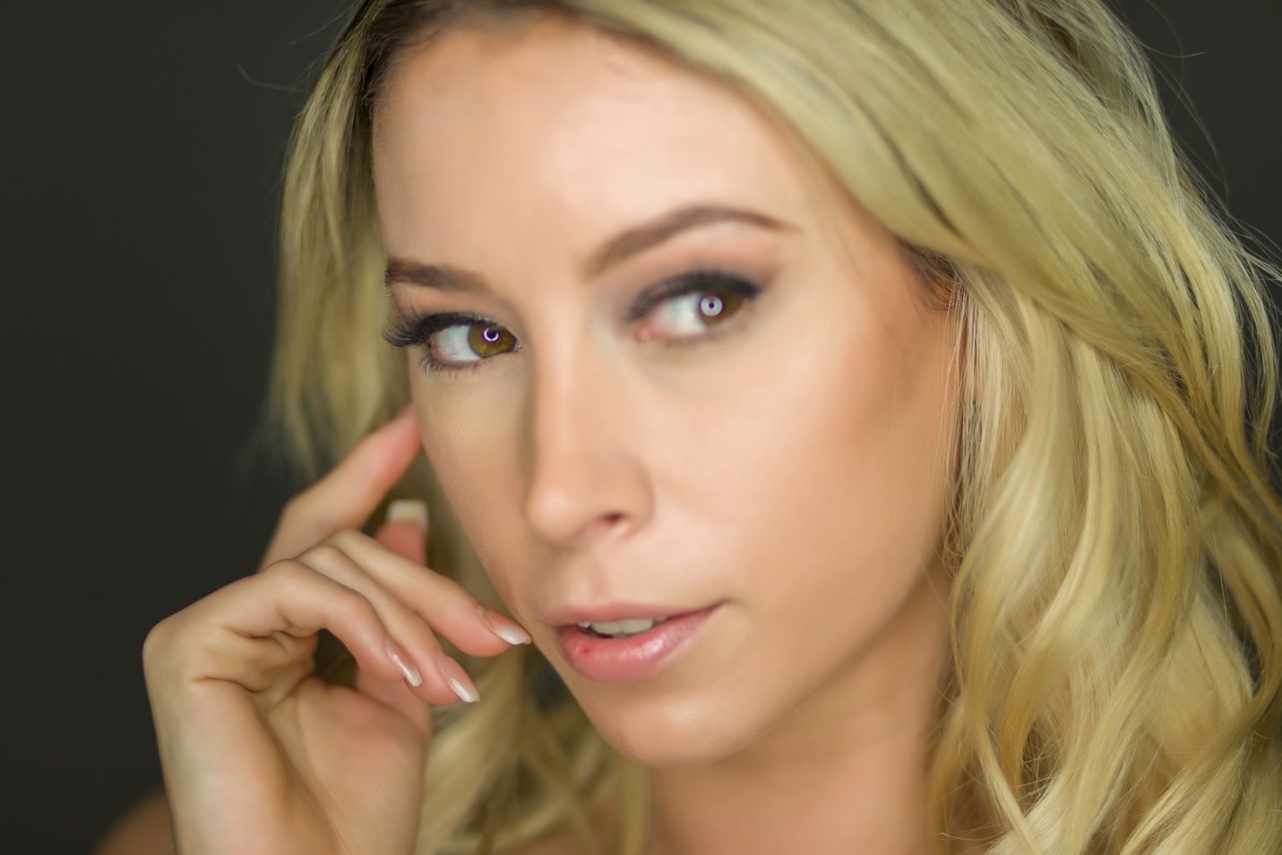
Focus, Daniel-san. Look eye! Always look eye. Who knew that in The Karate Kid, Mr. Miyagi was actually giving portrait photography advice?
In a portrait, probably the most important element is the eyes. The eyes are the “window of the soul” and it’s how we make a connection to the subject. If the eyes aren’t in focus, that connection is weakened, and most likely the image will be a failure. And this also applies when photographing animals and wildlife where the eyes are visible.
When shooting full length or ¾ length portraits, if the subject is in focus, most likely the eyes are in focus, especially at smaller apertures. But, as we come in tighter and tighter on the face, focus on the eyes becomes more and more critical. If you’re shooting at a wide aperture like f/1.8 to f/2.8 depth of field becomes very shallow, requiring very careful focus on the eyes. Many of the newer mirrorless cameras have not only face detection, but eye detection as well. If depth of field is so shallow that only one eye can be in focus, it should be the eye nearest the camera. Some of the cameras with eye detection follow the closest eye rule, and others not so much. With shallow depth of field, the difference in focus on the eyes is minimized when the subject faces the camera squarely, and it’s accentuated as the subject turns away.
As you shoot, review your images, zoom in and make sure the eyes are truly sharp. In tight and wide open, realize that not every shot will be razor sharp. Just the slight movement of the photographer or subject breathing can change the focus. Using a tripod can help by at least eliminating movement of the photographer. Also, as you review and edit on the computer, zoom in on the eyes to be sure they are really in sharp focus.
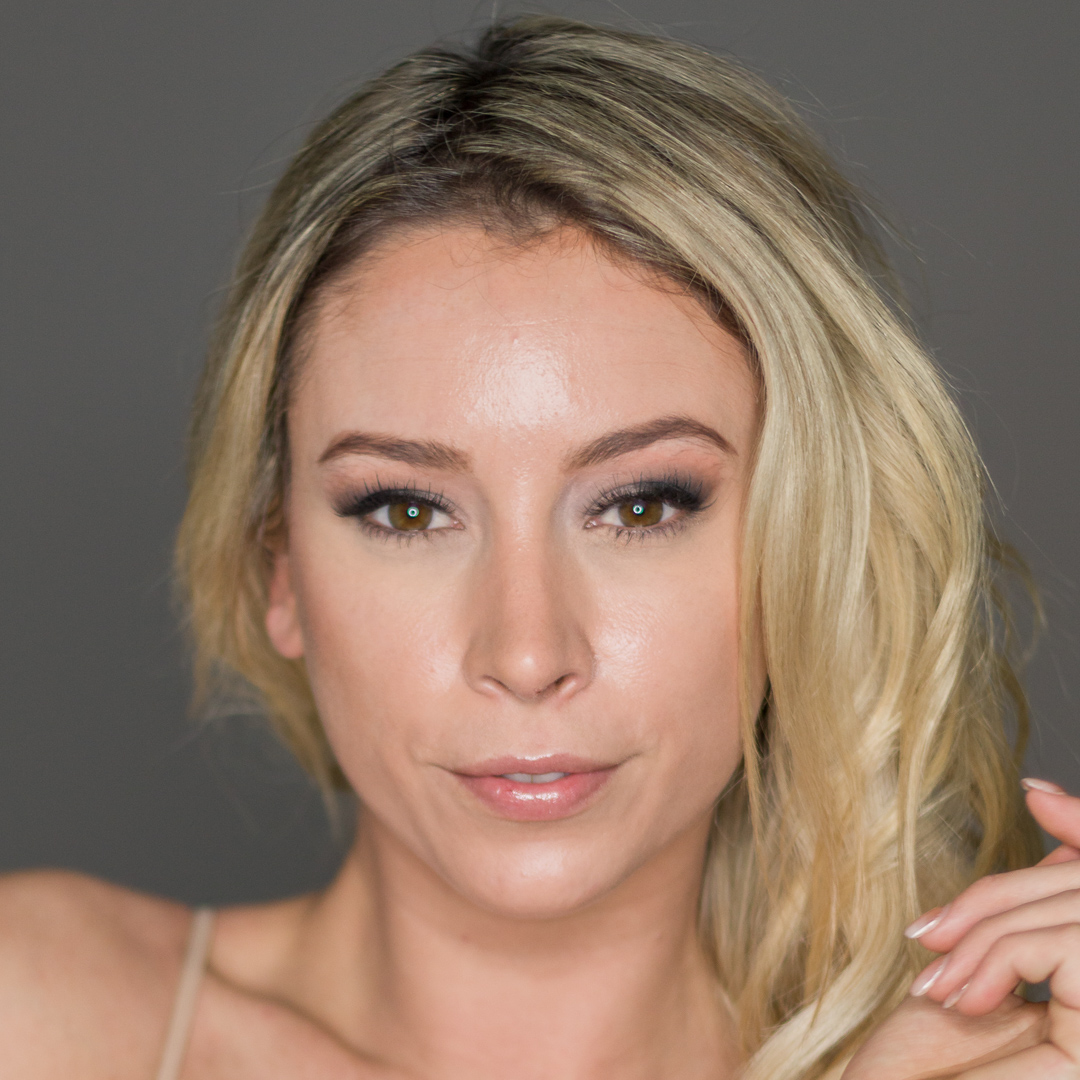
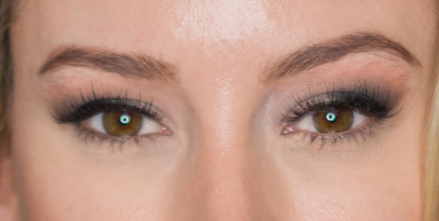
In the examples below I was testing a new camera and lens setup along with a fluorescent ringlight (notice the circular catchlights). Exposure was f/2.0 at 1/200 sec and ISO 200. This close at f/2.0 gave me a depth of field that was just fractions of an inch.
The examples below depend on very fine detail, which is sometimes lost by the time the newsletter is converted to a PDF and the resolution is reduced to create a manageable file size. If you want to see the images at higher resolution, go to my website. You’ll also find all of my past articles here.
Here, the eyes are pretty much on the same plane, and it’s possible to get both eyes in focus. Just be careful to place your focus point on the eye. Also don’t focus on the eye and recompose, as in a tight shot like this the slight change in distance to the eye as you recompose may cause the eye to go out of focus. Compose your image as you want it, and then move your focus point over the eye.
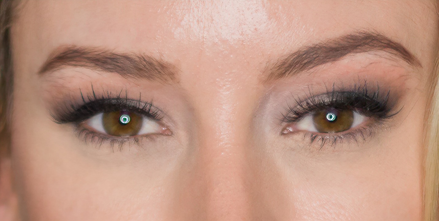
Here the model turned her head so the eyes are no longer on the same plane and both can’t be in focus at the same time. In the first two images I placed the near eye in focus.
Here the further back eye is in focus and the near eye is out of focus. Compare it to the two shots above, and it is not nearly as effective.
So what do you do when a shot is “almost in focus” but not quite sharp?
First shoot several shots so hopefully there will some truly sharp images to choose from.
Second, hit the delete key; this used to be our only option.
Third, you may be able to save it with a good sharpening program or plug-in. The one I prefer is the new Topaz Sharpen AI. Sometimes it is almost magical, and sometimes even it can’t save an image. Also when you sharpen with a program this powerful, it will sharpen things you don’t necessarily want sharp like skin texture and flaws. I usually sharpen a copy layer and then use masking to control where the sharpening gets applied.
At first glance, this images looked “sharp enough”.
After zooming in, it becomes evident that the eyes are not quite in sharp focus.
Here is the same image after I used Topaz Sharpen AI. It’s much better than the original, very usable, but not quite as good as a truly sharp original.
So the next time your shoot close-up portraits, remember “Look eye! Always look eye”
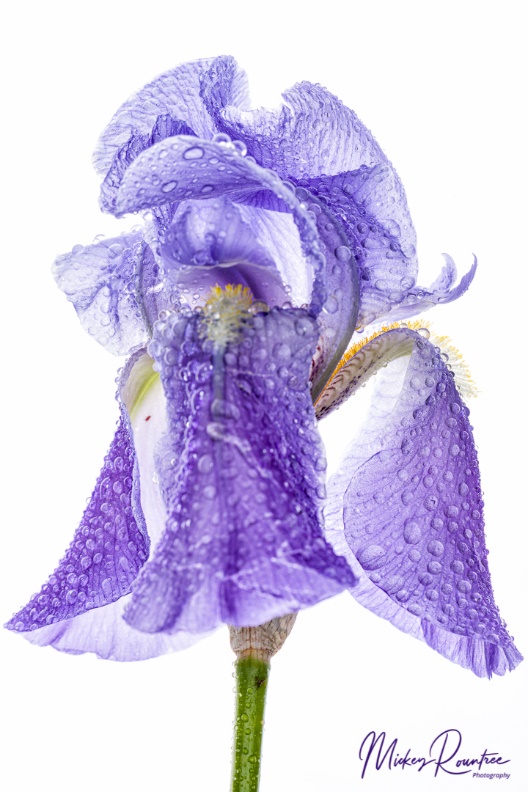
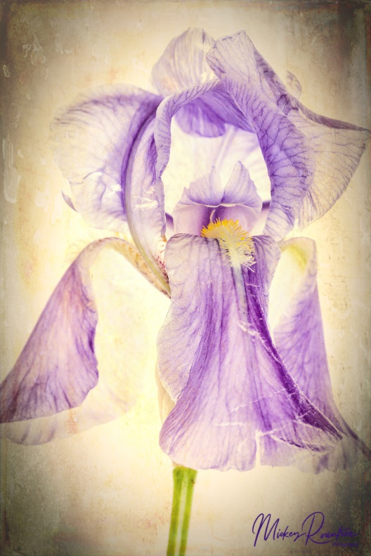
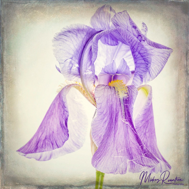
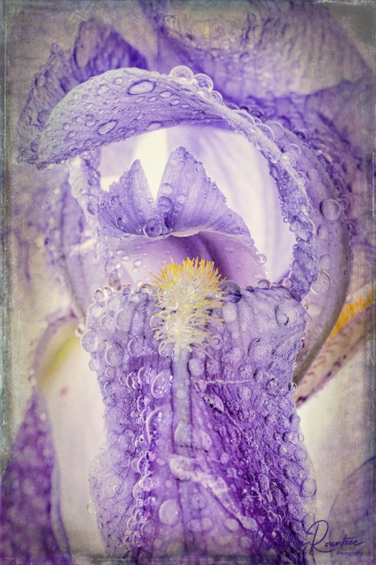
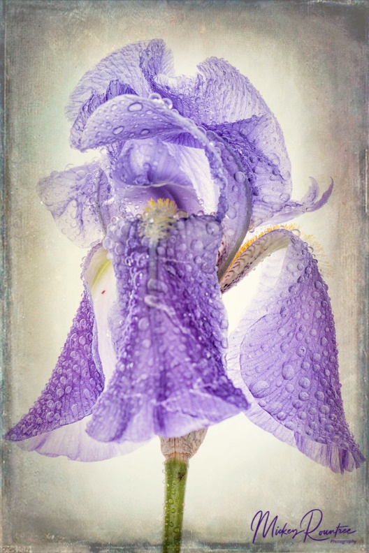
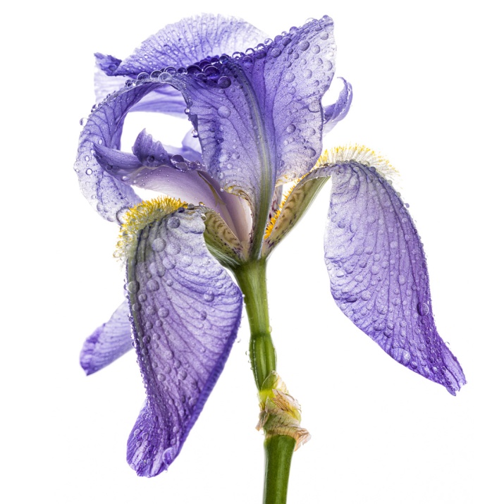
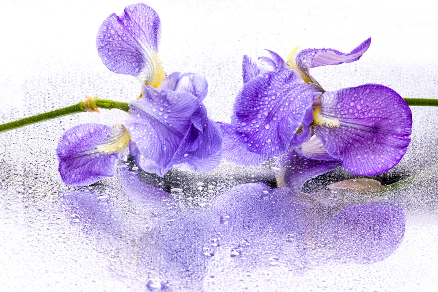
Here are two quick high key setups for photographing translucent flowers in the studio. I used irises from my yard, but any delicate, translucent flower would work. First, a quick definition of “high key” is an image that is almost entirely very bright with very little or no dark shadows present. Each of these setups took less than five minutes to create, yet they give a very unique look. I’ve said it before, but I am not really a flower photographer, so if I can do this anyone can.
My first setup had the flower positioned in front of a softbox. This was both the background, and a strong backlight which showed off the delicate transparency of the flower. To add some light to the front of the flower I brought in a silver reflector close to the flower and as close as possible to my camera. I used a Canon 5D Mark IV and a 100mm macro lens and shot at f/16 for depth of field. I misted the flower with a small spray bottle for extra texture and interest.
If you don’t have a softbox, you could hang a white shower curtain liner and light it with a speedlite or even place it over a window. You could use a white card as a reflector, or cover it with crumpled tin foil for a brighter fill. If you use the window, be sure to use a tripod since your shutter speed will be much longer than the duration of the flash that I used.
And below are the results I achieved with this simple setup.
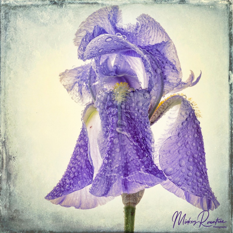
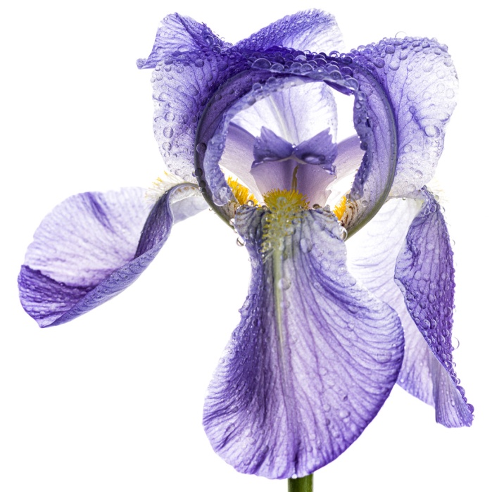
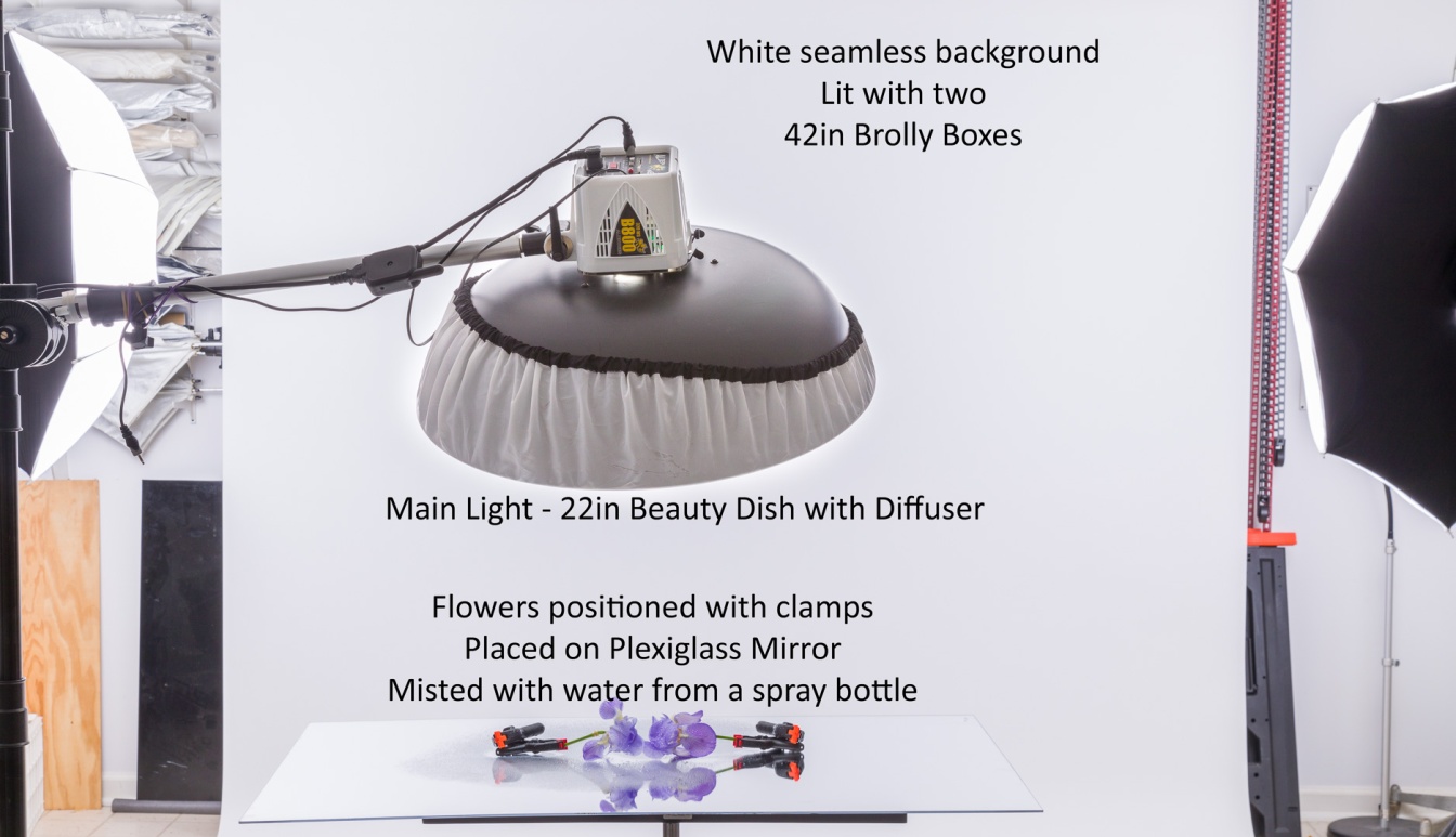
For the mirrored image, I laid two flowers on a Plexiglas mirror. Finding a Plexiglas might be the hardest part of this setup. I’ve had mine for over 20 years, and the plastics company in town where I bought mine is no longer in business.
I used small clamps to position and hold the blooms in place. Once I again I used my spray bottle to mist the flowers. My background was white seamless paper evenly lit with two umbrella soft boxes. Again the shower curtain liner over a large window would give a similar white background. My main light was from almost straight over the flowers. I used a beauty dish with a diffuser, but any small softbox, or even a white shoot-through umbrella would work. I shot from a low angle so my main light would not show in the image.
Once again I used my Canon 5D Mark IV and a 100mm macro lens and shot at f/16 for depth of field.
And here is one of the mirrored shots.
These images were processed in Lightroom only. If you adjust your lighting, composition, and exposure carefully as you shoot, you will not need to do any advanced processing in Photoshop.
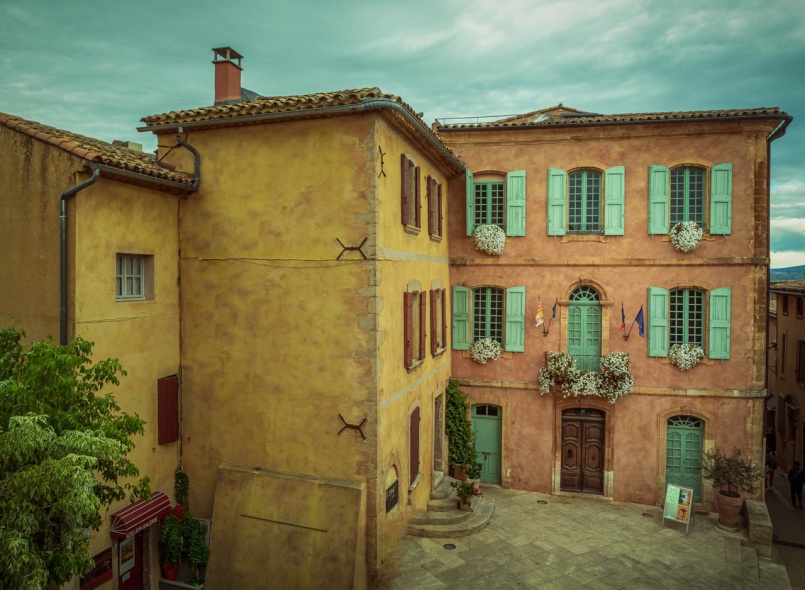
This is the fourth of my series where 4 photographers submit an image and it is edited by all four. My fellow photographers for this project are Bob Copeland, Bill Mueller, and Richard Smith.
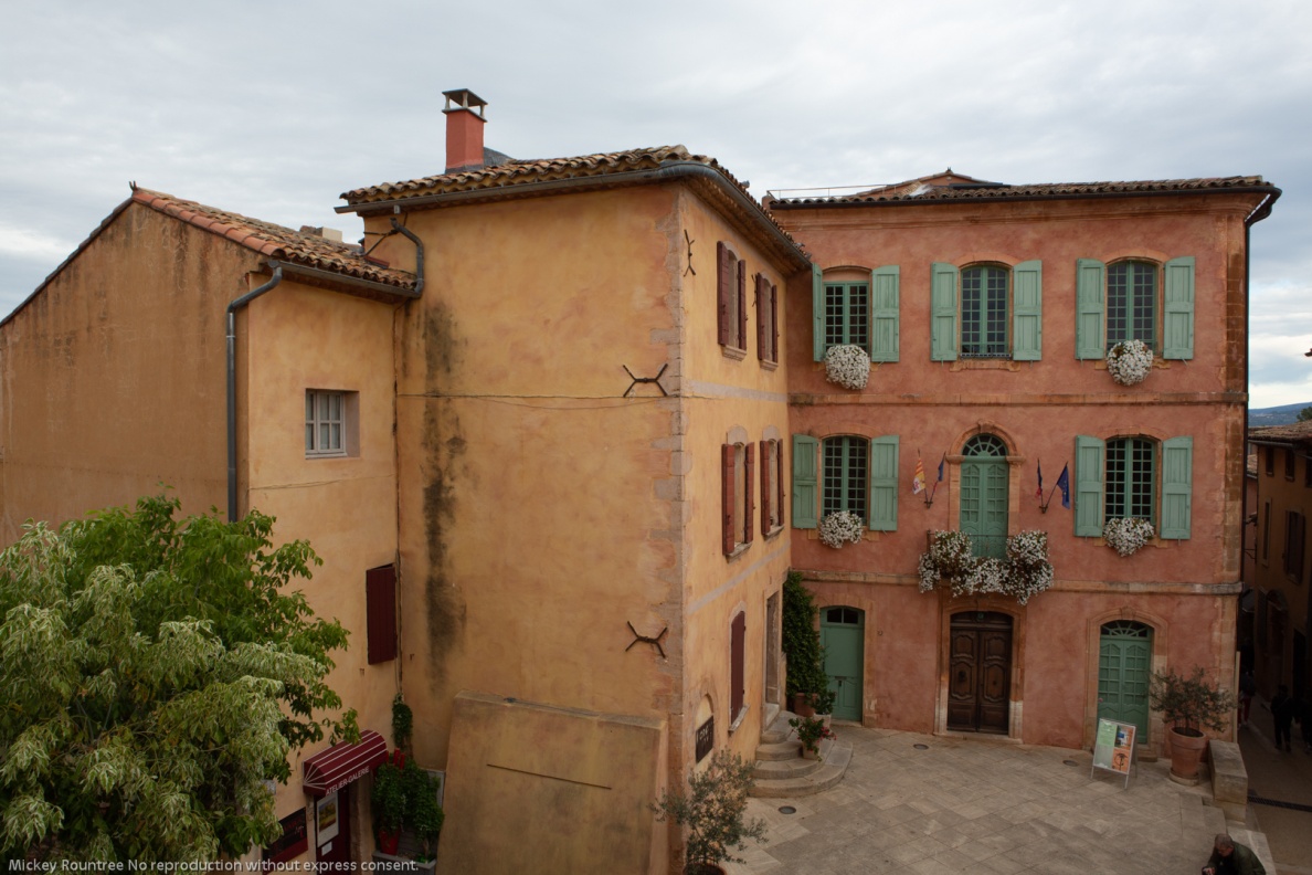
For this fourth image by Bob Copeland, we could edit in Lightroom, Photoshop or both.
Bob’s RAW image was a Canon RAW file with no editing applied.
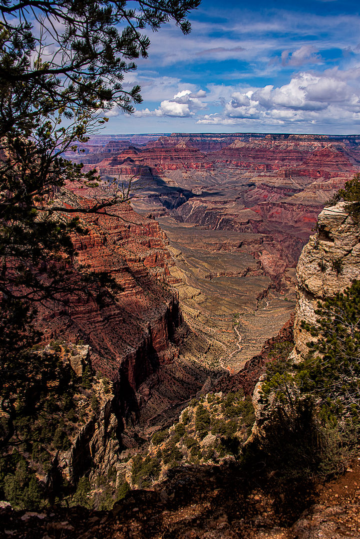
Original Image
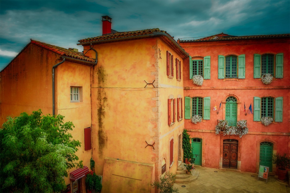
My Edit
Global Adjustments
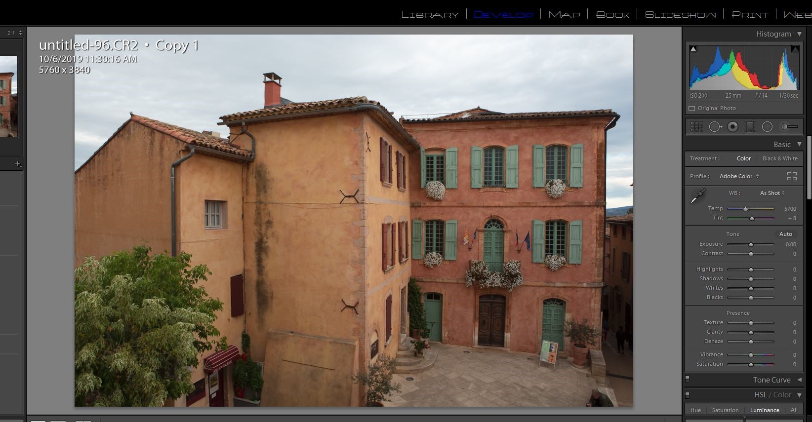
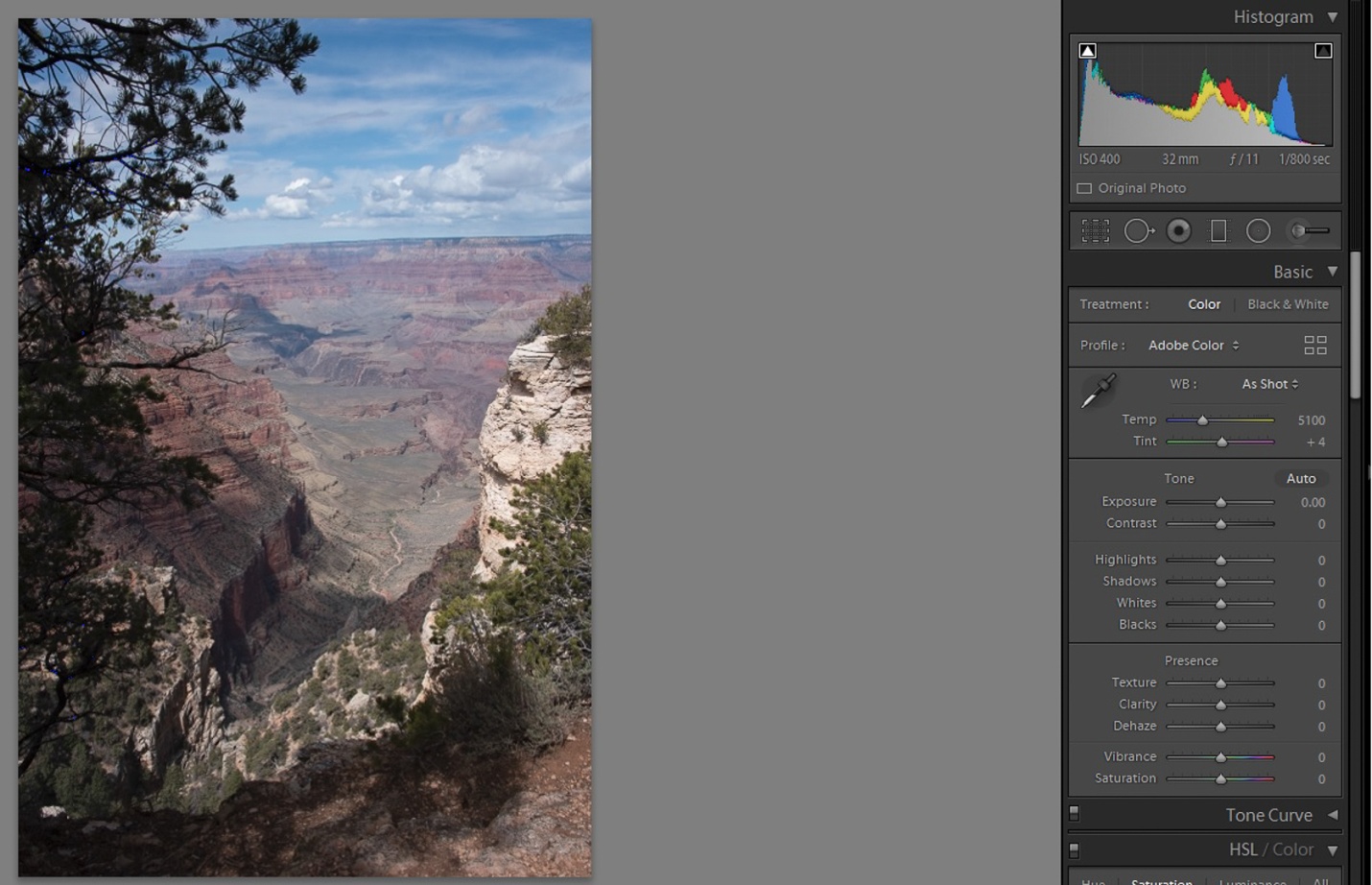
I brought Bob’s image into Lightroom with no editing or sharpening applied. It defaulted to Adobe color profile. A quick look at the histogram shows there is no highlight or shadow clipping and the histogram almost touches the right hand side, so the in camera exposure was perfect.
I started by doing all of my basic adjustments in Lightroom before moving the image into Photoshop.
1) Since Bob was using my Canon 5D Mark III, I changed the color profile to my color profile for that camera.
2) I turned on lens profile and chromatic aberration corrections.
3) I left the color balance as shot.
4) In the tone panel my settings were: Exposure 0 Contrast +29 Highlights -66 Shadows +43 Whites +36 Blacks -20 Texture 70 Clarity +35 Dehaze 8 Vibrance +20 Saturation 0 5) I sharpened with settings of amount 40, radius .8, and detail 35.
Local Adjustments
Still in Lightroom I added a graduated filter to the sky with -0.8 exposure and -24 color (toward blue)to add detail and color. I masked it from the buildings using the color range mask.
Photoshop Editing
First I used content aware fill to remove the tourist sitting on the steps, and did a bit of cleaning up with the clone tool. I removed the three people in the alley with the clone stamp tool.
I sharpened the image using high pass sharpening, one of my favorite sharpening methods for landscapes and HDR. High pass settings were 2 pixels and softlight blend mode.
I used NIK Color EFEX tonal contrast filter. Normally I mask out the sky with this, but on this image I didn’t.
I used the camera raw filter and an adjustment brush to darken down the lower corners.
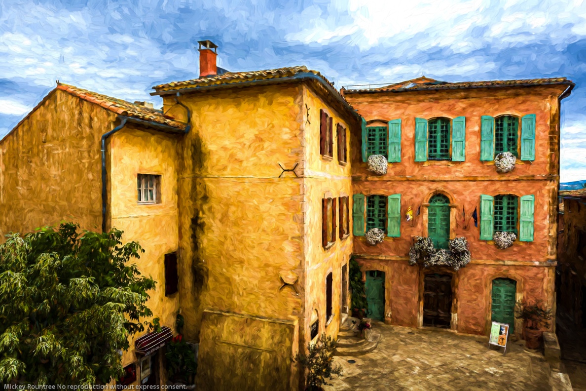
I tried turning this into a black and white image using NIK Silver EFEX. It was OK, but I preferred the color. I then used Topaz Impression 2 and after trying several presets, I chose the Cezanne painting effect. This is ironic since Cezanne was from this region of France.
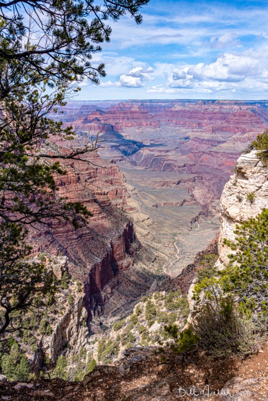
My Final Edit
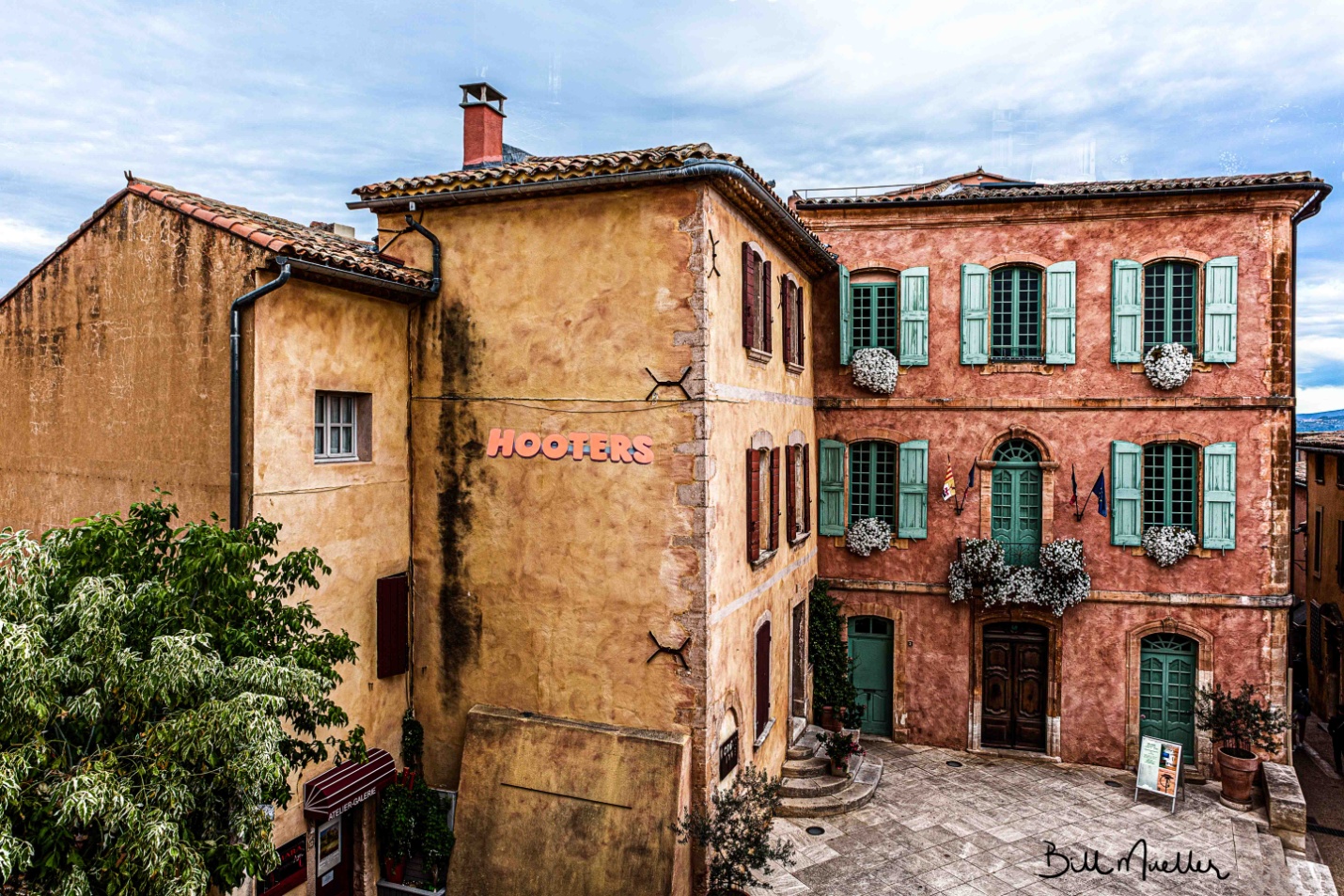
Bill Mueller’s edit in his words
Global Adjustments I started this document in Lightroom with the initial adjustments of Transform to straighten the image and Lens Corrections to remove Chromatic Aberration and Enable Profile Corrections. Next, I adjusted the White point by +10 and the Black Point by +7. I increased contrast to +98 and dropped Highlights to -100 and increased the shadows to +100. I added 48 points of Texture to enhance the surface of the buildings and added 43 points of Clarity. Then I sent the image over to Photoshop.
Local Adjustments In Photoshop, I thought I’d add a little element of interest by adding the Hooters sign to the side of the building. Once I got it positioned and sized, I needed to blend the lighting and color to more closely match the tone of the main image. I converted the image to B&W since I find it easier to match the tone that way. I used a Levels adjustment on the Hooters image to more closely match the tone of the building. I’m sure you all know that the Hooters sign is bright Orange, so I wanted to bring it down a little bit to better blend in with the main image. I did that with the Photoshops Color Match adjustment.
I wanted to bring out the blue in the sky more, so I set up a Hue/Saturation layer and used a Color Range selection to create a mask of the Sky. Then increased the saturation. I wanted to brighten up the white flowers and the lighter parts of the variegated leaves on the tree. I used a luminosity mask to only show the brightest parts of the image, painted out the parts of the mask I didn’t want to use, like the sky, and used a curves adjustment to brighten the targeted areas. I added a little bit of sharpening to the image and sent it back to Lightroom.
Final Adjustments
Once I got it back into Lightroom, I added about 25 points of Clarity to finish it off.
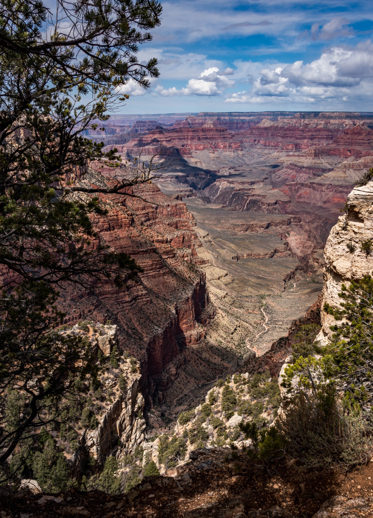
Bill’s Final edit
Richard Smith’s Edit in his words My Confession The following narrative of how I edited this image is not entirely truthful. My workflow does not proceed in a logical, linear fashion from A —> B —> C—> D—> E . The reality is more like A —> B —> C —> A —> D —> B —> C—> E—> B—> A —> OCD, OCD, OCD …… So what follows is a somewhat more coherent summary of an often random, disorganized and mildly schizophrenic workflow process. Some of you may be disappointed to hear this. Others are saying “I knew it, I knew it, I knew it !”
Although I give the value for each slider adjustment, the direction of the adjustment (+/-) is usually more important. If I re-work an image, the numerical values of the adjustments change more often the direction of the adjustment.
Global Adjustments First things First Lens Correction Panel – Check boxes for “Remove Chromatic Aberration” and “Enable Profile Corrections.”
Transform Panel – Click on “Auto” to level and straighten image.
Crop Tool I cropped in from the left to the top of the roof line. Nothing of interest was lost and the downward slop of the roof now leads the viewer into the most important area of the image: the courtyard and the facades of the buildings at right angles to each.
Tone Curve All RAW images will need more contrast. The questions are which tool to use to add the contrast, where to add it, and how much to add. Using the Contrast Slider in the Basic Panel will provide a uniform level of contrast to the entire image, which will also darken the image to some degree. The Clarity Slider will add contrast to the mid-tones and may lighten the image. I did use the Clarity Slider in this image, but most of the contrast was added using the Tone Curve. Specifically, I used the Control Points in the Point Curve editing mode to add contrast to targeted areas within the image.
By clicking on the box in the bottom right hand corner of the Tone Curve Panel, you can switch between the Point Curve Mode and the Parametric Mode. You begin with a straight diagonal line running from the bottom left corner to the top right corner in the Point Curve Mode. Both horizontal and vertical axes go from 0-100, starting from the bottom left hand corner. Zero (0) is absolute black and one hundred (100) is absolute white. A Control Point can be applied by clicking on the diagonal line with the cursor. The line can then be moved by dragging the cursor up and down or side to side. You can reposition the Control Point along the diagonal line by holding down on the cursor and sliding it along the line. Also when you click on the Control Point a pair of numbers appear in the upper left hand corner locating the position of the Control Point in relation to the horizontal and vertical axes (H/V). Using Control Points allows you to apply precise amounts of contrast to specific ares of the image. As you move the solid diagonal line with the Control Point a broken diagonal line is revealed beneath. This provides a visual of how far the solid line has been moved from its original position. The greater the slope of the line the more contrast is being added.
In adding more contrast to this image, I applied 3 Control Points with Horizontal/ Vertical numerical values of (29.4/26.3), (49/49/8) and (74.1/77.6). These were very small movements off the original diagonal line, but they yielded a dramatic change in the contrast in the image. (If you are a man of a certain age, you may be reminded of the advertising slogan for the hair product “Brylcreem” – “A little dab will do ya.”( Hey, Boomer !)).
HSL Panel (Hue, Saturation, Luminance) Adjustments to the Saturation Slider in the Basic Panel uniformly affect all colors within the image. If I use it at all, it is usually to move it to the left (negative) to desaturate the image. I like to make adjustments to individual colors using using the Saturation and Luminance Sliders in the HSL Panel. First I activate the button in the upper left corner of the HSL Panel by clicking on it. As I run the activated crosshair over the image, the color corresponding to the location of the crosshair will light up in the HSL Panel. I do this because sometimes Lightroom reads these colors in unexpected ways. In this image both the peach-colored building and the yellow building were read by Lightroom as being “orange.” Although the orange slider did affect both buildings, it affected the peach colored building to a much greater degree. The yellow slider did affect the yellow building, but not the peach-colored building. The shutters were read as green. I wanted to make the green shutters stand out. Here are the my slider adjustments in the HSL Panel : Luminance Red(+23), Orange(-5), Yellow(+2). Green (+47); Saturation: Red (+14), Orange(+13), Yellow (+15)
Split Toning Panel I wanted to something else to modify they yellow in the building on the left. I decided to try Split Toning. In Split Toning, I can add to an image a tint form a range of HUEs to just the Highlights or just the Shadows and also control the Saturation of the tint. Here in the Highlights I set the Hue value to 168, which added a green/aqua tent. I then set the saturation at 20% ( Split Toning seems to work best when the Saturation is 25% or lower).This provided a subtle greenish tent in the yellow that I have seen in many European buildings.
Local Adjustments Photoshop Whenever I have a difficult distracting element that needs to be removed, I take the image to Photoshop. The Spot Removal tool in Lightroom is usually good enough, but it is just not as effective on more difficult problems and when more repair to the scene is required. In this image I wanted to remove the man in the lower left corner, the black stain on the wall and the shrub at the corner of the yellow building. Using the Spot Healing Brush Tool and the Healing Brush Tool, I was able to remove both of these elements and repair the disruption to the scene caused by their removal. I always use a new Layer to remove distractions, I never work on the Background Layer ( Be sure that the “Sample All Layers” box in the horizontal bar at the top of the screen is checked). When, as here, removal of the distractions and repair of the scene is complicated, I use multiple Layers. When one section is repaired, I will then add a second Layer to repair the next section. This way if you mess up on one Layer you will not have to start completely over. In this image, It took me 6 Layers to complete the removal of the distracting elements and repair the image.
Finishing Adjustments Back to Lightroom – Final Adjustments Coming back to Lightroom from Photoshop, the image is now a TIFF document. In the HSL Panel, I lowered the Orange Saturation by -19. Next I used the Radial Filter and made a large sphere completely covering the area of the courtyard and building facades. Leaving the “Invert” box unchecked, I lowed the exposure by -20. This decreased the exposure on the area outside the sphere. Next, I again used the Radial Filter, duplication a second sphere over the approximate same area as the first. This time I checked the “Invert” box and increased the Exposure by +20. Both times I used the Radial Filter, I set the “Feather” to 50. In short, I used the Radial Filters twice to highlight and create a vignette around the area where I wanted to focus the viewer’s attention.
Sharpening Detail Panel This is where sharpening is applied. I set the Amount at 75, Radius 1.0, Detail 25, Masking at 53
I hope you found this useful.
Richard’s Final edit
Bob Copeland’s edit in his words
Global Adjustments
1) Adjust highlights (-100) Shadows (+100) White (-6) black (+28) Dehaze (+17)Texture(=7)
2) Move to Photoshop
Photoshop Adjustments
1) Adjust first curve input 128 to output 74 Use white to allow adjustment to darken image. Then use a soft brushbrush at 50% to lighten center area.
2) Adjust second curve with 3 points to adjust contrast. (First point input 2 output 0,) second point input 127 to 75 output) third point input 197 output 186) -fill curve layer with black to hide adjustment then use soft brush tool to add contrast in center area.
3) Third curve adjustment to lighten center area. Input 128 output 164. Mask with black to hide and again use brush at 25% to lighten center.
4) Create duplicate background. Use unsharp mask 176%, Radius at 1.0 and Threshold 1 levels.
5) Create duplicate background of unsharp mask and use Gaussian blur at 50 pixels and set opacity at 23%. Create layer mask and use soft brush at 25% on center portion. This will leave the edges soft and the center area sharper.
6) Size to print at 24×36 at 300dpi.
Bob’s Final Edit
Some closing thoughts
This seems to be the edit we were all most different in our processing and our individual tastes started to come out more.
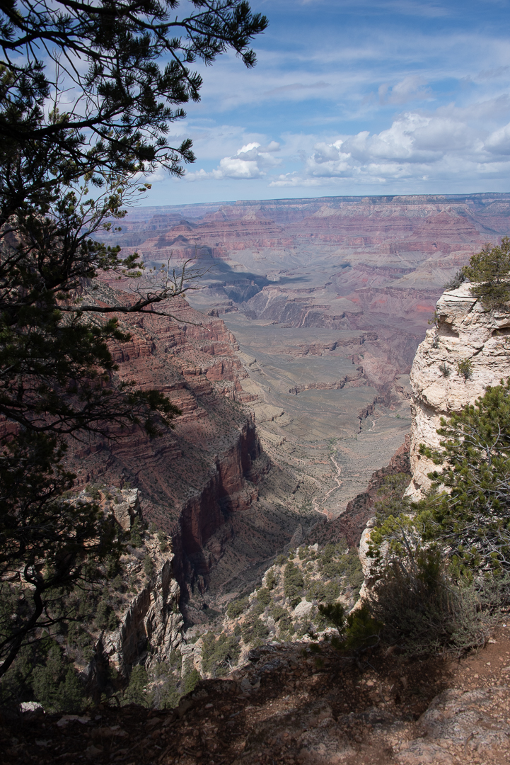
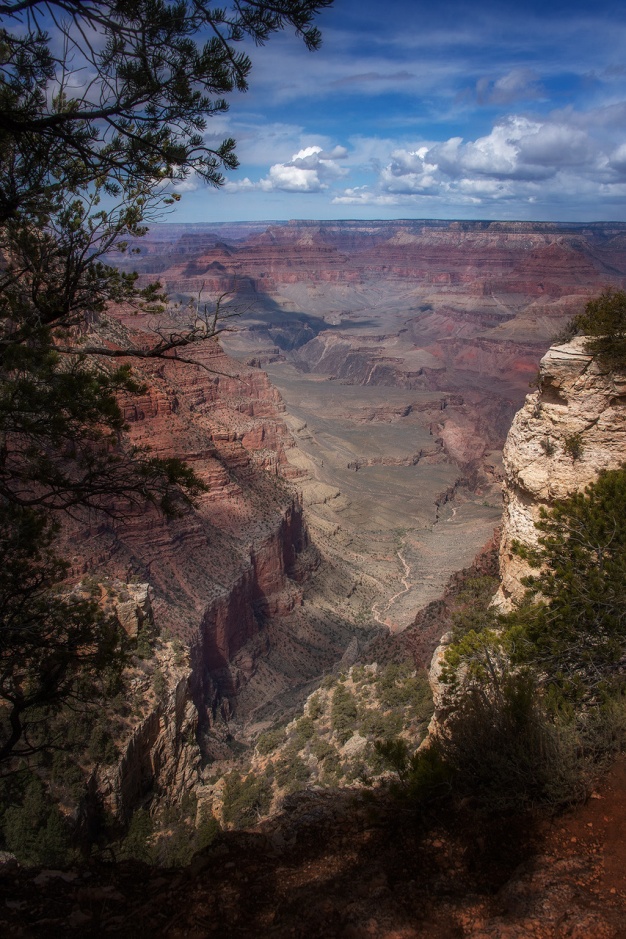
This is the third of my series where 4 photographers submit an image and it is edited by all four. My fellow photographers for this project are Bob Copeland, Bill Mueller, and Richard Smith.
For this third image by Richard Smith, we could edit in Lightroom, Photoshop or both.
Richard’s RAW image was a DNG file with no editing applied.
Original Image
My Edit
Global Adjustments
I brought Richard’s image into Lightroom with no editing or sharpening applied. It defaulted to Adobe color profile. A quick look at the histogram shows there is no highlight or shadow clipping and the histogram almost touches the right hand side, so the in camera exposure was perfect.
I started by doing all of my basic adjustments in Lightroom before moving the image into Photoshop.
1) I usually fix the thing that bothers me most first. In this case it was the crooked Horizon. I straightened it with the level tool.
2) I changed the color profile to Adobe Landscape, and that helped the colors a lot.
3) The sky seemed a bit too cyan, so I changed the temperature to 6050 and added +7 Magenta.
4) In the tone panel my settings were: Exposure -0.12 Contrast +24 Highlights -100 Shadows +40 Whites +33 Blacks -19 Texture 0 Clarity +12 Dehaze 25 Vibrance +5 Saturation 0
Local Adjustments
Still in Lightroom I painted over the light color rocks with brush settings of Texture +80, Highlights -22 and exposure -.35 to tone these bright rocks down a bit. I used a second brush at -1.0 exposure and painted over all of the foreground rocks to keep the eye in the center of the photo.
Photoshop Editing
I sharpened the image using high pass sharpening, one of my favorite sharpening methods for landscapes and HDR. High pass settings were 8 pixels and softlight blend mode.
I used NIK Color EFEX tonal contrast filter on a new layer and masked out the sky so it didn’t become too extreme.
I used the camera raw filter and an adjustment brush to paint over the canyon wall in the center of image with +20 dehaze for even more contrast and to make the colors pop a bit more. (I could have done this back in Lightroom just as easily)
I tried turning this into a black and white image using NIK Silver EFEX, but it wasn’t effective to me, since the colored layers in the canyon walls are part of the images impact.
My Final Edit
Bill Mueller’s edit in his words
I decided to do this image entirely in Lightroom to experiment with the luminosity masking capabilities added in the last year to the adjustment brush. Usually, I move over to photoshop for those types of adjustments. With every image I go to the Transform panel and hit Auto. This straightens the image. Sometimes further adjustments are needed but this works about 99% of the time. Next I move to Lens Corrections and make sure that Remove Chromatic Aberration and Enable Profile Corrections are checked.
Global Adjustments
To start off I did some basic adjustments. I set the White +26 and Black -17 points of the image. I increased the exposure+12, increased the Highlights +17 and increased the shadows +100. In the Presence box I Upped Texture +24, Clarity +38, Dehaze +10 and Vibrance +24.
I felt the adjustments made the blue in the sky too dark so in the HSL panel I increased the Blue Luminance +36
To finish off, I added some sharpening to the edges. To mask out all but the most obvious edges I moved the masking slider up to 92, then increased sharpening to 107.
Local Adjustments
Then I moved to the Adjustment Brush to use the Luminosity Masks. I set the first one up to address the Shadows. If you haven’t tried this, you paint the entire image with the adjustment brush, then you set the Range Mask to luminance and then adjust the range. I this case I moved the right slider from 100 down to 41. If you click on Show Luminance Mask you’ll see the Red areas of the mask are the ones that will be affected by the adjustments. I made adjustments to Exposure +.44, Texture +33. Dehaze +15 and Saturation +80. I also increased Sharpness by +57.
Next I moved on to the Highlights. This time I moved the left slider from 0 to 69. The adjustments I made here were to Exposure +.52, Highlights -100, shadows -2, Texture +48, Clarity +17, Dehaze +11 and Saturation +50.
Bill’s Final edit
Richard Smith’s Edit in his words
Analyzing the Image This is my image. I made it in the Spring of 2018, when Louann and I drove out west to find the parts of old Route 66 that remain. We arrived at the south rim of the canyon at mid-morning on a beautiful spring day. Good things never last. An hour after I made this image, a sudden snow storm hit the canyon. In a span of about 5 minutes a view of miles was reduced to 20 feet. Within 10 minutes after that, we were up to our ankles in snow. Time to go.
I have processed this image many times. None have captured the sense of awe and wonder I experienced seeing it with my own eyes. But I keep trying.
This is a RAW image so it needs more contrast, saturation, sharpening. If I had shot this in jpeg, contrast, saturation and sharpening would have been automatically added to the image, but those additions would have been uniform throughout the image. The adjustments needed for the sky are different from those needed for the canyon.
Global Adjustments
Lens Corrections and Transform Panels First things first. in Lens Corrections I checked the boxes to Remove Chromatic Aberrations and Enable Profile Corrections for my Nikon lens. In Transform I clicked on Auto to level the horizon. Cropping I am not afraid of heights, I just have a healthy respect of heights, so I stood well back from the edge when I made this image. But I wanted you the viewer to have the feeling of standing right on the edge, so I cropped up from the bottom a little. I also cropped down from the top to eliminate the pine cone in the middle of the image.
Tone I have two different methods for setting the Black and White points. I will choose one, depending on my subjective judgment of which one works best for the particular image. In the older method, I would move the Whites slider to the right and the Blacks slider to the left until you begin to see clipping. Then I saw a video by one the Adobe gurus who slammed the Highlights slider all the way to the left (-100) and the Shadows slider all the way to the right (+100). In this image I used the latter method. I then adjusted by increasing the Whites (+31) and decreasing the blacks (-8). This is just like seasoning a stew – everybody does it a little differently. HSL Panel Sometimes I will use the HSL sliders nears the end of the edit to made final adjustments to specific colors. This is all purely subjective. Here I made the following adjustments: Luminance Red, Orange and Yellow (-10), Saturation Red, Orange, and Yellow (+15,) Green and Blue (-5).
Local Adjustments The Sky I first used the Graduated Filter tool, starting from the top and bringing it down to the top of the rim of the canyon. This included part of the tree on the left, which needed a different adjustment than the sky. To exclude the tree I used the Luminance RangeMask embedded in the Graduated Filter. Holding down the Option key (ALT on PC), I moved the slider for the Luminance Range Mask to 85 which turned the tree black, thereby excluding it from my adjustments to the sky. (Remember: black excludes, white includes.) Staying in the Graduated Filter, I moved the sliders as follows: Highlights (-5), Dehaze (+30) and Clarity (+10). The Canyon Again I used the Graduated Filter this time starting from the bottom and going upward to the canyon rim. Within the Graduated Filter, I adjusted the sliders as follows: Highlights (-10), Shadows (+12), Saturation (+10), Sharpness (+10), Clarity (+10), Texture (+40), Temperature (+20). Tree on the Left Using the Brush tool, I painted over the tree. I was not careful about my technique, because I next applied the Luminance Range Mask embedded within the Brush tool. Moving the slider to left until it reached 10, this left the tree white (included in the adjustment) and the surrounding areas black (excluded from the adjustment). I then adjusted the sliders as follows: Exposure (+40), Shadows (+100), Clarity (+30), Sharpness (+10). Foreground Shadow Using the Brush tool, I painted over the area of shadow and then adjusted the sliders as follows: Shadows (+50), Clarity (+40), Saturation (+10). Bright Rock on the Right. I felt the brightness of this rock formation drew the eye. It is a part of the image, but not the focus of interest. To de-emphasize it, I painted it with the Brush tool and then made the following adjustments: Highlights (-30), Texture (+25), Clarity (+20), Saturation (+10), Sharpness (+10). Canyon Floor Looking at the image I felt the canyon floor was a little soft. I used the brush tool to paint the portion of the floor nearest to the viewer and then made the following adjustments: Texture (+15), Sharpness (+10), Clarity (+10), and Dehaze (+15)
Finishing Adjustments Sharpening Amount: 65, Radius:0.8, Detail: 30, Masking: 45. I increased the Masking slider to 45 because at that amount the blue sky was black, meaning it would not be sharpened (black excludes). You do not want to sharpen a clear blue sky with a smooth surface. Vignette I added a Vignette of -7.
I stepped away from the image overnight and then came back to it. I wanted to do something that would give the image a little more 3D effect. I turned to the ToneCurve tool. This is a tool most people avoid, including me, but it has its place. Using the Custom Point Curve. I placed control points at the middle of the linear line and at at the top of the smallest square in the lower left quadrant. This covered the area of the shadows in the image. I then placed another control point close to the bottom point and pulled down on it very slightly. Boom! That was enough to make it pop. Using three points gave me more precise control as none of the areas outside the outer point were affected by the adjustment.
None of these adjustments are written in stone. It is important to get the correct exposure for your image, but after that it’s just seasoning for the stew. Everyone likes their seasoning a little different.
Richard’s Final edit
Bob Copeland’s edit in his words
Global Adjustments In Lightroom I adjusted highlights (-100) Shadows (+100) White (-15) black (+2) and Dehaze (+16). I cropped to 2 by 3 ratio. I then took the image over to Photoshop.
I adjusted the levels with an adjustment layer, Shadows 0, Midtones 100, highlights 228
I created a curves adjustment layer input 118 to output 96. I then created a second adjustment curve layer with input 130 to 155 output -fill curve layer and filled the mask with black. I painted white on the mask using a soft brush at 25% in center area and puffy clouds.
Local Adjustments
I created a third curves adjustment layer input 121 to 71 output . Fill with black soft brush at 25% and burn bottomland around edges. Go back over bottom at 50%.
I created a duplicate background. I sharpened using unsharp mask 176%, Radius at 1.0 and Threshold 1 levels.
I copied the unsharp mask and used Gaussian blur at 50 pixels and set opacity at 35%. I created a layer mask and used a soft brush at 25% on center portion.
Bob’s Final Edit
Some closing thoughts
This is the image that we all edited most similarly. While we used different techniques, we were all using exposure adjustments and contrast to guide the viewer’s eye through the image.