
Four Image Edits Part 4
by Mickey Rountree
This is the fourth of my series where 4 photographers submit an image and it is edited by all four. My fellow photographers for this project are Bob Copeland, Bill Mueller, and Richard Smith.
For this fourth image by Bob Copeland, we could edit in Lightroom, Photoshop or both.
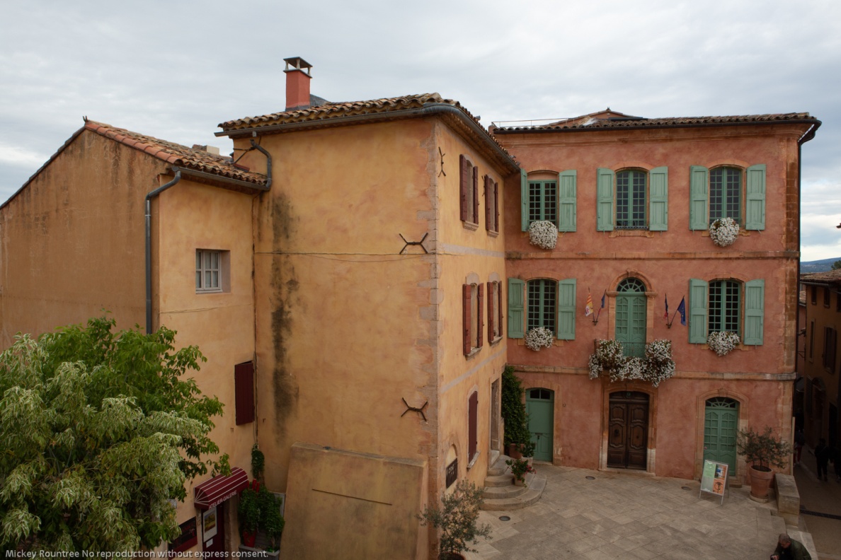
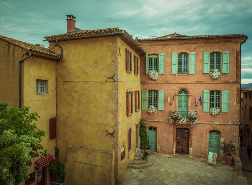
Bob’s RAW image was a Canon RAW file with no editing applied.
Original Image
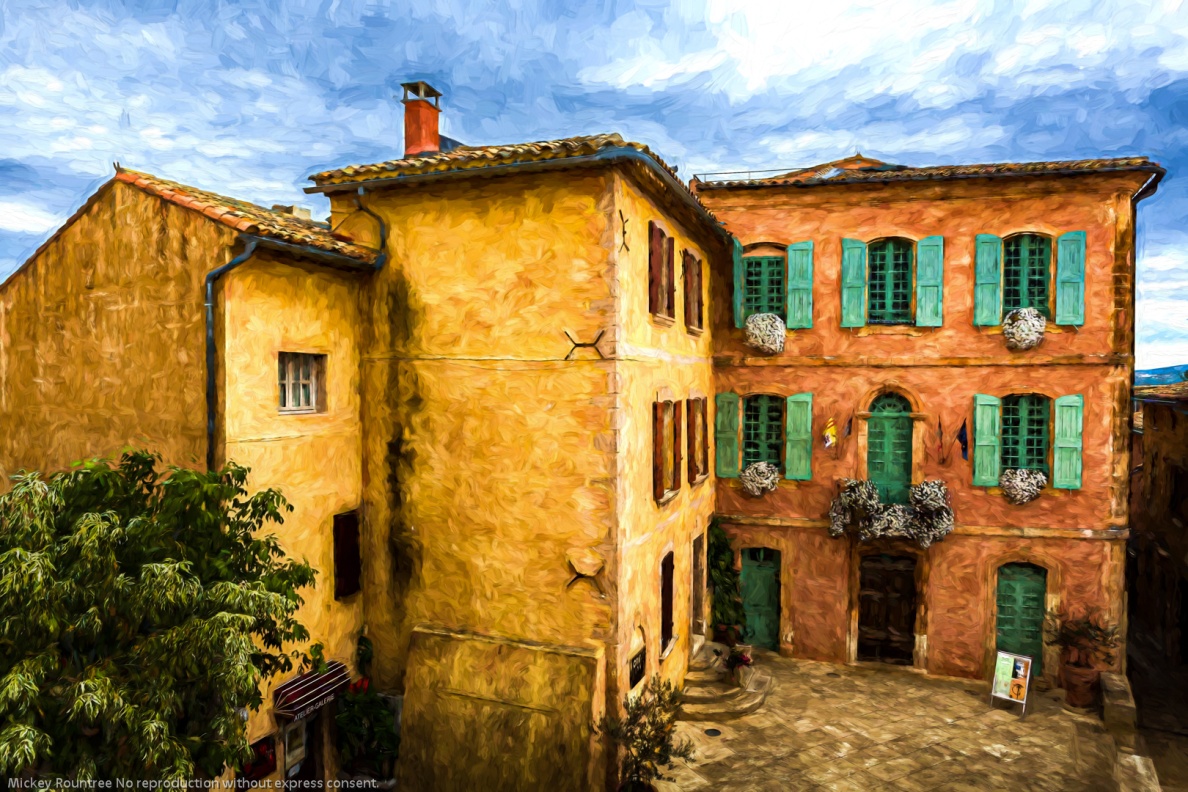
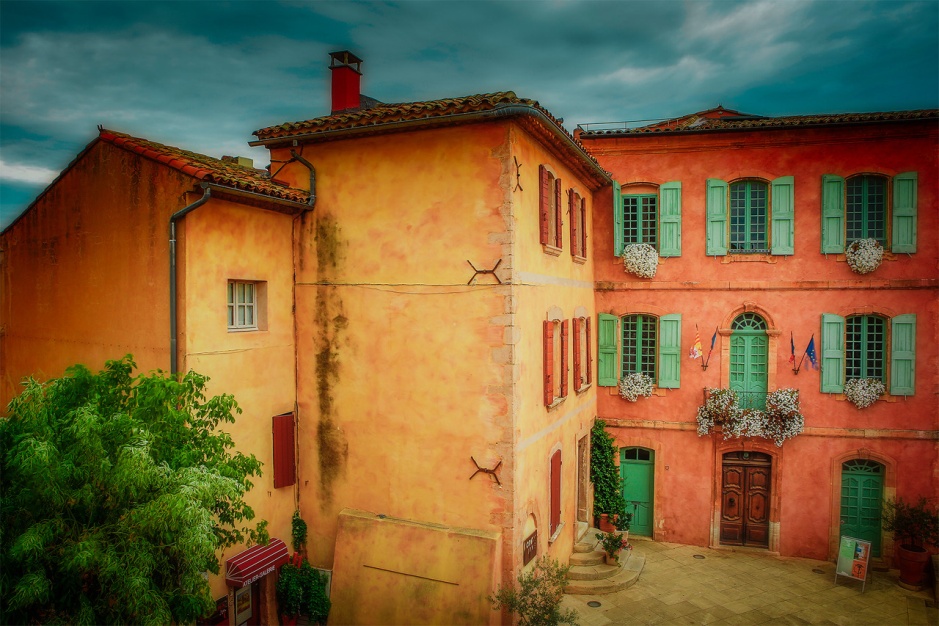
My Edit
Global Adjustments
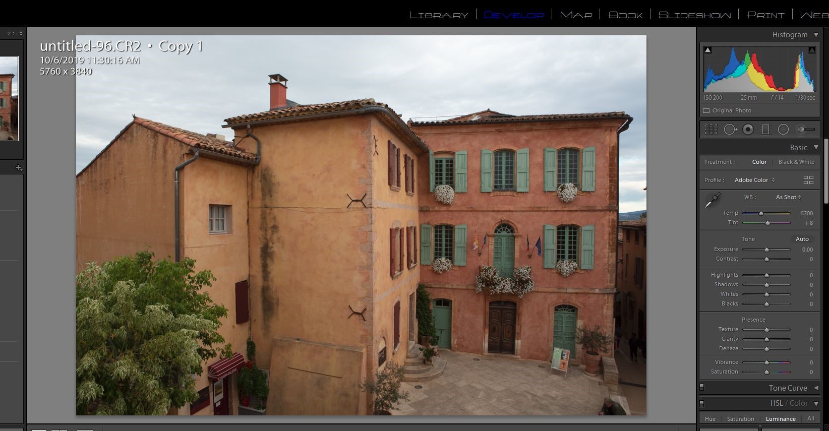
I brought Bob’s image into Lightroom with no editing or sharpening applied. It defaulted to Adobe color profile. A quick look at the histogram shows there is no highlight or shadow clipping and the histogram almost touches the right hand side, so the in camera exposure was perfect.
I started by doing all of my basic adjustments in Lightroom before moving the image into Photoshop.
1) Since Bob was using my Canon 5D Mark III, I changed the color profile to my color profile for that camera.
2) I turned on lens profile and chromatic aberration corrections.
3) I left the color balance as shot.
4) In the tone panel my settings were:
Exposure 0
Contrast +29
Highlights -66
Shadows +43
Whites +36
Blacks -20
Texture 70
Clarity +35
Dehaze 8
Vibrance +20
Saturation 0
5) I sharpened with settings of amount 40, radius .8, and detail 35.
Local Adjustments
Still in Lightroom I added a graduated filter to the sky with -0.8 exposure and -24 color (toward blue)to add detail and color. I masked it from the buildings using the color range mask.
Photoshop Editing
First I used content aware fill to remove the tourist sitting on the steps, and did a bit of cleaning up with the clone tool. I removed the three people in the alley with the clone stamp tool.
I sharpened the image using high pass sharpening, one of my favorite sharpening methods for landscapes and HDR. High pass settings were 2 pixels and softlight blend mode.
I used NIK Color EFEX tonal contrast filter. Normally I mask out the sky with this, but on this image I didn’t.
I used the camera raw filter and an adjustment brush to darken down the lower corners.
I tried turning this into a black and white image using NIK Silver EFEX. It was OK, but I preferred the color. I then used Topaz Impression 2 and after trying several presets, I chose the Cezanne painting effect. This is ironic since Cezanne was from this region of France.
My Final Edit
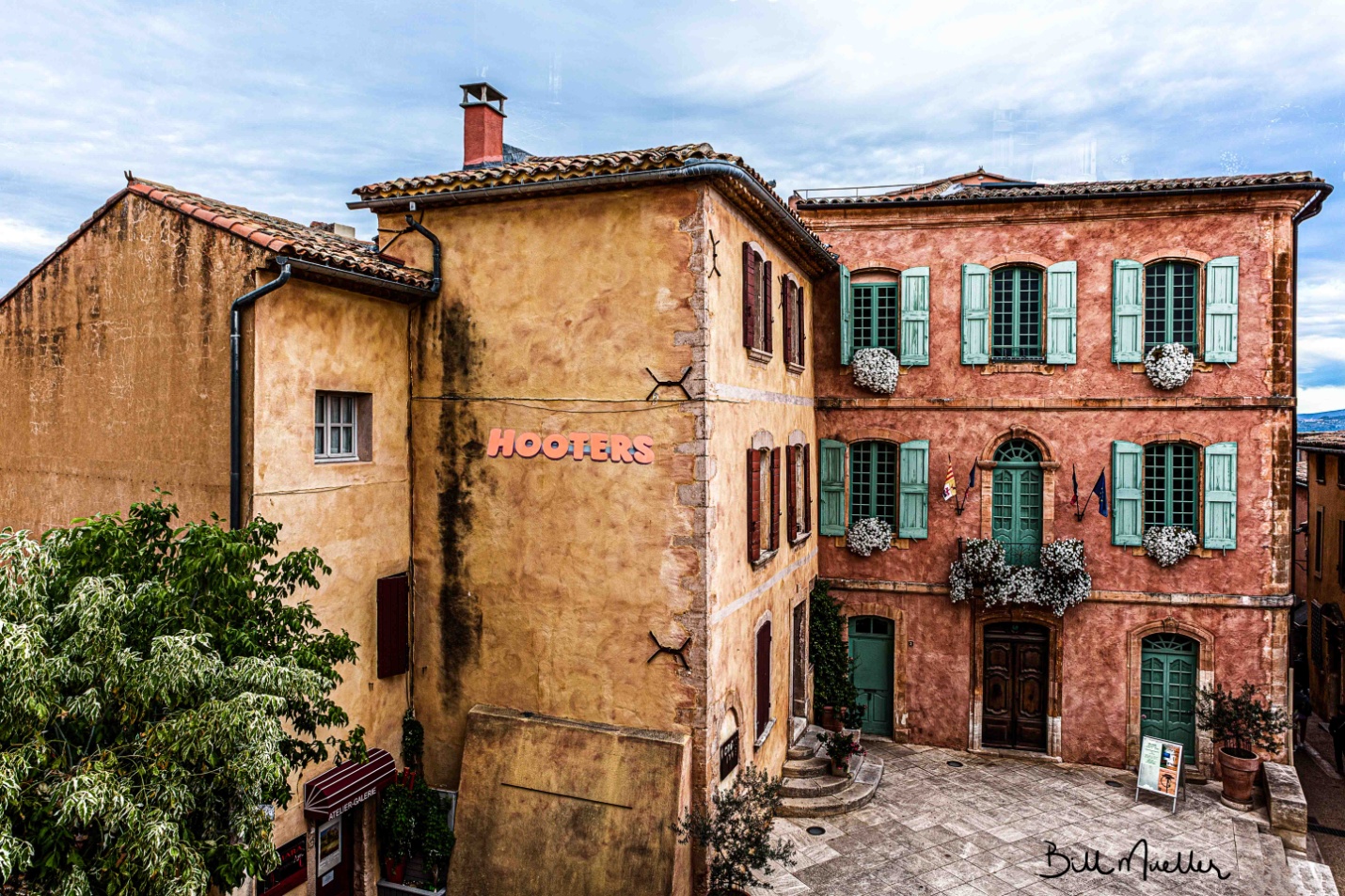
Bill Mueller’s edit in his words
Global Adjustments
I started this document in Lightroom with the initial adjustments of Transform to straighten the image and Lens Corrections to remove Chromatic Aberration and Enable Profile Corrections. Next, I adjusted the White point by +10 and the Black Point by +7. I increased contrast to +98 and dropped Highlights to -100 and increased the shadows to +100. I added 48 points of Texture to enhance the surface of the buildings and added 43 points of Clarity. Then I sent the image over to Photoshop.
Local Adjustments
In Photoshop, I thought I’d add a little element of interest by adding the Hooters sign to the side of the building. Once I got it positioned and sized, I needed to blend the lighting and color to more closely match the tone of the main image. I converted the image to B&W since I find it easier to match the tone that way. I used a Levels adjustment on the Hooters image to more closely match the tone of the building. I’m sure you all know that the Hooters sign is bright Orange, so I wanted to bring it down a little bit to better blend in with the main image. I did that with the Photoshops Color Match adjustment.
I wanted to bring out the blue in the sky more, so I set up a Hue/Saturation layer and used a Color Range selection to create a mask of the Sky. Then increased the saturation. I wanted to brighten up the white flowers and the lighter parts of the variegated leaves on the tree. I used a luminosity mask to only show the brightest parts of the image, painted out the parts of the mask I didn’t want to use, like the sky, and used a curves adjustment to brighten the targeted areas. I added a little bit of sharpening to the image and sent it back to Lightroom.
Final Adjustments
Once I got it back into Lightroom, I added about 25 points of Clarity to finish it off.
Bill’s Final edit
Richard Smith’s Edit in his words
My Confession
The following narrative of how I edited this image is not entirely truthful. My workflow does not proceed in a logical, linear fashion from A —> B —> C—> D—> E . The reality is more like A —> B —> C —> A —> D —> B —> C—> E—> B—> A —> OCD, OCD, OCD …… So what follows is a somewhat more coherent summary of an often random, disorganized and mildly schizophrenic workflow process. Some of you may be disappointed to hear this. Others are saying “I knew it, I knew it, I knew it !”
Although I give the value for each slider adjustment, the direction of the adjustment (+/-) is usually more important. If I re-work an image, the numerical values of the adjustments change more often the direction of the adjustment.
Global Adjustments
First things First
Lens Correction Panel – Check boxes for “Remove Chromatic Aberration” and “Enable Profile Corrections.”
Transform Panel – Click on “Auto” to level and straighten image.
Crop Tool
I cropped in from the left to the top of the roof line. Nothing of interest was lost and the downward slop of the roof now leads the viewer into the most important area of the image: the courtyard and the facades of the buildings at right angles to each.
Basic Panel
Highlights (-100), Shadows (+100), Whites (+12), Blacks (-11), Texture (+9), Clarity (+12)
Tone Curve
All RAW images will need more contrast. The questions are which tool to use to add the contrast, where to add it, and how much to add. Using the Contrast Slider in the Basic Panel will provide a uniform level of contrast to the entire image, which will also darken the image to some degree. The Clarity Slider will add contrast to the mid-tones and may lighten the image. I did use the Clarity Slider in this image, but most of the contrast was added using the Tone Curve. Specifically, I used the Control Points in the Point Curve editing mode to add contrast to targeted areas within the image.
By clicking on the box in the bottom right hand corner of the Tone Curve Panel, you can switch between the Point Curve Mode and the Parametric Mode. You begin with a straight diagonal line running from the bottom left corner to the top right corner in the Point Curve Mode. Both horizontal and vertical axes go from 0-100, starting from the bottom left hand corner. Zero (0) is absolute black and one hundred (100) is absolute white. A Control Point can be applied by clicking on the diagonal line with the cursor. The line can then be moved by dragging the cursor up and down or side to side. You can reposition the Control Point along the diagonal line by holding down on the cursor and sliding it along the line. Also when you click on the Control Point a pair of numbers appear in the upper left hand corner locating the position of the Control Point in relation to the horizontal and vertical axes (H/V). Using Control Points allows you to apply precise amounts of contrast to specific ares of the image. As you move the solid diagonal line with the Control Point a broken diagonal line is revealed beneath. This provides a visual of how far the solid line has been moved from its original position. The greater the slope of the line the more contrast is being added.
In adding more contrast to this image, I applied 3 Control Points with Horizontal/ Vertical numerical values of (29.4/26.3), (49/49/8) and (74.1/77.6). These were very small movements off the original diagonal line, but they yielded a dramatic change in the contrast in the image. (If you are a man of a certain age, you may be reminded of the advertising slogan for the hair product “Brylcreem” – “A little dab will do ya.”( Hey, Boomer !)).
HSL Panel (Hue, Saturation, Luminance)
Adjustments to the Saturation Slider in the Basic Panel uniformly affect all colors within the image. If I use it at all, it is usually to move it to the left (negative) to desaturate the image. I like to make adjustments to individual colors using using the Saturation and Luminance Sliders in the HSL Panel. First I activate the button in the upper left corner of the HSL Panel by clicking on it. As I run the activated crosshair over the image, the color corresponding to the location of the crosshair will light up in the HSL Panel. I do this because sometimes Lightroom reads these colors in unexpected ways. In this image both the peach-colored building and the yellow building were read by Lightroom as being “orange.” Although the orange slider did affect both buildings, it affected the peach colored building to a much greater degree. The yellow slider did affect the yellow building, but not the peach-colored building. The shutters were read as green. I wanted to make the green shutters stand out. Here are the my slider adjustments in the HSL Panel : Luminance Red(+23), Orange(-5), Yellow(+2). Green (+47); Saturation: Red (+14), Orange(+13), Yellow (+15)
Split Toning Panel
I wanted to something else to modify they yellow in the building on the left. I decided to try Split Toning. In Split Toning, I can add to an image a tint form a range of HUEs to just the Highlights or just the Shadows and also control the Saturation of the tint. Here in the Highlights I set the Hue value to 168, which added a green/aqua tent. I then set the saturation at 20% ( Split Toning seems to work best when the Saturation is 25% or lower).This provided a subtle greenish tent in the yellow that I have seen in many European buildings.
Local Adjustments
Photoshop
Whenever I have a difficult distracting element that needs to be removed, I take the image to Photoshop. The Spot Removal tool in Lightroom is usually good enough, but it is just not as effective on more difficult problems and when more repair to the scene is required. In this image I wanted to remove the man in the lower left corner, the black stain on the wall and the shrub at the corner of the yellow building. Using the Spot Healing Brush Tool and the Healing Brush Tool, I was able to remove both of these elements and repair the disruption to the scene caused by their removal. I always use a new Layer to remove distractions, I never work on the Background Layer ( Be sure that the “Sample All Layers” box in the horizontal bar at the top of the screen is checked). When, as here, removal of the distractions and repair of the scene is complicated, I use multiple Layers. When one section is repaired, I will then add a second Layer to repair the next section. This way if you mess up on one Layer you will not have to start completely over. In this image, It took me 6 Layers to complete the removal of the distracting elements and repair the image.
Finishing Adjustments
Back to Lightroom – Final Adjustments
Coming back to Lightroom from Photoshop, the image is now a TIFF document. In the HSL Panel, I lowered the Orange Saturation by -19. Next I used the Radial Filter and made a large sphere completely covering the area of the courtyard and building facades. Leaving the “Invert” box unchecked, I lowed the exposure by -20. This decreased the exposure on the area outside the sphere. Next, I again used the Radial Filter, duplication a second sphere over the approximate same area as the first. This time I checked the “Invert” box and increased the Exposure by +20. Both times I used the Radial Filter, I set the “Feather” to 50. In short, I used the Radial Filters twice to highlight and create a vignette around the area where I wanted to focus the viewer’s attention.
Sharpening
Detail Panel
This is where sharpening is applied. I set the Amount at 75, Radius 1.0, Detail 25, Masking at 53
I hope you found this useful.
Richard’s Final edit
Bob Copeland’s edit in his words
Global Adjustments
1) Adjust highlights (-100) Shadows (+100) White (-6) black (+28) Dehaze (+17)Texture(=7)
2) Move to Photoshop
Photoshop Adjustments
1) Adjust first curve input 128 to output 74 Use white to allow adjustment to darken image. Then use a soft brushbrush at 50% to lighten center area.
2) Adjust second curve with 3 points to adjust contrast. (First point input 2 output 0,) second point input 127 to 75 output) third point input 197 output 186) -fill curve layer with black to hide adjustment then use soft brush tool to add contrast in center area.
3) Third curve adjustment to lighten center area. Input 128 output 164. Mask with black to hide and again use brush at 25% to lighten center.
4) Create duplicate background. Use unsharp mask 176%, Radius at 1.0 and Threshold 1 levels.
5) Create duplicate background of unsharp mask and use Gaussian blur at 50 pixels and set opacity at 23%. Create layer mask and use soft brush at 25% on center portion. This will leave the edges soft and the center area sharper.
6) Size to print at 24×36 at 300dpi.
Bob’s Final Edit
Some closing thoughts
This seems to be the edit we were all most different in our processing and our individual tastes started to come out more.