Several of us were recently discussing why more photographers don’t use editing programs to process their images. One reason (among many) that we came up with is that they may not how much basic edits in a program like Lightroom can improve an image, and then what is available with more advanced editing software like Photoshop. So for this article I’m going to take an image as it came from the camera and do basic and advanced edits. My goals in this edit are to adjust basic exposure and contrast, and then to remove distracting elements, improve the composition, and use final adjustments to help direct the viewer’s attention to where I want it.
I’m not going to do an in depth explanation of how to use tools such as cloning, burning, or content aware fill, but I do hope to make you aware of their power and want to learn more about them. For more in-depth reading about Lightroom and Photoshop, I would recommend a couple of my favorite authors. Martin Evening has books on both Lightroom and Photoshop. His books are very detailed and almost encylopedic in their coverage and are great to have on hand as references. Scott Kelby’s books are probably the most widely read Lightroom and Photoshop books. They are excellent for a photographer just getting started with editing and they do a great job of teaching all of the skills you’ll need on a regular basis.
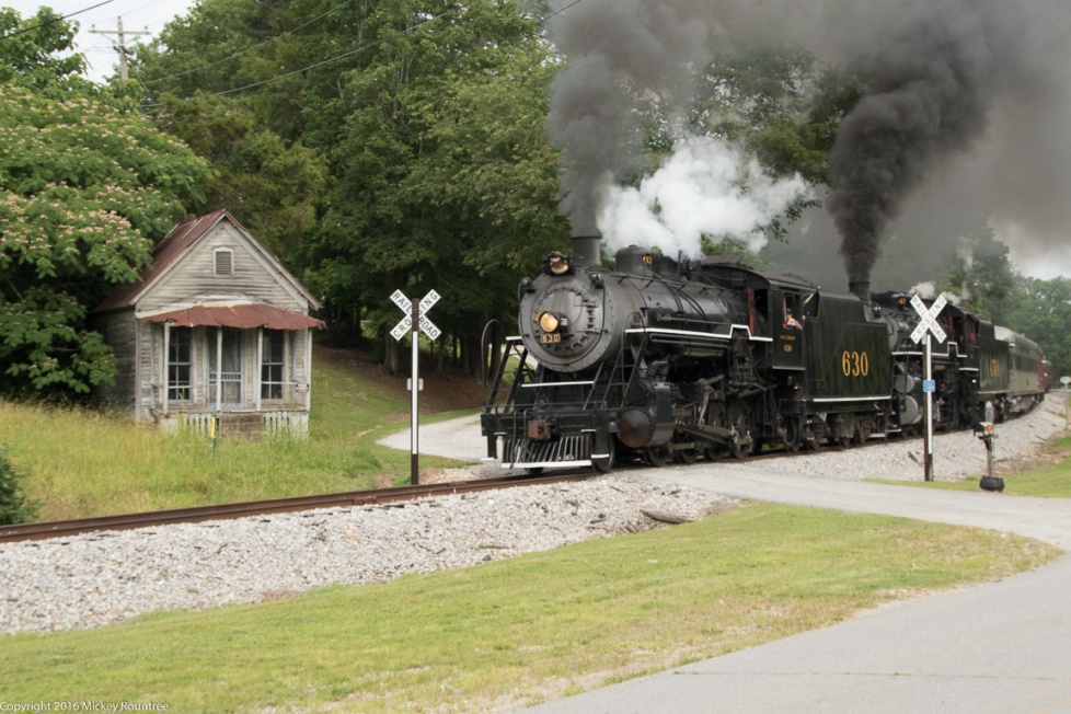
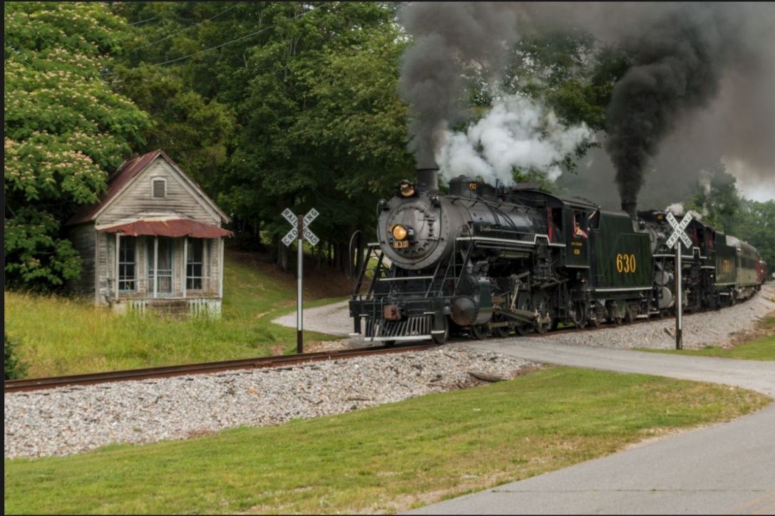
Here is the image I’m starting with. Straight from the camera it’s a little flat and low contrast, there are several distracting elements, and it could be sharper. I should mention that I shoot in RAW format. If you shoot in JPEG, your camera applies some sharpening and contrast to the image, so it may look a little bit better to begin with.
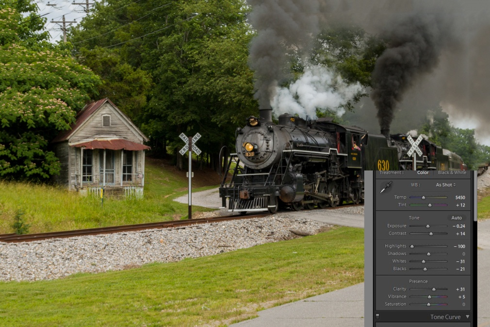
The first thing I’ll do is make my basic edits in Lightroom. You can see the settings below. I’ve added contrast, adjusted the white and black points, decreased highlights so there are no burned out white areas with no detail and added clarity which brings out detail and decreased the exposure slightly. The best way to learn these settings is just to play and experiment. Adjust each slider left and right and see what it does and adjust it until it looks right to your taste. With just these very basic adjustments, the shot is already looking better.
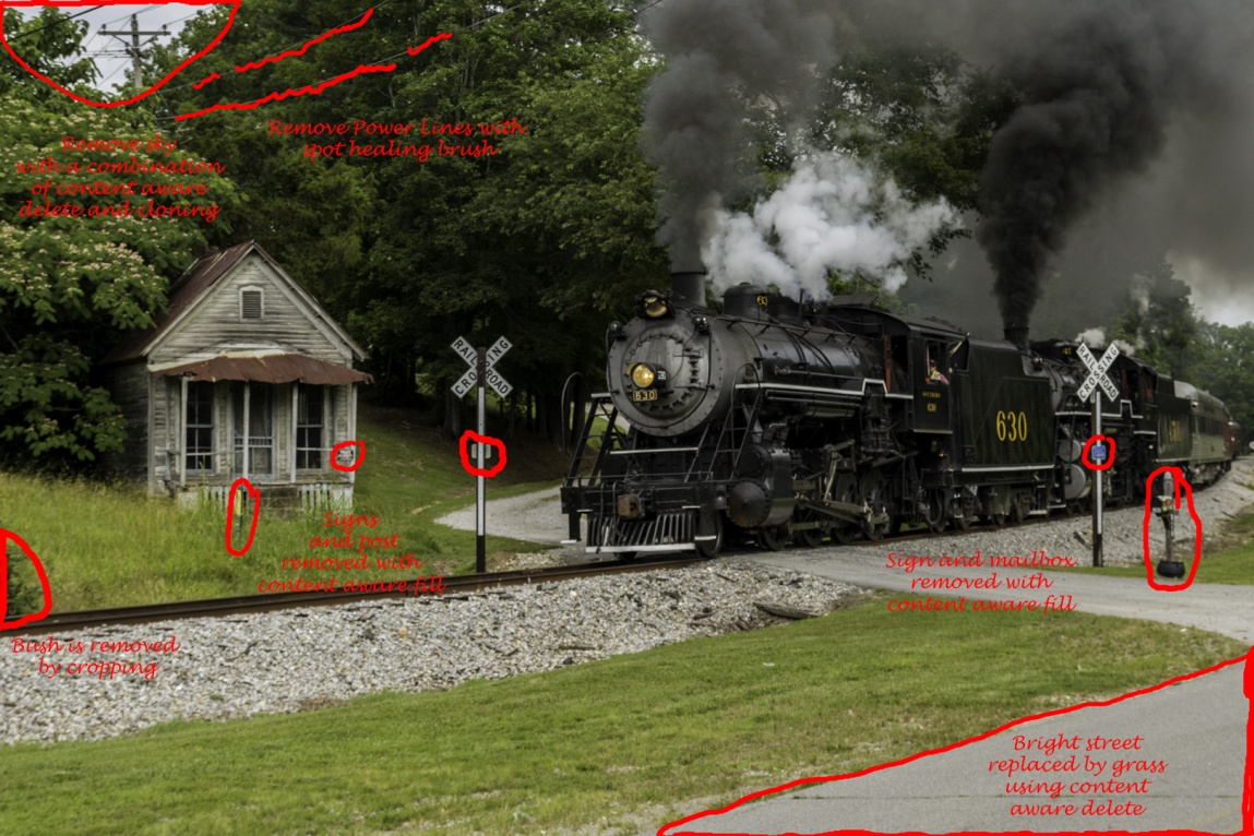
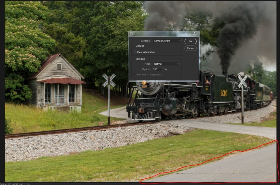
Now to show you some of the power of editing in Photoshop, I’ll start getting rid of distracting elements. I’m trying to keep the viewer’s attention on the steam engine. The eye tends to go to the brightest part of an image, so I’ll use content aware delete and cloning to remove the bright sky in the upper left. The power lines are a distraction, especially since I’m removing the telephone pole that they lead to. The eye is also drawn to signs with writing, so the no trespassing sign on the porch has to go. I will also remove the small signs on the crossing warnings. This is a relatively colorless image, so a bright color like the pole with the yellow marking is a distraction to remove. It may or may not be necessary to remove the mailbox, but I found it distracting. The bush on the left hand side above the railroad tracks is a border merger that tends to pull the eye out of the frame. I could remove it now, but I already know that I’ll be cropping in tighter and that will remove it. Also the triangle of pavement is relatively bright. I could darken it, but I chose to replace it with grass.
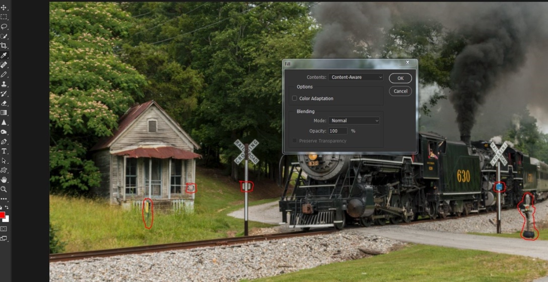
To use content aware, use a selection tool like the lasso, draw around what you want to replace and then go to edit/fill/ and select content aware. It may help to go to selection/modify selection/expand and expand your selection by two to four pixels before using the fill command. Sometimes after using content aware fill you may find it didn’t work well. Choose edit/step back and either repeat the fill or redraw your selection and try again. Often it’s close but you may need to do some cloning to finish the replacement. Here it worked well, and I didn’t need to make any other changes. You can select all of the elements you want to replace and replace them all at once. I prefer to remove large objects one by one. I will select lots of smaller objects and delete them all at once if they are widely separated and not in areas with too much detail. The telephone lines were removed with the spot healing brush. Choose a brush slightly larger than the lines, make sure the content aware option is check and paint over the lines. A graphics tablet like the Wacom Intuos will make this much easier than trying to use a mouse.
Here I’ve selected the sky area and chosen fill/content aware.
Below, I’ve selected several objects, by outlining one with the lasso tool and then holding the shift key while selecting the others. You can also see I’ve gone to select/modify/expand and I’m increasing my selection by two pixels.
Here I’ve selected edit/fill/content aware.
And like magic, all of those little distracting elements are gone.
Now I want to remove that triangle of light pavement, since I feel it draws the eye. I’ve circled it with the lasso tool. I went to select/modify/expand and expanded the selection by four pixels. I find this works well when the selection in on an edge.
Here is the image after all of distracting elements have been removed with content aware delete.
Now to remove the telephone and power lines, I’ll use the spot healing brush and paint along the lines.
The lines are gone.
Here is the image with all of the distractions removed.
Now for the finishing touches. Here I’ve sharpened the image with high pass sharpening. To do this use Ctrl-J to duplicate the layer. Then go to filter/other/high pass and choose 2 pixels. That leaves an ugly gray image, but change the blend mode to softlight (or overlay for a stronger effect) and you have a sharpened layer. Use Ctrl-E to combine this layer. By the way, you may not see the effect well in this article, because by the time the image is reduced to fit and then the whole article is converted to PDF format, sharpness often suffers.
For inanimate objects I like to use NIK’s Color Efex 4 plugin, and particularly the tonal contrast preset. Here it is at the default Settings. The NIK collection is free from Google. You can download it at https://www.google.com/nikcollection/
Here is the effect after tonal contrast.
Here I’m cropping the image for better composition, removing areas that don’t contribute to the picture, and notice that that removed the bush.
Next I want to darken down some areas that are relatively bright. I’ll use the burn tool at about 25% to burn in the highlights and midtones on the areas marked below.
Tonal contrast darkened the lower part of the steam engine, so I used the dodge tool at about 30% to lighten the shadows in the areas below.
After lightening you can see more detail in the wheels and pistons.
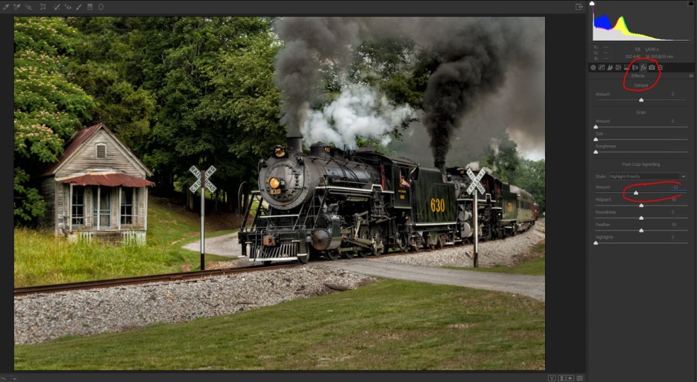
To help pull the eye to the center of the image, I’m adding a dark vignette to the corners. I could do this in Lightroom, but since I’m in Photoshop, I’ll use filter/camera raw (or the shortcut Ctrl/shift-A). Click on effects (Fx) and select highlight priority and -12. Be careful not to overdo it and get a bullseye effect.
With all of the highlight darkening and vignetting, the whole image feels just a bit dark, so as long as I’m in camera raw I’ll increase the exposure slightly. I could also do this after I save the image back to Lightroom.
Here is our finished image.
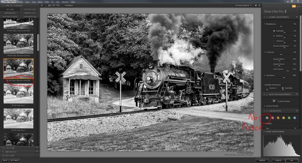
You might want to go a step further and convert the image to black and white. Here I’ve opened NIK Silver Efex, chosen the high structure smooth preset, and no color filter. The color filters simulate the effects of having shot the image with a color filter on. Click through them and see if you like any of them. For this image I preferred none.
There are an unlimited number of ways to edit an image, and my way may not be your way; in fact it almost certainly won’t. But next time you find an image that you like, look at it critically and try to visualize how your eye moves through the image. Then ask yourself what could you change, enhance or remove to help deliver your message.