In this article, I’m going to explain how to add fireworks to an image. Why not just shoot them live you ask? Well fireworks displays get rained out, there are crowds and traffic to contend with, it may be hard to find a good unobstructed view point with room to use a tripod, the fireworks may not be where you want them in the composition, or there aren’t enough bursts to satisfy you. Adding fireworks puts you in control. You can add as many bursts as you want and put them wherever you need them.
To make this possible, it’s good to have a file of fireworks images to choose from. Over the years I’ve found locations where I could shoot isolated bursts without worrying about composition. My basic exposure is f/8 and ISO 100. My shutter is set to bulb mode, which means it opens when I press the release (I use a cable release) and stays open until I let up on the release. I usually listen for the sound of a fireworks being fired, or look for the trail of one rising. I open the shutter and hold it until the burst is through. I usually only try to get one burst at a time, except for right at the end of a show when lots of fireworks are going off all at once.
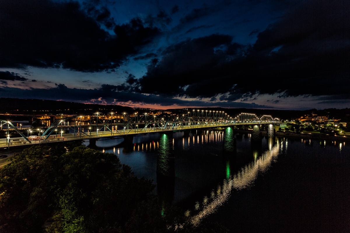
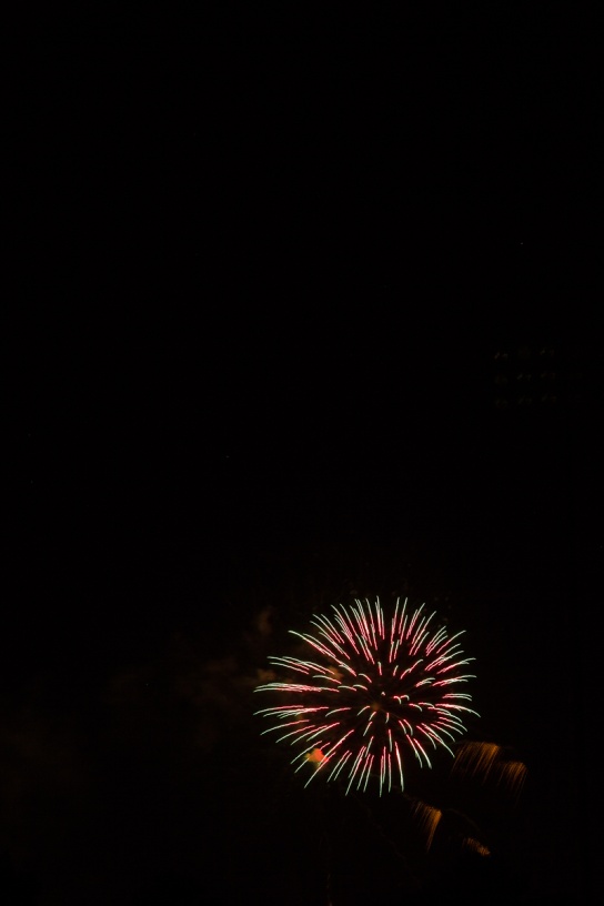
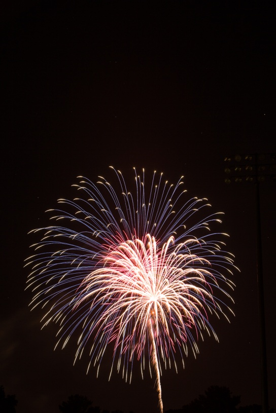
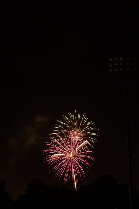
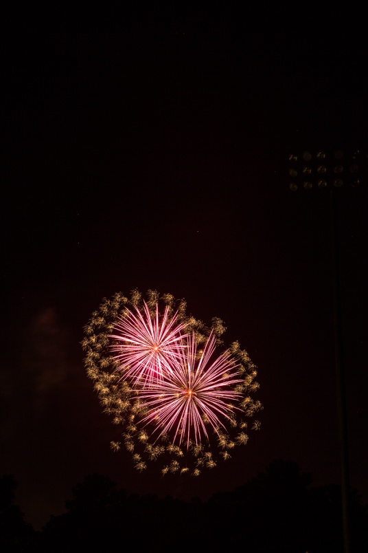
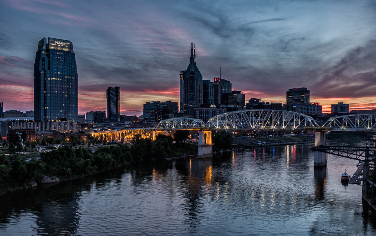
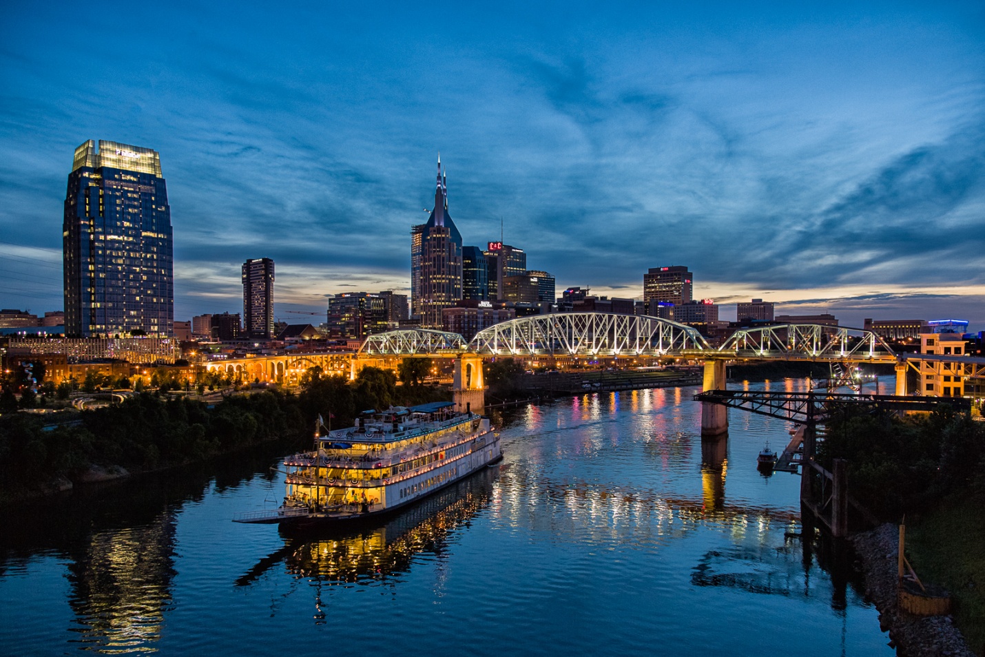
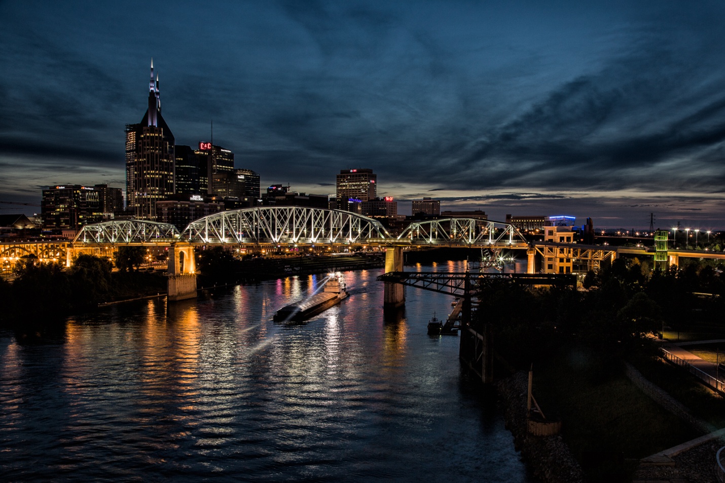
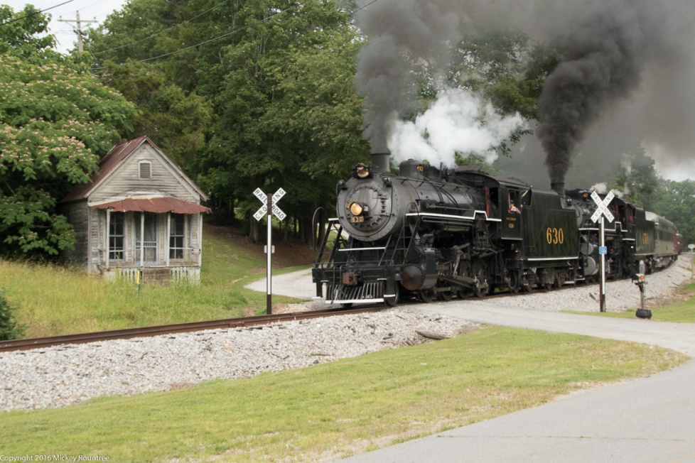
For this lesson we’ll use a dusk image of Chattanooga as our base image and add four fireworks bursts from my library. Below are the base image and fireworks images we’ll start with.
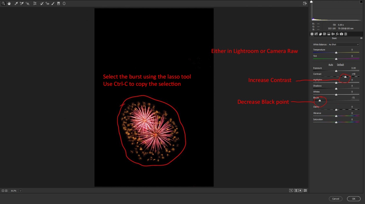
We’ll start by opening our base image and all 4 fireworks files in Photoshop. (This should also work in Photoshop Elements). First select one of the fireworks files. Then open the camera raw filter and increase the contrast, and decrease the blacks. This will help our fireworks blend in more cleanly. I also usually increase saturation and vibrance so the colors will show up well. Then click OK. You could also do this step in Lightroom before opening the fireworks in Photoshop.
Make a selection around the burst, and hit Ctrl-C (Cmd-C for you Apple types) to copy your selection. At this point you could close this file.
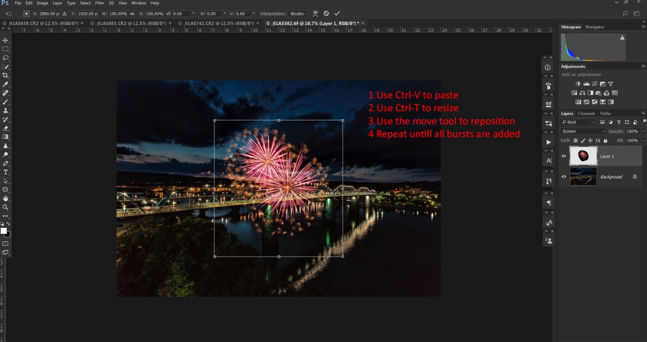
Go back to your base image and enter Ctrl-V (Cmd-V) to paste your fireworks selection. At this point, it’s probably not the right size, not in the right place, and it’s surrounded by a black blob.
To resize the burst enter Ctrl-T (Cmd-T) to bring up free transform. Hold down the shift key and drag a corner in to change the size while keeping the same proportions. Hit return when it’s the right size. Use the move tool to drag it where you want it. Here’s the secret to blending the fireworks without that black blob – change the layer blend mode to “screen”. Only tones lighter than what’s below them will show and the black blob disappears.
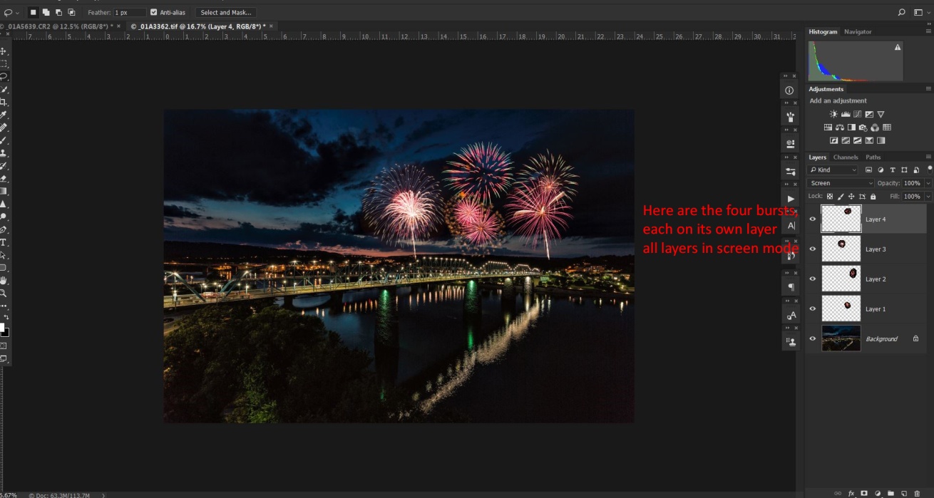
Repeat these steps for as many fireworks bursts as you want. Here I’m using those four images.
If there are no reflective surfaces, go to Layers/Flatten image then save and you’re done. If there are reflective surfaces like the river in the Chattanooga shot there are a couple of additional steps that will add to the realism.
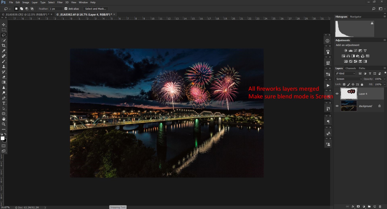
Start by selecting all of the fireworks layers by clicking on one, then hold Ctrl (Cmd) while clicking on each of the others. Right click and select merge layers. That puts all of the fireworks in one layer and they move and behave as one. You will need to change the blend mode of this merged layer to screen.
To create the reflections in the water we’ll create a new layer by duplicating the merged fireworks layer by hitting Ctrl-J (Cmd-J).
Select this layer and enter Ctrl-T (Cmd-T) to bring up free transform again. Right click inside the box and choose flip vertically. Hit return and use the move tool to drag the reflections layer down to the water.
Erase or mask the reflections from anything that isn’t reflective or that would block the reflections. To make the reflections blend more realistically, decrease the opacity until the reflections are more subtle. And choose filter/blur/gaussian blur and add a blur so the reflections don’t look too sharp. Something between 5 and 10 should work.
Now all that’s left is to go to Layers/flatten image, and then save and close.
I’m going to talk about night photography in the context of photographing cityscapes. That’s the main subject of my night photography and I am not an expert at other more specialized areas of night photography like astrophotography.
When to shoot
What is the best time to shoot night photographs? If you said “at night, of course” you’re actually wrong. The best time is actually during the “blue hour” which is from about 30 min before sunrise to about 10 min before sunrise, and from about 10 or 15 min after sunset till dark. I tend to think of the very first part of the blue hour as the “silver time” since the golden glow is gone, but the blues aren’t prominent yet.
If I’m shooting in the evening, I usually try to be in place and ready to shoot just before sunset. That way hopefully I get a colorful sunset as well as my night shots. I shoot until my exposures are at about 15 seconds at f/8 at ISO 100. The reason I stop then is not that my camera can’t capture a good image, but that by then the sky and shadows are getting black without detail or interest. If I’m shooting in the morning I try to be in place and ready to shoot at least 30 min before sunrise and I’ll shoot until the sun is a few degrees above the horizon.
I also find that if I’m shooting a city at night December through February work well because it’s dark earlier and more businesses and offices will have their lights on. Also you may get more lights on during the work week rather than on the weekend.
Exsate Golden Hour is an app available for both androids and IPhones that will calculate sunrise and sunset times, blue hour and golden hour times for your location. It will even integrate weather forecasts to predict colorful sunrises or sunsets. Definitely a must have for night photography.
Here is a sequence of Nashville from just after sunset to early blue hour then to late blue hour.
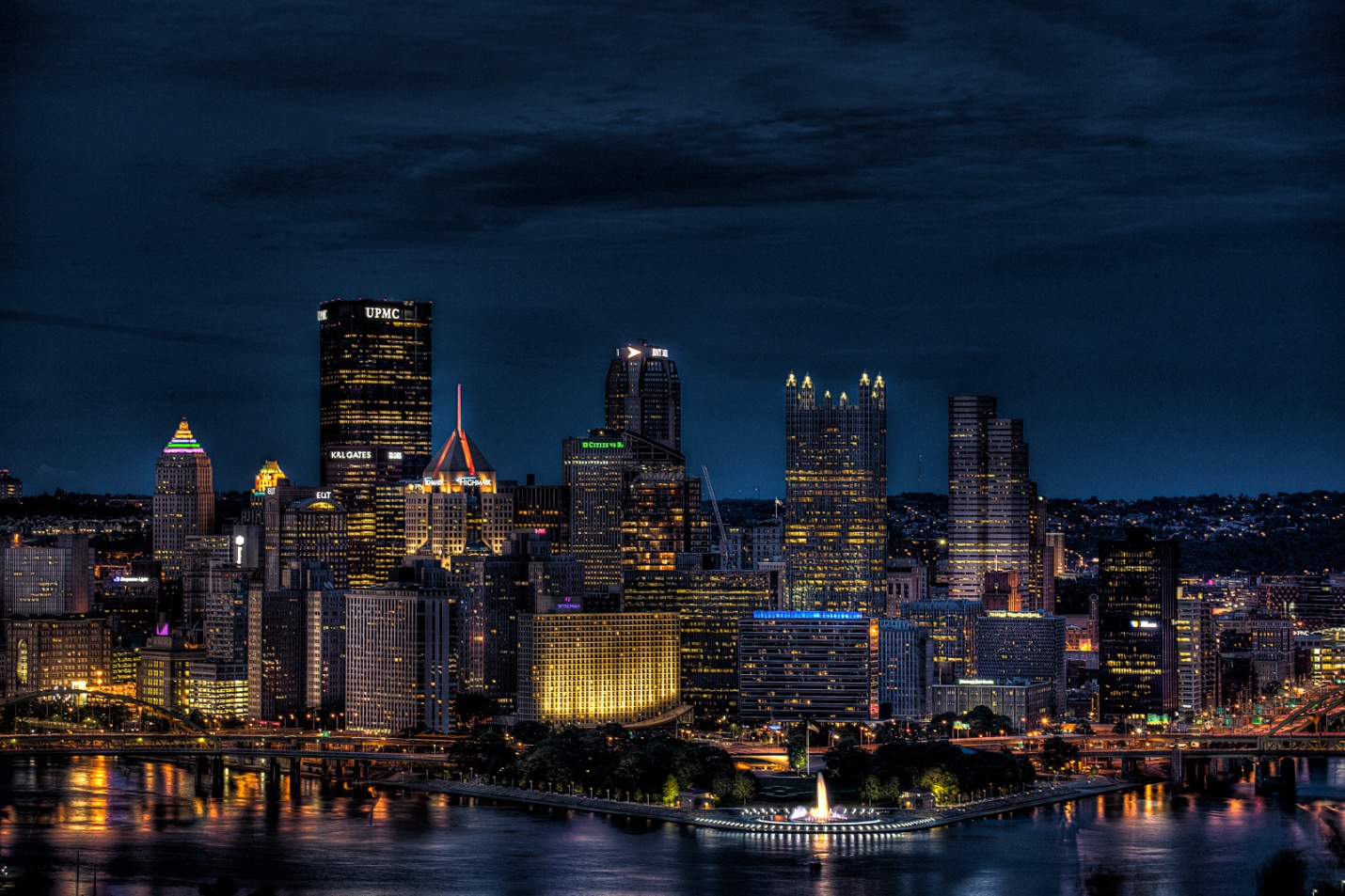
This shot of Pittsburgh was taken very late into blue hour.
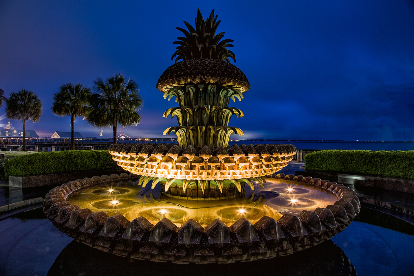
This shot was taken in Charleston, SC about 20 minutes before sunrise. A side benefit is that most of the tourists are still sleeping soundly.
What to shoot
Generally the best scenes include bright lights, neon lights and signs, moving lights like car headlights or tail lights, and maybe reflections of lights in water. You may also want to try light painting, which is a specialty of its own.
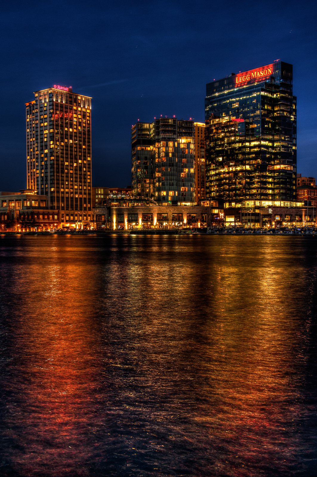
Reflections of the lights below are a natural for night photography.
Equipment
It should go without saying that other than a camera with adjustable settings, the most important piece of equipment is a good sturdy tripod, since your shutter speeds will be much too long to hand hold. To make maximum use of the tripods stability, either use a cable release or set your self-timer so your finger on the shutter doesn’t cause vibrations. Also on most stabilized lenses (IS, VR, OS etc), turn off image stabilization when shooting on a tripod.
You can use wide angle lenses for whole cityscapes or longer lenses for details. My favorite cityscape lens is the 17-40 mm on a full frame body. I always have the appropriate lens hood attached, both to protect the lens from bumps and to minimize lens flare. I have also heard that night photography is one time that you should remove any clear or UV filters, although I rarely think to do this.
Some photographers like to use a 4, 6, or 8 point star filter. This is a clear glass filter with lines etched into it to make point sources of light create a star patter. I don’t like to use them because the degrade the image overall and cause a loss of contrast and sharpness. Also if you want the choice of stars or no stars, you will be constantly swapping the filter on or off. You can get a natural star effect by stopping down to f/16 or f/22. Or my choice is to use software like Topaz Labs star effects. That way I can add the stars later and control the size and number of rays.
You will find a small flashlight or head lamp useful for checking camera settings and seeing your in or out of position. Many of the small LED lights are even bright enough to do some light painting.
How to Meter
I usually use aperture priority mode or sometimes manual mode, and I use Evaluative metering (Matrix on Nikon). Early in the blue hour it is pretty accurate. As the sky gets darker, the meter will try to compensate by increasing exposure. So as the blue hour progresses I will be dialing in exposure compensation, so that by the time I stop shooting, I’ll usually be at about -2 stops compensation. You can check your exposure on the LCD, by using the histogram, and by turning on the highlight warning to make sure you aren’t blowing out highlights. You will also have much more latitude and ability to correct your images later if you shoot in RAW rather than JPEG.
Since I like to shoot HDR, and find that it works well for night photography, I usually shoot a three shot bracket at -2, normal and +2 stops. Even with brackets, I’m usually dialing in exposure compensation as the sky gets darker. I may not always create an HDR image, but then I have a range of exposures to choose from when I process.
Here’s a quick tip to save some time. As it gets dark, your exposures may be as long as 30 seconds. If you want to shoot a test shot, each test will take 30 secs. To save time while you test, set your ISO to 1600, make your test shot and then reset your ISO to 100 or 200 for your actual shot. If you are in aperture priority, you don’t have to do anything. If you are in manual mode, remember to increase your exposure time 3X longer for ISO 200 or 4X longer for ISO 100.
Color Balance
Color balance can vary a lot depending on the lighting in the location you are photographing as well as personal taste. I always shoot in RAW, so I normally just stay on daylight balance and adjust later. This doesn’t work well if you shoot in JPEG. In JPEG, you may want to try auto color balance, or tungsten. Tungsten balance will also make the sky go even bluer. One trick to try is to set your camera on LiveView mode and then scroll through all of the color balance settings on your camera until you find the one that looks best to you.
This picture was shot in daylight balance, but later corrected to tungsten balance. This is also later than I would normally shoot, since the sky is almost black. but the reflections help fill the empty blackness.
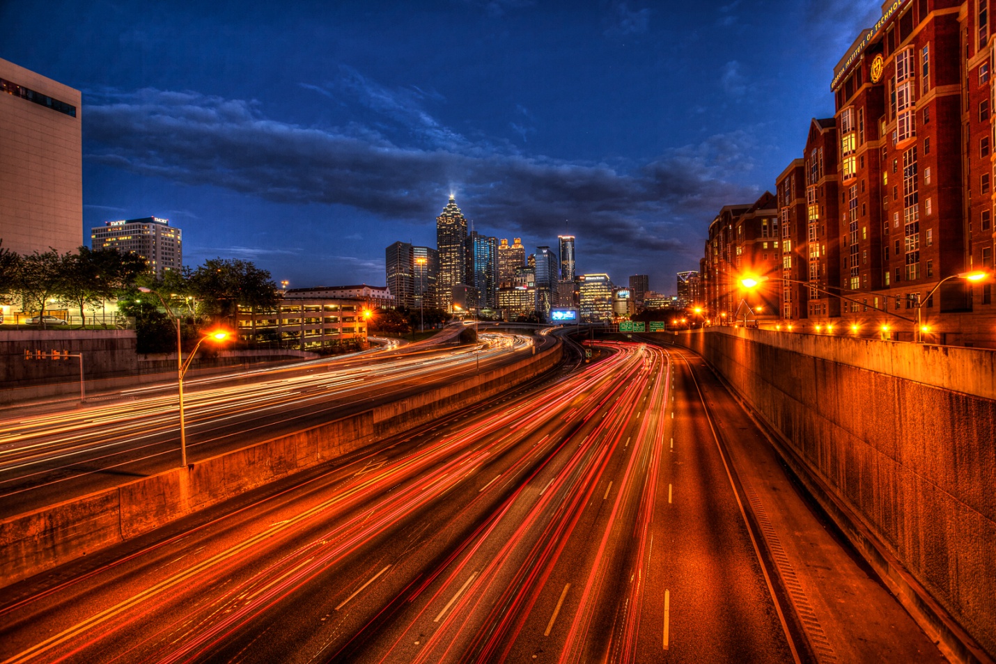
One problem that is becoming more common is sodium vapor lighting. Cities are increasingly using it because it is more cost efficient and requires less maintenance than incandescent lighting. It casts a yellow or orange cast that is impossible to correct. That is because most light sources produce light with varying amounts of all of the colors of the spectrum. We can color correct by decreasing the dominant wavelengths and bringing up the weaker wavelengths. The sodium vapor lights have only a single wavelength – yellow. If we decrease yellow, there are no other colors to bring up and balance the yellow color, so we’re basically stuck with what we get.
The shot of Atlanta, below shows the effect of sodium vapor lighting on the right side of the shot.
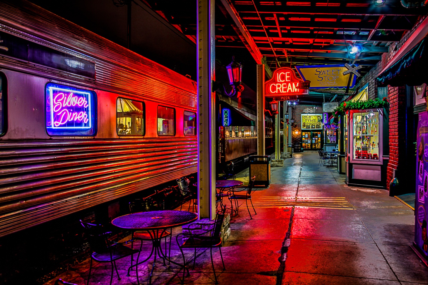
Neon lights look good in daylight balance. There is no need to color correct, and why would you want to, since the colors are so attractive they become the subject.
Motion trails
Motion trails are produced by moving light sources and slow shutter speeds. The faster the objects move, and the slower the shutter speed, the longer the trails. The classic effect is cars headlights or tail lights on streets, but they could also include skiers with head lamps, planes, or even pedestrians with flashlights or headlamps.
Special Problems
Some of the best cityscape views are from pedestrian bridges or street bridges and overpasses. The movement of people walking by, or cars passing can cause vibrations that will ruin your shot. Try to shoot when no one or thing will create vibrations, and if it does happen try to reshoot that shot.
Also don’t forget traffic safety. Stay out of roadways, wear light or reflective clothing, and maybe even a light. Keep your eyes open and don’t trust that everyone out there is driving safely and alertly.
Also I hate to have to mention this, but be very aware of your surroundings and personal safety. It is very easy to get totally absorbed in the details of night photography, and not be aware of danger around you. The bad guys can certainly be out at any time of day, but they tend to prefer the dark They know the good spots for photography and where they can steal high end cameras and cash, and their favorite prey is clueless and paying no attention to what’s around them. A friend and I were photographing the Nashville skyline form the pedestrian bridge at dusk. It was cold, and we were the only people out until a shady looking character came out and chose the bench right across from us (out of dozens) and facing down river where there was nothing of interest. I really felt something was wrong and we quietly agreed to take turns shooting and watching this potential threat. Every time he looked over his shoulder at us, one of us was staring right back. Finally, right when I thought the robbery was about to go down, a large group of photographers came out on the bridge, and our friend decided it was time to leave. The moral of the story is BE AWARE, and if something feels dangerous, it probably is, so leave if you safely can.
1) Pay attention to all of the entry requirements.
The rules may specify a certain file format, such as jpeg. Some may accept TIFF, generally none will accept RAW. Many contests specify maximum image size in pixels, such as 1024×768 for PSC contests. PSC also has a maximum file size of 800kb. Most contests will automatically reject oversized or wrong format images. Also make sure you enter the maximum allowable size, or you will be diminishing the impact your picture has.
2) Make sure your picture fits the theme or subject if there is one.
Most judges won’t even score an image that doesn’t fit the theme. You may need to shoot specifically for a theme or you may have an existing image that fits well. Don’t enter an image that doesn’t clearly fit the theme. If you have to play word association games to make the image fit the theme, don’t enter it.
3) Make sure your picture is sharp; really sharp.
Soft, blurred or out of focus images get minimal scores. Even if it is a great subject, lack of sharpness kills your score. So zoom in and evaluate your image’s sharpness. Toss out anything less than perfectly sharp.
There are basically three things that ruin sharpness; camera movement, subject movement, and out of focus. Whenever possible use a good sturdy tripod. Also either use a cable release, or the camera’s self time to remove shake caused by pushing the shutter button. If you can’t use a tripod, use a higher shutter speed. The general rule has always been a shutter speed of 1/focal length. This is the slowest shutter speed you should hand hold, and faster shutter speeds are even safer. This may require a higher ISO, a wider aperture, or both. High ISO’s result in noise, but a sharp picture with some noise will always beat a blurred shot with no noise.
Subject movement can be handled with fast shutter speeds, using flash to freeze movement, or panning with the subject. Panning takes a lot of practice, has a high percentage of rejects, but it can look fantastic when it works.
The default for many cameras is for all focus points to be active, and the camera selects the closest subject to focus on. That may not always be the subject that you want to be in sharp focus. Select a single focus point and place it directly on the subject that you want to be in sharp focus.
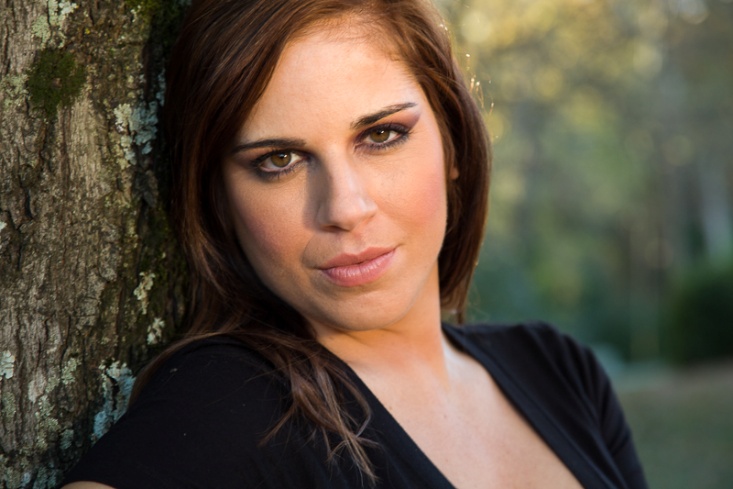
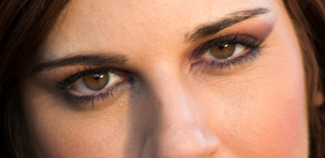
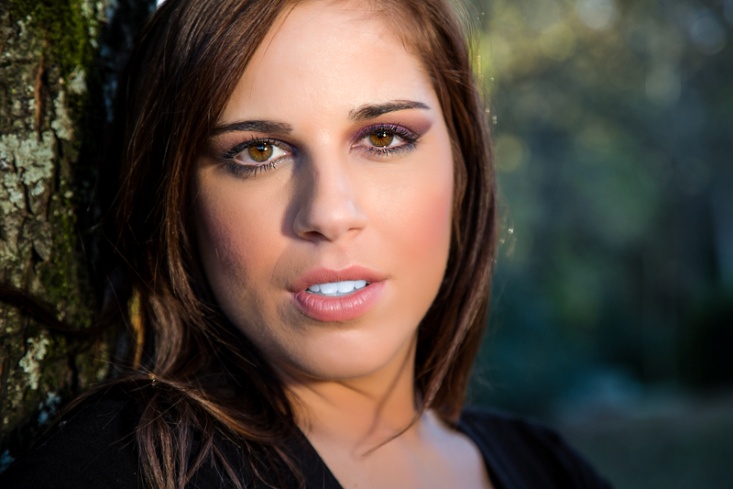
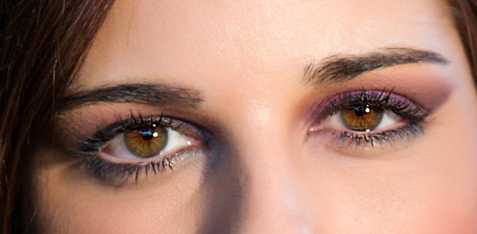
A special note when photographing people (or animals) is to make sure the eyes are sharp and in focus. If depth of field is shallow, make sure the closer eye is in focus.
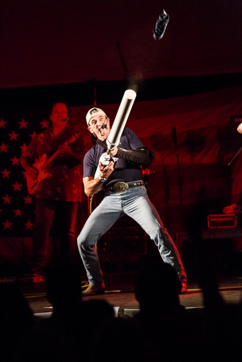
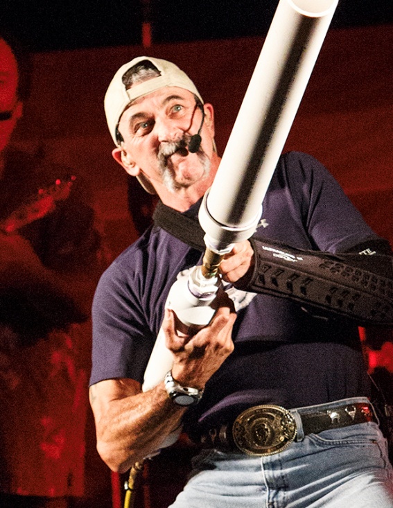
Here’s a shot taken at ISO 12,800 at an indoor concert. What looks like bright light to your eyes is really pretty dim to the camera. There were no tripods allowed, so to keep a fast enough shutter speed I used a wide aperture and very high ISO. Is it a bit noisy? Yes. But is it sharp? Yes. You can see the noise in the cropped image, particularly in the red shadow areas.
Here are two portraits. The first is “almost” good enough. The second is razor sharp. Look at the crops of the eyes. Don’t even think about entering the out of focus shot. No matter how good the subject or expression, lack of sharpness kills the score.
4) Choose an image with impact.
The image is large, bright, super sharp, unique, photographed from an unusual viewpoint, or anything that creates that WOW factor and leaves no doubt what the subject is.
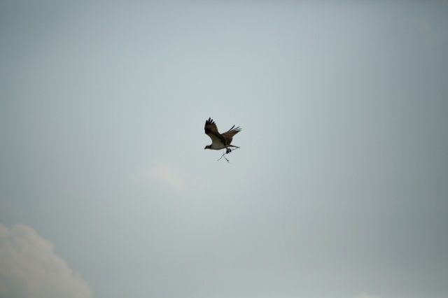
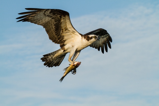
Here are two osprey shots. The first is so far away that he is tiny in the frame and barely recognizable. Add to that poor lighting and a dead center composition and it is a horrible picture. If it is the first and only osprey picture you ever took, you might be all excited about, but the judges won’t be. The second shot is close, has better composition, better lighting, more impact, and actually tells a story about the osprey.
5) Use composition to draw attention to your subject and be aware of elements that draw a judges eye away from your main subject.
All of the “rules” of composition exist to help direct your viewer’s (or judge’s) eye to what you want him to see. Yes, rules are meant to be broken, but pay attention to where your eye is drawn when you analyze a shot.
Leading lines can help lead a viewers eye to your subject. The first shot has effective leading lines. The second has leading lines that take you to a pair of poorly lit, uninteresting deer and then continue to lead you past them and right out of the picture, never to return. Be aware of the power of lines.
Camera angle and viewpoint can have a drastic impact on the image and what it conveys. Wide angle lenses exaggerate a sense of perspective, and telephoto lenses compress. The two shots below show the difference between a wide angle lens and a high viewpoint and a lower viewpoint with a longer lens. Can you feel the difference in impact between the two?
The rule of thirds divides your image into thirds horizontally and vertically. The intersections of these lines are “power points” and placing the most important elements on these points emphasizes them. Most importantly, it avoids the more boring dead center placement. Look at where the eyes are placed in the first two portraits. Compare them to the third where the eyes are dead center. Also look at all of the “dead space” that contributes nothing to the portrait.
Border mergers are elements on the borders of your photos that draw the eye to the edge of the frame and away from the main subject. Pay attention to the edges when you shoot, or use cropping and content aware fill or cloning to remove them later. Look at the difference simply removing the branches at the upper right makes.
Make sure your horizons are level. This is an easy fix in Lightroom and Photoshop. Better yet, make sure your camera is level when you shoot. Here I also changed exposure and contrast, but the most important change was fixing a badly tilted horizon.
Bright areas tend to draw the eye. This can work for you, or against you. Also many photographers darken the corners or use a dark vignette to help hold the viewers eyes on the main subject. In the pictures below, I cloned away the bright pavement, the tip of the white star, the yellow patch and the white blur. Do you see how much easier it is for your eyes to stay on the gun turret as the main subject?
Your eye is drawn to the area of sharpest focus, so make sure that is your subject. Putting distracting background elements out of focus keeps them from competing with your main subject. Wide apertures provide shallow depth of field to limit sharp focus. The first example is ridiculously shallow depth of field, but can you look anywhere but at that one eye? In the second picture, imagine if all of the background elements and highlights were sharp; the subject would not stand out so clearly.
Your lens choice and perspective has a powerful effect on how the viewer sees your subject. In the picture below, a wide angle lens and perspective make it obvious who the leader of the band is. It’s not so obvious that he is the shortest band member.
6) Correct the color balance.
Match your color balance to the light on your subject. Sometimes auto color balance works, but sometimes it is better to select an actual color setting such as tungsten, florescent, shade or daylight. If you shoot in RAW, you have more options for correcting color balance in post processing. Sometimes there are odd color balances that require trial and error correction. The first two pictures were shot in a large room with no lights. All of the lighting was reflected from green leaves and came through windows covered with green mold. I don’t think any auto color balance setting could have fixed this. But imagine how contest judges would react to the uncorrected shot. The concert shot shows the same shot as above, but shot with daylight balance under tungsten lighting. Notice the yellow cast compared to the correct white balance.
7) Add contrast if needed.
At one of our recent meetings our judges did a critique of the images for a quarterly contest. Their number one comment was “needs more contrast”. Generally that means that somewhere in the picture are some blacks that are close to true black, and some highlights that are bright without being blown out to pure white without detail. Here is an extreme example from a heavily overcast day with fog and mist that completely destroyed contrast. Restoring some contrast in editing made a big difference.
8) Try to tell a story.
Creating mood, drama, setting a scene, and good expressions all help a picture score well. One comment I hear a lot from judges is “There’s nothing happening here.” All of your composition tools, lighting, and choice of color or monochrome can help create a mood. Below is a pretty plain shot of a room. Look at the difference when I got to shoot a couple of the men who had been living there for a few days. Notice how the mood changes even more in black and white.
9) Get a second opinion from a photographer whose judgment you trust.
It is all too easy to fall in love with your own picture and not see its flaws. It may be a picture of someone you love, it may remind you of a great day, or you worked very hard to get the shot. But it still may not be a great shot. Another photographer can be much more objective. Also if you find yourself explaining a picture to someone, it is probably not going to do well in a contest. In a contest your pictures have to speak for themselves.
10) Realize that you won’t always win.
In fact it’s almost certain that you will lose more than you win. Try not to get your feelings hurt and take it personally. Use it as an opportunity to look at the winners and see how to improve your own work. Whenever you can get comments from the judges, it can be a great insight into the minds of judges, and tell you what works and doesn’t, particularly if you can see comments for all of the entries. Also remember that every judge brings his or her own biases, due to background, training, experience, personal photographic styles and preferences, and even their mood on that day. If you don’t win, it may just mean that those particular judges didn’t like that particular image on that particular day. The same image may score well in another contest, with no changes other than the judges. At the same time, try to hold your ego in check when you do win. Again, all it means is that you pleased those judges on that day. When you can do well consistently, you will know that you have improved as a photographer. Entering contests can be very rewarding if you approach it as a way to share your work, receive feedback and grow as a photographer.
Before I begin, I should thank Bill Lea and the late Dean Collins for their influences for this article. If you’ve seen Bill when he spoke to our club, you know that photographing in the rain can produce beautiful images. But most of us don’t want to get our expensive gear soaked. And if you’re an old graybeard like me, you might remember Dean as one of the most innovative and motivating photography teachers in the 80’s and 90’s. Several of Dean’s articles dealt with building photographic accessories out of common PVC plumbing pipe and parts. So when I started out to make my own umbrella mount, PVC was my first choice of materials because it’s cheap, readily available and easy to work with. My whole rig costs around $5 and took about 10 minutes to make.
Figure Glade Creek Mill in a light rain
Figure Perry’s Water Garden steady rain.
I use Induro tripods (CT 313, 213 and 113), but this design should work for any tripod with a removable center column. If your tripod has no center column or it can’t be removed, stop reading now, and go work on your own design.
My basic design starts with a 1in. diameter PVC Tee. The 1 in. fits my 213 perfectly, is loose with the 113 and didn’t fit the 313 until I used a hole saw to drill it out to 1 1/8 in. The best idea is to remove your center column and take it with you when you shop for parts. Your tripod may require a different size than I used. While it isn’t necessary, I cut mine as close as possible on each side of the Tee so it will work with a short center column. If you only use a long center column you can skip this step. If you do cut down the Tee, use a miter box to make sure that your cuts are square.
After the Tee is slid over the column, add a piece of 1in PVC pipe roughly 4 in long. This piece needs to be long enough to make sure the umbrella clears the camera body, but no longer or it creates leverage to unbalance your tripod. The other end of the 1in tube inserts into a 1 in to 1 1/2 in bushing. That is inserted into a 1 1/2 in right angle fitting, and a 4-6in (depends on the length of the umbrella handle) piece of 1 1/2in tubing is inserted into it. This is where the handle of the umbrella will be placed. All tubing cuts should also be square, so either use the miter box or a tubing cutter. I prefer not to glue any of the joints, but twist them together hand tight. This allows me to adjust the angle of the umbrella. It would look great painted black, except paint doesn’t adhere to PVC.
Figure PVC Parts list
Figure The mount attached to the tripod column
In use, the umbrella is placed in the upright piece of 1 1/2 in tubing. I prefer a large golf umbrella for maximum coverage. There are two important precautions to keep in mind with this rig. First, make sure the umbrella fits loosely into the upright. You want a strong wind gust to remove the umbrella rather than send that expensive camera and lens crashing. Second, the umbrella is in the mount only while you set up and compose. Remove and hold the umbrella when you actually shoot, so that any vibrations the wind would create on the umbrella don’t get transmitted to the camera and tripod.
Figure PVC Parts $5.00 Water Damage to studio $875.00 Keeping your camera dry PRICELESS
Several of us were recently discussing why more photographers don’t use editing programs to process their images. One reason (among many) that we came up with is that they may not how much basic edits in a program like Lightroom can improve an image, and then what is available with more advanced editing software like Photoshop. So for this article I’m going to take an image as it came from the camera and do basic and advanced edits. My goals in this edit are to adjust basic exposure and contrast, and then to remove distracting elements, improve the composition, and use final adjustments to help direct the viewer’s attention to where I want it.
I’m not going to do an in depth explanation of how to use tools such as cloning, burning, or content aware fill, but I do hope to make you aware of their power and want to learn more about them. For more in-depth reading about Lightroom and Photoshop, I would recommend a couple of my favorite authors. Martin Evening has books on both Lightroom and Photoshop. His books are very detailed and almost encylopedic in their coverage and are great to have on hand as references. Scott Kelby’s books are probably the most widely read Lightroom and Photoshop books. They are excellent for a photographer just getting started with editing and they do a great job of teaching all of the skills you’ll need on a regular basis.
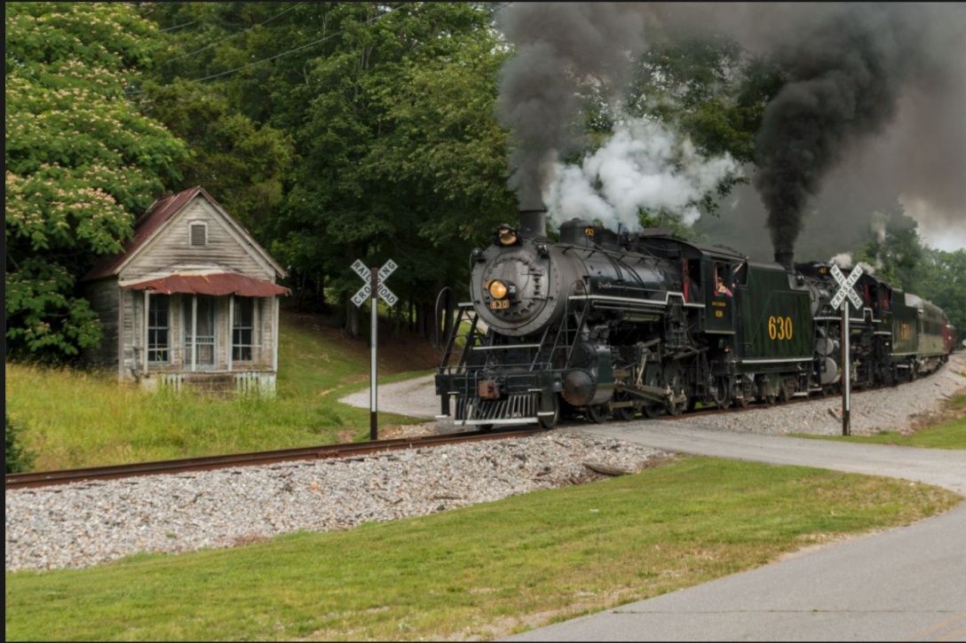
Here is the image I’m starting with. Straight from the camera it’s a little flat and low contrast, there are several distracting elements, and it could be sharper. I should mention that I shoot in RAW format. If you shoot in JPEG, your camera applies some sharpening and contrast to the image, so it may look a little bit better to begin with.
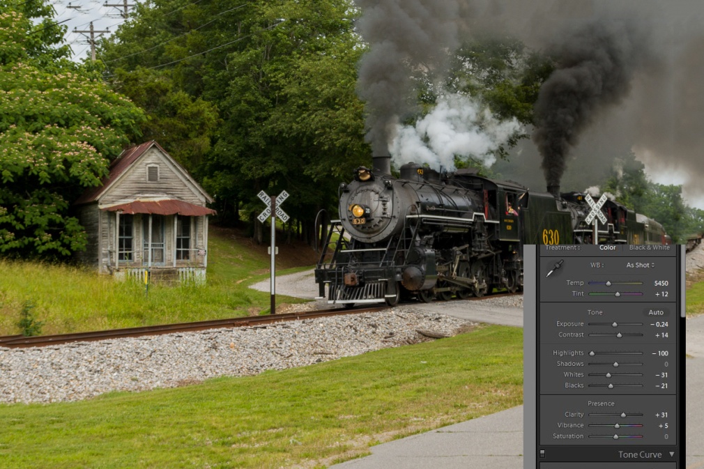
The first thing I’ll do is make my basic edits in Lightroom. You can see the settings below. I’ve added contrast, adjusted the white and black points, decreased highlights so there are no burned out white areas with no detail and added clarity which brings out detail and decreased the exposure slightly. The best way to learn these settings is just to play and experiment. Adjust each slider left and right and see what it does and adjust it until it looks right to your taste. With just these very basic adjustments, the shot is already looking better.
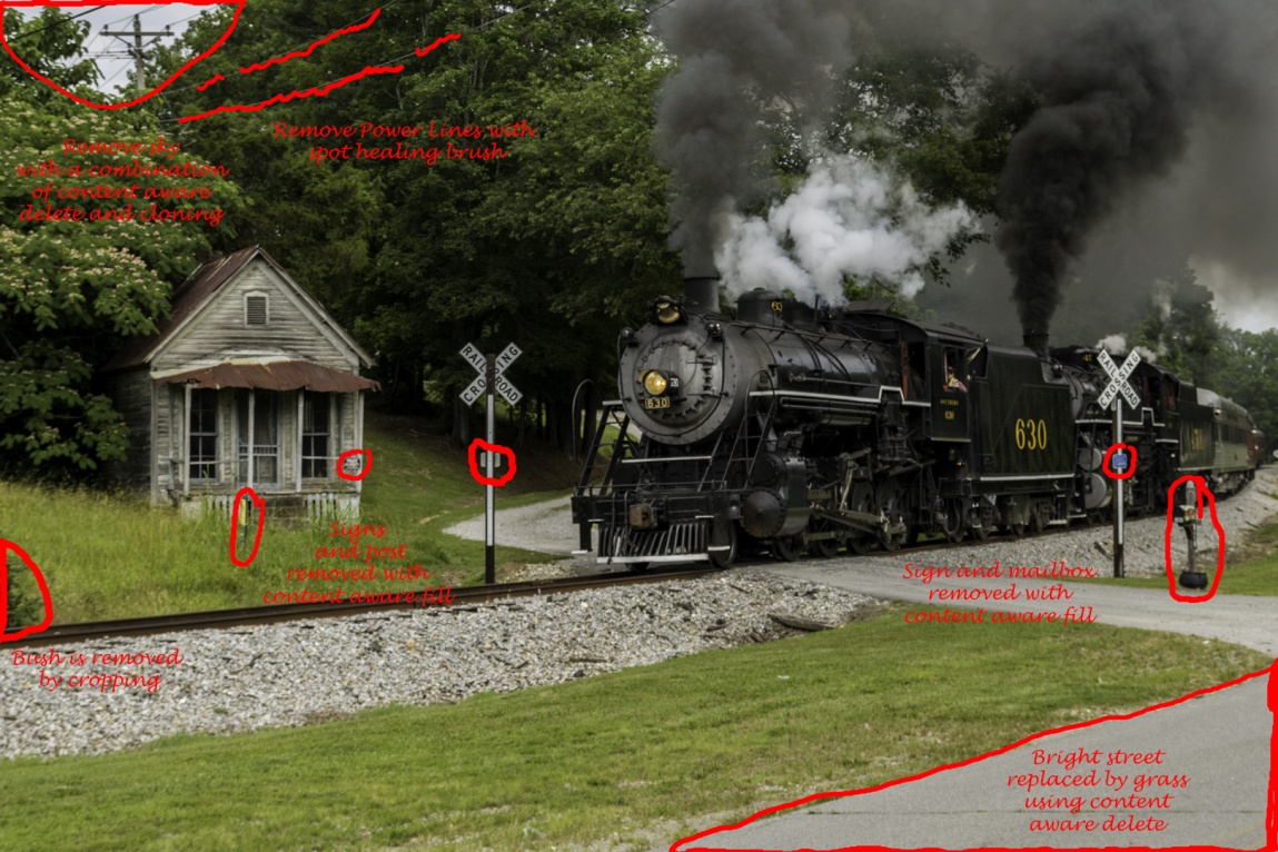
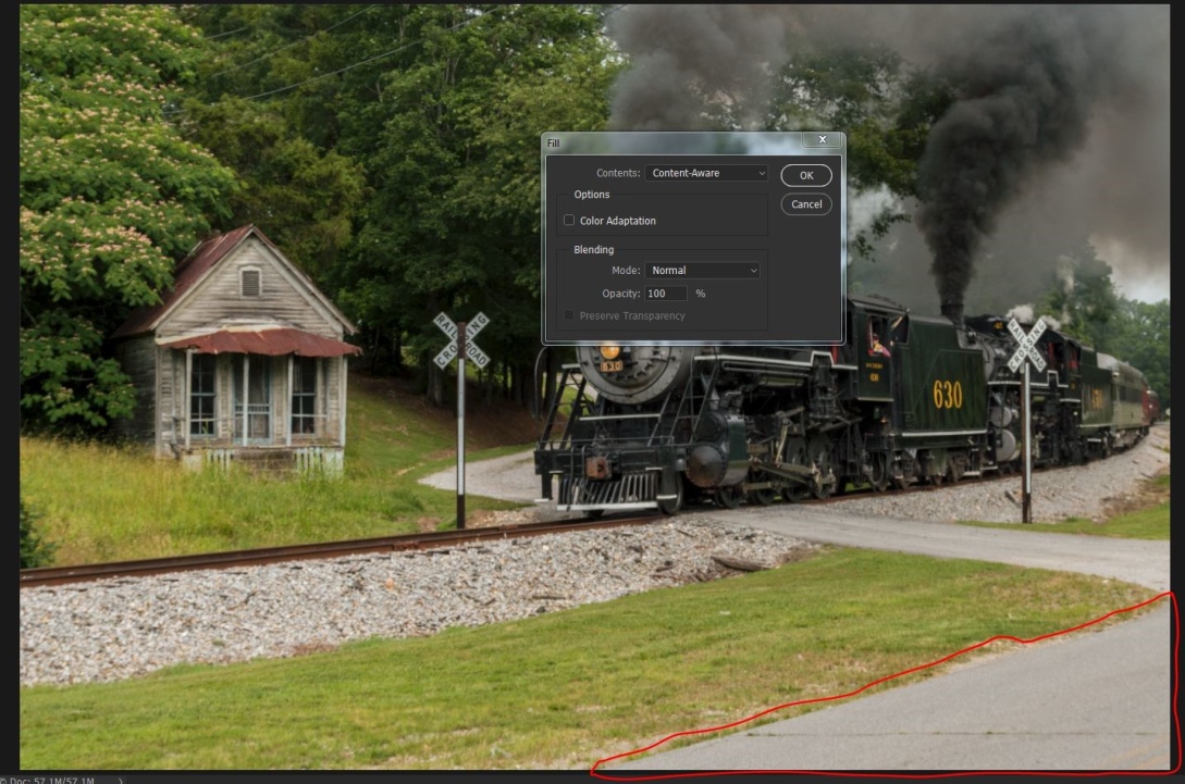
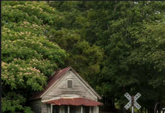
Now to show you some of the power of editing in Photoshop, I’ll start getting rid of distracting elements. I’m trying to keep the viewer’s attention on the steam engine. The eye tends to go to the brightest part of an image, so I’ll use content aware delete and cloning to remove the bright sky in the upper left. The power lines are a distraction, especially since I’m removing the telephone pole that they lead to. The eye is also drawn to signs with writing, so the no trespassing sign on the porch has to go. I will also remove the small signs on the crossing warnings. This is a relatively colorless image, so a bright color like the pole with the yellow marking is a distraction to remove. It may or may not be necessary to remove the mailbox, but I found it distracting. The bush on the left hand side above the railroad tracks is a border merger that tends to pull the eye out of the frame. I could remove it now, but I already know that I’ll be cropping in tighter and that will remove it. Also the triangle of pavement is relatively bright. I could darken it, but I chose to replace it with grass.
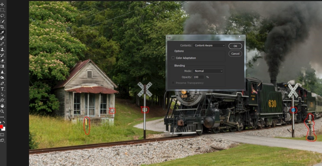
To use content aware, use a selection tool like the lasso, draw around what you want to replace and then go to edit/fill/ and select content aware. It may help to go to selection/modify selection/expand and expand your selection by two to four pixels before using the fill command. Sometimes after using content aware fill you may find it didn’t work well. Choose edit/step back and either repeat the fill or redraw your selection and try again. Often it’s close but you may need to do some cloning to finish the replacement. Here it worked well, and I didn’t need to make any other changes. You can select all of the elements you want to replace and replace them all at once. I prefer to remove large objects one by one. I will select lots of smaller objects and delete them all at once if they are widely separated and not in areas with too much detail. The telephone lines were removed with the spot healing brush. Choose a brush slightly larger than the lines, make sure the content aware option is check and paint over the lines. A graphics tablet like the Wacom Intuos will make this much easier than trying to use a mouse.
Here I’ve selected the sky area and chosen fill/content aware.
Below, I’ve selected several objects, by outlining one with the lasso tool and then holding the shift key while selecting the others. You can also see I’ve gone to select/modify/expand and I’m increasing my selection by two pixels.
Here I’ve selected edit/fill/content aware.
And like magic, all of those little distracting elements are gone.
Now I want to remove that triangle of light pavement, since I feel it draws the eye. I’ve circled it with the lasso tool. I went to select/modify/expand and expanded the selection by four pixels. I find this works well when the selection in on an edge.
Here is the image after all of distracting elements have been removed with content aware delete.
Now to remove the telephone and power lines, I’ll use the spot healing brush and paint along the lines.
The lines are gone.
Here is the image with all of the distractions removed.
Now for the finishing touches. Here I’ve sharpened the image with high pass sharpening. To do this use Ctrl-J to duplicate the layer. Then go to filter/other/high pass and choose 2 pixels. That leaves an ugly gray image, but change the blend mode to softlight (or overlay for a stronger effect) and you have a sharpened layer. Use Ctrl-E to combine this layer. By the way, you may not see the effect well in this article, because by the time the image is reduced to fit and then the whole article is converted to PDF format, sharpness often suffers.
For inanimate objects I like to use NIK’s Color Efex 4 plugin, and particularly the tonal contrast preset. Here it is at the default Settings. The NIK collection is free from Google. You can download it at https://www.google.com/nikcollection/
Here is the effect after tonal contrast.
Here I’m cropping the image for better composition, removing areas that don’t contribute to the picture, and notice that that removed the bush.
Next I want to darken down some areas that are relatively bright. I’ll use the burn tool at about 25% to burn in the highlights and midtones on the areas marked below.
Tonal contrast darkened the lower part of the steam engine, so I used the dodge tool at about 30% to lighten the shadows in the areas below.
After lightening you can see more detail in the wheels and pistons.
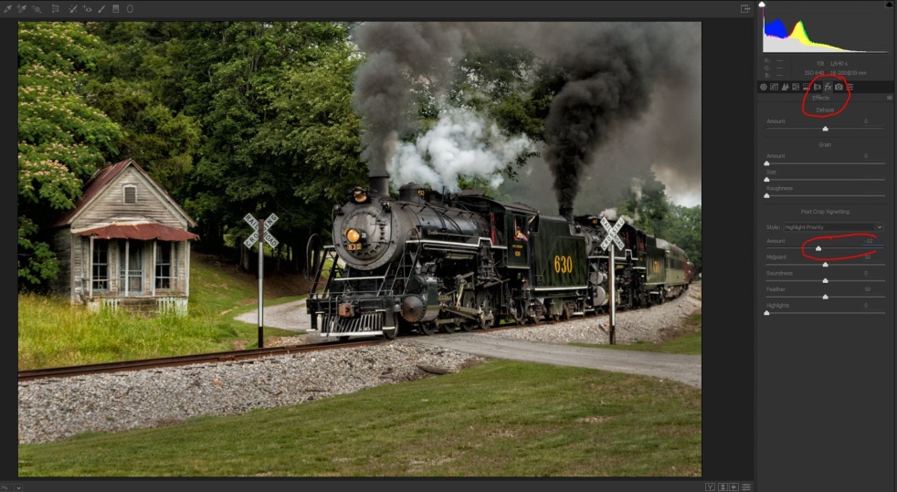
To help pull the eye to the center of the image, I’m adding a dark vignette to the corners. I could do this in Lightroom, but since I’m in Photoshop, I’ll use filter/camera raw (or the shortcut Ctrl/shift-A). Click on effects (Fx) and select highlight priority and -12. Be careful not to overdo it and get a bullseye effect.
With all of the highlight darkening and vignetting, the whole image feels just a bit dark, so as long as I’m in camera raw I’ll increase the exposure slightly. I could also do this after I save the image back to Lightroom.
Here is our finished image.
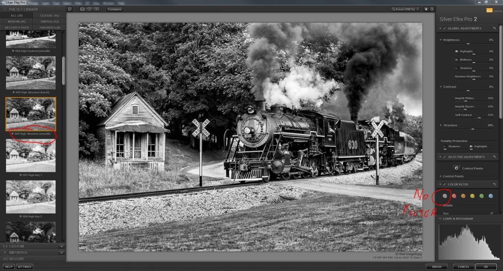
You might want to go a step further and convert the image to black and white. Here I’ve opened NIK Silver Efex, chosen the high structure smooth preset, and no color filter. The color filters simulate the effects of having shot the image with a color filter on. Click through them and see if you like any of them. For this image I preferred none.
There are an unlimited number of ways to edit an image, and my way may not be your way; in fact it almost certainly won’t. But next time you find an image that you like, look at it critically and try to visualize how your eye moves through the image. Then ask yourself what could you change, enhance or remove to help deliver your message.
Very few images come out of the camera that couldn’t be helped by some basic adjustments. Every time I’m involved in judging a contest, the most frequent comments by the judges are lack of sharpness, lack of contrast, and poor exposure. There is not much you can do about sharpness after the fact, but there is a great deal you can do to improve contrast and exposure. As I’ll show you it’s even possible to salvage what starts out as a bad image.
I’ll be using Lightroom, because that’s what I use regularly and what I’m most familiar with. You could also use Camera Raw in Photoshop or Photoshop Bridge, Canon Digital Photo Professional, Nikon’s ViewNX 2, or even free software like GIMP.
One very important fact to know about processing in Lightroom is that it is non destructive editing. The changes you make do not directly change the image file, but go into an instruction set that tells the computer how to display the image. If you make a change you don’t like you can step back, or you can even select reset to undo all of your changes.
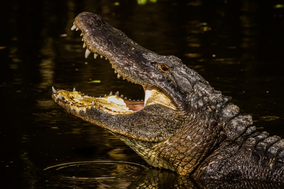
Here are a couple of images that don’t look good at all straight out of camera (SOOC). Even I can take less than perfect pictures, but I also know when it’s possible and how to rescue them.
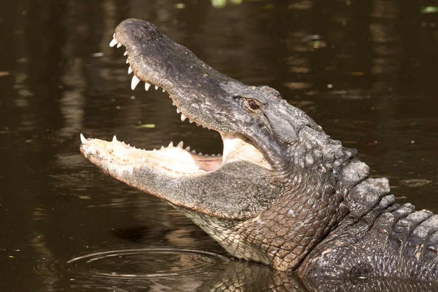
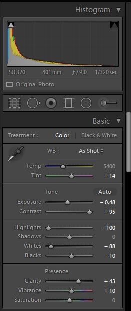
This shot of the alligator is badly over exposed and flat looking. He came up and snapped so quickly that all I had time for was one quick grab shot with no time to correct exposure as I shot.
In Lightroom I switched to the develop module and began my corrections. I usually adjust the white and black points first and then follow the order of the sliders as I make my adjustments. To have Lightroom adjust them automatically, place your cursor on the word “black” hold shift and then double click. Then repeat for white. I decreased exposure to -48, just by trial and error. Remember, you won’t hurt your image my playing around with the sliders. I wanted a very dramatic image, so I took the contrast all the way up to 95. Normally 25-50 works for most images. I also completely decreased highlights, because the light inside of his mouth was so extremely overexposed. I increased clarity to 43 to improve midtone contrast and increase the appearance of sharpness, and just slightly increased vibrance. Vibrance increases the saturation of colors which have low saturation, without affecting colors that are well saturated or skin tones. I rarely increase saturation because it can quickly cause colors to block up and look posterized.
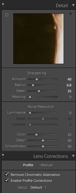
Lightroom usually adds a sharpening value of 25 by default, but here I increased it to 40. Also you can just see below that that I almost always check profile correction and remove chromatic aberration. Lightroom can usually detect the lens used and adjust for its distortion and vignetting. It doesn’t make a huge difference on this image, but it can drastically improve architectural shots or images with straight lines.
Here is the final image with only basic adjustments. I hope you’ll agree that it is much improved over the original.
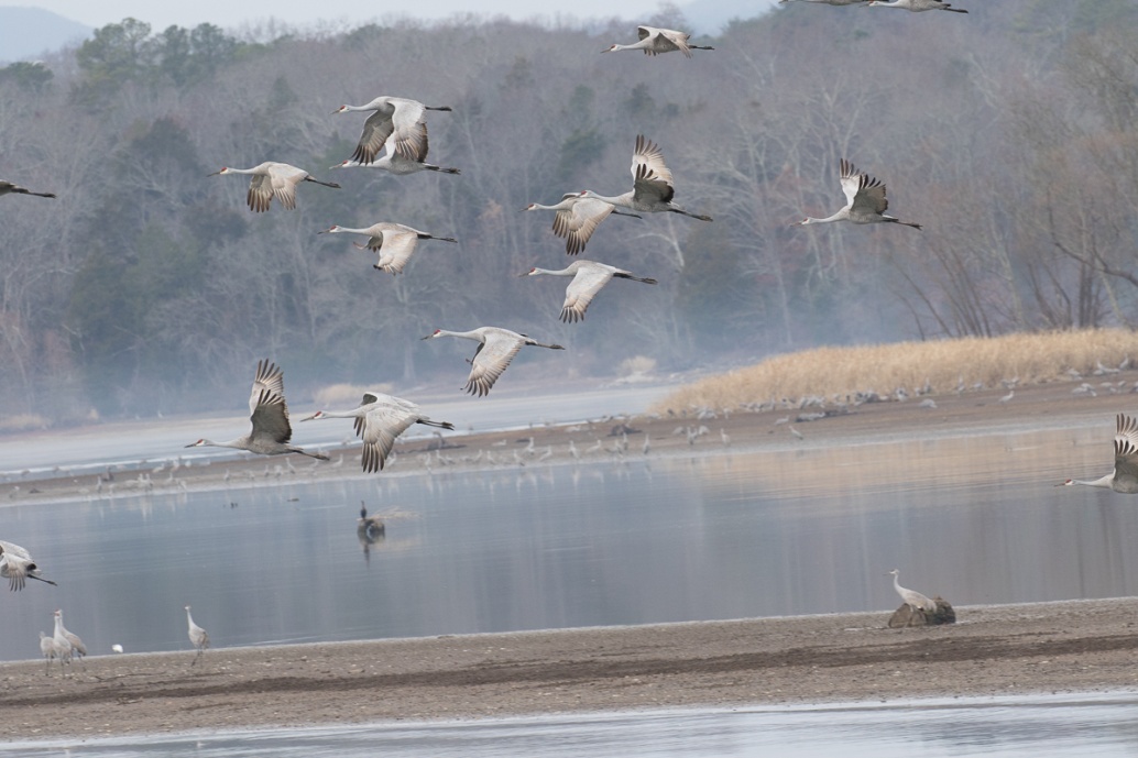
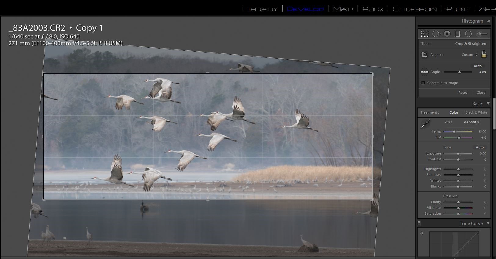
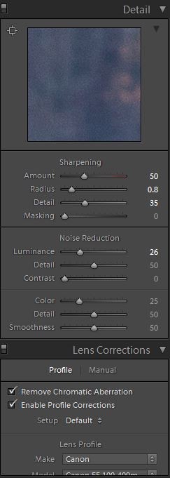
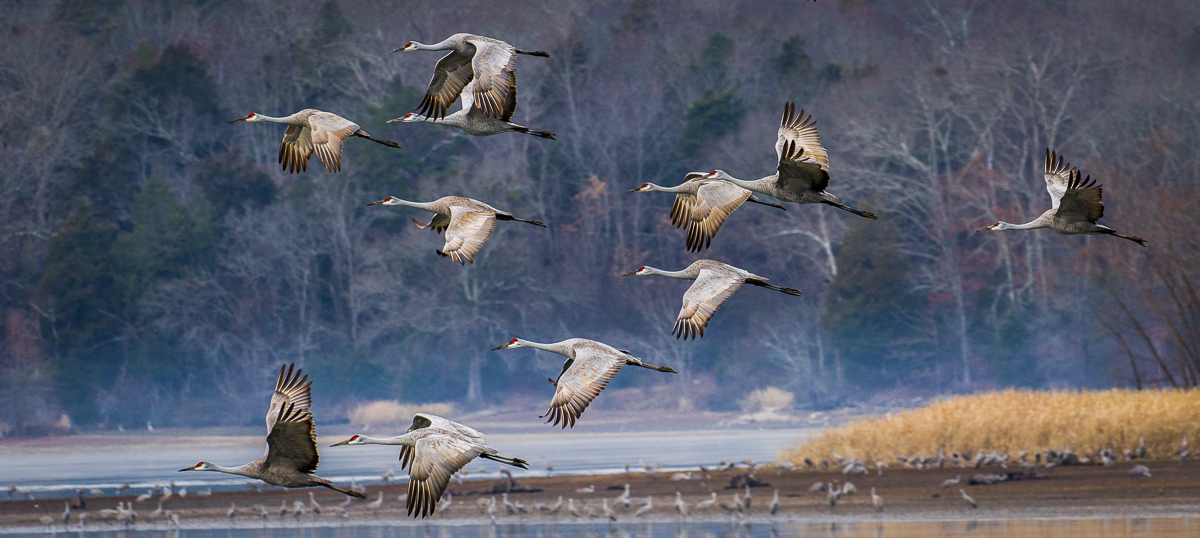
Here is one more quick example. This shot of Sandhill cranes in flight was made on a very overcast day which caused it to have very low contrast. I was also shooting quickly from a moving boat and the horizon is badly tilted. Here is the SOOC image.
I like to fix the really annoying errors that distract me before I do even the basic edits. In this case it was the badly tilted horizon and cropping. I selected the crop tool and then the level tool and drew a line across the waterline to fix the tilt. Then I cropped in on the main flight of cranes and eliminated the partial birds and the foreground elements that didn’t add to the image. You don’t have to keep the original perspective or keep to the standard picture frame dimensions. Here I preferred a panoramic format.
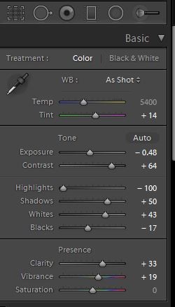
Now that the cropping and horizon are fixed, it’s easier to see what needs to be done. I first adjusted the white and black points as described above. Then I decreased the exposure by about 1/2 stop, and made a large increase in contrast to +64. I decreased the highlights and increased shadow exposure a bit. I added some clarity for details, and added +19 of vibrance to bring out the cranes’ red heads.
I increased sharpness from Lightroom’s default 25 up to 50 and checked lens profile and chromatic aberration. Since this image was shot at a high ISO to allow a fast shutter speed, I also increased luminance noise reduction from the default of 0 up to 25.
Here is the final image with corrections.
So now you see how much an image can be improved with just basic adjustments – no Photoshop magic, no “cheating”.
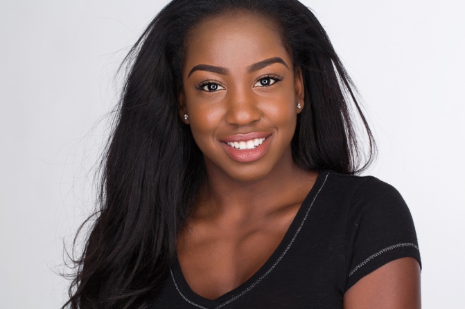
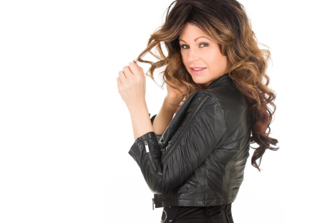
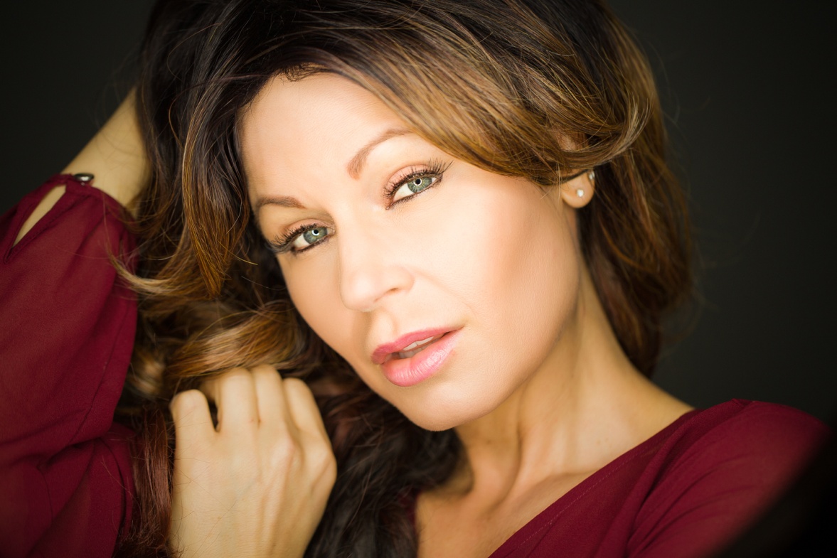
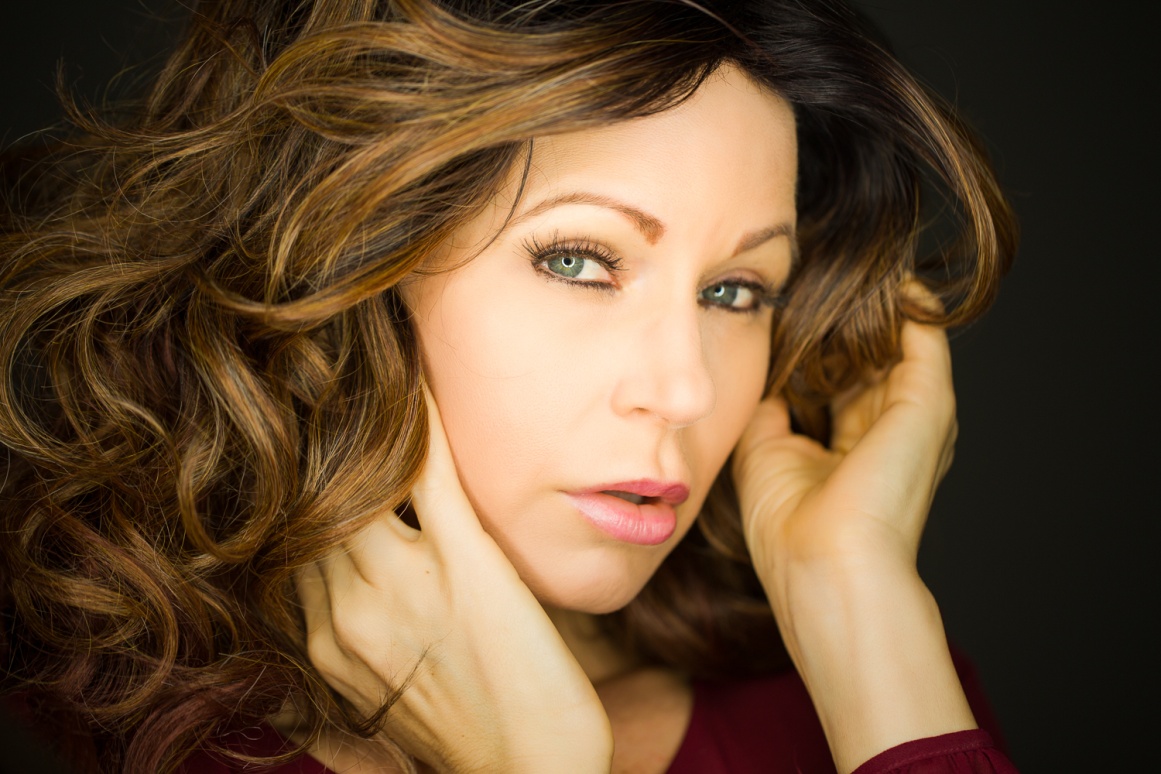
Headshots for actors or models are much different from a standard portrait. Portrait lighting tends to use direction and shadow to sculpt the face, and allows the subject very little freedom to move once the lights are set. The lighting setup I’m about to describe is loosely based on the lighting setup used by Peter Hurley, one of the masters of the headshot. It is soft and flattering to the skin and allows the subject a lot of freedom to move. Once the lights and subject are in place, you don’t have spend a lot of time critically examining how the light is striking your subject, and your subject doesn’t have to be as stiff as a mannequin, so both of you are free to work on interacting and getting a good variety of expressions. The one potential disadvantage of this setup is that it is very flat, shadowless lighting. Without shadows we lose some the shape of the face and a round or heavy face will look even rounder or heavier. In a beauty or glamour headshot we would compensate by using makeup to create the contouring and dimension that flat light doesn’t provide. But actor’s headshots usually avoid heavy makeup since the intent is show how the person actually looks.
Part of the Peter Hurley look is that his headshots are shot in horizontal format, and the top of the head is cropped off. Not what we were taught in photography class, but it works.
The setup I use starts with a 24×30 inch softbox on a boom arm above and centered in front of the model. On each side of the softbox I place a 12×60 inch stripbox positioned vertically and touching the softbox on each side. Below the center softbox I have a 22 inch silver reflector disk to fill in shadows from below. I usually shoot on a white background lit by two softboxes. With the power on the background lights high I can make the background pure white. By decreasing the power of the background lights I can get varying shades of gray.
My last few articles have been all about cheap lighting, but as I normally use this setup in my studio it is not a cheap setup. That’s because I’m using four White lightning Ultra 600’s, one Alien Bee 800, and five softboxes. All of it together is probably $2500, definitely not cheap. However, you can buy fairly inexpensive softboxes and stripboxes for speedlites, and use basic speedlites like the Yongnuo 560 IV and duplicate the look for under $600. Maybe that isn’t cheap, but it sure beats $2500.
Here is a diagram of the basic setup.
Here is how the setup looks from the models perspective.
And here are the kinds of shots that result. My model and I didn’t have to worry about anything but having fun creating a range of expressions. Also, just as makeup is minimal in this type of image, so is post processing, so I did very little skin and eye retouching and only removed major blemishes.
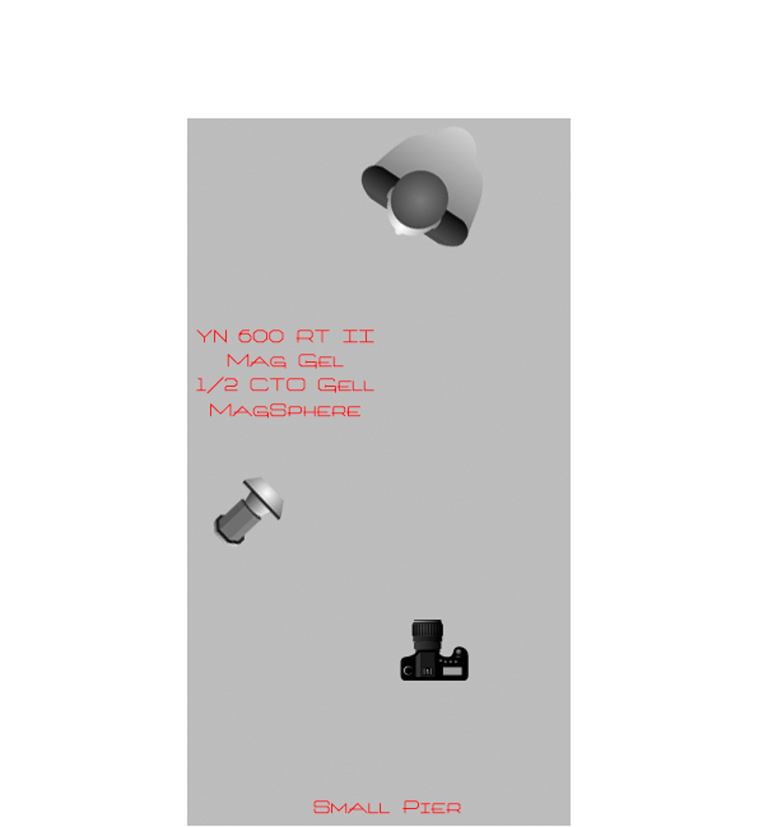
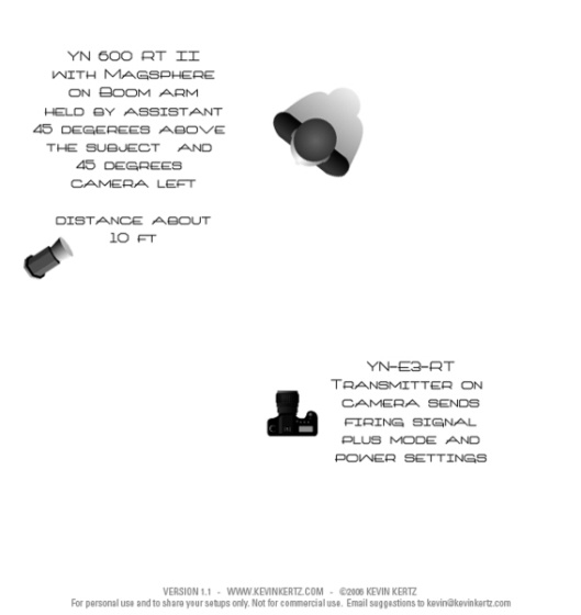
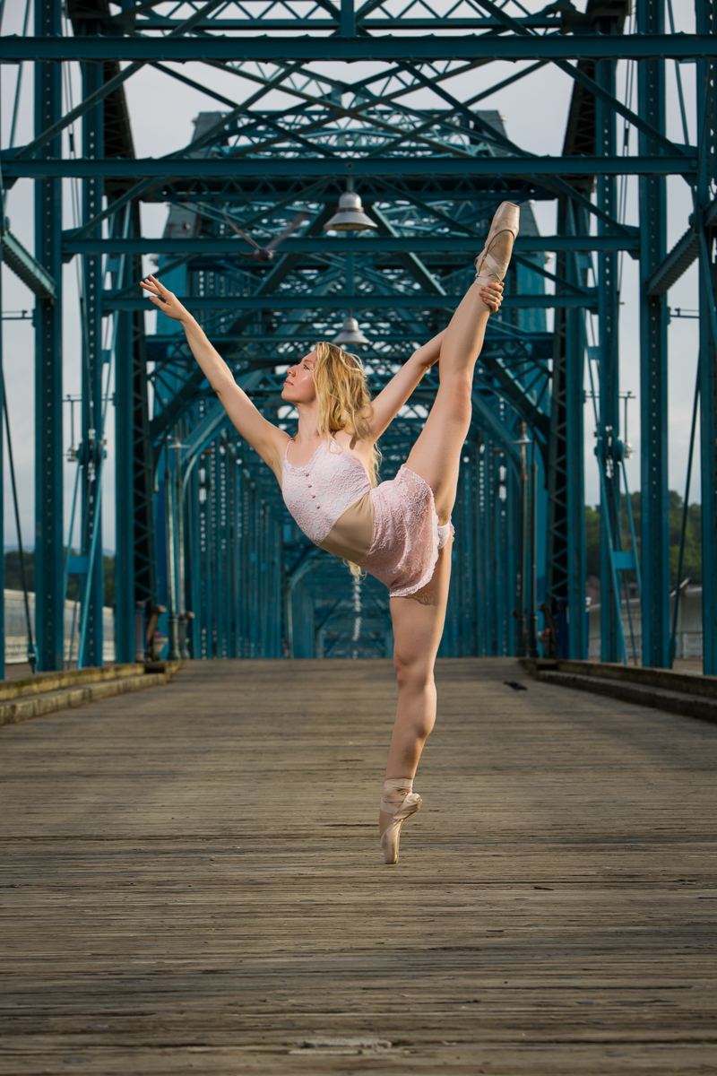
I recently had the opportunity to photograph a ballet dancer, and decided to use the shoots to experiment with both a speedlite on location and some of the new MagMod accessories. I was also using the Yongnuo 600 RT II and YN E3-RT transmitter for the first time. The main differences from the Yongnuo 560 system that I wrote about earlier are the ability to shoot in ETTL mode, and to use high speed synch (HSS) which allows the use of shutter speeds up to the camera’s fastest shutter speed. For my two location shoots I wound not using ETTL mode, or needing HSS, so anything I describe here could have been done just as well with the cheaper YN 560 system.
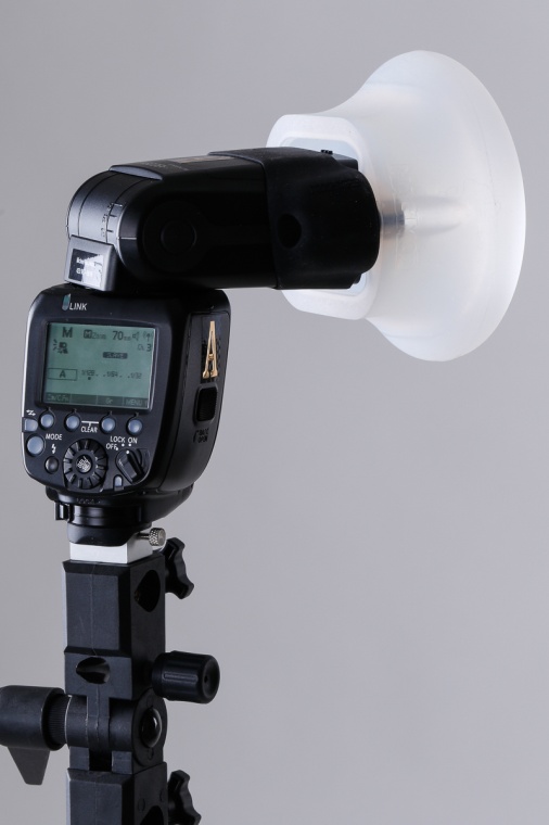
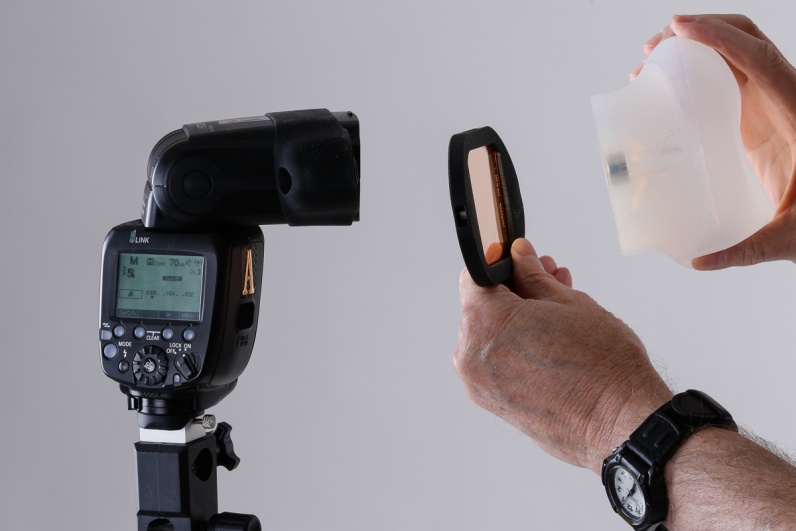
The MagMod is a modular system, consisting of a MagGrip band that stretches over the speedlite. It contains two powerful magnets which will attach to corresponding magnets on all of the accessories. The MagMod accessories I used were the MagSphere and the Mag Gel. The Magsphere is a round silicone rubber diffuser, that was originally designed to use when shooting bounce flash in small to medium sized rooms. However it works well as a diffuser when aimed directly at the subject. I chose it over an umbrella because I had more control over the spread of the light beam and also because it does not have the wind resistance of an umbrella. On my first shoot this was important because I was shooting on a pier at the lake with a breeze blowing. The Mag Gel is used to hold colored gels for color temperature balancing or for dramatic color. It can be used in conjunction with the MagSphere and other modifiers. You can find out more about the MagMod system at their website: http://magnetmod.com .
Figure The MagSphere
Figure 2 The MagSphere used with a Mag Gel
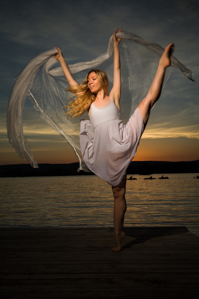
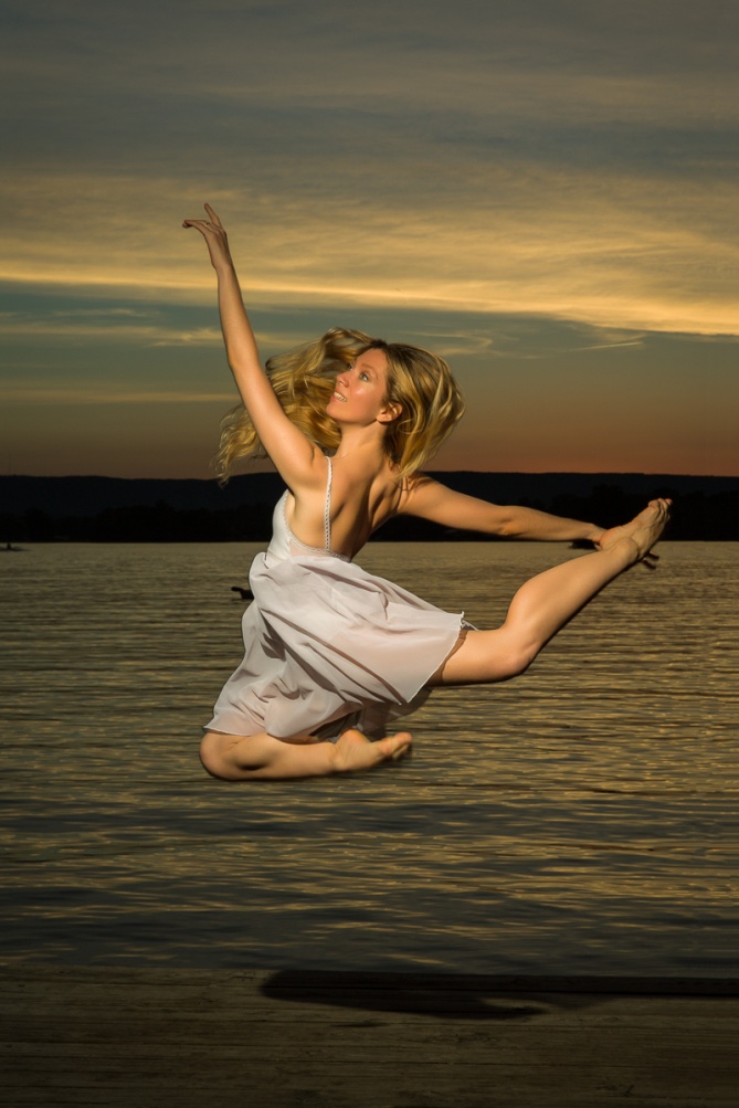
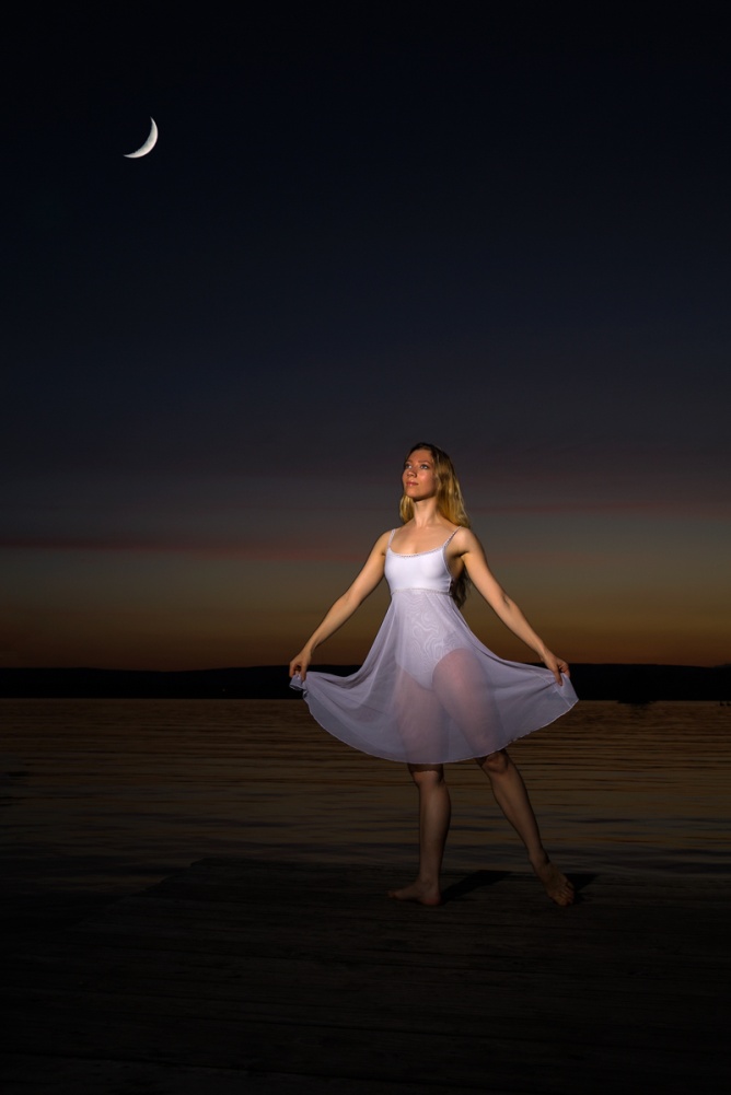
On the first evening we went to Chester Frost Park in Hixson, just as the sun set. I didn’t have an assistant, so I used a light stand. I used the MagSphere and a ½ CTO gel in the Mag Gel. This gel warmed the light up to match the color of the flash to the color and mood of the sunset. When using speedlite outdoors, the power of the flash controls the aperture, while the ambient light is controlled by the shutter speed. My general setting is to choose manual mode, an aperture of f/8 or f/11 and then select a shutter speed that underexposes the ambient by 1 or 2 stops to make the colors richer and more saturated and to help separate the model who is lit by the strobe. I then adjust the power of the speedlite until the model is properly exposed. As long as the distance between the model and speedlite is constant, I don’t need to adjust the aperture or power again. As the ambient light decreases, I do need to use slower shutter speeds to maintain the balance of light. Right after sunset I was using a shutter speed of 1/200 sec and by the time it was too dim to focus I was down to 1/30 sec.
You will notice a couple of interesting effects of mixing flash and dim ambient. Even though I’m at a slow shutter speed, the speed of the flash is fast enough to stop ALMOST all movement. You will see a shadow behind the model which is caused by her movement blocking out the ambient light. There is no way she was casting a shadow on the sky miles away. But it does create an interesting effect and almost makes it appear she was in front of a painted background. Also you will notice that most of the model is sharp, but her feet still tend to blur a bit because they are moving faster than her body.
Figure Speedlite and MagSphere and 1/2 CTO
Figure 4 1/200 f/8 ISO 100
Figure 5 1/100 f/11 ISO 100
Figure 6 1/40 F/8 ISO 100
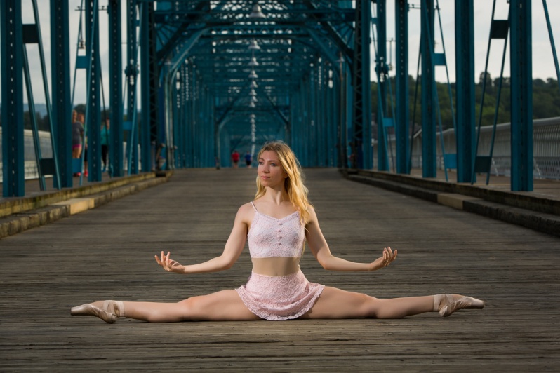
On Monday morning I had Tom Angsten join us downtown and we shot on the Walnut Street bridge and around the aquarium. Rather than having to use a lightstand and constantly adjust it Tom acted as a voice activated Lightstand (VAL). This allowed us to shoot much more efficiently, which was important in the rapidly changing light. We shot in everything from bright direct sunlight after sunrise, to open shade to shade plus heavy overcast. Usually the light was about 45 degrees camera left and 45 degrees above the model. There was one shot where the natural sunlight was nice, and I used the speedlite and MagSphere as an on camera fill, at about 1 stop less than the ambient.
Mixing flash and ambient daylight, and most importantly, getting the flash off camera opens up a huge range of possibilities. All it takes is a speedlite with adjustable power, and a transmitter to trigger it from the camera. So grab your speedlite and go outside and play.
I recently got a 19 inch Flashpoint fluorescent ringlight. I’ve been looking at getting one for a couple of years, but finally broke down and bought one when I found it on on special at Adorama for $90 (Regularly $140). I bought the 19 inch model, but there is also a smaller (and cheaper) 13 inch model. The 19 inch allows a little more flexibility in shooting and should provide a larger catchlight in the eye. There are several brands (and prices) available, but all should work similarly. A fluorescent ringlight is suitable for tight head and shoulder portraits. It creates a distinctive circular catchlight in the eye. Some people will see the round catchlight as unnatural, but it is common in fashion photography.
One of the big advantages of a ringlight is that the light is direct and frontal and tends to minimize imperfections in the skin. A disadvantage is that it doesn’t create the shadows that define the shape of the face. Your subject may have to do more contouring than usual with makeup. Which also brings up the point that this light is most often used as a type of beauty lighting for females. It will probably not look appropriate for a male face.
This light is probably different from any light you have used before, so here are some tips.
The light is daylight balanced, but I used my Color Checker Passport to create a custom color profile for it with all of my cameras. If you don’t use custom profiles, shoot a gray card in the first shot and use it to set the white balance.
A fluorescent ringlight may seem bright, but it is relatively weak. It must be close to the model, and you will need to shoot at a high ISO and a wide aperture. With the light 24 inches from my subject I am at about 1/250 sec, f/2.8 and ISO 400. Also, you need to shoot in a dark room, as any other light sources will affect color balance and shadows. You can use an incident light meter or just use your camera’s metering. If you do this, use aperture priority, a wide aperture, and shoot a test shot. If the exposure is not right dial in some exposure compensation and retest until it looks right. Or you could use manual exposure mode.
For the most even light on the face, and the roundest catchlight, set the light at the same height as the face and square on to the subject. You will be shooting through the center of the ring.
The distance of the light to the subject will affect three things. The first is the obvious change in exposure; the closer the light, the brighter; the further away the darker. Second, and less obvious is light falloff. The closer the light is, the more rapidly exposure falls from the front to the back of the subject, so the tip of the nose might be just right while the ears are dark. Third is the size of that round catchlight in the eye. The closer the light, the larger the catchlight.
Below you can see a couple of setup shots and the lighting effect a ringlight produces.
While it may look similar, a fluorescent ringlight is quite different from a ringflash. Ringflashes are larger, heavier, more expensive , and much more powerful. Ringflashes are often used in fashion photography and you’ve seen full length or 3/4 length shots with flat light and a fine line of shadow that surrounds the subject. You could use a ringflash for a portrait, but it’s powerful output would be uncomfortable, if not painful to the model. Because of their low power, a ringlight can’t shoot a full or 3/4 length shot like a ringflash can (see below).
Let’s forget about speedlites, strobes and reflectors, and talk about some really cheap lighting – candles. With a little attention to detail, and the sensitivity of modern sensors, it is fairly easy to shoot good portraits by candle light.
By their nature, candles aren’t very bright. So to increase the light, keep these points in mind; the closer the light, the brighter, and the more candles the brighter. Remember you’re working with open flames, so watch out for burning hair, skin, clothes or any nearby flammable materials. Have the candles securely mounted so they won’t fall and ignite your model or home. Having a fire extinguisher close at hand would be a good idea.
People look best with light coming from slightly above the face. Lighting from below the face results in “monster lighting” and while it may be the natural position of a candle it’s not often flattering. I prefer to have my model hold the candelabra and move it around until I like the light on the face. And I should mention to shoot in an otherwise dark room. Even dim household lighting will completely overpower candle light.
The color temperature of candles is low on the Kelvin scale. You might try auto white balance (AWB) or I usually set tungsten balance in the camera. Regardless of your camera setting you will most likely have to adjust the color balance in post processing. You can make this much easier and more accurate by shooting a shot with the model holding a gray card at the start of your session and using that to set your white balance for all of the shots in post processing.
You will most likely need to use a very high ISO like 3200, 6400 or even higher, and be at a wide aperture to be able to hand hold. Just realize and accept that there will be some noise in your images. If you have a choice use a tripod but remember that while a tripod will hold your camera steady at slow shutter speeds, your subject may move and be blurred. Try to keep your shutter speeds above 1/30 sec or preferably 1/60.
The combination of very low light and shallow depth of field make focusing critical and difficult. Shoot a lot of images and expect some out of focus shots. Also with very shallow depth of field, both eyes may not be in focus. If this is the case, it’s important that the eye closest to the camera is in focus.
It may take some practice to get everything right, but portraits by candle light can be very romantic and moody so they are worth the effort.
For the shots below, I found a 3 candle candelabra at a thrift store for $5 and three candles for about $1 each. That’s lighting for under $10! The first picture was shot with a Canon 5D Mark III and an 85mm lens; the second shot was with a Canon 5D Mark II and an 85mm lens and the third with a Canon 5D Mark II and an 135mm lens with a star filter.
The image below was the first portrait I ever did by candle light. And it was the ultimate in cheap – the model brought the candles. The starbursts that you see with pinpoints of light usually don’t appear until the lens is stopped down to f/16 or f/22, and that is never going to work for a candle light portrait. For this shot I used a six point star filter which has lines engraved in the glass to produce the stars and the diffraction colors. It also softened the image slightly and decreased contrast. Today I would probably not shoot with the star filter, but would add them later in post production with Topaz Star Effects. This shot was done with a with a Canon 5D Mark II and an 85mm lens.
So go find some candles, candle holders and a subject and start experimenting. Your subject doesn’t even have to be a model either; I’ve seen beautiful, moody still life images illuminated only by candle light.