Here we’ll take a look at what’s known as beauty or glamour lighting. This is commonly used for fashion and beauty headshots. You’ll see this look almost every time you see a close-up image of a female actress or model on a magazine cover.
The lighting is very simple, just a light source like a beauty dish or softbox centered in front of the model and roughly 45 degrees above and a reflector or another softbox below the models face to fill in shadows. The magic of this light is that it is so shadowless that blemishes and imperfections almost disappear. The disadvantage is that we normally use highlights and shadows to show the shape and dimensions of a face, and we can use shadows to slim a round or wide face. Because there are no shadows, this light can make a face look heavier, so it works best on thin faces. Also without shadows, the structure of the cheek bones disappears and must be added back by heavier than normal makeup contouring. It is important not to raise the light so high that the eyes go dark and don’t have catch lights in them.
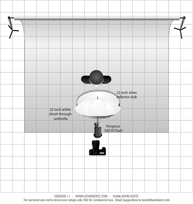
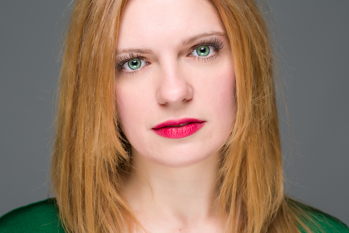
So here are a couple of ways to get the look inexpensively using a speedlite. In our first example I’m using a 32″ white shoot through umbrella as my light source. It is just mounted on a plain stand, and I’m shooting with my camera lens right below the edge of the umbrella. The shadows are filled from below with a 22″ silver reflector which is actually being held by the model. Not only is this cheaper than mounting the reflector on a stand, but the model can adjust the angle of the reflector while you watch for the most effect on filling shadows. Below is the lighting diagram and the resulting image. All of the images were shot with a Canon 5D Mark III and a Canon 100mm Macro lens.
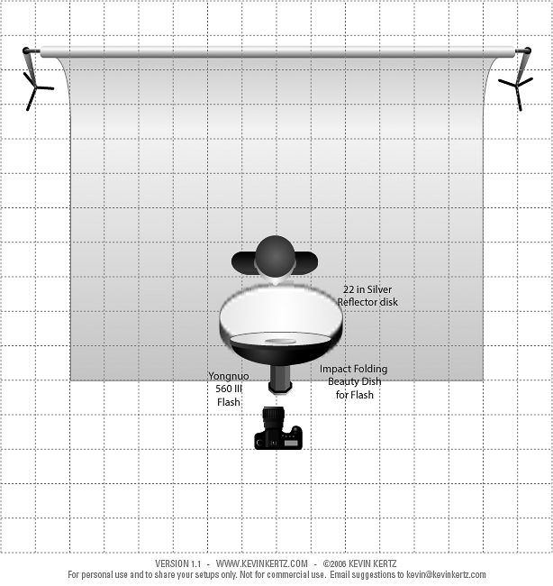
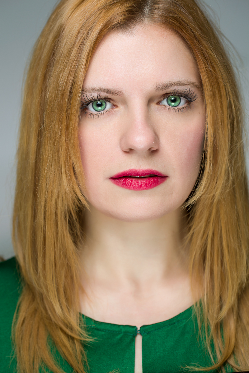
The next setup is very similar, except the shoot through umbrella has been replaced by the Impact folding beauty dish (see Part 1 for a picture). Once again I’m shooting from just below the edge of the beauty dish. Here is the lighting diagram and final image.
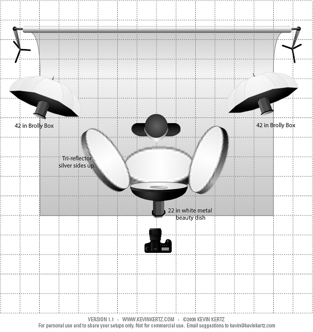
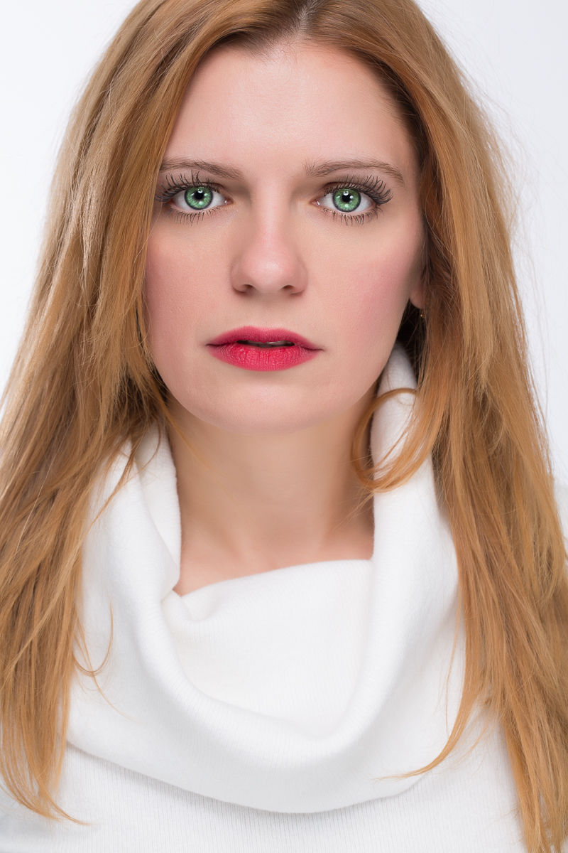
This last shot was done with studio strobes and a specialized reflector call a Triflector that has a lower silver panel and two side silver reflectors that can each be adjusted to fill shadows from below and on each side of the face. Look closely at the catch lights in the eyes and you’ll see the reflections of the 3 panels. This reflector has to be mounted on a sturdy stand. The light was in a 22″ white metal beauty dish which had to be mounted on a heavy duty boom stand. I’ve added two additional lights in softboxes lighting the background so that it would appear lighter. Again here is the lighting diagram and result.
So once again I lit similar shots using $140 for the shoot through umbrella shot, $210 for the folding beauty dish shot or almost $2200 for the studio equipment shots but all of the results are very similar. So don’t be fooled into thinking that you have to have a lot of expensive gear to shoot a good beauty headshot. What’s important is the direction and quality of the light and the knowledge and skill of the photographer.
In part 4 of this series we’ll look at some extremely cheap lighting for portraits.
In this article I’ll show you a basic portrait lighting set using only a single flash and a reflector. I’ll also show you a similar shot using studio strobes and a reflector. Hopefully you’ll agree that the results are similar, especially when you consider the cost difference.
A very basic portrait lighting consists of a softbox (or umbrella) aimed at the subject from roughly 45 degrees from the side and 45 degrees above. The light is adjusted by watching the nose shadow and making sure the eyes are not in shadow. In the last article I mentioned that the larger the light source in relation to the size of the model, the softer the shadow transition and the less harsh the light appears. Here I used the 32″ Neewer octagonal softbox with a 560III flash inside and placed close to the model. I used a 22 silver reflector disk on the side of the model opposite the light to fill in the shadows. The softbox is somewhat in front of the model to allow light to wrap around her face and create a gradual transition from highlight to shadow. Also the light is aimed past her rather than directly at her to use the more indirect light and again create a softer effect. Here is a diagram of my lighting setup, and the resulting image is below that. Both images were shot with a Canon 5D Mark III and a Canon 100mm Macro lens.
For comparison, here is a similar shot with studio strobes. Here I’m using a White Lightning Ultra 1800, inside a 7 foot Photflex Octabox. I’m using a 5 foot Photoflex silver reflector, and I’ve added a second strobe in a 4 ft by 1 ft strip box with a directional grid to highlight her hair from about 45 degrees behind her. But the basic lighting on her face is similar. Below are the lighting setup and the resulting image.
The lesson I hope you learn from this is that it doesn’t always take the most expensive and elaborate equipment to produce a good picture. Far more important is understanding whatever lighting equipment you work with and knowing how to place it. The studio gear certainly looks impressive, has lots of conveniences, and the modeling lights really make placing the lights easier, but the studio shot used almost $1700 in equipment. All of the gear for the speedlite shot was under $130. To your camera’s sensor (or film) light is just light. The camera doesn’t know or care where the light came from. 99% of subjects will never care what kind of lighting gear you used, they only care that you make them look good. And the 1% who will care are photographers, and we all know you can’t please them.
In Part 3 of this series, we’ll look at using speedlites for beauty lighting.
If you have used or looked at buying studio strobes, you know how expensive they can be. When you start adding on accessories and light modifiers, the cost can quickly skyrocket. Also shooting on location with studio strobes can be difficult for many reasons; the lights and stands are heavy, they require electrical power which may not be available on location, or require heavy batteries and inverters. The two biggest advantages of studio strobes are lots of power and modeling lights which allow you to preview your lighting.
Speedlites and Accessories
If you want to get into lighting more cheaply or want a more portable location kit and are willing to work without modeling lights, speedlites (small flashes) may be a good, cheap alternative. With our ability to quickly review the image on a digital camera it should be possible to adjust your light placement with a couple of test shots. Exposure can be metered with a flash meter for the greatest accuracy or judged on the image with some trial and error. If the exposure on the subject is too dark, increase the power of the flash. If the flash is already at full power then open the aperture (lower f-stop number). If the subject is too bright decrease power or close down the aperture.
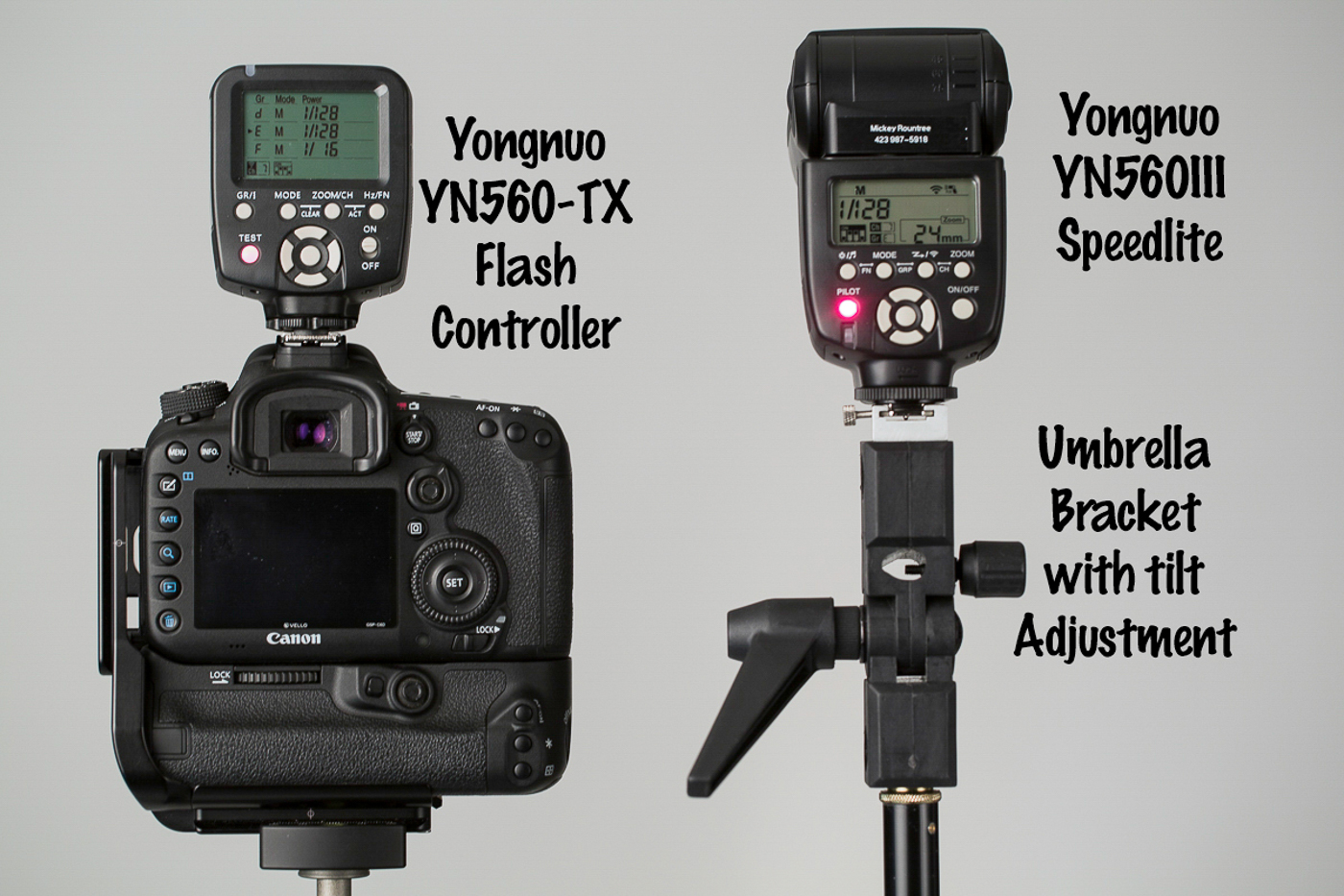
Now here is where we begin to really get cheap. The top of the line speedlites from the major brands can easily cost $600 each. They feature TTL (Through the Lens) flash metering which can be wonderful when it works, but it can also be difficult to understand and hard to troubleshoot when using multiple lights off camera. I put together a kit using Yongnuo 560III (the current model is the 560IV) speedlites. Each flash is about $65 and the controller that makes this such a useful system is only about $40. While my system uses the Yongnuo flashes, there are several other inexpensive brands if you search the camera stores or even Amazon.
Why so cheap you ask? First there is no TTL. To change the exposure output you must manually increase or decrease the power of the flash and you can do that on the flash or from the controller which mounts on the camera. The build quality may not be as good as the major brands, but at 10% of the cost of the name brand, replacing an occasional flash won’t break the bank. Also dropping or having the wind blow a flash over and breaking it won’t ruin your day. And at this price you can afford to buy several for multi-light setups and backups.
The 560TX controller attaches to the camera hot shoe. It sends out a radio signal that fires the flash, and can also remotely increase or decrease the power of each flash and zoom the head in or out. In use, all of your flashes should be set to the same channel so the controller fires them all at once. Each flash is assigned a group (a,b,c,d,e or f) and you can have several flashes share a group if you want the settings for all flashes in that group to be the same. Changes in flash power or zoom are made individually by group. Using the controller is very useful when the flash is hard to reach or contained in a soft box. I have found that there is a slight time delay with the wireless controller, so you may have to use a slightly lower maximum shutter speed. For example my Canon camera lists a synch speed of 1/250 sec, but with the controller I have to set 1/160 or slower.
Each flash uses 4 AA batteries. You can (and should) buy an external battery pack that holds an additional 8 AA’s. These increase the number of shots you can take and also decrease the recycle time. Be careful because shooting a lot of full power flashes in succession with short recycle times may cause the flash to overheat. If you’re lucky a safety feature will cause the flash to shut down until the electronics cool down. If you aren’t so lucky the flash may be permanently destroyed. Using disposable batteries gets expensive fast. Buy Eneloop rechargeable batteries and get a high quality charger like the Powerex which can charge 8 batteries at a time. The Eneloops can maintain a charge for months, unlike most rechargeables that drain down rapidly even without being used.
To use your speedlites off camera you will need a light stand for each flash. Because speedlites are so light weight you don’t need the heavy and expensive stands required for studio strobes. A 7ft stand is tall enough for most uses. I was able to but 4 7ft. stands on Craigslist for $8/ea. Even new they should be under $30. You will also need an umbrella mount for each stand. These are $10-20. Even if you don’t plan to use an umbrella this is what will allow you to tilt your flash up or down and provides the means of attaching the flash to the stand.
Light Modifiers
Modifiers are used to alter the quality and spread of light. The larger the light source is in relation to the subject the softer the light quality will be. Smaller light sources are harder and may cast shadows that are unpleasantly harsh for portraits, but may add drama and mood for other uses. A flash with no modifier is a small and harsh source.
ExpoImaging makes the Rogue Flashbenders and grids. The flashbender acts as a larger reflector to soften the light. They also have accessories to convert this into a small softbox. Grids are used to minimize the spread of light and are used for adding accents lights with a lot of control.
Umbrellas are just modifications of the basic rain umbrella. They come in varying sizes, and materials. There are white or silver reflective where the flash is aimed into the umbrella and bounces out toward the subject. With white shoot through umbrellas, the closed side of the umbrella faces the subject and the light is fired through the umbrella. The major advantages of umbrellas are low cost ($10-50), light weight, and compact storage and transport. The two major disadvantages are difficulty controlling the spread of light and they become wind sails with even the lightest breeze. Either use sandbags to weight your light stands outdoors, or better yet have an assistant constantly holding the stand.
Soft boxes do just what they say and enclose the flash in a an enclosed box. They can be square, rectangular, or octagonal. Softboxes for speedlites can be made light, compact and relatively cheap. The Impact Quickbox is a folding soft box that folds down flat and is popped out to form a 24″ square softbox with a mount that holds a flash and attaches to the stand. It is normally $135 but you can find it on sale sometime for as low as $85. I found a 32″ Octagonal softbox by Neewer on sale at Amazon for only $35. The construction is light weight, but should be very usable if taken care of. It folds down and stores like an umbrella. Like umbrellas, softboxes offer a lot of surface area that is easily blown by even minor breezes.
Beauty dishes offer a light quality with more control than an umbrella, and a slightly crisper look than a softbox. The light comes in from the back of the dish, strikes a reflector that blocks light from striking the subject directly and spreads it across the whole face of the dish and on to the subject. For several years they have been all the rage for beauty headshots and even full length fashion photography. Impact makes a folding beauty dish that is fairly light and compact for around $80. I found a metal beauty dish with adaptor and mount for a speedlight on sale for $50, but it is normally closer to $100. Metal beauty dishes are large, heavy and easily dented. Both folding and metal beauty dishes catch the wind, but are a little more aerodynamic than umbrellas and softboxes.
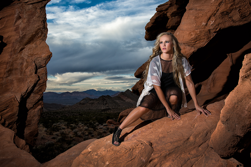
The shot below was taken with a single flash with no modifier placed about 6 feet from the model. Normally I would use a modifier to soften the light when photographing a female subject, but in this case there were several reasons that I didn’t. She was young, with great skin and professionally applied makeup, so there were no imperfections to exaggerate with harsh light. She was in the shadow of some large rocks, and I wanted the light to look more like the low sun lighting the background. Also I needed all the power I could get out of the strobe, and most modifiers cause at least a one stop loss of light. And perhaps most importantly my flash was on a stand at full extension, balanced precariously on a large rock. I didn’t want a breeze to blow my flash crashing to the rocks below and a modifier would have made the wind more likely to do just that.
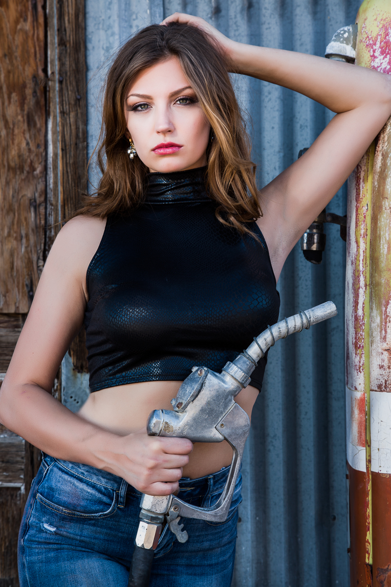
The shot below was taken in the shade of an old gas station. The light was soft, but flat and nondirectional. I added a flash with the Rogue Flashbender to light the model, add some directional light and keep her eyes from disappearing into shadow. The Flashbender helped soften the light and prevent harsh and unflattering shadows.
In part 2 we’ll look at a basic portrait setup using just one speedlite, and compare it to studio strobes.
Panoramas are a great way to show a wider view in landscape and cityscape photography. A panorama is made by taking several overlapping images and stitching them together into one wide image. It’s easy to do a panorama in Lightroom or Photoshop, but I’ll concentrate on Lightroom in this article. And we can also do a panorama of HDR images. All of the principles are the same, we just have several bracketed images that we combine into single images and then combine them into a single panorama.
When you shoot your images for a panorama, start at one end of your scene and shoot an image (or in the case of an HDR Pano a bracketed series), pan over leaving about a 20% overlap, shoot and repeat until you have covered the view you want. I usually look for a feature near the edge of a shot, and make sure it is at the edge of the next image. I tend to shoot from left to right, but the software will work if you shoot right to left also. Also just as in HDR brackets, it is important that the aperture and focus stay constant. The software today is so good it can combine even hand held shots, but I think you will have the best results if shoot on a tripod that has been carefully leveled. That is especially important shooting an HDR panorama.
In addition to combining physical features, the software will attempt to match exposure and colors. That works best if you shoot your exposures in manual mode. If you shoot in an automatic mode like aperture priority, the exposure will change as you move through brighter and darker areas of the scene and there may be obvious bands in the sky where two pictures join. I try to pick an exposure in a part of the image that is not the brightest or darkest part, and bracket around that.
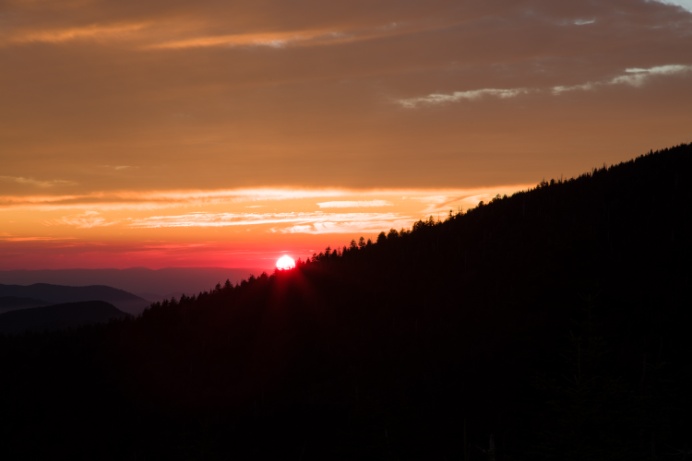
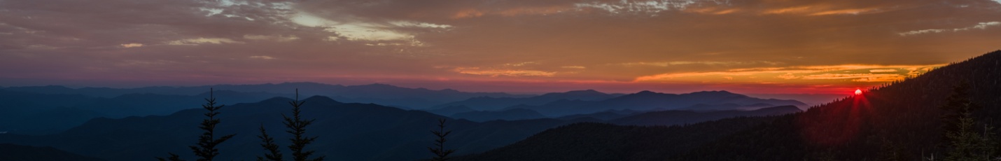
I’ll be showing you the steps in creating an HDR panorama. For this image I shot 25 total images, 5 scenes with 5 brackets (From -4 to +4) each. I set my camera to manual mode and took a meter reading from the center of the scene which was neither the darkest or lightest area. My metered exposure was 1/25 sec at f16 at ISO. My brackets then were 1/400 sec, 1/100 sec, 1/25 sec, 1/6 sec and .6 sec. I combined each set of brackets into an HDR image in Lightroom as I covered in part 3 of my series. I made no edits whatsoever, I only created the HDR DNG files. Again that’s important so that the tones in the sky match up well.
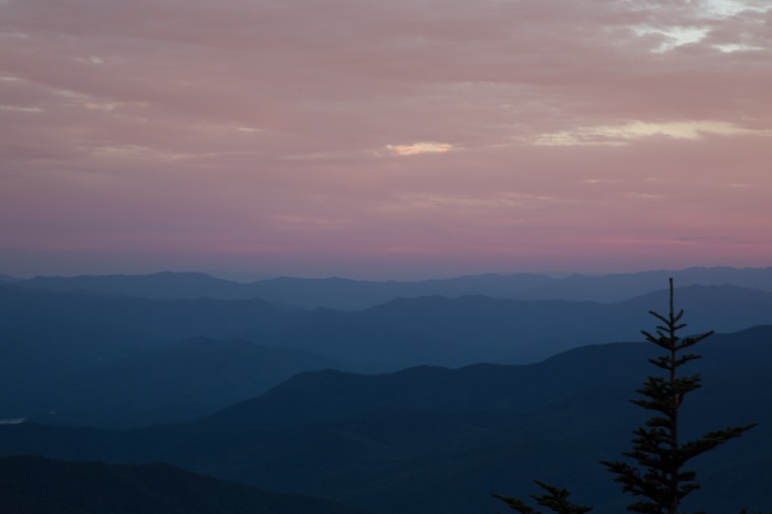
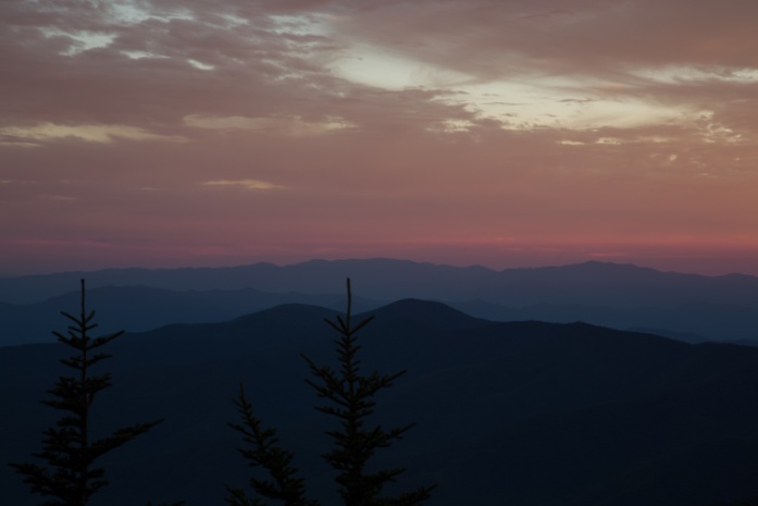
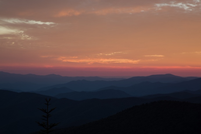
Below are the five HDR files I’ll use for the panorama.
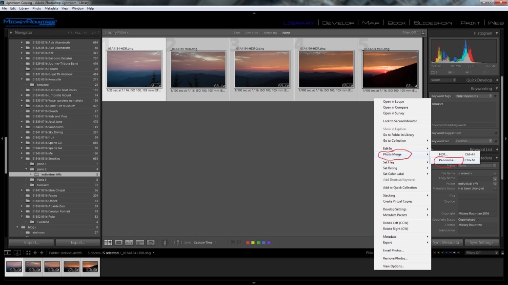
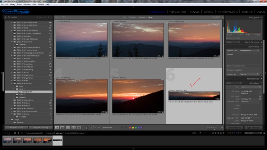
Once I had all five of these images created, I selected them in Lightroom, right clicked on them and selected Photomerge/panorama.
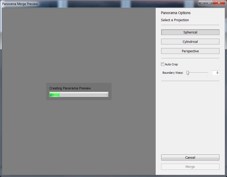
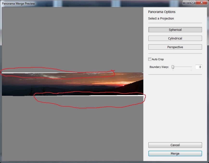
On the options screen I selected spherical, and unchecked autocrop.
Normally when the images are combined there is some distortion produced that results in the white areas in the image below. If I had selected autocrop, Lightroom would have cropped my image to delete all of these areas.
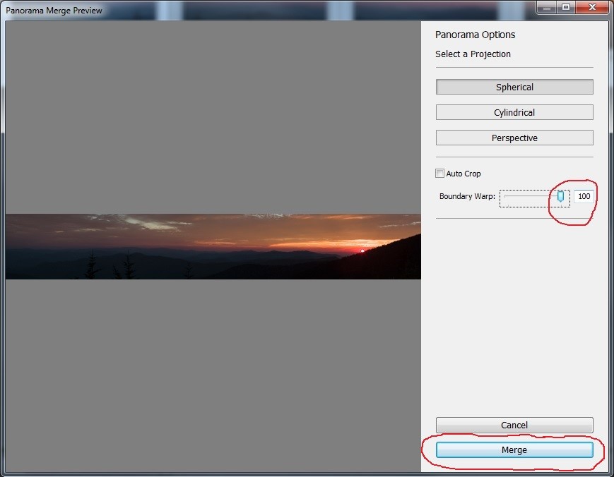
Instead I adjusted the Boundary warp area slider to 100% and those white areas were filled in as Lightroom corrected for the distortion. Hitting merge completes the process.
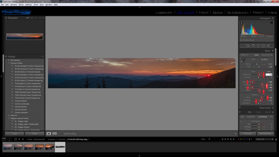
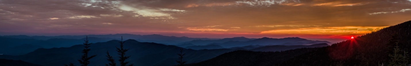
I now have an HDR panorama as shown below. But just like our previous Lightroom HDR image, it looks underexposed and pretty plain. But there is a huge range of exposure values that we don’t yet see until we do some editing to bring them out.
In the develop module I adjusted the white and black points automatically by shift-double clicking on their pointers. This increased the black point slightly and decreased the white point to -100. I completely decreased highlights, increased shadows to about 62, increased the exposure and increased clarity and vibrance.
Here is the image after my Lightroom adjustments.
From Lightroom I took the image over to Photoshop for high pass sharpening and Tonal contrast as I discussed in Part 6. And here is the finished image.
Here is another image shot with the same technique, but with 3 images, each with three brackets.
After I’ve created my HDR image, I will adjust exposure, white and black points, contrast, vibrance and color in Lightroom as in past articles, or in ACR if I’m already in Photoshop.
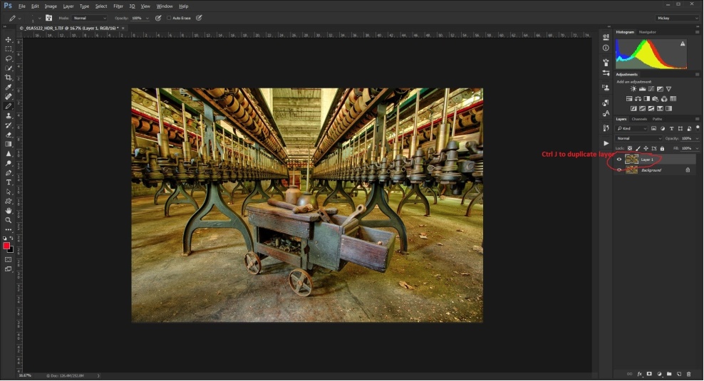
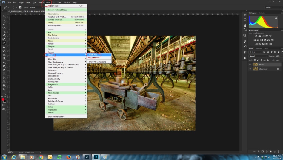
There are two things that I almost always do and occasionally I’ll add a couple of other touches. The first thing that every HDR gets is some pretty strong sharpening. For this I use the high pass sharpening technique. It’s pretty easy if you follow the steps, and since it’s so useful, you may want to create an action for it which allows you to run the process with a single click. Here is how to create an action in Photoshop.
The first step is to duplicate our base layer. The shortcut is ctrl (cmd)-J.
Next select filter/other/high pass.
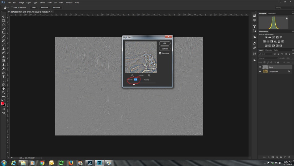
Select a radius of 5 and hit OK.
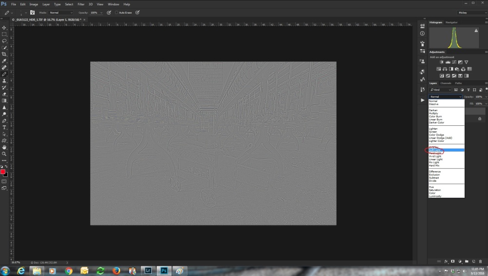
That looks pretty strange, but we’re about to fix that. Select the high pass layer and change its blend mode to soft light. You’ll see a lot of sharpening, and it seems to lighten and open up the mid tones.
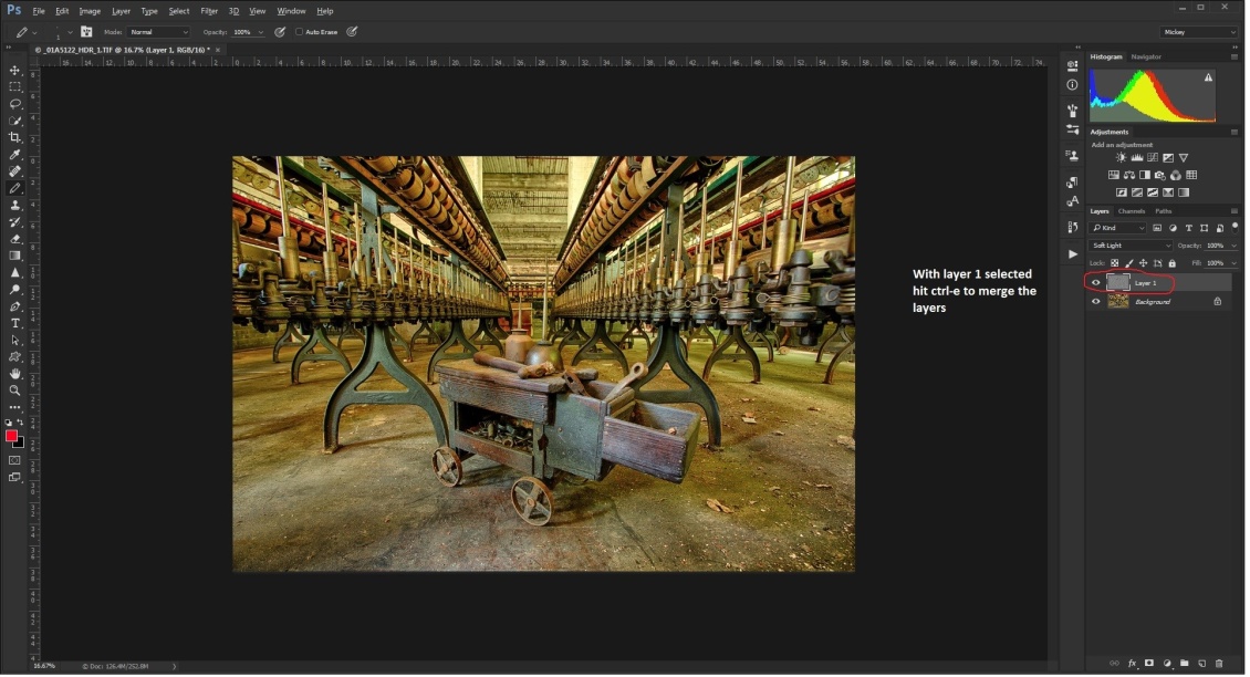
Merge the two layers with the shortcut ctrl (cmd)-e. If you want more intense sharpening there are several options. You can select hard light as the blend mode, or increase the radius. Or you can repeat the steps at the original radius and blend mode. I have made actions for both 5 and 10 pixel radius settings.
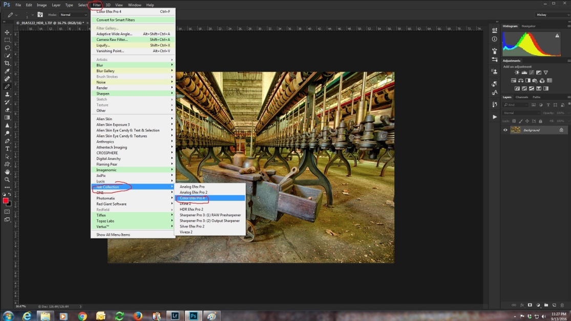
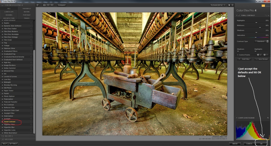
Now that we have our sharpening done, I almost always run NIK’s Color Efex (Part of the NIK Plug-ins suite, and remember it’s free) and select the tonal contrast preset.
The tonal contrast filter will create a new layer and apply the effect to this new layer. That also allows us to vary the effect by changing the opacity of the layer and even by using masks to block the effect from parts of the image. I usually accept the plug-in’s defaults and hit OK.
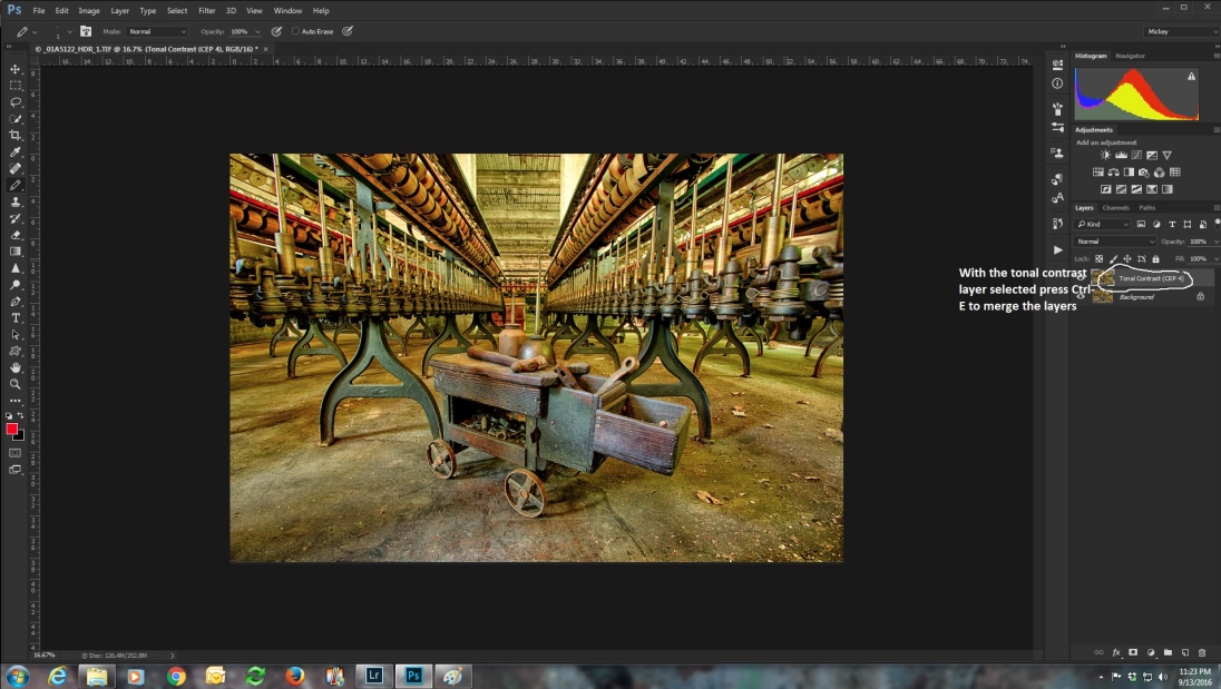
Then select the tonal contrast layer and merge the two layers with the shortcut ctrl (cmd)-e.
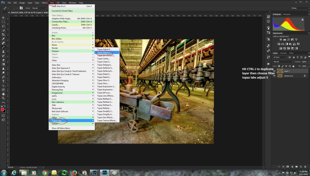
Those are the two things I do for almost every image. If I want something a little more extreme, I often run Topaz Adjust with the Spicify filter. You can purchase Topaz adjust or download a trial at:
Before running Topaz adjust, I create a duplicate layer with the shortcut ctrl (cmd)-j. That way I can vary the effect by changing the opacity of the layer, using a mask to block the effect in parts of the image, or I can just delete the layer if I don’t like the effect at all.
There is no limit to the effects you can add, but I hope these articles have given you some of the basics. There are also several other programs for creating HDR images such as Aurora, Easy HDR and HDR Projects 4.
And remember there is no one way, no right or wrong way, only the way that suits your vision for the image. As you do more and more HDR images, you will find your own style starts to emerge. So, now go out, shoot some brackets and start experimenting.
So you can see how some of the images from the earlier articles look, here are some examples.
NIK HDR Efex image with high pass sharpening and NIK Color Efex Tonal Contrast.
NIK HDR Efex image with high pass sharpening and NIK Color Efex Tonal Contrast and Topaz Adjust Spicify.
Lightroom HDR image with high pass sharpening and NIK Color Efex Tonal Contrast.
Lightroom HDR image with high pass sharpening and NIK Color Efex Tonal Contrast and Topaz Adjust Spicify.
Photomatix HDR image with high pass sharpening and NIK Color Efex Tonal Contrast.
Photomatix HDR image with high pass sharpening and NIK Color Efex Tonal Contrast and Topaz Adjust Spicify.
Adobe Photoshop has had HDR Pro built in since version CS5. I rarely ever use it because I either create my more photorealistic HDR images in Lightroom, or the wilder images in Photomatix. But here are the basic steps involved in creating an HDR within Photoshop.
Again I’ll be using the same six images we’ve worked with in the previous articles. The first step is getting you images into Photoshop HDR Pro. As usual there are a couple of ways to do this.
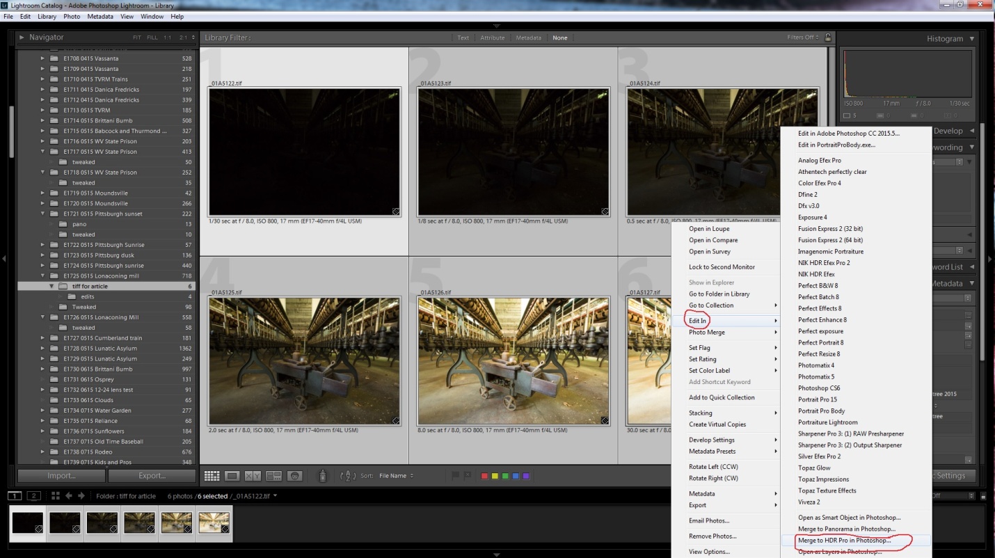
If you use Lightroom, select your images, right click and choose edit in/merge to HDR in Photoshop.
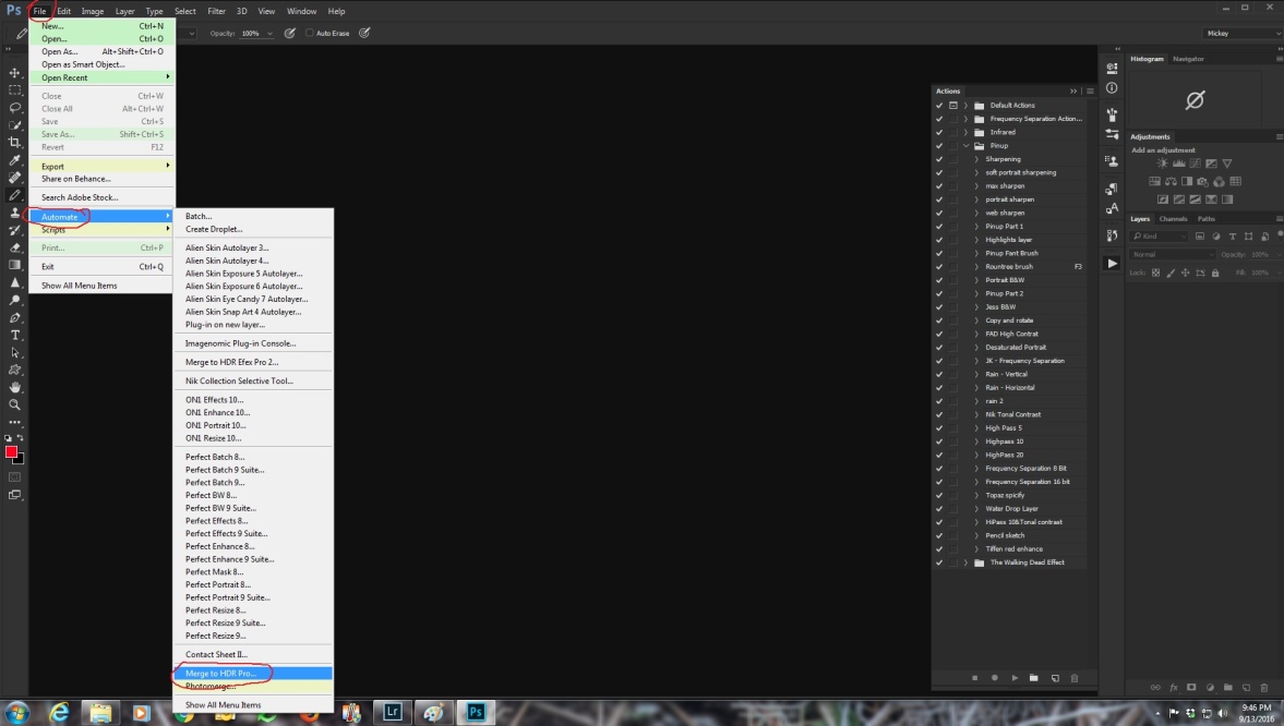
If you don’t use Lightroom, there are two ways to get your images into HDR Pro.
The first is not so obvious because it begins with file/automate/merge to HDR Pro.
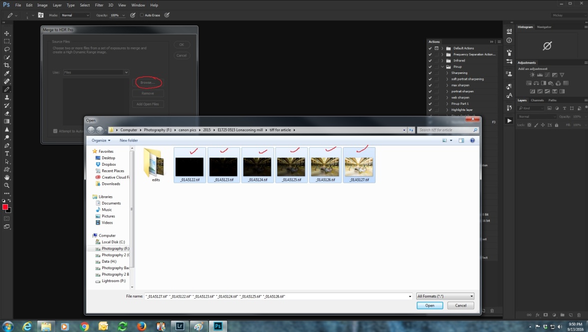
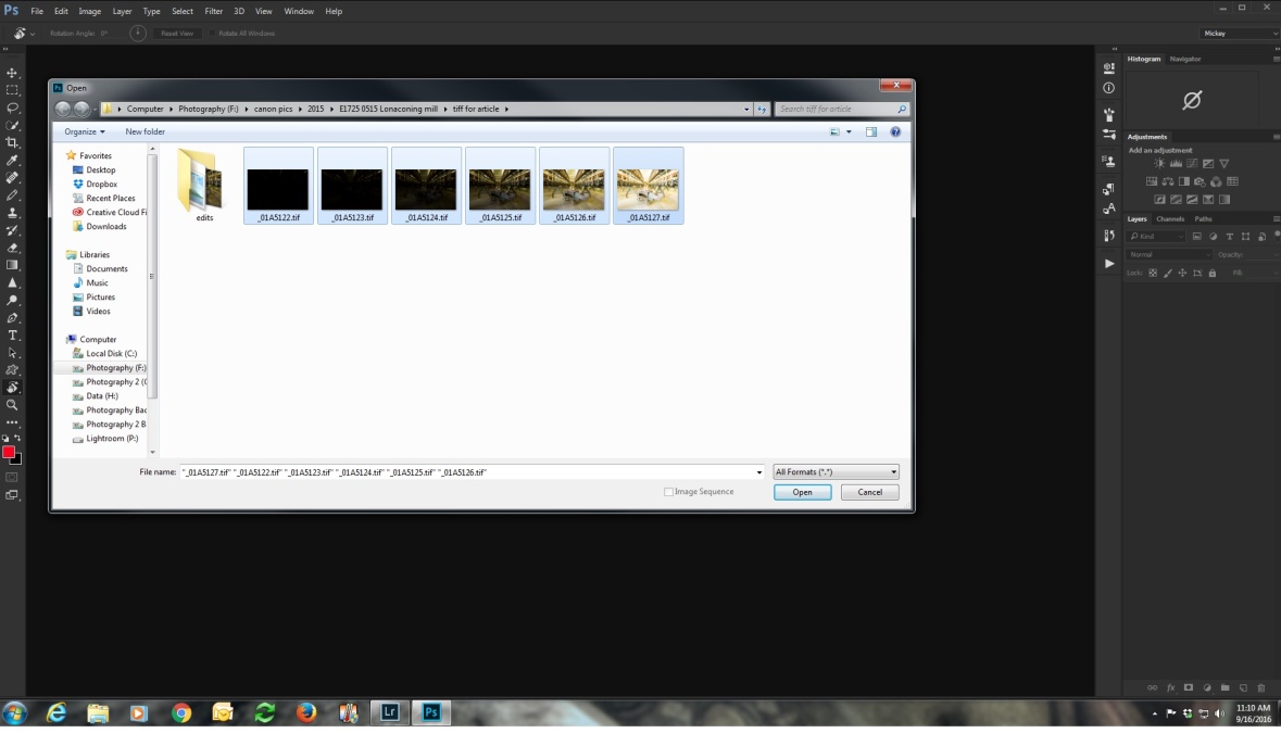
After you select Merge to HDR, you’ll see a dialog box where you can browse and select your images. Once you select them click open.
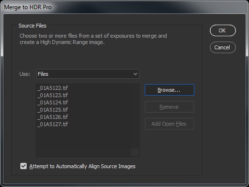
After opening the files you’ll see the dialog box below. Check attempt to automatically align images and click OK.
The other way is to open Photoshop, and choose file/open and browse to select your images. When you have them selected, click open.
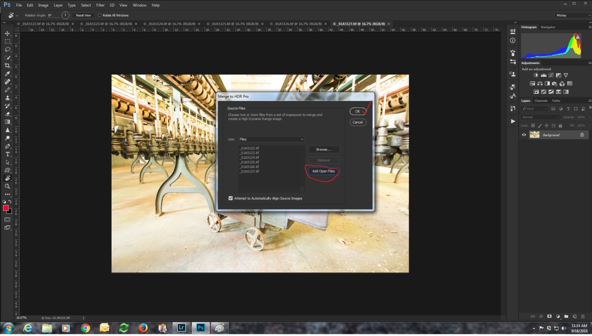
At this point you have six separate files open. Now go to file/automate/merge to HDR.
Click add open files and click OK.
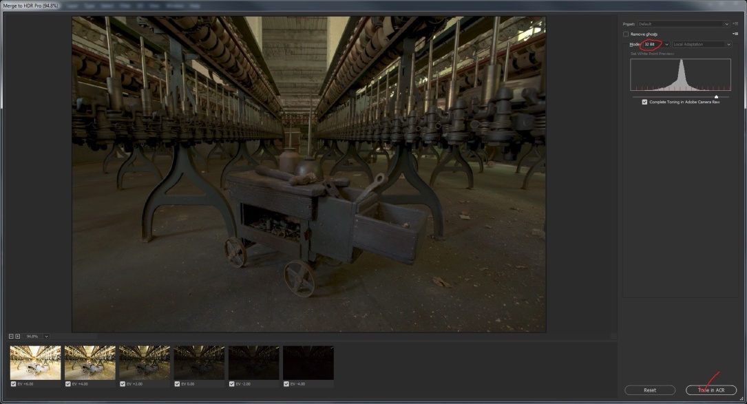
Now the next screen opens, and you can select two ways to process your image. Again only check remove ghosts if there was movement in the images. If you leave the color depth at 32 bits, “complete toning in Adobe camera raw” will be checked.
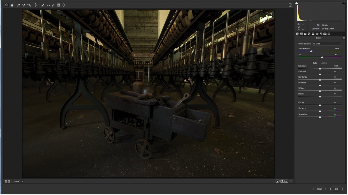
Click tone in ACR and you will see the screen below. If it looks a lot like editing in Lightroom, that’s because it’s exactly the same. I won’t go into details here, because we covered that in part 3.
If you select 8 or 16 bit color depth, toning in Adobe camera Raw is not an option. You’ll see the screen below. If you leave the preset at custom, basically you’re on your own. So start moving sliders and see what you like. Here I adjusted strength, gamma, and exposure.
You can select from a range of presets and see if any are close to what you like. Most of the presets are pretty much unusable, but you might find Scott5 (named for Scott Kelby) or RC5 (named for RC Concepcion) useful starting points. Below I’ve selected the Scott 5 which is my favorite starting point.
As usual, I would either make further edits in Lightroom, or in Adobe Camera Raw (ACR) since I’m already in Photoshop. And then I would do my final touches in Photoshop which is the subject of Part 6.
In this article I’ll explain how to create an HDR image in HDRsoft Photomatix 5. This is probably the most widely used HDR program, and it’s my choice when I want to get wilder than the photorealistic look I get in Lightroom. You can purchase or download a trial at https://www.hdrsoft.com/index.html.
I’m using the same six images we used in HDR Part 2. The first step is to select our images and then there are two main ways to get them into Photomatix depending on whether you use Lightroom or not.
The way I prefer to work from Lightroom is to configure Photomatix as an external editor. This allows you to define what type of files will be sent to Photomatix, the color depth, and what file to start to run Photomatix. Once you have Photomatix set up as an external editor, select all of the files you want to use, right click (PC) and select “edit in” and select Photomatix. Lightroom will then convert your raw images to the file format you specify (I use 8bit TIFF) and open them in Photomatix. Again if you don’t know how to configure an external editing program here is an article showing how.
After you select edit in Photomatix, you will see the dialog box below. If you shot in raw, Lightroom will automatically create TIFFs (or whatever file type you specified when setting Photomatix up as an external editor) and that is your only choice. If you shot JPGs or TIFFs you will have the option to edit the originals.
If you don’t use Lightroom (and why don’t you?) or if you want to work directly with your raw files, you can start Photomatix, and import directly. Choose load bracketed images, browse to their location and click open.
Then choose Merge for HDR processing as below.
You will see your images listed in the box. I always leave “show 32 bit image” unchecked. Click OK
Whether you selected you images in Lightroom, or opened them in Photomatix you will see this import dialog. I always leave align source images checked. Then choose whether you shot handheld or on a tripod. You can leave crop aligned images checked, but that really only applies if you shot handheld and the program had to do a lot of shifting to align the images. Again ghosting options are only necessary if something with the picture was moving, so I left it unchecked. I always choose reduce noise on underexposed and normal images, leave strength at 100% and I always check chromatic aberration. Depending on the speed of your computer, and the number and size of your files, it may take a couple of minutes to do all of the corrections and open your new image in the main editing window.
Below is the main editing window. On the left are the individual controls, and on the right are several presets. I have created several of my own presets that are my usual starting point. My suggestion is to click through the presets until you see something close to what you like, and then start adjusting sliders to fine tune the look.
In the image below, I started with my own “medium painterly high black point” preset and adjusted from there. I almost always leave strength at 100%. I usually don’t change saturation from the default of 50 since I prefer to adjust that later in Lightroom. I usually have tone compression high, between 8 and 10, and detail contrast between 6 and 10. Lighting adjustments I rarely change from medium. Surreal and surreal+ pretty much do as they sound like, and they’re usually too much, even for me.
Smooth highlights I usually leave low, sometimes even 0 as here. The white and black point settings really depend on the individual image, but I generally have the white point less than 1 and the black point between 6 and 10. I’ve found that a higher black point creates more realistic shadows. If you’ll notice, most of the extreme HDR’s that you love to hate, have almost no shadows, and that is part of the unreal look. Gamma adjusts the overall exposure as well as the balance of highlights and shadows. Increasing it lightens the image, decreasing darkens it. Small adjustments make pretty big changes. I also don’t usually change the color temperature, but wait to do that back in Lightroom.
If you have some settings you really like, before applying them, you can save them as a preset, for later use. When your image looks good to you click apply at the lower left.
After a few seconds, you will see the finishing touch box. I usually select “sharpen with mild sharpening”, but don’t use contrast or color controls. Again I’ll do them back in Lightroom.
Choose where to save your image and in what format. I usually choose 8 bit TIFF. 16 bit has more color information, but the files are much larger, and if I edit them in Photoshop, many plug-ins only work in 8 bit mode.
Here’s how my image looks after editing in Photomatix.
Back in Lightroom I adjusted the color balance by selecting the eyedropper tool and clicking on the gray spoke of a wheel. I set the white and black points by shift-double clicking on their pointers. I increased the exposure, added some contrast and added a good bit of clarity and some vibrance.
And here it is with Lightroom edits. Of course I still have more editing to do in Photoshop, but that’s for Part 6.
In this article I’ll explain how to create an HDR image in Adobe Lightroom. This is probably my preferred method when I want a more natural looking image. And we can do it all without leaving Lightroom, though I usually do some extra work in Photoshop.
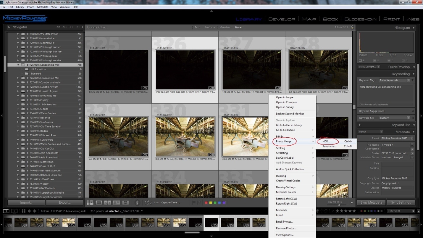
The first step is to select our images, right click and choose Photomerge, and then HDR as below. I’m using the same six images we used in HDR Part 2.
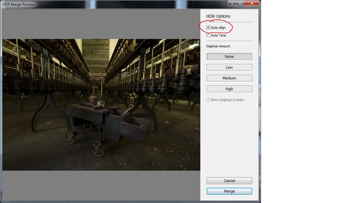
After clicking on HDR, we get the opening screen below with a couple of choices to make. Auto align is necessary if you handheld your shots, and it doesn’t hurt to leave it selected if you shot on a tripod. I always leave it checked. Auto tone will attempt to adjust the image once it’s assembled. I Always leave it unchecked. It’s important not to check this if you are creating HDR images for a panorama. The deghosting options are only necessary if something in your image was moving, and that isn’t the case in this image. Once you make your choices click merge and Lightroom does the work.
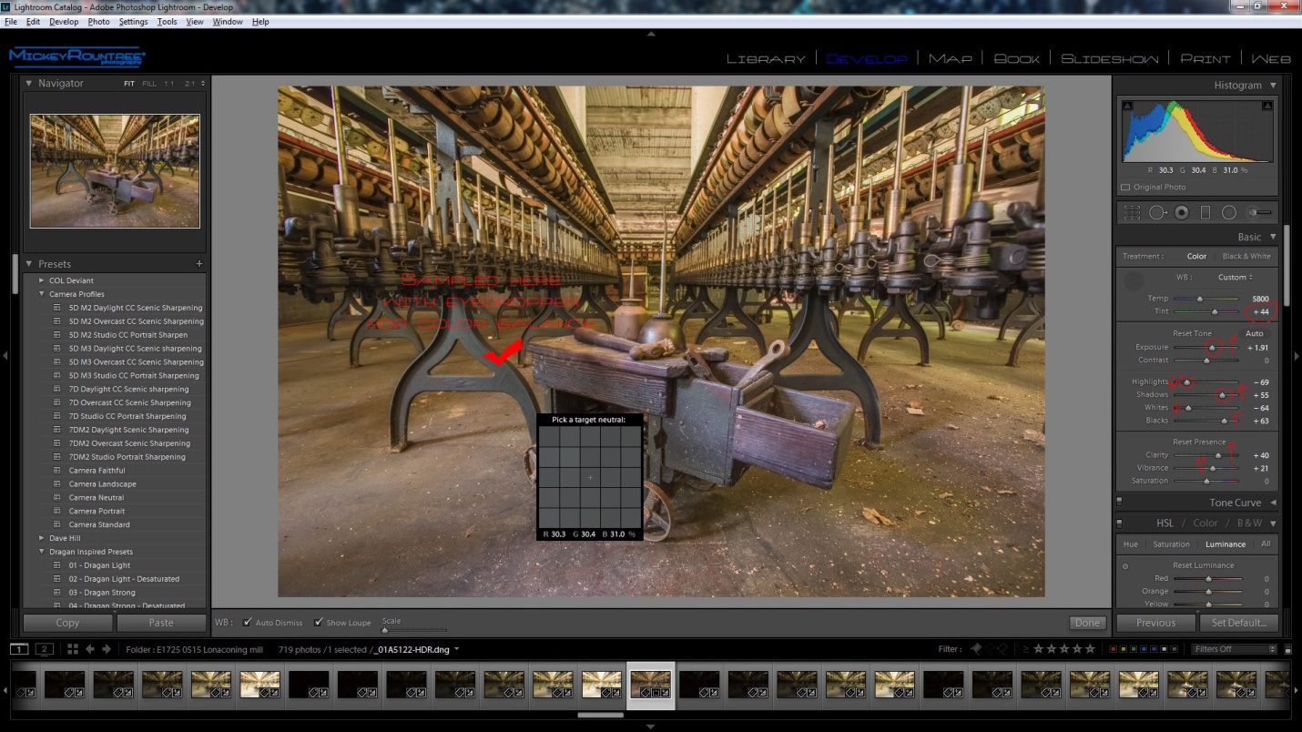
After Lightroom assembles the images, you’ll see the file below with the name of the first image, HDR and in DNG format (circled in the image below). Right now it just looks like a somewhat underexposed image. What isn’t apparent is that it contains a huge range of usable exposure information which allows us to make very large adjustments in exposure and highlights and shadows without losing quality or increasing noise.
From here we begin working on the image just as we normally would in Lightroom. The first thing I did was get rid of the green cast. I selected the eyedropper tool and clicked on a couple of areas that were gray, until I found a spot that gave me a color balance I liked. Then I set the black point by shift-double clicking on the blacks pointer and then on the white pointer. I increased the overall exposure and brought down the highlights and raised the shadows. I increased clarity and vibrance a bit. Again I stay away from saturation.
Here you can see the adjustments I made.
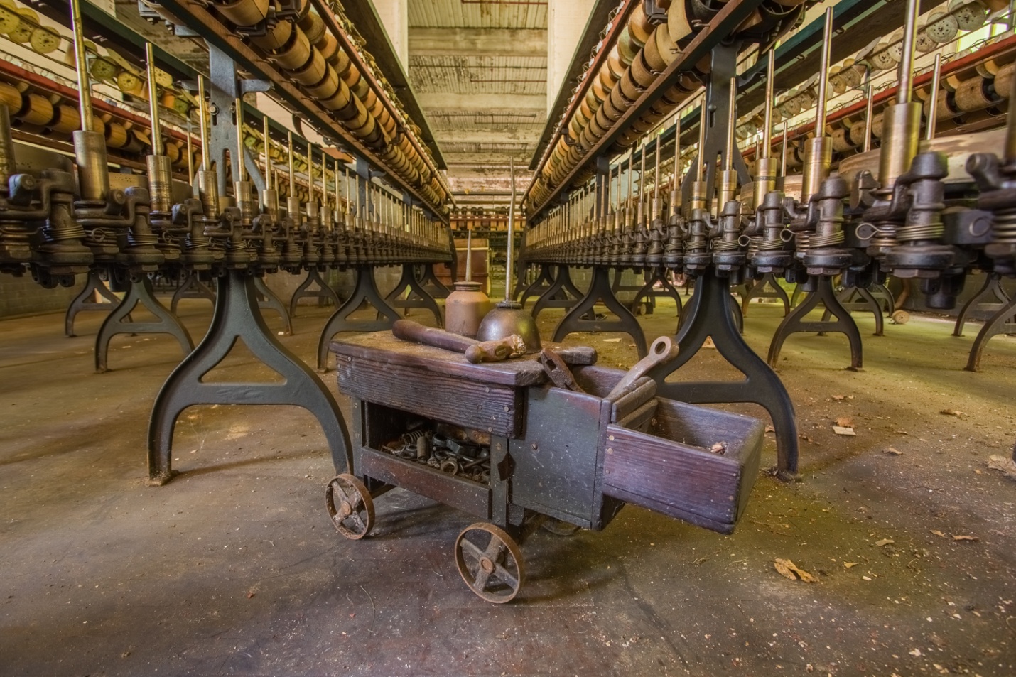
And this is the resulting final image. It has a fairly realistic look. You could leave it here, but in Part 6 I’ll take it into Photoshop for some extra tweaks.
We can make it a little more like the extreme HDR images you have seen by completely flattening the highlights, increasing the shadows all the way, and increasing clarity to the max. Below are the settings and resulting image. Which is right – the image above, or the one below? The choice is yours. Once you start working with HDR, there is no one right way, only your vision.
In this article I’ll be discussing how to create an HDR image in NIK HDR Efex 2. The good news is that it is part of the complete Google NIK suite which can be downloaded for free at:
https://www.google.com/nikcollection/
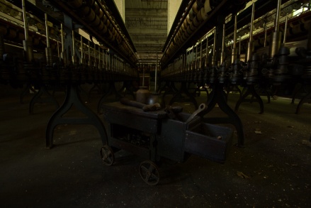
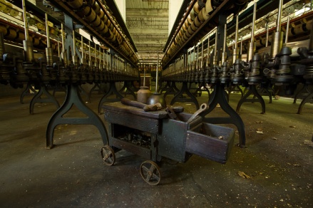
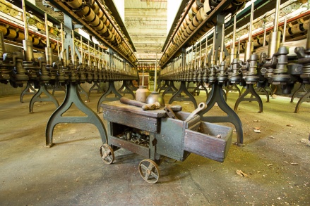
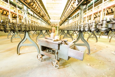
To begin with, these are the bracketed images we’ll work with. I originally shot 7 brackets, but the -8 bracket was almost totally dark with no useful detail, so we’ll only work with the remaining six. It may seem that the +4 bracket is totally washed out, but look at the detail it reveals inside the tool cart. I had also dialed in -2 stops of exposure compensation, because I was more concerned with washed out highlights in this situation.
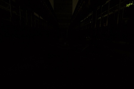
Figure -6 stops 1/30 sec f/8 ISO 800
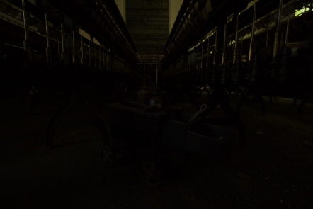
Figure -4 stops 1/8 sec f/8 ISO 800
Figure -2 stops 1/2 sec f/8 ISO 800
Figure normal 2 sec f/8 ISO 800
Figure +2 stops 8 sec f/8 ISO 800
Figure +4 stops 30 sec f/8 ISO 800
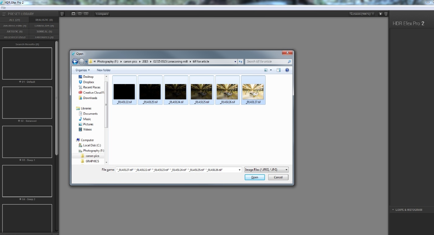
The first thing we have to do is get our six images into NIK HDR Efex. Here’s the bad news – while HDR Efex can run as a standalone program, it cannot directly open camera raw files from any camera. If you shoot raw, you must create TIFFs or JPGs to use HDR Efex as a standalone. If you shoot JPGs, no problem – you can select and open them directly into HDR Efex. Here I have already created TIFF’s and I’m opening them in HDR Efex.
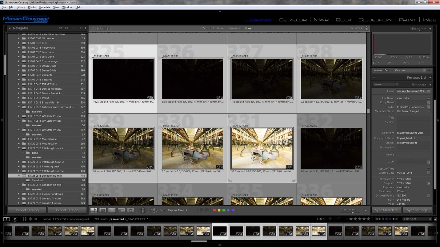
If you use Lightroom (and you should, for many reasons) you can select your images and send them to HDR Efex in a couple of ways. Here I’ve selected my images in Lightroom.
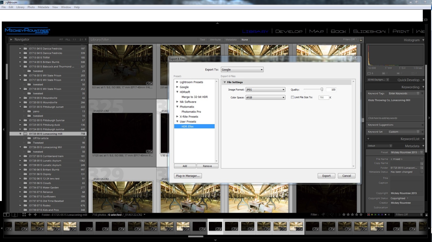
One option is to select your images, then choose File/export/ to google/and user preset/ HDR Efef. If that doesn’t appear as an option, here is how to correct that.
Or the way I prefer is to configure NIK HDR as an external editor. This allows you to define what type of files will be sent to NIK, the color depth, and what file to start to run NIK HDR. If you have NIK set up as an external editor, select all of the files you want to use, right click (PC) and select “edit in” and select NIK HDR Efex. Lightroom will then convert your raw images to the file format you specify (I use 8bit TIFF) and open them in NIK HDR. If you don’t know how to configure an external editing program here is an article showing how.
Whichever of the three methods you use to open your images, the first screen you see in NIK HDR will ask you to make a couple of choices. The first choice is about alignment. You must check this if you shot handheld, but you can also select this if you used a tripod.
Ghost reduction only applies if there was something moving within the image. This could be a fluttering flag, a person or animal, a car etc. This image had no movement so it is unchecked.
Besides intensifying noise, HDR seems to intensify chromatic aberration, so I leave this checked and usually accept the default settings.
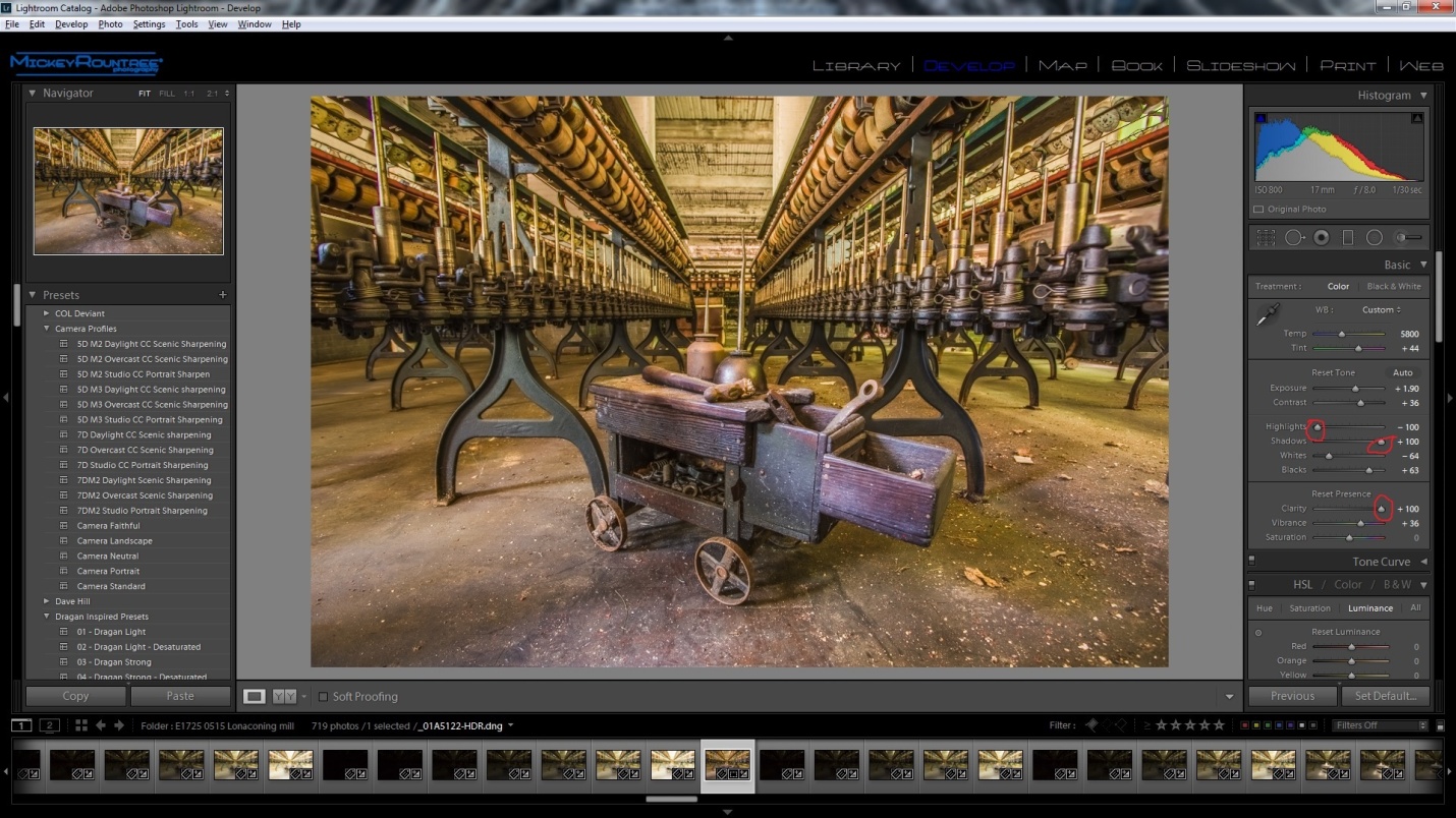
Click on create HDR in the lower right, and your image opens in a window as below. On the left are the program’s built in presets, and as you click each one you can see how it will change the look of your image. I suggest you click on several and see what suits your image. I find I most often use the balanced preset, and that is the starting point I chose here.
Then start playing with sliders. Tone compression controls the balance between highlights and shadows, method strength effects micro contrast. Increasing strength gives a greater sense of detail, but can cause halos and other problems. be careful about overdoing this one. I decreased exposure a bit, left the shadows and highlights alone. I slightly decreased both blacks and whites, a bit. I increased structure to about 66%. Structure is similar to high pass sharpening in Photoshop and effects the look of detail and contrast. Several of these changes were made after this screenshot. Once you have the look you want, click save and select where to save the image.
Here is our image after processing in NIK HDR Efex, but it’s not at all ready yet. Notice the overall green color cast, and the highlights still feel a bit washed out.
My last article in this series is going to address some finishing touches in Photoshop, but here I’ll at least fix the color balance, add vibrance and clarity, and fine tune the exposure, and the white and black points. You can see I adjusted the color balance to eliminate the green cast by adding magenta. I opened the shadows a bit, and set the white and black points. I do this automatically by shift-double clicking on the back pointer and then the white. Sometimes I need to readjust from there, but it’s a good starting point. I usually add in some clarity (midrange contrast), here about 40, and increase vibrance a bit, but I usually don’t touch saturation.
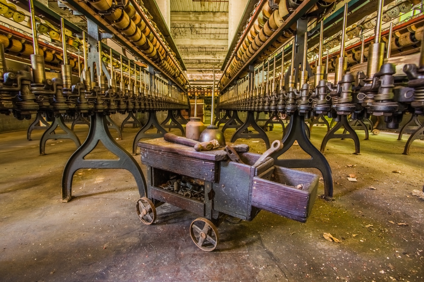
So below is our first HDR created in NIK HDR Efex with some additional tweaks in LR. We’ll do the final adjustments in Photoshop in the last article.
Everyone knows I love doing HDR photography, so several people have asked me write an article on it. Actually, there are numerous books, so rather than try to do this as a single article, this will be a multipart article. First I’ll explain what HDR is, why to use it, and the basics of shooting for HDR. In the next articles I’ll discuss various programs and methods for creating HDR images, and how to apply the finishing touches in Photoshop.
What is HDR
HDR stands for High Dynamic Range Photography. Our eyes are capable of seeing more than 20 stops of dynamic range. That means we see into the shadows and still can see detail in the highlights. On the other hand, our cameras can see only 10 or 12 stops of dynamic range. We can improve that somewhat with post processing, but still detail will either be lacking in the shadows, or highlights or if the contrast is extreme, both.
In HDR photography we “bracket” by taking several images over a range of exposure from underexposed to record highlight detail to normal and then to overexposed to record shadow detail. We use software to combine and process all of these images into one image that has a greater dynamic range than is possible straight from the camera. There are several software options for processing HDR and each has its own advantages, disadvantages and “look”.
Figure 1A normal exposure has dark shadows and blown out highlights in the window
Figure 2 The HDR image has good detail in both the shadows and the window.
In addition to HDR, Rick Sammon talks about “EDR” or extended dynamic range. This is processing a single image to lighten the shadows and lower the brightness of the highlights. It is an improvement over the straight image, but it still can’t handle the extremes that HDR can.
Figure 3 An “EDR”. This is a single image with the shadows lightened as far as possible and highlights decreased as much as possible in Lightroom. It’s better than a normal image, but still doesn’t have the range of a true HDR image.
Why shoot HDR
HDR is absolutely the best way to maintain detail in extreme contrast. Typical examples are shooting inside a church and trying to maintain detail inside and in the stained glass windows, shooting a subject in heavy shade when the bright sky is also visible and trying to maintain detail in the subject and also in the sky. I often shoot HDR when the range of contrast doesn’t demand it, but I like the “look” of HDR which seems to intensify and exaggerate textures, and make colors pop.
Figure 4 No single exposure could capture the dark interior, bright ceiling lights and very bright exterior in the windows. Bill Mueller convinced me to try my first ever HDR on this 2010 field trip. He had no idea of the monster he was about to create.
Figure 5 Contrast wasn’t too bad this day and this single image has pretty good detail throughout.
Figure 6 This is the HDR version. While it wasn’t necessary to control contrast, I prefer it for the overall feel and snap particularly the sky. You may prefer the original.
Figure 7 HDR wasn’t necessary for the contrast range here.
Figure 8 But again, I prefer the texture and pop of the HDR.
What to shoot in HDR
So if you ask “what subjects can I shoot in HDR?” I, being the HDR fanatic that I am would answer almost anything you want to. Typically, most people think of hard subjects like machinery and old buildings, but give it a try with flowers and other soft subjects. The two main subjects that don’t work well are people and moving subjects. Small areas of movement like a fluttering flag cause ghosting that can usually be corrected by software. Large movements like people walking, cars and bikes moving, birds in flight won’t work. And HDR is rarely good for people photography; nobody wants all of the detail and texture in their skin enhanced.
Figure 9 What can we shoot – grungy old buildings
Figure 10 Or we can shoot beautiful buildings
Figure 11We can shoot hard industrial equipment
Figure 12 Or the softness of a water lily in rain.
Figure 13We can shoot dark stormy skies
Figure 14 Or postcard blue skies
When do we shoot HDR?
The short answer is anytime. Night, sunset, sunrise, midday, good skies, bad skies, high contrast light, dappled uneven light, even low contrast all work. I was taught not to shoot between 10AM and 2PM, because the light was too contrasty with unpleasant shadows. Now with HDR, we can even work around that.
Figure 15 Nighttime
Figure 16 Sunrise
Figure 17 Midday bright sun
Figure 18 Sunset
Figure 19 How about HDR for people?
Figure 20 Probably not if you ever want to photograph them again. HDR is not flattering to skin.
We can even do HDR Panoramas
The trick here is to make your brackets in manual mode. Once you have your brackets shift over leaving about 20% overlap, then repeat for as many sequences as it takes to cover your panorama area. Then you must process each of the HDR sequences exactly the same way, so the images will blend well when merged into a panorama.
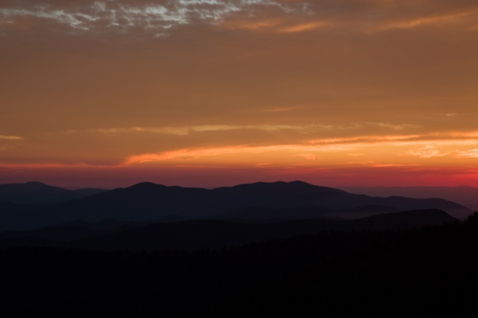
Figure 21 5 HDR images were stitched to create this panorama
How to Bracket
There are a couple of ways to bracket. The most important thing is to keep the aperture constant and bracket by varying time. If the aperture changes, it will slightly alter the look of each image and they will not line up properly when combining the images for HDR. Shoot in either aperture priority or manual mode. Also focus must stay constant. Either use manual focus, or set your camera for back button focus, focus once and don’t change it for any of the shots in the bracket series.
I prefer to shoot all of my brackets on a tripod. Some of the software programs will align images that are slightly off from being hand held. But unless you are in very bright light, you will run into issues with slow shutter speed and camera movement. Also I find it best to turn off image stabilization (IS, VR, OS). And shoot at the lowest possible ISO. HDR photography often seems to work best at small apertures, so you will sometimes have to increase ISO. Just be aware that HDR tends to increase noise.
Whichever mode you use, take a meter reading and shoot exposures below that, at the meter reading and above the meter reading. You can manually adjust your exposures by changing your shutter speed. You decrease exposure by setting faster shutter speed, and increase exposure with slower shutter speed. In a dark room, it’s very common for the slow exposures to be 30 sec or longer.
Most current cameras can be set to bracket automatically. On my Canon 5D Mark III and 7D Mark II I can set the camera to shoot 2, 3, 5, 7 or 9 brackets up to 3 stops apart. Nikon I believe only lets you set up to 1 stop apart. On most cameras once you set the bracketing, set the drive to high speed and press and hold the shutter and the camera will shoot the set number of brackets and stop. On my Canon I can set the drive to 2 sec self timer, press the shutter and after 2 seconds it will shoot the whole sequence. That way I don’t need a cable release, but I don’t get vibration from pressing the shutter.
Every camera is different, so read the manual to find out how to set bracketing and practice it before going out to shoot.
How Much to Bracket
Look at your bracketed images and make sure the darkest image has good detail in the brightest highlights that are important and the brightest image has good detail in the darkest shadows. If they don’t, then either increase the number of brackets, the stops between brackets or both.
I usually bracket in 2 stop intervals. In average or low contrast light such as cloudy days 3 brackets is usually enough. Bright contrasty sunny days may require 5 brackets. And situations with vary dark areas and extreme bright may require 7 or even 9 brackets. This would typically be shooting inside a dimly lit building (or car) where you also can see out windows in bright daylight.
Here is a less technical way of looking at it. It’s always better to have more brackets than you need, than not have enough. You can delete that solid black image and the solid white image in a second. But what if you traveled 700 miles, paid for a workshop or rented a location and come home to process and realize you don’t have enough brackets to cover the shadows and highlights? When will you ever be there again, and how much would it cost to go back and reshoot? If you look at it that way a few extra brackets are cheap insurance.
Here is a 5 shot bracket and the resulting image. Notice the detail in shadows and highlights at each end.
Figure 22 -4 Stops to get detail in the clouds
Figure 23 -2 stops
Figure 24 normal exposure
Figure 25 +2 sops
Figure 26 +4 stops for detail in the shadow under the dash
Figure 27 the HDR assembled from 5 brackets.
Below you can see what happens when you don’t have enough brackets. The software is forced to try to bring out detail where very little exists. In dark areas this results in poor detail with lots of noise.
Figure 28 The same image processed using only the three middle exposures. Notice the noise and loss of detail under the dash.
A Little Known Secret
Everyone assumes I shoot everything in HDR, and for the most part they’re right. I do shoot HDR brackets for almost every inanimate subject. The secret is I don’t always use them to create an HDR image. If I see that I can get all of the detail I want in a single image, I’ll process the one image in the sequence that has the best exposure and the feel I’m after. The nice part is that even if I wind up not doing an HDR, I have a range of exposures from which to choose.
In the next few articles I’ll discuss how to process an HDR image in NIK HDR Efex II, Lightroom, Photoshop, and Photomatix. And in the last article I’ll explain how to finish and fine-tune the image in Photoshop.
I have converted all of my old articles into web format and put them on my website under the “Articles” heading. I’ll be adding this and all future articles so that my followers (both of them) can find everything in one location.