2021 Foreward When I was doing my original “Basic Photography” series I put off writing about composition for a long time because I knew it was going to be a difficult article to write. There are whole books written on composition, so it’s difficult to do justice to this important subject in one article. And as you’ll see, composition is very subjective. If you’ve read (and done the exercises) the articles on exposure, aperture, and shutter speed, this article should round out a basic intro to photography.
In this article I’m going to talk about photographic composition. It is undoubtedly one of the basic foundations of photography, but one of the hardest to define, understand and master. Most of the photography basics can be evaluated objectively; within limits, a photograph is well exposed, it’s either sharp or it isn’t, the color balance is right or it isn’t. But composition is subjective; there is no absolute right or wrong composition. No two photographers will see and compose a scene exactly the same way. It is why on a field trip five photographers can stand shoulder to shoulder and get five very different images.
When we talk about photographers “having a good eye”, we’re referring to their ability to compose a photograph in a way that effectively guides the viewer to see what they want you see. Some lucky photographers seem to just naturally have a good eye, it’s intuitive and instinctive for them. They make fast progress learning, because the technical aspects are relatively easy to learn. Others master technical concepts quickly, or trust their camera to properly expose and focus, but their progress is slower because they haven’t learned to see photographically yet.
“There are two people in every photograph: the photographer and the viewer”― Ansel Adams
And even different viewers will see a photograph differently. Photographers see an image differently from non-photographers. A portrait photographer and the model see an image in very different ways. People from other parts of the world will look at photos differently. We read left to right, so we tend to scan images left to right. In countries that read right to left, viewers will scan images right to left and thus see an image much differently than we do.
Definitions
“Composition is the strongest way of seeing.” —Edward Weston
Composition describes the placement of objects and elements within a photograph. Those elements include line, color, texture, pattern, form, shape, and light. We can use principles such as relationship and perspective, balance, contrast. simplicity, rhythm and flow, and unity and cohesiveness to help arrange the elements.
I look at composition as using all of our photographic tools to guide our viewers through the photograph. Ideally, we want to lead the viewer through the image to our subject and hold his interest. We want to keep our viewer’s eyes within our image and not lead his eyes out of the image.
Composition begins before we shoot.
Whether we actively think about it or not, composition begins before we even look through the viewfinder. Our choice of lens focal length, aperture, and shutter speed and whether we shoot vertically or horizontally all effect the composition. Most important is deciding what our subject is, and what other elements to include or leave out and how to arrange them. In some types of photography like portraits and still life, we have the ability to move and arrange our subjects. In other areas we can’t arrange the elements, but we can move our camera to change the viewpoint, and the relationship of objects within the image.
“A good photograph is knowing where to stand.” —Ansel Adams
The “RULES”
“The code is more what you call guidelines than actual rules” –Captain Barbosa, Pirates of the Caribbean
You will hear and read about the rules of composition, and many of them are contradictory. If the rules were hard and fast, there would only be one right way to photograph a subject, and we all know that’s not the case. Some will say rules are meant to be broken, but realize that it’s usually more effective to understand the rules before you break them. Think about these “rules” as guidelines as you look through your camera and think about what your subject is and how you can direct your viewer’s eye through the image to the subject and keep it within the image.
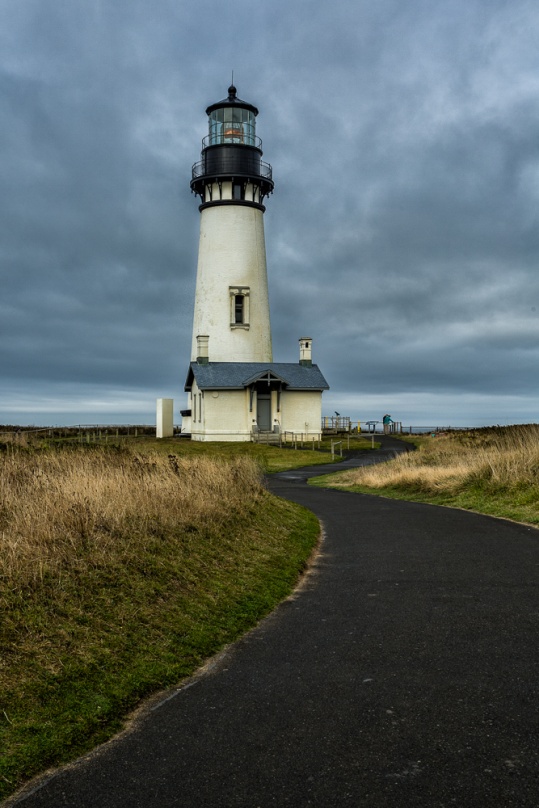
Avoid centering your subject.
“Dead Center is Deadly” – Rick Sammon
Dead center or bull’s-eye composition is often the first choice for the beginning photographer. It’s so easy to place the subject in the center focus point (after all we do want it in focus don’t we) and leave it there. The problem is that it generally presents a static image with no interest or sense of flow or movement. However, some subjects really seem to demand a centered viewpoint, but break this rule carefully.
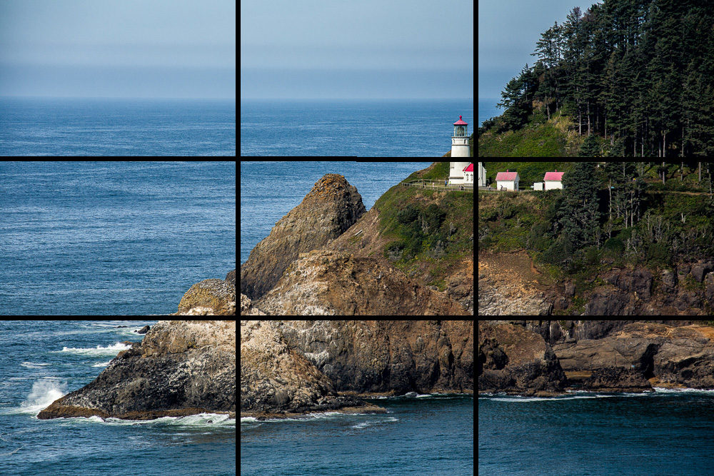
Rule of Thirds
In the rule of thirds, grid lines divide the image frame into thirds horizontally and vertically. The four intersections of these lines are “power points” that tend to draw the eye. Thinking of the rule of thirds helps avoid the dead center look.
Here you can see and feel the difference in centered and rule of thirds composition. Which is more interesting and dynamic?
Leading Lines
Lines have a powerful ability to lead our eye through a photograph. In particular “S” and “C” curves create a graceful flow. Be aware that the wrong lines may also draw your viewer right out of your image.
Framing
Finding a natural frame through which to shoot your main subject can focus the viewer’s attention and keep it from wandering out of the image.
Contrast and Color Contrast
The eye is drawn to the area of greatest contrast. So in a dark photograph the eye will be drawn to the lightest element, and in a bright photograph the eye will be drawn to the darkest element. Also in a photograph with very little color, the eye will be drawn to the most intense color.
Fill the Frame
“If your pictures aren’t good enough, you aren’t close enough.” Robert Capa
One way to emphasize your subject is to eliminate anything that doesn’t add to the main subject. There is no wasted space around the subject. Look at the first portrait and look at how much wasted black space surrounds the subject. It’s also dead center. The second portrait completely fills the frame.
Negative Space
This would seem to completely contradict the rule about filling the frame, but sometimes it is effective to have a lot of space surrounding the subject. It should be relatively simple and not detract from the subject.
Patterns
Repeating patterns tend to draw and hold the eye. A repeating pattern with one small break can be very effective at creating interest.
Symmetry
This would seem to directly contradict the rules about not centering the subject and the rule of thirds. Yet some subjects almost demand symmetry. Architecture and head on views of cars come to mind. and If you use it make sure your subject is as symmetrical as possible. A picture that is almost, but not quite symmetrical looks like an accident.
Rule of Odds
If there is more than one subject, odd numbers tend to be more interesting than even.
Simplicity
Have you ever looked at a picture that was just so busy it was hard to tell what the subject was supposed to be? Often a much simpler picture has more impact. Here are two photos from Sloss Furnaces taken on the same trip. Does the simple picture tend to hold your eye more than the very busy picture?
Balance
Balance means balancing an object in one part of the frame with an object of similar weight in the opposite part of the picture. Visual weight may be based on size, color or brightness.
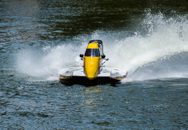
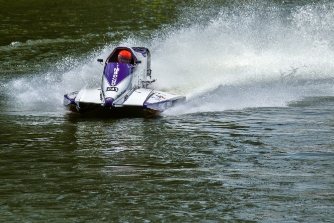
Give Subjects Space to Move
If there is a subject that should be moving the eye tends to anticipate where it will be going and move in that direction. If the moving object (or person or animal) is too close to the edge of the frame, the eye goes right out of the frame. Generally, a moving subject should have more room in front of it than behind.
Subjects Should Be Looking into the Frame
It’s natural to follow the gaze of people and animals. If they are near the edge and looking out of the frame, the eye tends to go right out of the picture. If the eyes are toward the center of the frame, the viewer will tend to stay within the picture. In the first picture below, whichever horse and rider you look at, your eye is directed to stay within the photo. In the second photo, through the magic of Photoshop both horses and riders have been turned around. Look at either horse and rider and your eye immediately leaves the image.
Border Patrol
Though this isn’t often listed as a rule of composition, it’s important none the less. Check the edges of your image for items protruding into the frame without a source and with no reason for being there. This is a common mistake in landscapes. In the picture below, the bare branch comes out of nowhere and pulls the eye. The larger leafy branches obviously belong to a large tree and have more reason to be there, and they actually act as a framing device.
Keep the horizon level
A horizon line that is not level is very unsettling The image below is only two degrees off level, but it feels very wrong compared to the level image. Either level your camera carefully when you shoot, or straighten it in post production.
Don’t Center the Horizon
A perfectly centered horizon tends to create a static composition. Generally if the interest is in the sky, put the horizon along the lower third. If the interest is in the foreground, put it along the top third. The exception is an image with reflections where a centered horizon is much more acceptable.
Use Foreground Objects to Create a Feeling of Depth
Having a strong foreground object, particularly with a wide angle lens can create a greater feeling of depth and dimension. Not having a foreground makes a flatter image.
Crop Happens
A lot of photographers seem to have the belief that they should not be cropping their images. Or that even if they crop, they must conform to their camera’s format or to the “standard” formats like 8×10 or 11×14. Not all images fit perfectly into 2×3, 4×3, or 4×5 formats. Cropping can remove non essential parts of the image to concentrate attention on the subject. Often we can’t photograph a subject without including things we don’t want in the picture, and good cropping can make a huge improvement. Think of cropping as a second chance to get you composition right. Let your artistic judgement decide the cropping and aspect ratio. Remember that if something in your image isn’t helping to focus attention on your subject, it’s probably distracting and needs to go.
I often find a wide aspect ratio looks more dramatic and is a good way to focus attention on a wide subject while eliminating distracting foregrounds and backgrounds.
When you have an image that could work as a horizontal, or vertical image, try a square crop. It’s worked for Hasselblad for decades.
Practice Exercises
Even if you aren’t one of those naturally gifted photographers with a “great eye” you can definitely improve with some training and practice. Here are a couple of exercises to get you started.
1) Get an object like an artificial flower and put it in front of a plain wall or background. Photograph it horizontally with the bloom in each corner, at each of the rule of third “power points” and dead center. Repeat vertically.
2) Add a second flower. Place one of the flowers on one of the power points, and then move the other flower to each of the other power points and dead center. Do this exercise in horizontal and vertical formats.
3) Pick a subject and photograph it so that it doesn’t fill the frame. Then zoom in and/or move closer and take another shot. Repeat until the whole image doesn’t fit within the frame. Try different cropping formats to move your subject around in the image.
4) Shoot a landscape or cityscape fairly loose and then in your editing program try cropping in different formats and moving the scene around.
5) Find 10 of your pictures that you like, open them and concentrate on how your eyes move through the picture. It would be helpful to make prints and actually mark your visual path on the print or draw it in Photoshop. Also look at the image and see which of the above rules help guide your eyes.
6) Go to a good photographic site like 500PX and find images that appeal to you. Analyze them as above, looking for which rules might apply and how your eyes move through the image.
7) Go out and shoot 10,000 photos. “Your first 10,000 photographs are your worst.” ― Henri Cartier-Bresson