Back in the film days, we had no Photoshop or other programs to create special effects. Actually until the 90’s we didn’t have home computers capable of working with images. So if we wanted special effects we had to do them in camera. One way of creating special effects was to use a prism or multi-image filter. These were all the rage in the 70’s and 80’s but sort of died out after that. I came across my stash of prism filters going through an old drawer the other day and that got me thinking about how what’s old is new again, and things run in cycles. Is it time for the return of the multi-image filter? With a little research I found that there are several new companies making prism filters, and they certainly have modern price tags. You can also find older used filters on EBay much cheaper. Search for prism filter or multi-image filters and you will find several versions, both new and old.
When you first get a prism filter it’s easy to go wild with it and the effect gets old quickly. A few shots a year may be unique and interesting. Dozens of effects filters quickly become boring and they lose impact.
Here are the ones I found in my drawer. These are just quick shots to show the basic effect. There are probably better subjects for some of these filters, but you’ll get the basic idea. With any of the prism filters you can vary the effect by how close you are to your subject, the focal length of your lens (zoom lenses are very useful), and by rotating the filter. Also all of the multi images image filters produce effects that are hard if not impossible to duplicate in Photoshop (I’ve tried without much success).
When these articles are converted to PDF and sized for the newsletter, the resolution and quality of the images is seriously degraded. If you would like to read the article and see the images as I did, you can see this article on my website at this link.
Kaleidoscopic or multi-multi image. This filter has many facets that produce a dozen or more images rotating around a single central image.
Three image or tri-prism. May also be called a 3C (for three image centered). This filter has 3 facets and produces three centered and fairly equal images.
Five image or 5R (for five images rotated) This filter has 5 facets, one central and four surrounding. It produces a central image with four outer images.
6 Image Parallel or 6P. This filter is half clear and has 5 parallel facets producing a repeating pattern that can also evoke a sense of motion.
by Mickey RountreeBack in the 70’s and 80’s we used to produce a tricolor effect by either making a triple exposure on one frame of film with pure red, pure blue and pure green filters, or by using a “Harris Shutter” (see below) which acted as both a holder for the three filters and as a shutter during a long exposure. I did the effect both in 35mm and on 4×5 film, but figuring out the proper exposure for the three exposures and the filter factors for each color was pretty tedious.https://www.lightstalking.com/harris-shutter-effect/In the tricolor effect different parts of an image with subject movement show up as different colors. Parts of the image with no movement have normal color, due to the fact that in the RGB color model equal parts of red, green and blue produce white, or normal white balance.
When these articles are converted to PDF and sized for the newsletter, the resolution and quality of the images is seriously degraded. If you would like to read the article and see the images as I did, you can see this article on my website at this link.
Since most digital cameras don’t allow for triple exposures, I was able to find a way to create the effect in Photoshop. The first step is to shoot three images that have some movement, but also some overlap, or something that is stationary (or relatively stationary).
In Lightroom select three similar images with some movement. Right click, choose edit in and select open as layers in Photoshop.
With the three images opened as layers in Photoshop, select the top layer and double click on the light side of the layer icon and layer styles will open.
Select the top layer, open the layers style and you will see check boxes for the red, blue and green channels. For consistency, I usually uncheck the blue and green channels, so the top layer becomes the red layer. For the second layer I uncheck the red and blue channels, and on the bottom image I uncheck the red and green channels. You can change this order and get slightly different effects, just make sure that each layer has only one channel selected and that there is a red layer, blue layer and green layer.
When you have made the three layer adjustments, go to layer/flatten image. From here you can continue editing just like you would any image.
Here are a few examples, ranging from subtle to extreme depending on the amount of movement, and how much of the image is stationary, or at least has a lot of overlap.
And now for a little color theory. It’s easy to understand that there should be red, green and blue colors in our image, but where did the yellow, cyan and magenta come from, since we didn’t use those filters? And here’s the answer. The stationary parts of our image get equal parts of red, green, and blue and that equals white or normal white balance. Areas that receive blue and green exposure, but no red produce cyan. Areas that receive red and blue exposure, but no green produce magenta. Areas that receive green and red exposure, but no blue produce yellow. If you look on a color wheel, you will find that red is opposite cyan, blue is opposite yellow, and green is opposite magenta.
This can be an interesting effect if used sparingly. Just remember to shoot three exposures that contain movement while keeping the camera as steady as possible between exposures. To me the most important part of the effect may be how it helps reinforce our understanding of the RGB and CMYK color models.
In my last article I discussed some older soft focus lenses. In this article, I’ll you how to get a similar look in Photoshop. There are advantages of creating the look in Photoshop rather than with a soft focus lens. First there is no need to buy a new (old) lens, so it’s free. Second if you shoot the image in soft focus and decide you would prefer it sharp, there’s no way to sharpen it. Third you have much more control of how much flare there is, and you can vary the softness on different areas of the image.
When these articles are converted to PDF and sized for the newsletter, the resolution and quality of the images is seriously degraded. If you would like to read the article and see the images as I did, you can see this article on my website at this link.
Begin by opening the sharp Image in Photoshop. Create a copy of the base image with Ctrl-J(CMD-J for Mac. Select filter/blur Gaussian Blur and select a low radius like 8-10 pixels. This just creates a slight overall softness.
Soft focus lenses flare highlights much more than darker tones, so we’re going to select the highlights. Go to select/color range/highlights. Choose a low fuzziness like around 10 and use the range slider to select the range of highlights you want to select. The lower the range value, the more highlights will be selected. The higher the range the less. Use Ctrl-J to put the highlights on their own layer and make sure that this is the top layer and if it isn’t drag it to the top. I find I sometimes have to delete this layer and repeat with a different range value till I get just the look I want.
Change the blend mode to screen. Go to blur, Gaussian blur and choose a high radius to really flare the highlights, something in the 300 -500 pixel range. We can always dial down the opacity if it’s too much.
Add a levels adjustment layer, and click the down arrow to turn it into a clipping layer which only affects the layer immediately below rather than all of the layers. Adjust the highlight and midtone sliders to vary how much flare there is. You can also decrease the opacity of the highlight layer to decrease the effect.
For an even more vintage soft focus effect I added a light leak effect from NIK Analog Efex
Here is the final soft focus image with the sharp version below
I’m going to show you a couple of older soft focus lenses that can be bought cheaply used on Ebay or other sites. They are great for portraits and still lifes and can spark your creativity by giving your images a different and unique look. The main characteristics of these older lenses is a lot of chromatic aberration and highlights that flare dramatically. The look is different from just putting a soft focus filter on the front of the lens, or blurring the image in Photoshop. I tend to use these lenses with dark backgrounds, because a light subject on a white or light background can quickly become a mess of smeary highlights.
When these articles are converted to PDF and sized for the newsletter, the resolution and quality of the images is seriously degraded. If you would like to read the article and see the images as I did, you can see this article on my website at this link.
The first lens I’ll discuss is the 100mm Sima soft focus lens that was introduced in the late 1970’s. It is simply a one element lens with push/pull slide focusing. The lens itself is not camera brand specific; it uses a “T-mount” adapter that screws on to the back of the lens and is available for most manufacturer’s lenses. I have adapters for my Canon EF, and EF-M lenses, and there are T-mounts for even the newer Canon R lenses. Obviously there is no autofocus capability and no adjustable diaphragm, so there is no auto exposure mode. However, they will work fine in manual or aperture priority on most cameras. Straight from the box, the Sima is an f/2.0 lens and between the very shallow depth of field and blurry viewfinder image, focus is also a challenge. The Sima comes with f/4 and f/5.6 aperture disks to increase DOF and decrease the highlight flaring, and a 2stop neutral density filter. That decreases brightness without decreasing flare and softness.
Right now there are several available on EBay ranging from $15 to $60, and a T-mount will cost around $10 to $20, so you could be shooting for under $30.
Here is an image shot with a 100mm macro lens to show you how the image looks sharp.
At f/2 the Sima is smear of flared highlights.
With the f/4 aperture disk added, there is less flare.
The 100mm Spiratone Portragon came out around 1976. It is a single element 100mm f/4 lens with a helical focusing mechanism that is easier to use than the Sima. Again this lens uses the T-mount, and there is no autofocus capability and no adjustable diaphragm, so there is no auto exposure mode. However, they will work fine in manual or aperture priority on most cameras.
Right now there are several available on EBay ranging from $45 to $60, and a T-mount will cost around $10 to $20, so you could be shooting for under $55.
Spiratone Portagon 100mm f/4
One unique, but brand specific lens is the Canon 135mm f/2.8 soft focus lenses. This was made in the EF mount but will work on EF-M or RF mounts with the appropriate adapter. The lens can be a normal sharp 135mm f/ 2.8 or there is a ring that adjusts to two levels of soft focus. On a Canon body, all exposure modes and autofocus work. There are several on Ebay from $120-$175.
Canon 135mm Soft focus at sharp setting.
Canon 135mm at #1 Soft Setting.
Canon 135mm at #2 Soft Setting.
Here is a pear with a 100mm macro so you see how it looks sharp.
Sima at f/2, f/4 and f/5.6
100mm Portragon f/4
Canon 135mm sharp, Soft 1 and soft 2
All of these lenses create a soft glamourous look that is probably different from anything you have shot before. And except for the Canon 135mm they are a pretty cheap way to explore soft focus photography.
Many years ago when I was on the ROTC rifle team, my shooting fell into a slump. I was griping about my rifle when the sergeant grabbed my rifle, put a shot dead center in the bullseye, and then put three more through the exact same hole. He handed it back and said “it’s not the rifle.” A few months ago, I overheard someone say “I just can’t afford the kind of camera and lenses that the contest winners use, so I can’t compete with them.” As my sergeant told me, it’s not the camera.
Let’s look at a few facts about cameras and lenses. The latest and greatest cameras have enormous megapixel sensors, great autofocus systems, insanely high frame rates and maybe a few other features that make photography a bit easier. But the best camera in the world doesn’t take a great or even good photo without a good photographer behind it. If we’re honest with ourselves, we probably hold the camera back more than it holds us back. Yes, it’s a great feeling when you get the latest camera, but don’t expect it to make you a better photographer. In fact, your photography is likely to suffer for a while, until you learn all of the features and controls of the new camera. Before you run out and buy equipment, ask yourself if it will do something better that is essential to your style of photography. Also remember that some really great images have been made by those older cameras. They were good cameras in their day, and they didn’t become bad cameras just because a newer camera has come out.
As for the idea that your camera is keeping you from winning contests or making great images, it’s just not true. A newer camera might let you make larger prints, but realistically most of our images are shared on the web in one form or another, usually on a monitor with 1920 X 1080 pixels, or maybe 2560 x 1440. And most contests like the PSC require images to be entered as 1920 x 1080 Jpegs, which is only 2.1 megapixels. So even if you have the latest 50 or 60 MP camera, you have negated most if not all of the newer camera’s advantages.
I decided a to do some experimenting and compare my current camera, a Canon 5D Mark IV which has 30 MP and was introduced in 2017 (oh no! I’m seven years out of date), to my first digital which was a Canon 30D which was released in 2006 and has an 8MP sensor. The 5D is a full frame camera, and the 30D is an APSC with a 1.6 crop factor.
When these articles are converted to PDF and sized for the newsletter, the resolution and quality of the images is seriously degraded. If you would like to read the article and see the images as I did, you can see this article on my website at this link.
I won’t claim that these are great images, or contest worthy, but can you really see a real difference at 1920 x 1080? Also the Canon 30D and 18-55mm kit lens can be bought used for $75-100, while the Canon 5D Mark IV 24-105mm can be bought for $3600. Can you see $3500 worth of difference between images? Also I’m not going to say which image was shot with which camera.
These two images have just my basic portrait editing done in Lightroom and skin retouching in Photoshop.
By the time I add some additional touches like adding a texture, there is even less of a noticeable difference.
Just to make this comparison as equal as possible all of processing for the pear still life was done in Lightroom only. Lighting was the same and I used a 50mm lens on the 30D image and an 85mm lens lenses to maintain the same shooting distance and perspective.
Does this mean I want to ditch my 5D and go back to the 30D? No way. Can I make usable images with the 30D? I used to in 2007 and if I had to I still could. Would a new $3600 Canon R5 or $5500 R3 and a couple of new lenses make me a better photographer? Probably not, but for sure I’ll never know until I win a lottery.
While we’re talking cameras, I have to admit that in the past I have been known to disparage “cell phone pics”. That was primarily because we are constantly barraged by bad cell phone pictures in social media. But in the last few years the quality of cell phone photos has increased tremendously. With just a few tweaks a good photographer can produce a really good image. You’ve probably seen 16 x 20 images in our gallery that were taken by a cell phone, but you wouldn’t have known unless you were told. I’m pretty sure some of the images in the last PSC annual contest were shot with cell phones, and some may have won ribbons.
I just got through judging the annual contest, and I can say for a fact that I couldn’t tell a Canon from a Nikon, from a Sony; I couldn’t tell a DSLR from a mirrorless; a 20 MP camera from a 50 MP, and I couldn’t tell a top of the line manufacturer’s lens from a cheap third party lens. What I could tell was the difference between good and bad composition, good and bad lighting, good and bad processing, sharp and poorly focused images, and good and bad concepts.
So if you win the next billion-dollar lottery jackpot, by all means go buy the latest camera (or two and a bunch of new lenses). In the meantime, realize that the camera doesn’t make the photographer, the photographer makes the camera. Or as the saying goes, 95% of cameras are better than 95% of the photographers.
As I usually do, I’m calling this article beyond basic because it involves Photoshop rather than Lightroom or other basic editing programs.
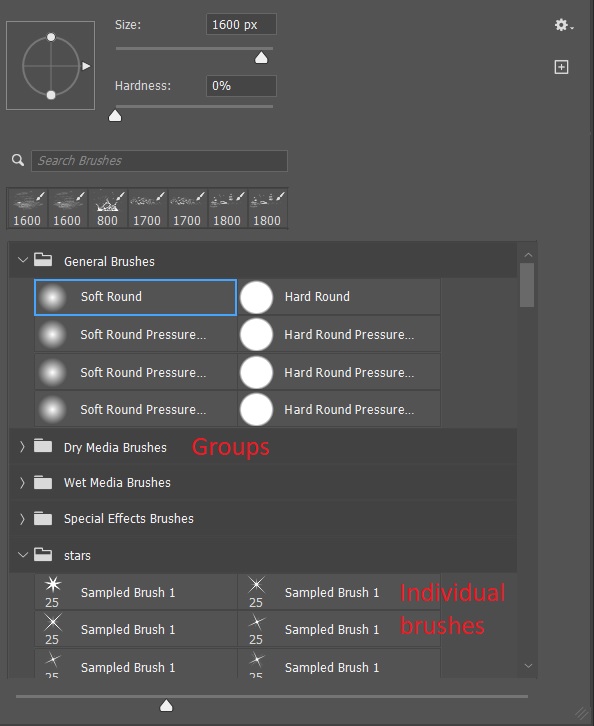
Photoshop brushes are located in the tools on the left hand side of the workspace. Clicking on the brush tool opens a submenu with the brush, pencil, color replacement tool and the mixer brush. For this article I’ll only be discussing the basic brush. You can also use the shortcut “B” to bring up the brush tool. You can use the brush tool to paint directly onto an image, onto a blank layer, or onto layer masks. You can also use the brush to make selections in quick mask mode, but I’m not going there for this article.
With the brush selected, clicking the dropdown arrow next to the brush opens a panel with control sliders for size and hardness, a list of the most recently used brushes, and a panel with all of your installed brushes arranged in groups. A quick shortcut to change the brush size is to use the right bracket key (}) to increase the brush size and the left bracket key ({) to decrease the brush size.
Hardness controls how sharp the edges of the brush are. It’s often better to use a softer brush if you need subtle blending, like when working on a mask.
Clicking on the arrow by a group opens the folder to show the individual brushes.
In the top tool bar you will see controls for flow and opacity with drop down arrows that bring up the sliders for controlling each.
Opacity sets a maximum opacity for each stroke, and you can’t go beyond that without releasing the mouse button and clicking again. Opacity is more like a computer-generated way of painting.
Flow allows you to build up ink over time, similar to using a marker on paper. The more times you go over an area with flow, the more ink is applied. Flow is similar to using spray paint, where you can make multiple passes to build up the paint.
In the example below, with the brush set at 50%, as long as I hold the mouse button the opacity will not go above 50%. If I release the mouse and start painting a new line the opacity will increase where there is overlap. In the flow example, at 20% opacity the line is light, but if I paint twice over an area opacity increases, and it increases more with each pass. It can give you a lot of control in some situations.
If you use a graphics tablet you can have opacity controlled by pen pressure.
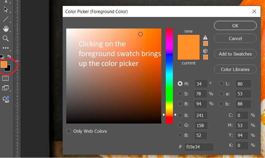
Closely related to brushes are the foreground and background color swatches. The default is a black foreground and a white background. Pressing “D” resets the swatches to black and white. The brush always paints with the foreground color.
When painting on a layer mask you cannot use color. If you try to select a color, it will show as a shade of gray. You could also set a shade of gray as the foreground, but I prefer to use the default black and white, and if I want less than pure black or white, I decrease the opacity.
Pressing “X” swaps the foreground and background, or you can click on the curved arrow above the swatches.
To pick a color other than black or white, click on the foreground swatch and the color picker will open and you can use it to select your desired color. You can use the “X” key to swap foreground and background and change the new foreground to a different color. Just remember the brush always paints with the foreground color.
A handy trick for picking a color that is already in your image is with the brush tool selected, press the “alt” (option on a Mac) and click on a color in your image and it will set that color as the foreground.
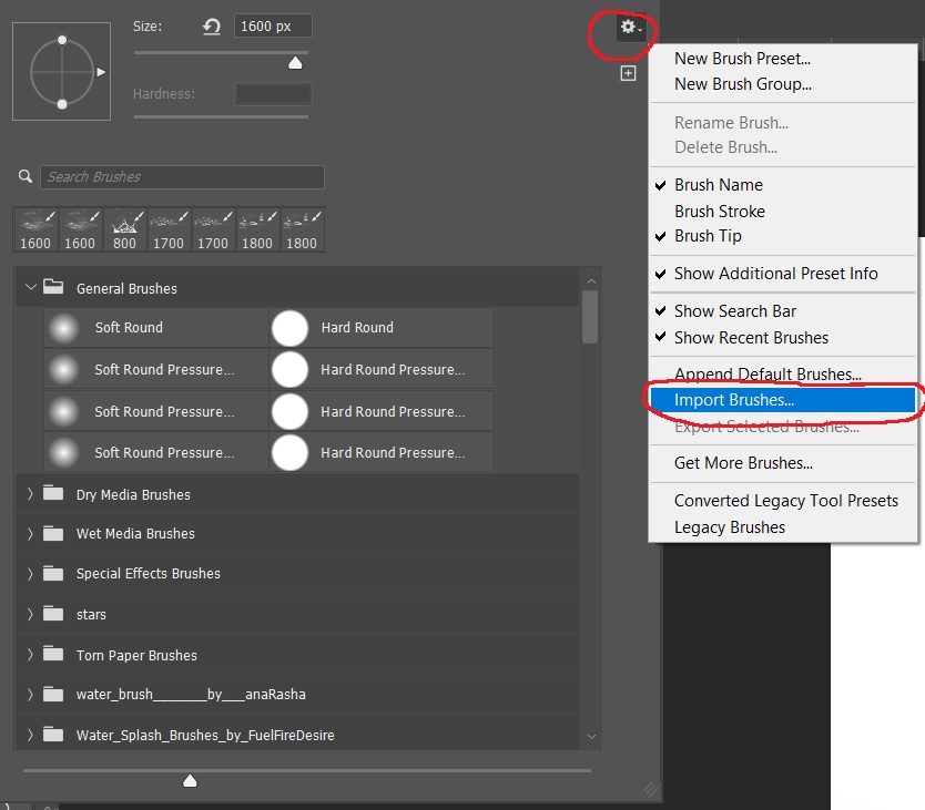
Photoshop installs with a number of brushes, and even more importantly there are unlimited brushes available online, and many are free. Do a google search on free Photoshop brushes and you’ll get too many hits to count. If you search for free Photoshop brushes and a specific subject like Christmas, or stars or birds you will probably find what you want. Photoshop brushes have the extension “.abr” whether it is a single brush or a set of brushes. There are two ways to install brushes. First, if Photoshop is not running, browse out to your brush set, double click it and Photoshop will open and install the brush set.
The second method if Photoshop is already open is to click the drop down arrow next to the brush size on the toolbar to open the brushes menu. Click on the gear icon to bring up the settings menu and go down to import brushes, then browse to the folder where your brush set is stored.
You also create your own folders, and move brushes into them or delete brushes from a folder. Brush folders have only been around for a couple of years. Before that all brushes went into one huge list and it could be really tough to find that one special brush you wanted.
WARNING! You can find and load unlimited numbers of brushes, but there are consequences. If you have a lot of brush sets loaded, it can be tedious to find the brush you want among the many you have loaded. If there are brushes that you use infrequently, it may be better to load them when you need them, and then delete them until you need them again. Also having a lot of brushes loaded may make Photoshop load more slowly and they take up memory. That may not be a problem on a high end system with lots of RAM, but on a smaller system it may become a real problem and make Photoshop run more slowly.
It’s also very handy to have a folder on your computer where all of your brushes are stored so you can find them when you need them and they are all in one place the next time you have to set up a new computer.
In the next articles we’ll look at a few different brushes and what they can do for you.
In this article, I’ll show you a couple of the plugins I use for retouching skin in portraits, female portraits in particular. Two of the most widely used plugins for portrait retouching are Imagenomic Portraiture, and Anthropics PortraitPro. Both have their advantages, and both can give you good results. Both are available at their websites below.
When these articles are converted to PDF and sized for the newsletter, the resolution and quality of the images is seriously degraded. If you would like to read the article and see the images as I did, you can see this article on my website at this link.
My most used retouching plugin is Imagenomic Portraiture. This one is fairly expensive, in the $250 range. I’m still using version 2, and although version 4 is out with a lot of improvements, I’m used to version 2 and most importantly happy with my results.
Portraiture can be set to output to a new layer which I always select, so I can vary the opacity and apply masking if necessary. There are several presets, or you can adjust settings with the sliders and save your own presets. I have several presets I have created for various situations. At the heart of the interface is the eyedropper tool which you use to select the various skin tones that you want to modify. With skin tones selected apply a preset or adjust the sliders for the amount of retouching you want.
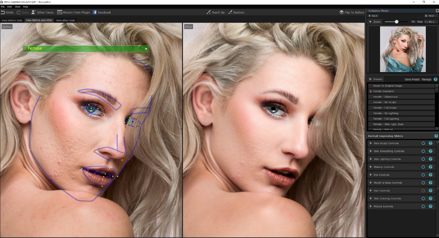
Anthropics PortraitPro is another popular program, which does much more than just skin softening. It can sculpt faces, add makeup, lengthen neck and several other tasks. I don’t use it often, but it is much cheaper, at around $90. I’m still using version 15, and the current version is 23. I would upgrade, except that I don’t use this plugin often.
This plugin does not offer the option of saving to a new layer, so I always first create a copy layer and then run the plugin so I can adjust opacity and masking. When you first open the plugin it will attempt to recognize the face and place markers over key features. There are points you can drag to refine the selection. In the right hand column are all of the adjustments available, and each one opens further into individual adjustments. Again there are presets, and you can save your own.
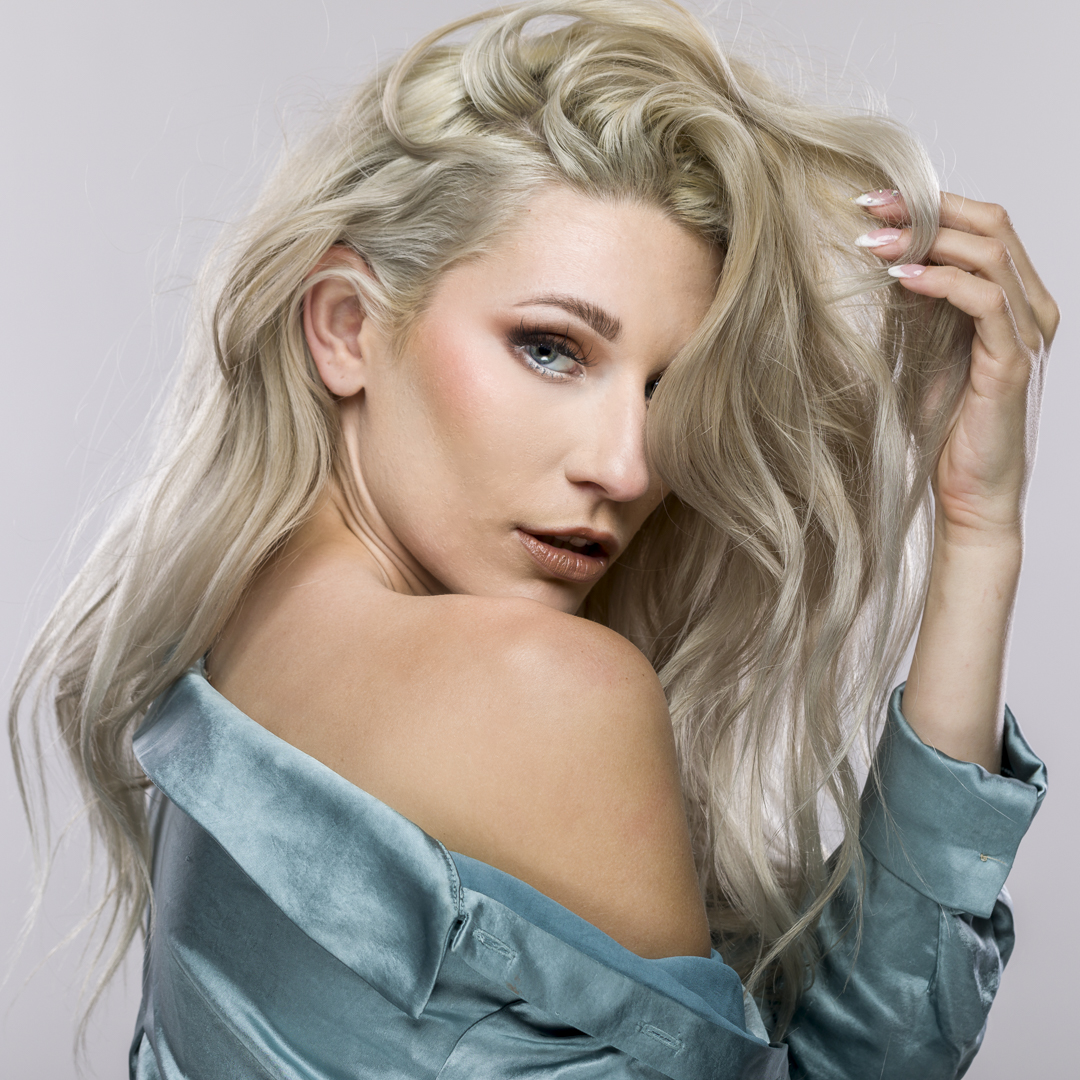
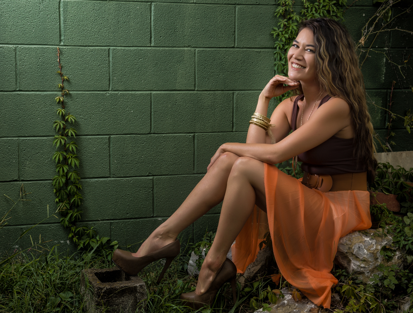
I thought the best way to compare these two programs would be to work on the same image. We’ll start with this unretouched image, and see how the programs do with no other retouching. This is actually pretty unrealistic, since normally I would remove larges blemishes first, but let’s see what happens. Our goal is a nice complexion, free of major blemishes and blotchy skin. At the same time, we don’t want to go overboard, and create skin that looks totally plastic with no texture.
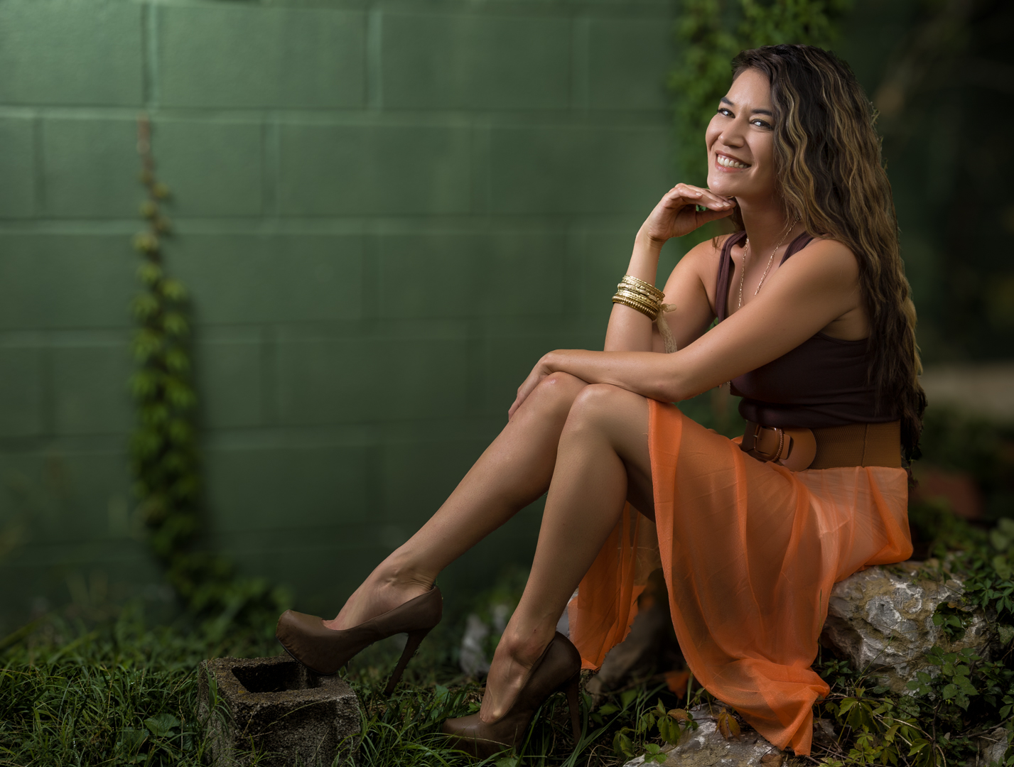
Without retouching the blemishes, here are the results with Imagenomic Portraiture and one of my saved presets. It’s much improved, although the larger blemishes are still obvious.
Again without retouching the blemishes, here are the results with PortraitPro and its default female preset. It’s much improved, although the larger blemishes are still there they are slightly less obvious.
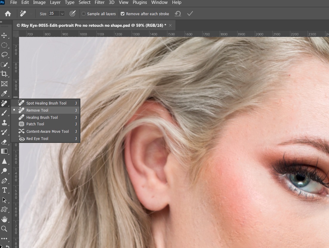
Now for a more realistic test, I’m going to remove the major blemishes. In the past I would have used the spot healing and healing brushes, but since its introduction I’m finding the remove tool does a great job. Below is the remove tool and the results of just removing blemishes. Notice that while the large blemishes are gone, the skin is still rough and blotchy.
Here is the result of using Portraiture after blemish removal.
And here is the result of using PortraitPro after blemish removal.
Both did a good job, although I prefer the Portraiture version. That may be because I use it more frequently and so I’m more skilled with it. Either would be perfectly acceptable.
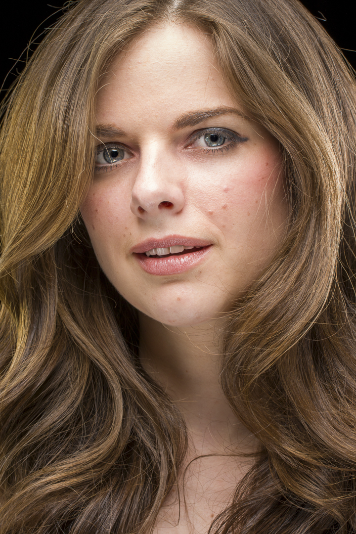
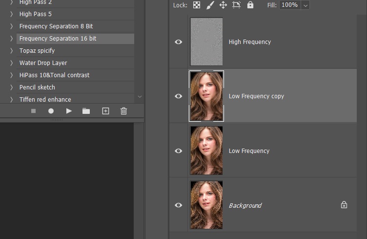
There is a more specialized skin retouching known as frequency separation. This technique creates a high frequency layer with the skin detail and a low frequency layer with skin color. I use Portraiture for my somewhat corrupted version of the technique by applying one of my presets to the color layer, and then dialing down the opacity until it looks good to me. Here is the image I’ll use to show the results frequency separation. This is the image with only Lightroom editing and no retouching.
Here is the image after using the remove tool to get rid of the major blemishes.
Below are the layers that make up frequency separation. The layer labeled low frequency copy is the layer with my Portraiture preset. I usually adjust the opacity down to 80 to 85%, and then flatten the image.
And here is the final result of the frequency separation technique. Notice how the skin tones are smoothed out, but there is still real skin texture, so we don’t get that plastic Barbie Doll look.
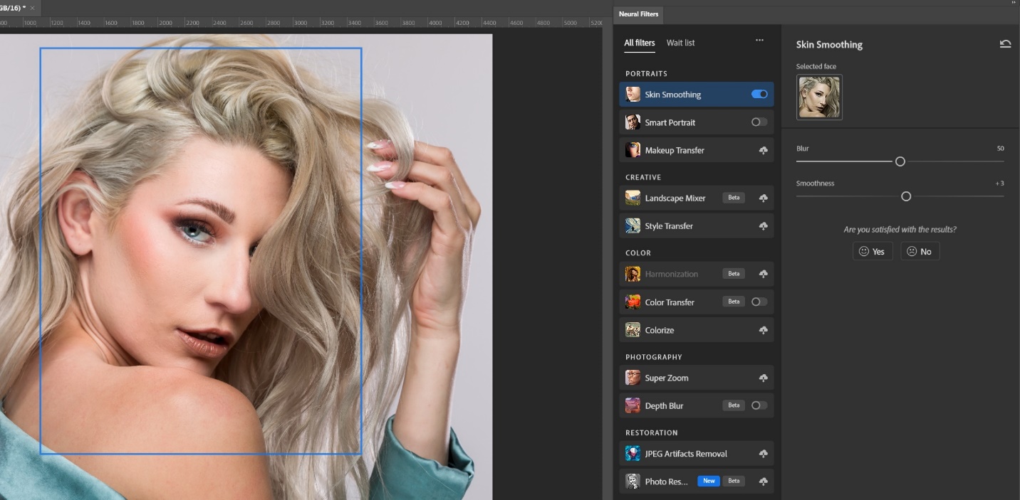
While we’re discussing skin smoothing, if you don’t do a lot of portraits and only need to retouch skin occasionally, the current version of Photoshop (24.7 as of this writing) has a neural filter which uses AI to find the face in a portrait and apply skin softening that is very much like frequency separation. It is under filters/neural filters and it is skin softening. If there is a cloud image next to it, you may have to download it to your computer before you can use it. The blur slider adjusts the detail in the skin while smoothness adjusts the blending of skin tones to remove blotchiness. The biggest downside is that the filter looks for a face and makes a selection box that can’t be adjusted. Notice in this case that leaves the skin of the lower shoulder and arm unselected, and if you look closely, you’ll see the difference in the final image. For tight headshots this works very well, but not so well when there is other skin in the image.
This is the final result with the neural filter skin softening.
Several articles ago, I did an article on faking the shallow depth of field look in Photoshop. It involved selecting and copying the subject, and creating blurred layers and masking. It worked, but it was time consuming. You can see the original article at:
When these articles are converted to PDF and sized for the newsletter, the resolution and quality of the images is seriously degraded. If you would like to read the article and see the images as I did, you can see this article on my website at this link.
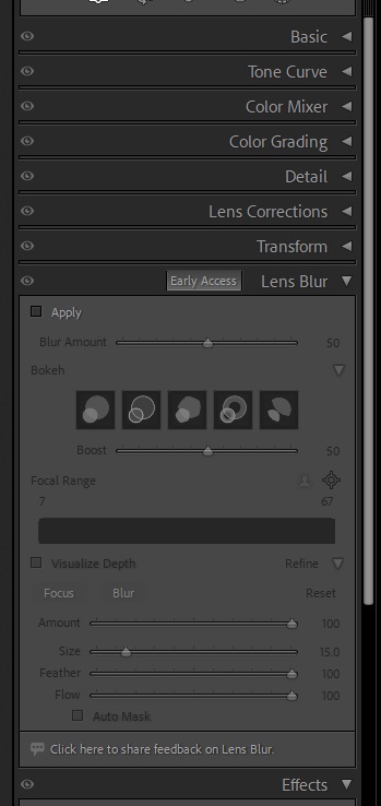
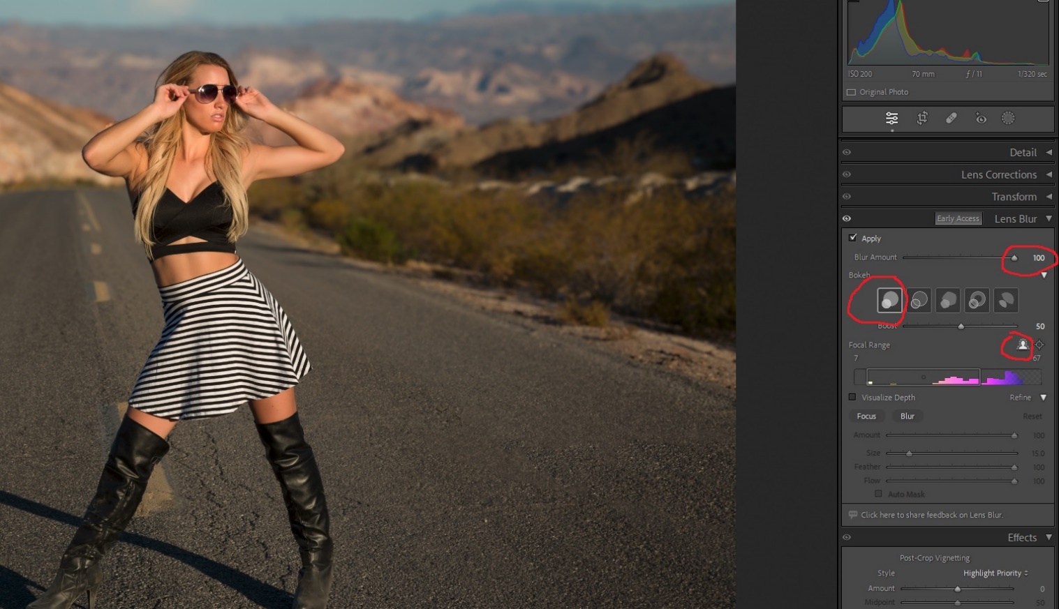
With the October 2023 update of Lightroom to version 13, this is now easily done with just a couple of clicks in the new lens blur panel in the develop module. This is a “early access” or Beta Test feature, which means that we’ll see improvements and changes to it over time. Since I like it a lot already, I can’t wait to see how they make it even better. The lens blur panel is located below the transform panel. And since Lightroom is essentially Camera Raw with a nicer interface Lens Blur is available in Camera Raw just below the optics panel, and works exactly the same as in Lightroom.
To use lens blur check apply at the top left. Then use the slider to adjust the amount of blur. There are five types of blur (or Bokeh if you want to sound fancy). The first is soft creamy round blur like you might get with a modern lens with a really wide aperture, and a really high price tag. The second has bubble like highlights. The third is more like older lenses with fewer aperture blades and a pentagonal shape. The fourth creates donut shaped out of focus hightlights like a mirror telephoto. The fifth has vignetted highlights. I find myself liking the first style the most.
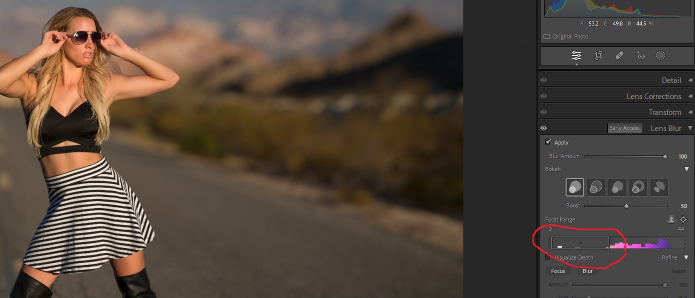
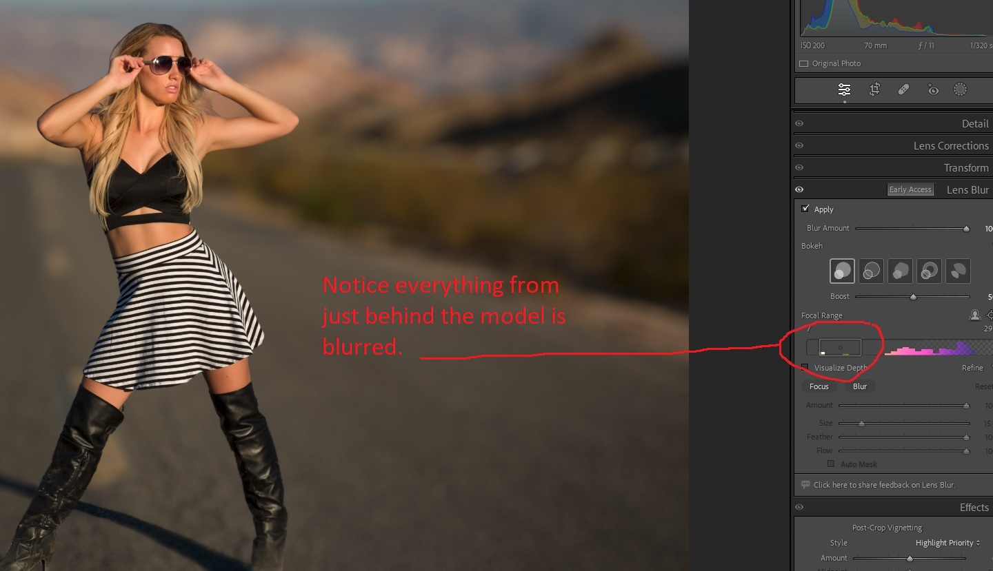
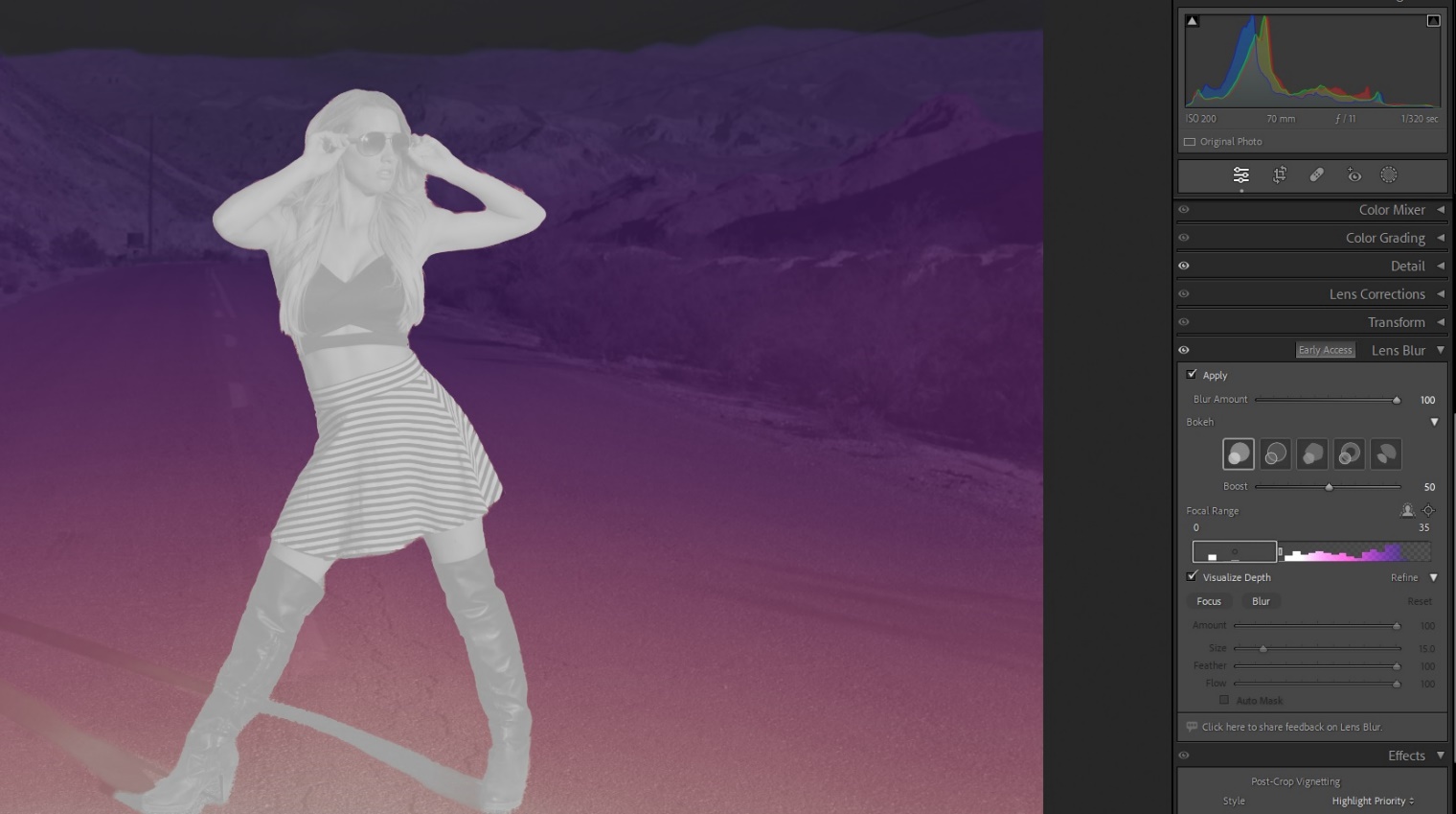
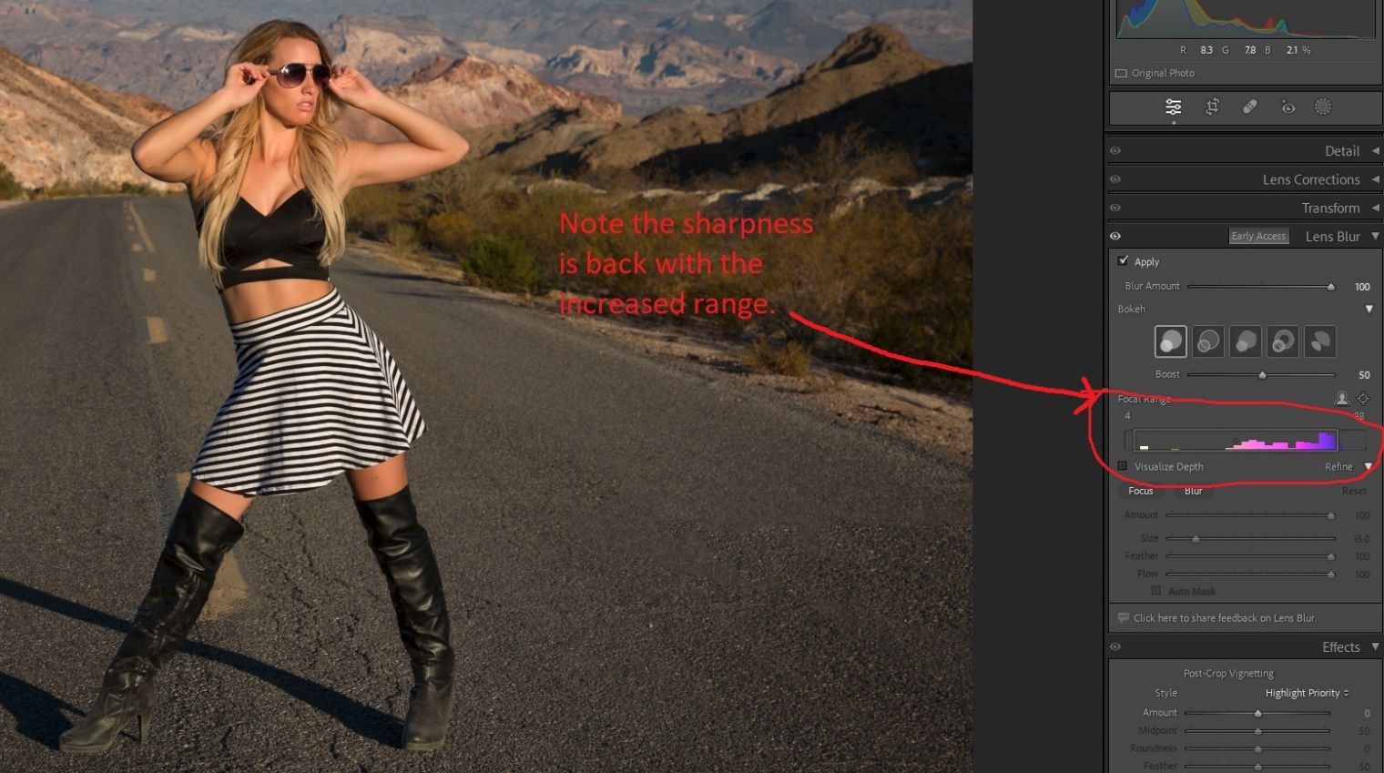
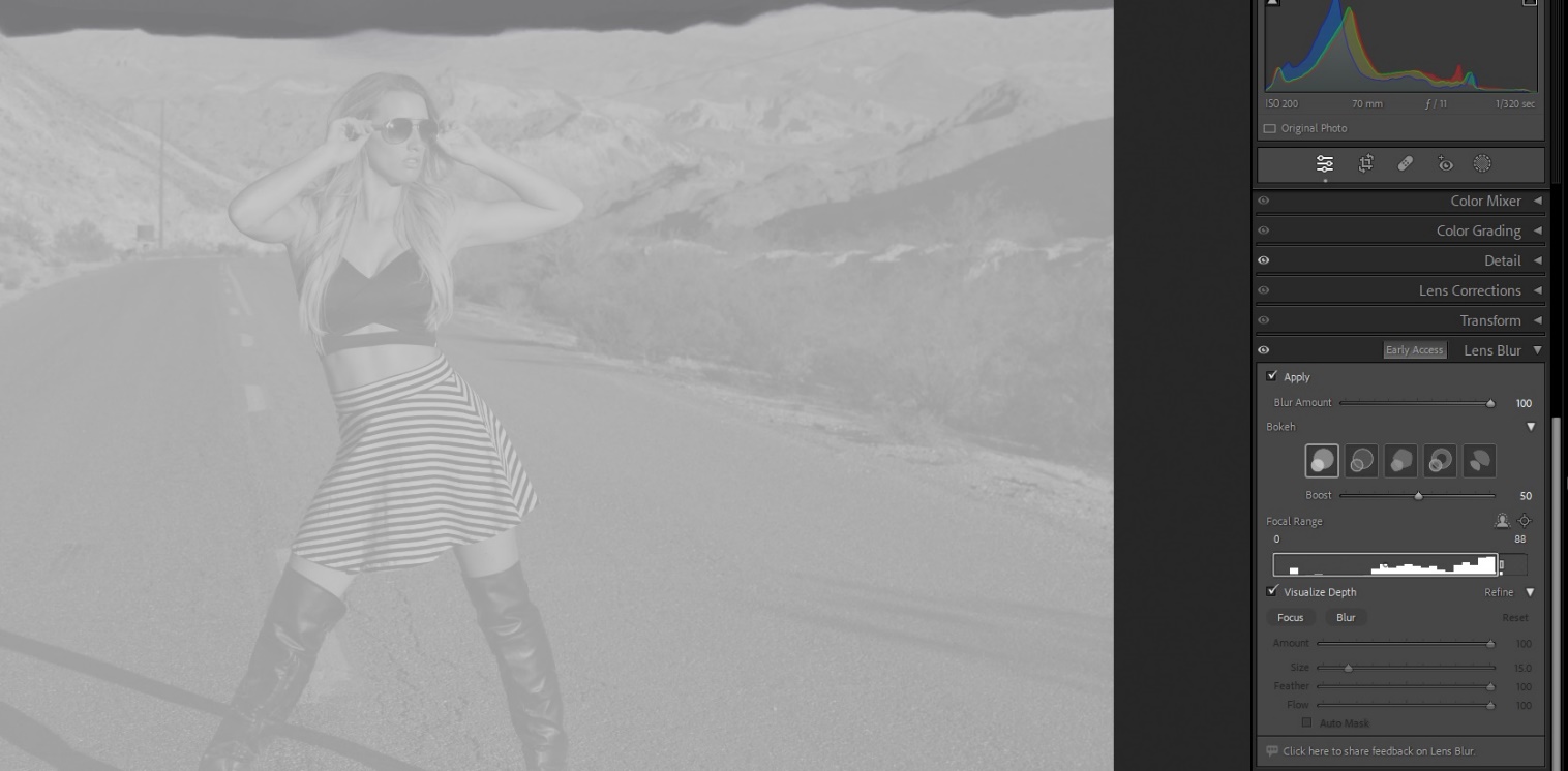
There are three ways to control where the sharp to soft focus begins and ends. There is a person icon and since I’ll primarily use this for portraits, that’s what I’ll most often use, and its an incredible time saver. There is a point icon you can choose and then drag a selection around the area that you want to be sharp. And below the icons is a histogram with a box showing the area of sharpness. You can drag the edges of the box and move the box back and forth to change the area of sharpness. If you click the visualize sharpness check box and then click on the histogram areas of sharpness appear white while blurred areas are colored. The more saturated the color, the greater the blur.
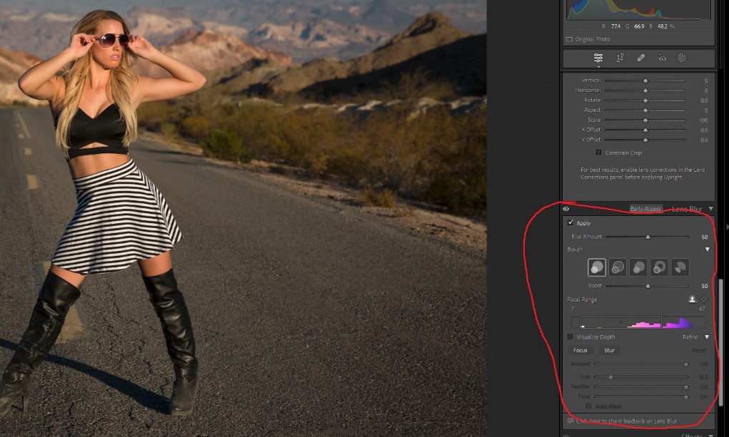
Here you can see the box of focus on the histogram is narrow, and depth of focus is shallow. Below that you see what happens when you check visualize depth and click on the histogram Here the box is narrow and only the subject is white.
Here the box is wider, and you can see more of the background is in focus. Checking the visualize box and then clicking on the histogram shows how much white (sharpness) there is.
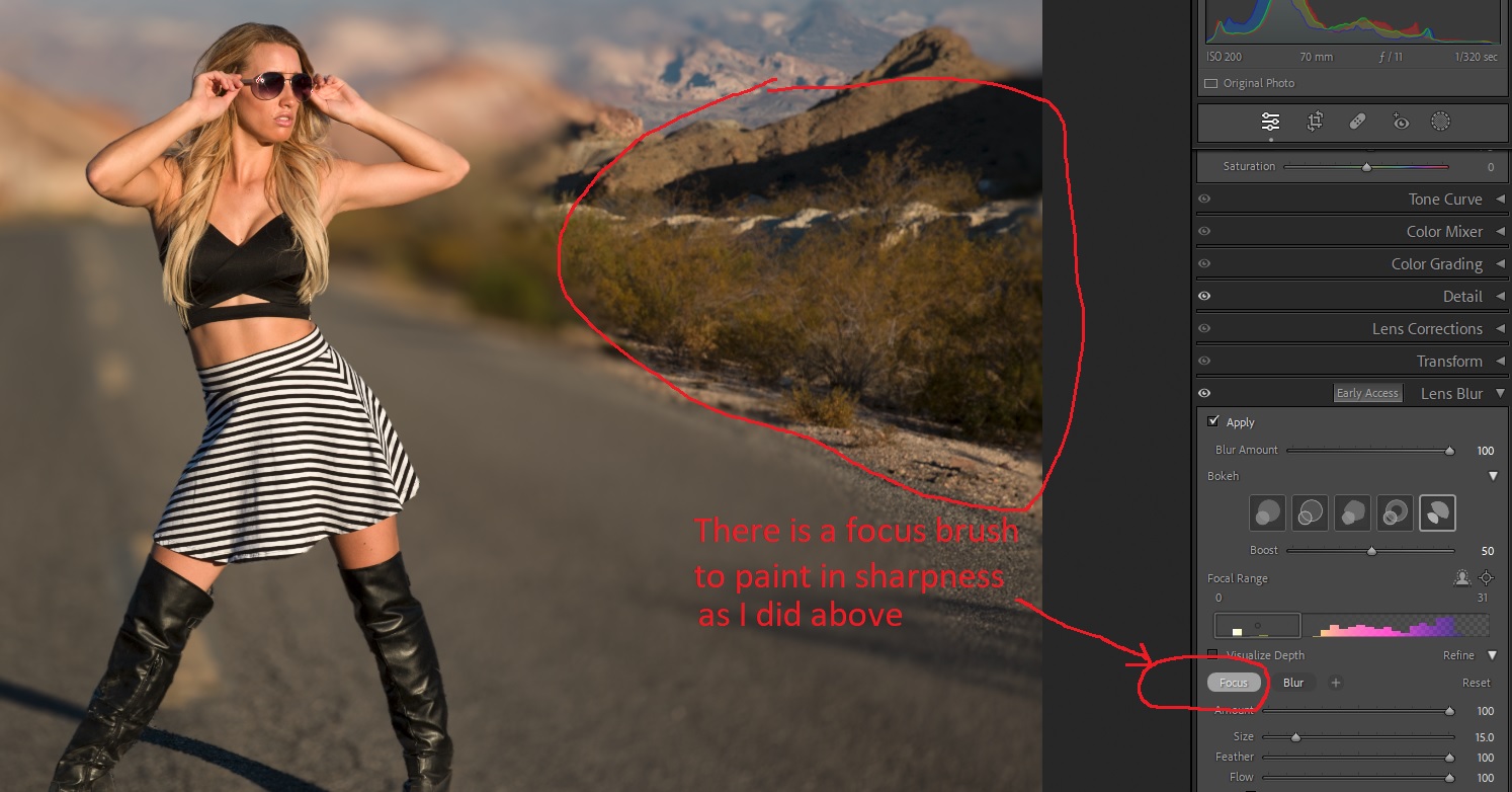
If you need to fine tune some areas, there is a brush that can be used to add sharpness or blur.
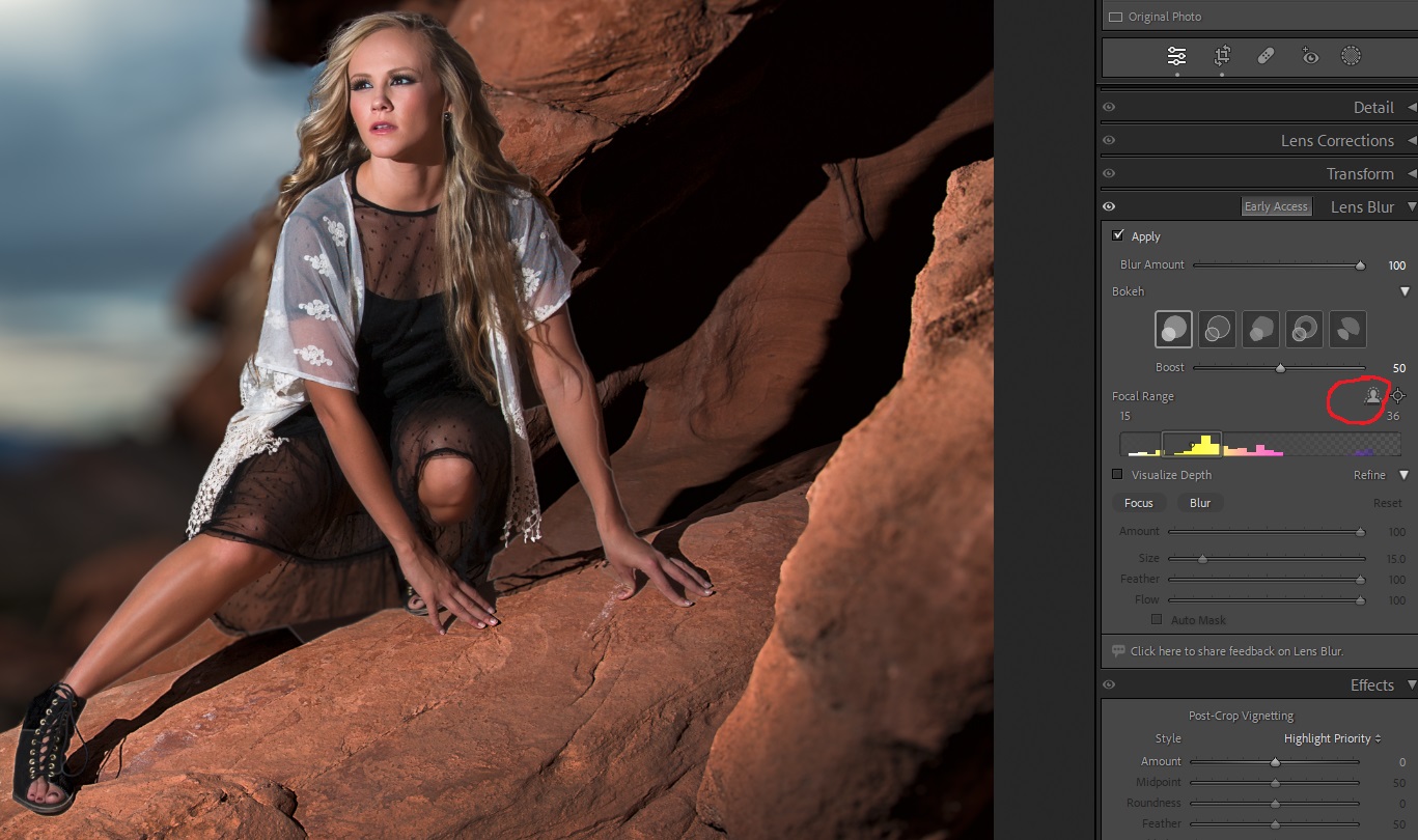
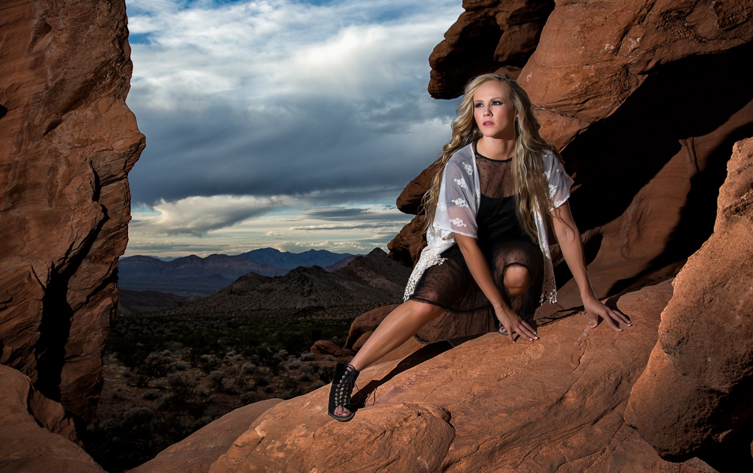
Here is another image from a workshop in Las Vegas. One click on apply, slide amount to 100%, click on the people icon, and click on the 1 blur style and I’m done in about 5 seconds, versus the 10 minutes my old layers technique used to take.
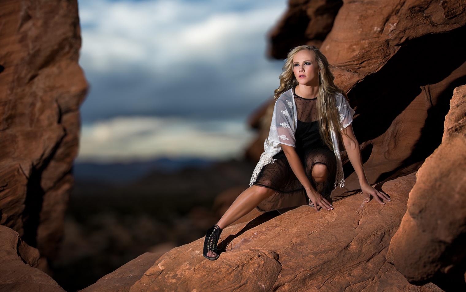
And one last example. Notice how much this one technique makes the model stand out from a busy background.
In this article, I’ll show you a couple of quirky filters, that create some unique effects. Fractalius, Fractalius 2, Fractalius G4 are available from Redfield at the link below. All of these filters are for the Windows platform exclusively, with no plans for Mac versions. Fractalius 1 and 2 only work on 8 bit images, and Fractalius G4 will run on a 16 bit image, but it creates artifacts, so do all of your major editing in 16 bits, and save a 16 bit version, then convert to 8 bit before running one of these plugins. As always, I recommend running these on a copy layer so you can vary opacity and add masking to refine the effects.
When these articles are converted to PDF and sized for the newsletter, the resolution and quality of the images is seriously degraded. If you would like to read the article and see the images as I did, you can see this article on my website at this link.
Fractalius has an intimidating control panel, but there are several presets available. My advice is to cycle through the presets until you find something close to what you like, and fine tune from there. When you have a setting you like, you can save it with your own name. Also there is a dice icon that creates random settings with each click. It’s truly a gamble; sometimes you get a winner, often you get a loser. Also this is a SLOW filter. I have a pretty high end Windows 10 system with lots of RAM and a good graphics card, but this filter takes about 3 minutes to run. Click start and go grab a drink, or maybe dinner and a movie if you have an older system.
My favorite use is a sort of sketch effect I came up with and saved. It works well for portraits if the background isn’t too busy.
Fractalius 2 has a similar interface, and seems to produce wilder effects. I haven’t found any settings that I like to use consistently. This one doesn’t work for me often, but when it does, the results are pretty flashy. This version 2 runs much faster than version 1, usually 30 seconds or less.
Probably the version I use most is Fractalius G4. This one finds lines and details in your subject and brings them out in interesting ways. Oddly, I have found that my favorite subject for this version is flowers, and I’ve saved several flower presets. The interface adds two slider control for brightness; the X axis controls shadow brightness, and the Y axis is highlight brightness. It works well once you get used to it. Also I always work on a copy layer, and almost always have to drop the opacity to blend it with the original.
These aren’t filters that you’ll use every day or on every image. But when you want something different, unique or even strange, these may be just what you need.
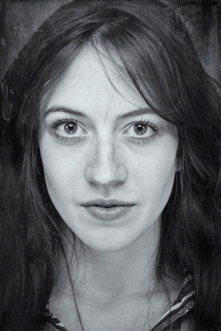
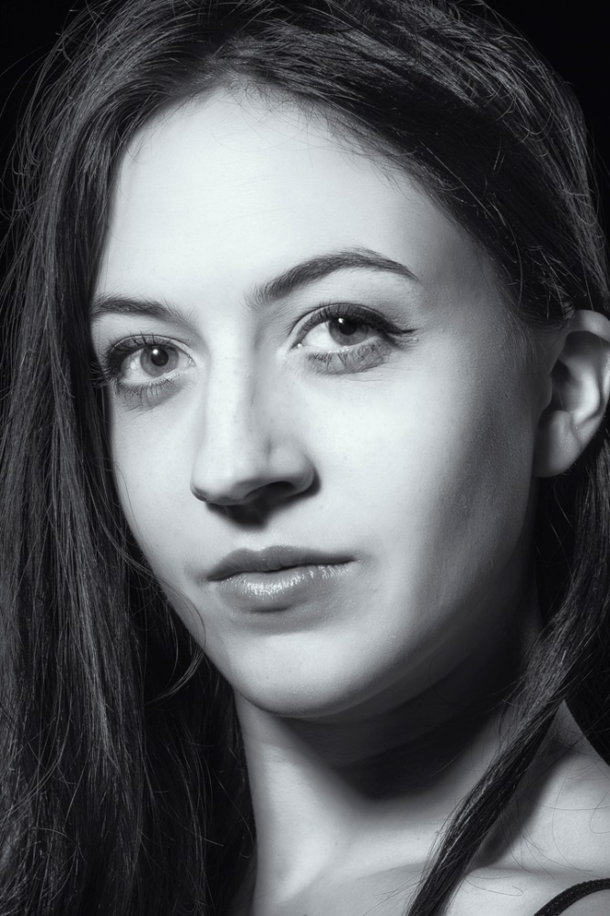
In this article I’ll show you my favorite plugin for creating black and white images, either as a conversion from a color image or as a different look for a monochrome image. Silver Efex is one of the programs within DXO NIK Collection. Version 6 has just recently been released, but I am still using version 5. Also as I said in my earlier article, even though this can run as a stand-alone program, or from within Lightroom, I use it as a plugin in Photoshop. This gives me the benefits of masking, blend modes, and “blend if” controls. The NIK plugins offer “control points” which allow for localized adjustments within an image. You may find them useful, but my workflow has always revolved around layers and masking, and that’s what I’ll be describing.
You can find more detailed information on how to use any of the NIK programs, including the use of control points at:
When these articles are converted to PDF and sized for the newsletter, the resolution and quality of the images is seriously degraded. If you would like to read the article and see the images as I did, you can see this article on my website at this link.
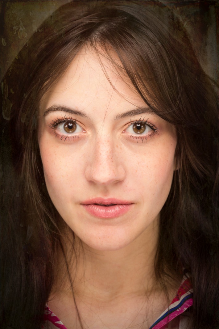
To me, one of the greatest advantages of digital photography is that we get to shoot in color, and then later we have the option of converting to Black and White. Very often in the film days I carried one camera with color film, and one with B&W. We won’t even mention the hours and hours in the darkroom breathing noxious fumes. While it is possible to make very nice B&W conversions in Lightroom or Camera Raw, Silver Efex gives much me more options and greater control. There are numerous presets and I can usually find one that suits my image. Often the preset is perfect as is, or is a good starting point for the many tweaks available in the right hand panel.
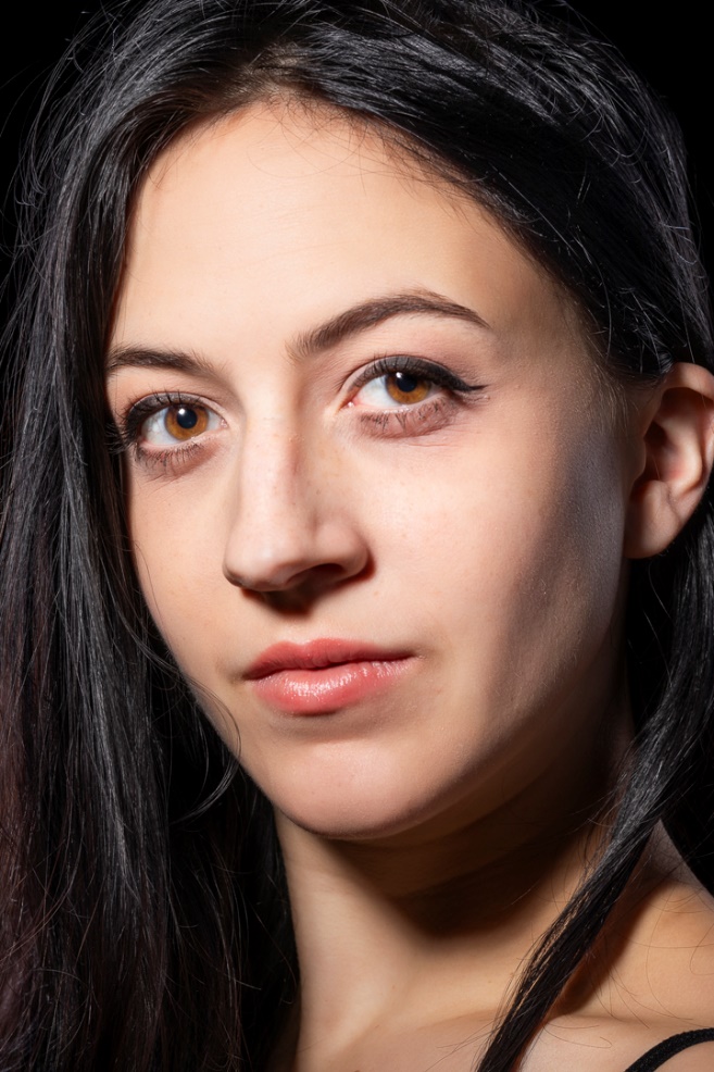
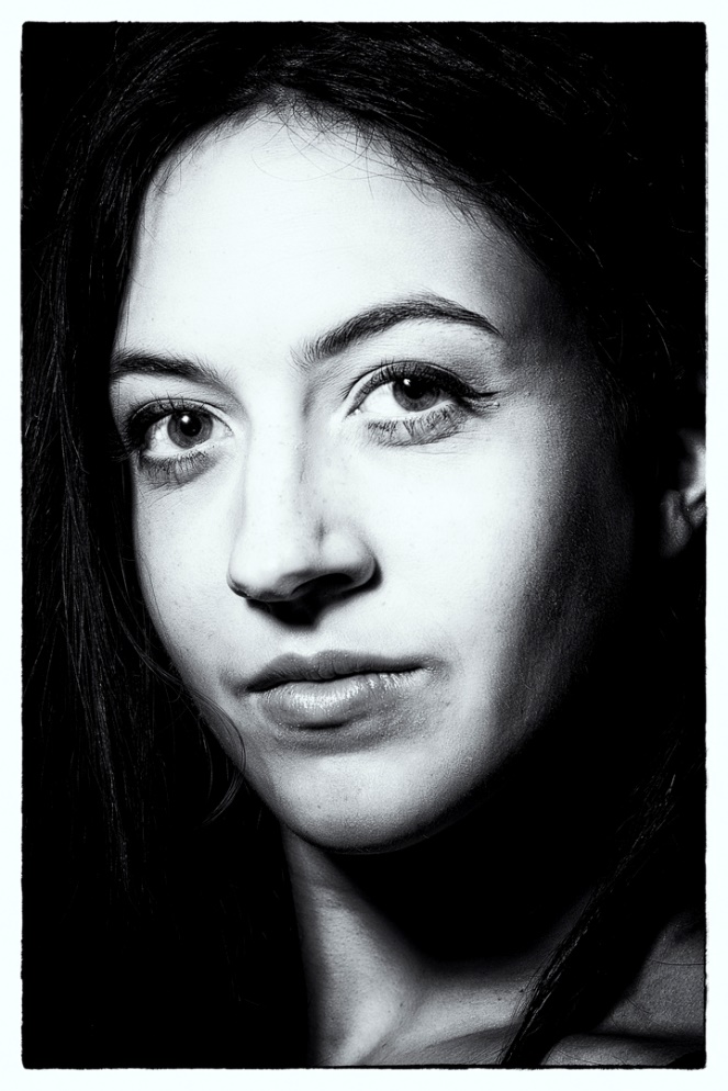
One of my favorite subjects has always been B&W portraits, but now I get to shoot in color and then choose the color or B&W version.
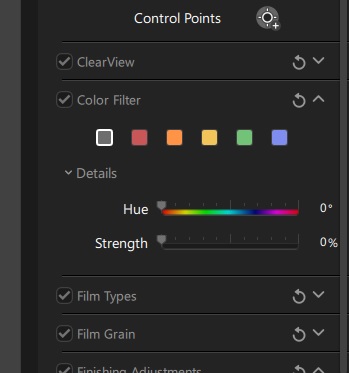
One important control in Silver Efex is the color filters in the right hand panel. These act just like shooting B&W with a colored filter on the lens. For those of you who didn’t grow up shooting B&W film, the basic principle is that the color filter blocks colors other than its own, and darkens those colors, while lightening its own. So in the example above, I used a low strength of the green filter, since it is the opposite of red and darkened down the lips.
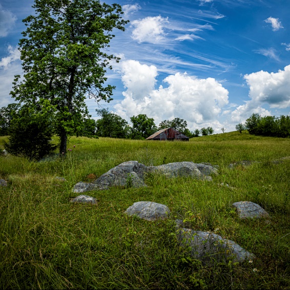
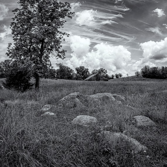
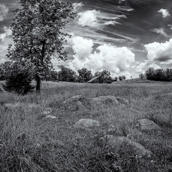
In the series below, I went from color to B&W without a filter and then B&W with a yellow filter. Since yellow is the opposite of blue, the blue skies are darkened. A red filter would also have darkened the blue sky, but would have lightened the red barn.
I shot this portrait with a small harsh light source to mimic the Hollywood glamour look of the 40’s and 50’s. Color doesn’t fit the mood of the image, so I converted it to B&W with several presets so you can see the differences. The first preset was film noir which was very appropriate to the mood.
In order, I also tried Full Dynamic Range, and Fine Art, which are probably my two favorite starting points for portraits.
One of the options for finishing an image in Silver Efex is toning. My personal favorite is the lowest level of selenium, which creates a very slight blue cast. I think I like this one because when I was in school doing actual B&W prints, selenium toner was so expensive that we didn’t get to use it very often. Of course varying degrees of sepia are available for a more traditional or antique feel as well as several others.
I have a camera converted for B&W Infrared, but even though I have an Adobe Monochrome image after basic editing in Lightroom, I still prefer the look I get with Silver Efex. Below is the image with basic processing, and then below that with the high structure smooth preset in Silver Efex. This is one of my go to presets for images other than portraits.
Here is another example where color just doesn’t suit the mood of the image. This was shot at a Civil War reenactment and there weren’t any color tin types in the day. This is the Antique Plate preset which is perfect for the time period.
One of the creative effects we have available by using layers is the ability to mask parts of the B&W layer to create a selective color effect. Use this sparingly and subtlely. Here is an image with subtle colors to begin with and masking just the leaf works pretty well. To make it easier to mask the leaf, I selected the leaf with object selection, and then with that selection in place, I painted black (Remember black conceals, white reveals) on the mask of the B&W layer.
This look has been way overdone, so be very careful not to overdo it yourself. In the 2010’s the bride holding her bouquet, converted to B&W, with selective color on the flowers became a cliché. Non-photographer brides loved it, while photographers hated it. But the bride had the checkbook, so who’s right? However if I see or hear of you doing this shot, I’ll deny ever knowing you and I certainly would never admit to showing you how it’s done.
Play around with all of the various presets in Silver Efex and enjoy the freedom of being able to shoot in color, but choose B&W later. This one ability is one my very favorite advantages of digital photography. Have I told you lately what a great time this is for photography? And it just keeps getting better every day.


 Back in the 70’s and 80’s we used to produce a tricolor effect by either making a triple exposure on one frame of film with pure red, pure blue and pure green filters, or by using a “Harris Shutter” (see below) which acted as both a holder for the three filters and as a shutter during a long exposure. I did the effect both in 35mm and on 4×5 film, but figuring out the proper exposure for the three exposures and the filter factors for each color was pretty tedious.