A couple of years ago I wrote an article on how to enter a photography contest. At the 2018 Photofest in St. Augustine, FL, I went to a class on “How to Judge a Photograph” by Lisa Langell. It struck me that if you knew what the judges look for, and used the same criteria to judge your own images as you make your contest selections your chances of success would be much better.
So first of all, from the PPA (Professional Photographers of America) web site, here are the twelve criteria PPA judges are trained to look for.
Impact Viewing an image for the first time always evokes some kind of feeling. Sometimes they can make us sad, happy or angry. Sometimes they force us to look inward at ourselves.
That’s called an impact, and the more powerful the image, the more powerful the emotional response of the viewer.
Technical Excellence This is the print quality of the actual image itself as it’s presented for viewing. There are a lot of aspects that speak to the qualities of the physical print. These can include:
Retouching
Manipulation
Sharpness
Exposure
Printing
Mounting
Color correction
Creativity Your point of view is exactly that– yours. And it’s unlike anyone else’s.
This element speaks directly to that perspective. It shows your imagination and how you used the medium to convey an idea, a message or a thought to the viewer. This is how you differentiate yourself from others.
Style There are many, many ways to apply this element to your work. Maybe you use light in a specific way on a subject, or maybe you make a technical decision for the express purpose of underscoring desired impact.
When subject matter and style come together in an appropriate manner, the effects on an image can be spectacular. But remember, when subject matter and style don’t work together, the results can be, well, less-than-spectacular.
Composition When all the visual elements of an image come together to express intent, that’s when the magic of composition happens. Good composition captures a viewer’s attention and directs it where you, the artist, want it to be. Depending on your intent, you can make something that pleases the viewer– or disturbs them.
Presentation How you showcase an image is just as important as how you compose it. Everything in the presentation should work to enhance your image and not distract from it. Keep this in mind when choosing mats, borders and everything in between.
Color Balance Proper color balance can bring a sense of harmony to an image. When the tones all work together to support an image, the emotional appeal is that much greater.
But color balance doesn’t have to be used to bring harmony to an image. You can use color balance to evoke any number of feelings from a viewer. The choice in how to take advantage is entirely up to you, but no matter what, be sure your choice enhances rather than distracts.
Center of Interest This is where an image’s creator wants a viewer’s attention focused. Sometimes there can be a primary and a secondary center of interest. Sometimes everything in an image will work together to create that center of interest.
Lighting The use and control of light has an effect on every aspect of an image. It informs dimensions and shape, it sets tone and mood, and, like every other technique, proper lighting can be used to enhance your image while improper lighting can detract from it.
Subject Matter Even though it lacks words, your image is still telling a story, and your subject matter is central to that. So make sure that your subject matter is right for the story that you’re trying to tell.
Technique How you choose to execute your image is key. It’s also a holistic decision. Technique informs everything in the creation of your image. From lighting and posing to printing and presentation, it all works to show off the techniques that you’ve mastered and applied to your craft.
Story Telling What does your image evoke in a viewer’s imagination? What do you want your image to evoke in a viewer’s imagination?
Keep in mind: You are creating art. And while the act of creating is a personal thing, so too is the act of viewing. Your image is a story, and the one it tells your viewer may be one you never knew you were telling.
As part of Lisa’s class, we did a quick judging of 50 images. Of 50 images, we judged 15 to be good. We then evaluated what we liked and why we selected them.
In our group, the most important criteria wasimpact. Keep in mind that in a contest, most judges will only spend 3 to 10 seconds on an image. Impact is that WOW Factor that makes a judge want to really look at an image. While all of the twelve criteria can contribute to (or detract from) impact, you have to catch the judges eye quickly. Some of the things that our class felt contributed to impact were action, separation of the subject, a clearly defined subject, eyes, and eye contact, expression, color, simplicity, bokeh (the soft out of focus background), and contrast.
Once you get past the WOW Factor, then the other criteria come into play. As competition chairman, I get to view the judging in most of our contests, and the most common comments I hear from judges involve lack of sharpness, lack of contrast, and compositions that could be improved with cropping. From there it becomes the little things like dust spots, stray highlights, distracting border elements, overly obvious vignetting and color balance.
Most importantly, realize that the judges are human, and art is subjective. Winning or losing is just a reflection of how a panel of judges saw an image on a given day. As one of my judges told me, “If I judged the same images tomorrow, I might get totally different results.”
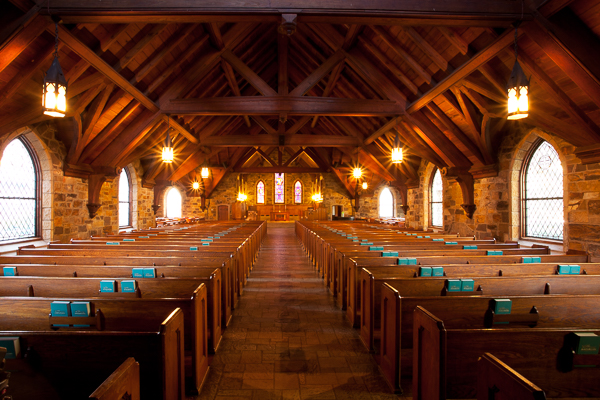
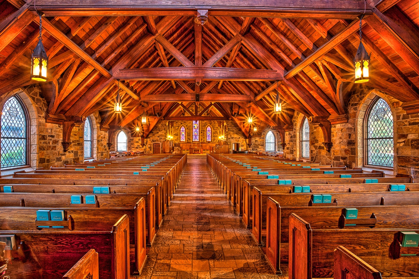
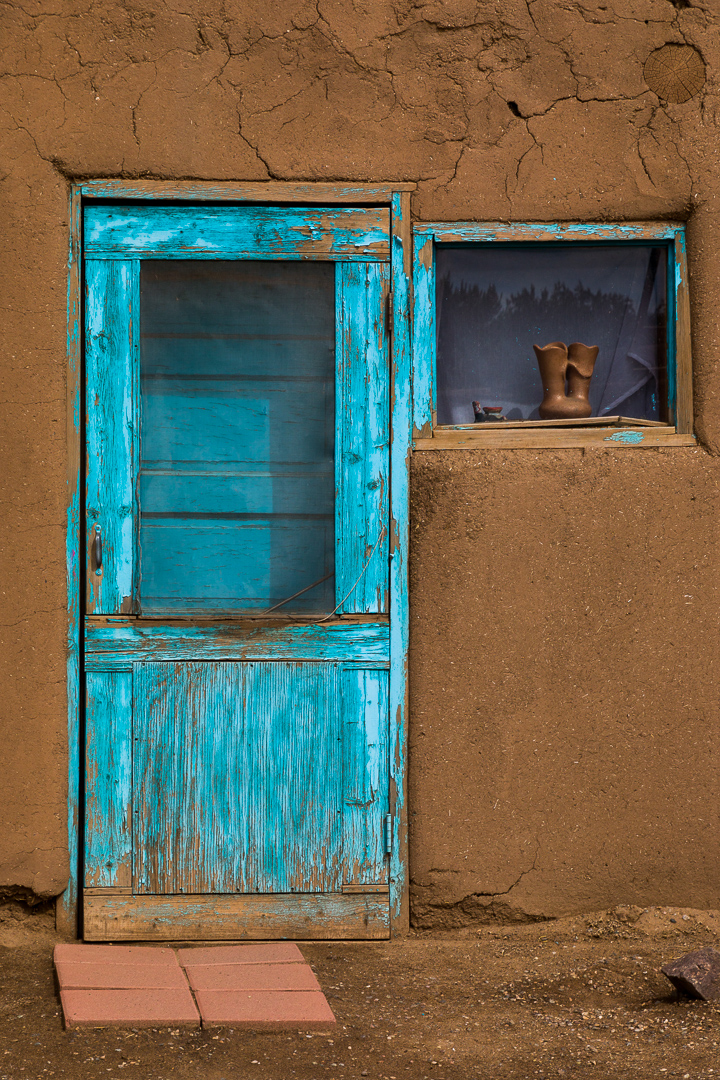
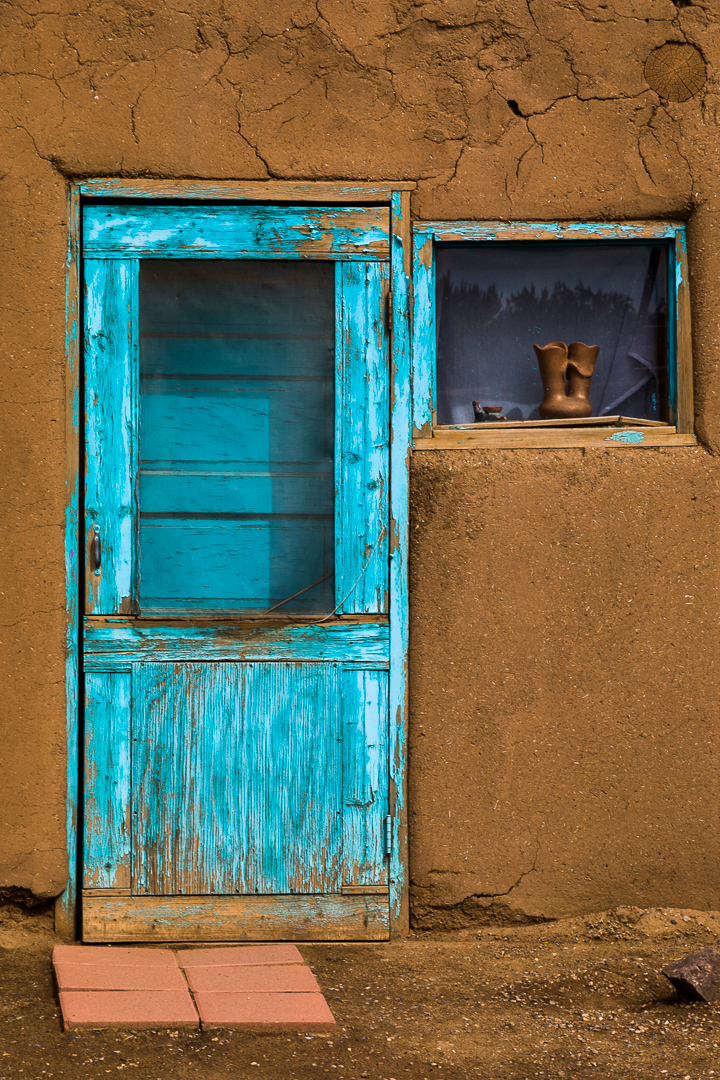
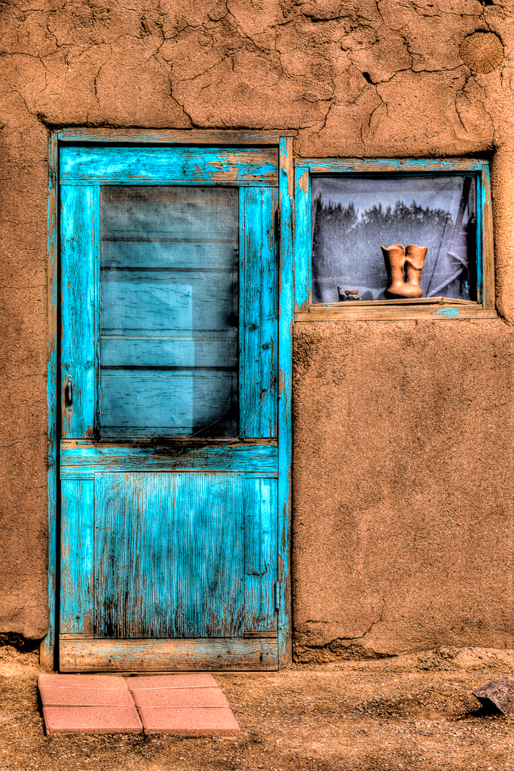
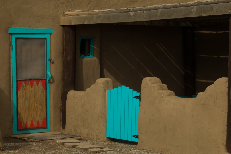
So with all of that in mind, here are the first, second and third place print and digital images from the PSC’s 2018 annual contest, and the three 2018 quarterly contests. As you look at these images, keep these twelve criteria in mind, and see how they apply to winning images. Also as always, be aware that the quality of these images may suffer through reduction in size, and the conversion to PDF format.
Lately I’ve been trying to cut back on the gear I carry when travelling. And while there are times where the situation demands a case full of large lenses and multiple bodies, and maybe even lighting gear, there are lots of times when simpler is better. In the film days, I used to carry a bag full of prime lenses, usually 20mm, 24mm, 35mm, 50mm, 100mm and 200mm. Add to that a couple of bodies and it adds up to nearly 40 pounds. Walking around with 40 pounds of gear for a whole day can quickly suck the fun out of almost any photography. It also seems I spent a lot of time deciding what lens I needed and then changing lenses.
A few years ago I bought a 18-200mm f/3.5-6.3 “all in one” lens for my Canon 7D Mark II. With the 7D’s 1.6 crop factor, that makes it the equivalent of a 28-320mm lens. That will cover all but the most specialized needs. This year I broke down and bought the Tamron 28-300mm f/3.2-6.3 lens for my full frame 5D Mark III and Mark IV. I have done numerous outings carrying only one of these do all lenses, including major trips like Cuba and the Durango Railroad photographer’s weekend with no regrets. And I’ve even purchased the Canon EF-M 18-150mm (28-240 equivalent) for my new M50 mirrorless.
There are some real advantages, and a few minor disadvantages to the all in one lens. First here are some of the advantages I see.
1) The Murphy’s Law of Lenses is “whenever you have more than one lens with you, the lens on the camera will always be the wrong one”. When you approach a scene or subject with an all in one lens you don’t have to decide which lens to use. You don’t have to change lenses, or worse yet change lenses in rain, snow or blowing sand. All you have to think about is your subject and how to compose; the lens choice is already made for you.
2) One lens takes the place or two or more lenses. That’s less weight, less to pack and less to keep track of in the field.
3) Less gear means less discomfort from lugging around a big heavy bag and that makes you a happier and more productive photographer.
4) You’ll never get caught changing lenses right when something good is happening; you’re always ready.
5) They are much less expensive than the multiple lenses they replace.
6) By not changing lenses, you’ll have much less chance of getting dust on your sensor.
Now for some of disadvantages.
1) To be small and yet have such a huge zoom range, there are some tradeoffs in sharpness. There is no way these lenses are as sharp as a prime lens, or even a really good zoom with less zoom ratio. But they are probably sharp enough for almost all of your travel photography. If the only thing people are looking at is how sharp the image is, it’s probably not a good image to begin with.
2) They tend to be slower (that is they have smaller apertures or higher f numbers) and they are usually variable aperture lenses. That means that as you zoom from wide angle to telephoto the aperture becomes even smaller. For the cost and versatility this isn’t a bad tradeoff. Any relatively recent camera can shoot high quality images at ISO 800 or even 1600 and beyond so you can still get a safe shutter speed for hand holding. And these lenses usually have image stabilization to help when hand held (turn this off when on a tripod). If you can’t get a shutter speed fast enough to hand hold, well you did bring a tripod didn’t you?
3) They tend to have more distortion, especially at the wide angle end. Most of the time, you’ll probably never notice it unless you’re shooting brick walls or other subjects with a lot of straight lines. And it’s easy to correct it just by checking the lens distortion checkbox in Lightroom’s develop module.
4) If it’s the only lens you’re carrying and it breaks, your shooting is done. True, but in 300,000 shots with five cameras and a dozen lenses, I’ve never had one fail in the field. That even includes a camera and lens that fell off a tripod, and bounced on a sidewalk. With a quick gaffer tape repair they worked for the next week until I could send them off for repair.
5) They aren’t as wide as I’d like at the wide end. I love the look of a 24mm lens and find there is huge difference just going up to 28mm, which is the common wide focal length. Tamron does make a 16-300mm for APS-C bodies which is an amazing 25-480mm equivalent. But most of the time I find I can work around not having a 24mm.
Here’s a bonus tip. Photograph with friends who use the same brand of gear. In Cuba four of us shot Canon and between us we had at least one spare body and a couple of spare lenses. The two Olympus shooters had coordinated their backup gear so they were covered without duplication, and the lone Nikon shooter, well who cares, after all he shoots Nikon.
Here are some shots from a couple of recent trips. I might even consider a couple of them once in a lifetime trips, and yet I trusted the whole event to a single all in one lens. And like I said, no regrets and I’m more than happy with my images, even though I am very picky about image quality. As usual, at this size and with the conversion to PDF you may not be able to fully appreciate the image quality, but trust me it’s there.
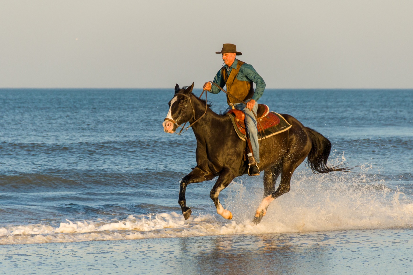
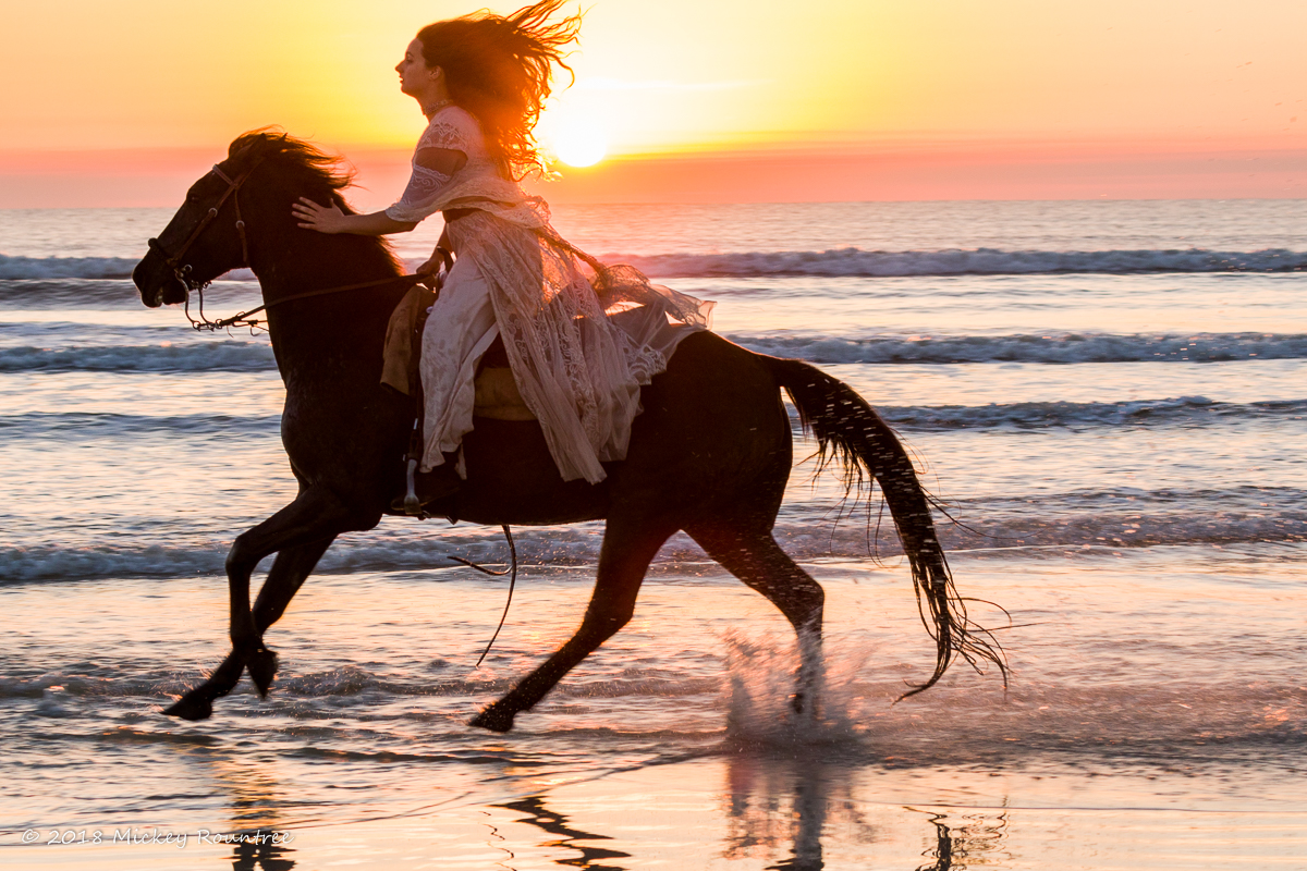
In 2017 I shot horses at the beach for the first time using a Canon 5D Mark III and 24-105mm and 70-300mm lenses. It seems like I was constantly changing lenses with sand and salt water spray flying. And I had to protect that extra lens while I was sometimes past knee deep in the surf. In 2018 I decided to use the 7D Mark II and only the 18-200mm Sigma. It covered everything I needed with ease. There was no lens changing, no extra lens to carry and keep dry, and I never missed a shot because I was busy changing lenses. Here are some shots from the 2018 St. Augustine Photofest and the horses on the beach. All are taken with the 7D Mark II. The first two are at 18mm (28mm equivalent), the third is at 39mm (64mm equivalent) and the last is at 200mm (320mm Equivalent).
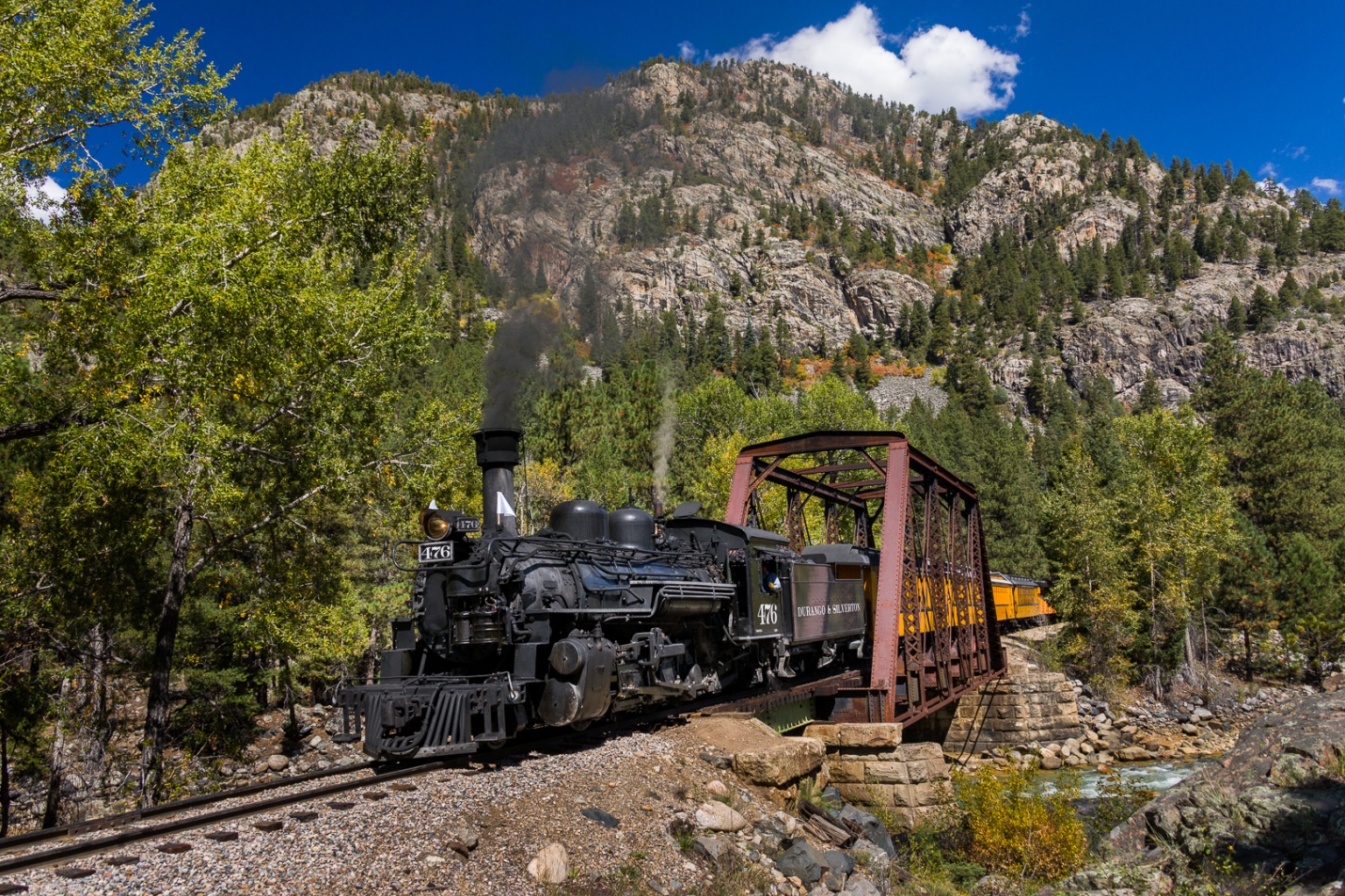
In September I went out to the Durango to Silverton Photographer’s Weekend. I only used my 5D Mark IV with the 28-300mm. I didn’t want to be juggling multiple lenses climbing on and off the train frequently, and I sure didn’t want to be caught changing lenses as the train went past. The first shot is at 28mm, and the second at 300mm.
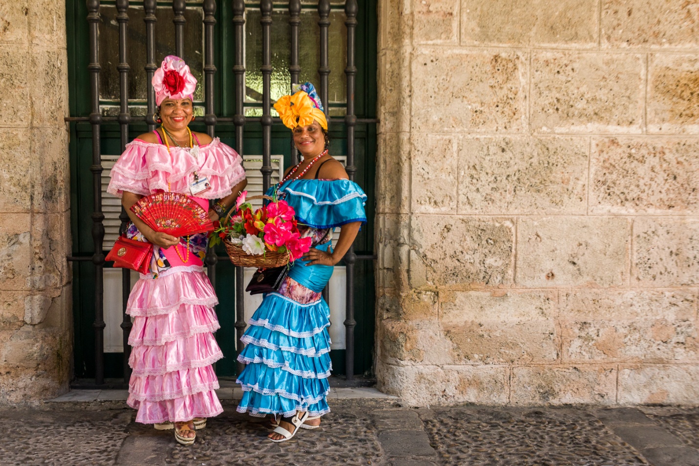
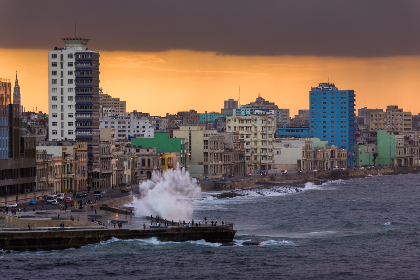
The last shots are from our recent Cuba trip. By the time of this trip I was so comfortable with the performance of the 28-300mm on my 5D Mark IV that once again it was my only lens. The first shot of the bar was hand held at ISO 4000. The second shot was at 50mm and ISO 1600 due to the shade of the porch (we asked them to come out the harsh sunlight where everyone had been photographing them). The third shot was at dusk at 179mm (On a tripod) and the last two shots were at 300mm. I hope you’ll agree that the quality of all of these shots with the 18-200mm or 28-300mm lenses is more than good enough, and the zoom range can handle almost everything you’re likely to shoot while travelling.
You might assume the answer is always yes, but I’m finding that the answer is maybe, maybe not. With the cold and rainy weather, I’ve spent more time inside working on editing or re-editing some old images, and I’ve found a surprise or two when it comes the need for three or more images to create an HDR image. In past articles I’ve talked about the need for HDR when the dynamic range of a scene exceeds the sensor’s capability to record it. I’ve also tried to show the look of Lightroom and Photomatix HDR images, both when the scene is within the sensor’s range and when it exceeds it. Here I’ll try to show if and when you need multiple brackets to create an HDR.
Part of the reason for this article results from my recent Cuba trip. I returned with over 6,000 images, many of which were three image brackets of -2, 0, and +2 stops. Partly to avoid buying more hard drives, and partly because I felt that I was in the mood for more realistic images, I combined the brackets into HDR DNG images in Lightroom, and then deleted the brackets to save hard drive space. After a few weeks I came to regret that decision, when I decided some images would have been more my style if I had the three brackets to send to Photomatix. So I began to experiment by sending some of the Lightroom HDR’s over to Photomatix. Photomatix will tone map a single image, but usually the results are not as good as sending bracketed exposures. I was surprised to find that the LR HDR’s processed as well as the brackets. It makes sense when you realize that the LR HDR may look normal, but it contains the greater range of highlights and shadows that were contained in the three brackets.
I found one sunset image where I kept the three brackets. This allowed me to do some comparisons in HDR processing. While it looks contrasty, this image did not have the sun showing and it was within the range of my sensor. Results would probably be different with a wider contrast range, at least when trying to process a single image in Photomatix.
Here are the three original brackets: -2, normal, and +2 stops.
Below is the normal exposure edited just using the basic tonal controls in Lightroom. It’s an acceptable image, but not very exciting. The drama in the sky that I remembered just isn’t there.
Below is the LR HDR image with no editing, with basic editing in Lightroom, and after mild high pass sharpening and NIK Color Efex 4 Tonal contrast in Photoshop. Now the drama in the sky is starting to pop.
This is the result of sending just the normally exposed image to Photomatix. This worked fairly well, because the scene contrast didn’t exceed the range of the sensor. The image on the left is just as it came from Photomatix. The second image is after high pass sharpening and NIK Tonal Contrat were added in Photoshop. It’s not too bad, but the clouds are pretty noisy.
Here is the result of sending the three brackets to Photomatix. High pass sharpening and Tonal Contrast have been applied. I fully expected this to be the clear winner.
And here is the result of sending the unedited LR HDR to Photomatix. Again high pass sharpening and Tonal Contrast have been applied. I was somewhat surprised to see that it’s virtually identical to the image created from the three individual brackets. It is obviously much better than sending just the single normal exposure to Photomatix. Even though I only sent one image to Photomatix, it contained all of the information available in the three brackets.
So, to answer my question “Do you need multiple Brackets?”
If your scene exceeds the range of your sensor, yes.
If your scene exceeds the range of the sensor , but you have created a LR HDR DNG image from multiple brackets, then no.
If your scene doesn’t exceed the range of the sensor, then maybe not. You can send a single image to Photomatix, but the results are somewhat less than optimal.
If your scene doesn’t exceed the range of the sensor , but you have created a LR HDR DNG image from multiple brackets, then no.
And to answer the question that started all of my experimentation: “Do I need to keep all 3, (or 5 or 7) Brackets?” The answer is now “Not really”, if you combine them into a LR HDR DNG before deleting them, and as long as there is no “ghosting” caused my movement from one image to the next. Photomatix needs the multiple images to fix that.
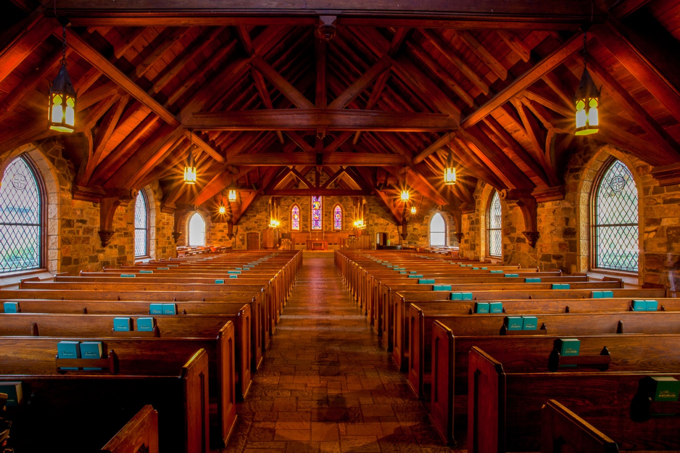
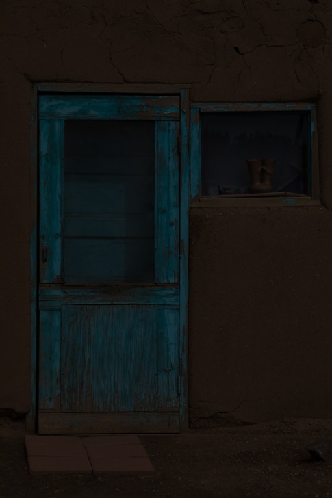
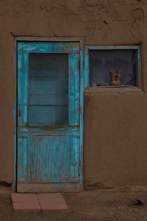
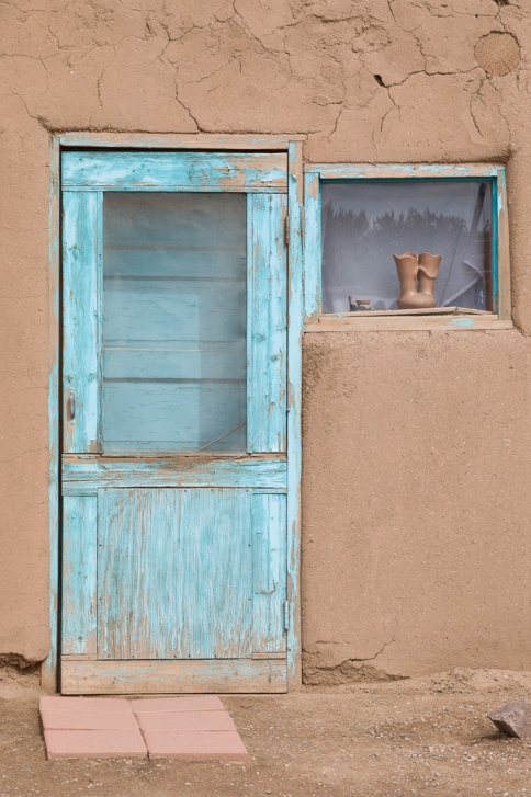
In my last article I showed examples of how HDR in Lightroom and Photomatix compared to processing a single image when the image fit within the dynamic range of the sensor. In this article I’ll show the same comparisons when the image exceeds the dynamic range of the sensor. This is actually from my first ever attempt at HDR all the way back in 2010. It wasn’t as bad as I feared it might be. It took me a few more years to really perfect bad HDR habits. But this shot had a range of brightness from the bright outdoors and the relatively bright light fixtures, to the dim interior of the chapel. Also since this was 2010, my Canon 5D Mark II didn’t have nearly the dynamic range of my current 5D Mark IV. Also all of these images may lose some detail when this article is converted to PDF format.
Here are the six brackets I shot and they range from -3 stops to + 2 stops in 1 stop Increments. This was before I began bracketing in 2 stop increments.
Here is the image that results from trying to edit the single normally exposed image. In this image the light fixtures are completely blown out, and when I edited and reduced the highlights, they just become a muddy gray rather than showing any detail. Also I had to open up the shadows to maintain detail. The net result is a fairly flat looking image (even though I increased contrast) and gray light fixtures and windows without detail.
Below is the result I achieved by merging the six images to HDR in Lightroom, and then editing using just the basic controls in the tone panel. At first glance it may look similar to the single image, but notice how much more detail there is in the light fixtures, and the shadows are cleaner with better detail. Already you should see the advantages of HDR for this image, and that it was really necessary to capture the dynamic range of this image.
This is how I edited it back in 2010 using Photomatix 4.0. Notice that even though you see details in the windows and the outdoors, in the light fixtures, and in the shadows, there is contrast with even some blacks in the darkest shadows. It has a different look than the Lightroom HDR, with more pop and contrast. Photomatix 4 had different modes and presets compared to the current 6.0 version.
This is how I processed it in Photomatix 6 using the details enhancer mode and my current technique and settings.
I also tried processing it in the tone balance mode to see if that more closely resembles the tonemapping of version 4, but I don’t think it is very similar at all.
So now I’ve shown you four different HDR edits: LR merge to HDR, Photomatix 4.0, and two modes in Photomatix 6.0. You may like one more than the others, or you may not like any of them. But hopefully from this example you can see how brackets in HDR really can create a much better image than a single exposure where the range exceeds the dynamic range of the sensor. This still happens, even with the best of cameras. Typically it happens with a mix of indoor and outdoor exposures, very dark shade and bright sun, or an image with strong light sources. Then it’s HDR to the rescue. Even if you don’t use (or misuse) HDR as much I do, it’s a good tool to have in your bag for situations like this.
In photography HDR stands for high dynamic range and is used to reproduce a greater range of tones than is possible with normal techniques. The human eye can see a dynamic range of about 20 stops. The best current DSLRs have a dynamic range of about 14 stops at low ISO and proper exposure. Dynamic range capability decreases with higher ISO and poor exposure. My first camera had a dynamic range of only about 10 stops. When the range of tones in a scene exceeds the ability of the sensor, either the shadows will be blocked up, or the highlights will be blown out, or both. This happens frequently in harsh light. HDR involves shooting several images with bracketed exposures to increase the dynamic range available in an image.
I recently read a statement to the effect that HDR is no longer necessary now that recent camera models have such fantastic sensors. Without stating it directly, this implies that the only reason (or excuse?) for HDR is to capture an image when the range of tones exceeds the sensors capability to record them.
So, is HDR dead? Is there any reason or excuse to shoot brackets and process with HDR techniques when the range of tones falls within our sensor’s capabilities? With the newer sensors, it’s much less common for the scene to exceed our camera’s range. Those of you who have been on photo outings with me know that even though I walk around with a Canon 5D Mark IV which has very good dynamic range, you’ll still see (or hear) me shooting bursts of brackets, usually at -2 stops, normal and +2 stops. Why? Because for me it’s not only about the dynamic range.
Most of us know the advantages of shooting under overcast skies that reduce the contrast range. In the studio we use light modifiers to mimic overcast light and decrease contrast. Certainly with lower contrast scenes, HDR is not necessary to capture an acceptable image. For my particular style of photography, I find that an HDR image can make tones, textures and sometimes even colors really pop. Could I make an acceptable or even good image without HDR? Yes, but again it comes back to personal style, vision, and how I want the image to feel.
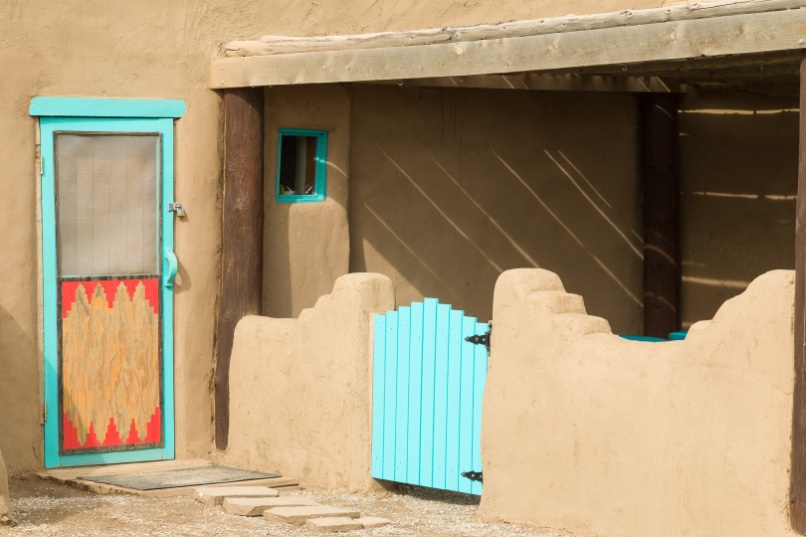
So here are two images from the Taos New Mexico Pueblo taken last year. It was partly to very overcast, and certainly the light didn’t require HDR. There were no reflective tones that demanded HDR. But I’ll try to show you the difference in the look and feel of the images without HDR, and with two HDR techniques.
Here are the three brackets (-2, normal and +2) used for my first image. You can see that the normal exposure doesn’t have any blown out highlights or totally blocked up shadows.
This is just the normal exposure processed in Lightroom using just the normal tonal controls. It is a perfectly acceptable, maybe even good, image. Certainly there are no blown highlights or black shadows.
Here, I created an HDR image in Lightroom from the three brackets using the merge to HDR function. This has become my go-to technique when I want a realistic look, even when I have exceeded the range of my sensor. I’ve processed it using just the tonal controls and here is the result. I really don’t see any real differences, and given the low contrast scene, that’s probably to be expected.
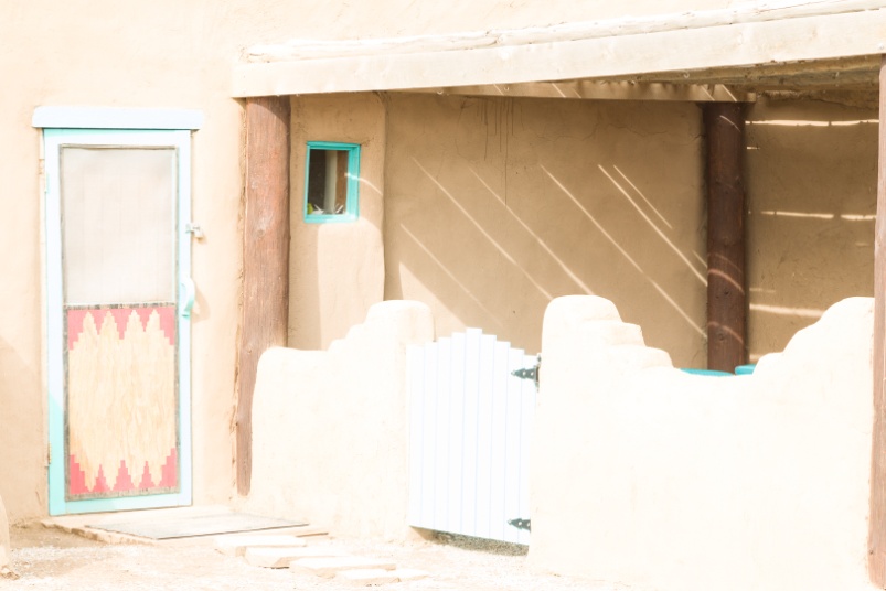
Here I took the three brackets into Photomatix 6 Pro and processed the image by adjusting white and black points, and detail contrast using the image enhancer mode. While you may not see it clearly at this size (and it may have lost resolution and detail in the conversion to PDF), the details and textures seem much sharper to the eye. The colors may pop just a bit more, but not that drastically for this image. One of the characteristics of “Bad HDR” (and I’ve done more than my fair share) is the lack of shadows, causing an image to look flat and unrealistic. When I process in Photomatix I look at the preview and the histogram to make sure I’ll have at least a touch of black in the shadows. In this image, the smaller shadows that show texture are actually accentuated.
Here are the three brackets (-2, normal and +2) used for my second image. By the time I shot this scene, the sun was out a bit more and there was more contrast, but well within the range of my sensor. Again, the normal exposure doesn’t have any blown out highlights or totally blocked up shadows.
This is just the normal exposure processed in Lightroom using just the normal tonal controls. Again, it’s a perfectly acceptable image.
Here is the result of creating the HDR image in Lightroom. It was processed using just the tonal controls in the develop panel. Again the look is pretty similar to the single normally exposed image. That’s because we are well within the range of the sensor.
Now here’s the image processed using the three brackets in Photomatix. While the large shadow under the porch is opened up, there is still a dark shadow under the gate. But once again the shadows of the textures of the Adobe are emphasized, bringing out the detail. This is the image that best fits my personal vision for this image.
So, is HDR really dead? Just kidding. After all it’s part of my style.
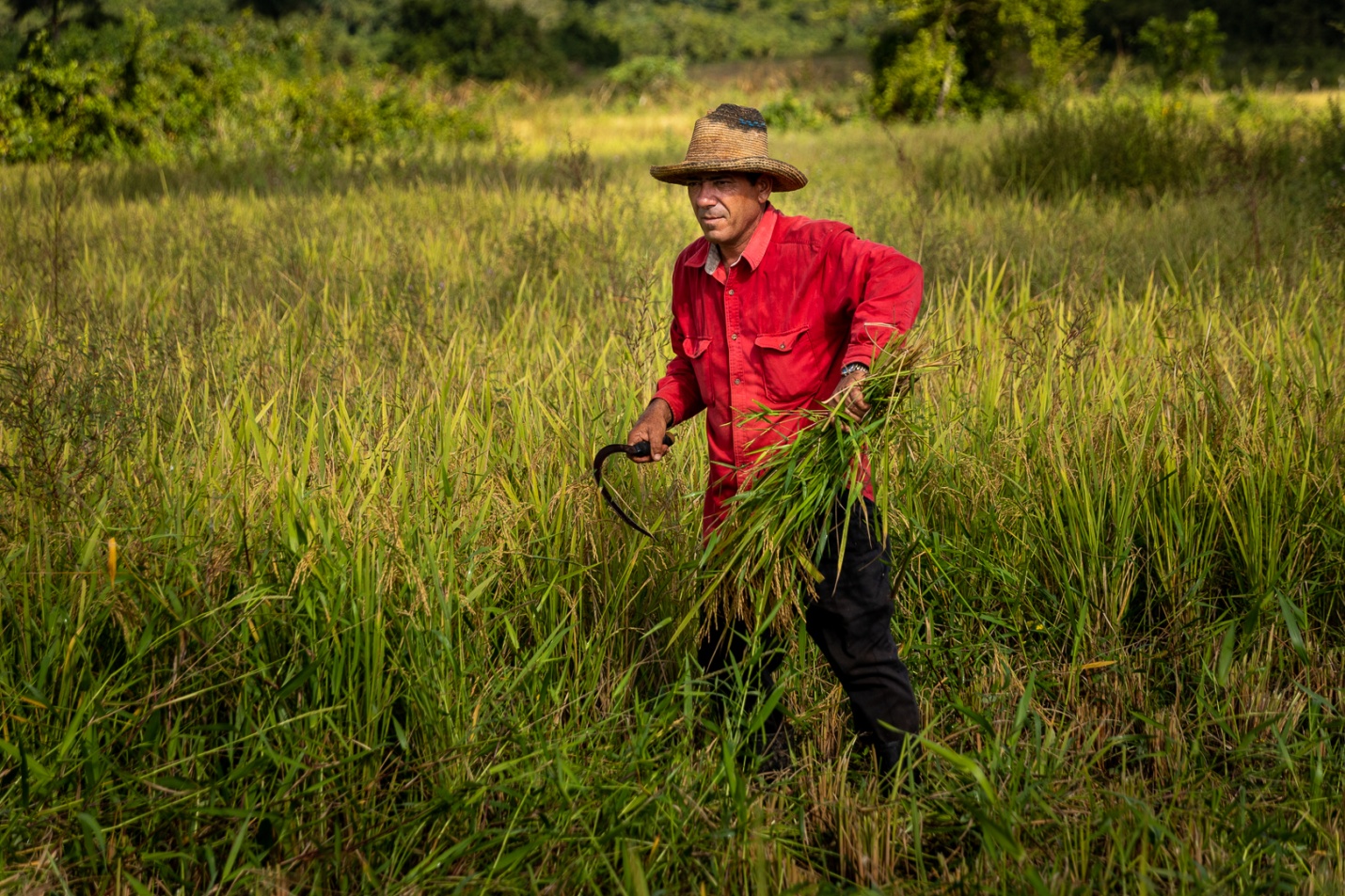
In my earlier article on composition, I wrote that the goal of composition was to guide the viewer’s eye through the image and to our subject. If we have control of lighting, we can also use that to direct the viewer. If we don’t have control of lighting, we can fake lighting effects to a degree in Lightroom (or Photoshop or Adobe Camera Raw). In these two images, I’ll do basic editing and then show how we can direct the eye to our subject, using the localized adjustments including the adjustment brush, the radial filter and vignetting. Remember that the eye tends to go toward the brightest parts of an image, so if our subject is dark or in shadow, we can lighten it to draw the eye.
Here, we have a single subject working in a field. Straight from the camera, it’s flat, our subject is not well lit, and his face is heavily shadowed by his hat. Our goal is change the light to make him brighter, and in particular to open up the shadows on his face.
This is the original with no adjustments at all.
First I’ll do just basic corrections using the tone panel in Lightroom. I’ve set the white and black points, the highlights and shadows, the overall exposure and contrast. I’ve also added some clarity and vibrance to bring out details and colors. Already it looks a bit better.
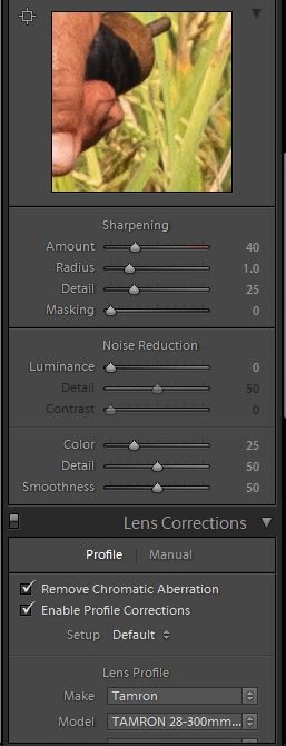
I always add camera profile and chromatic aberration adjustments. The camera profile corrects for geometric distortion and light fall-off of a lens. It is specific for each brand and lens model. Normally Lightroom automatically determines the lens used, but occasionally it needs prompting using the drop down menus. It is probably more important in images with straight lines than in this image, but I do it with all of my images anyway. Chromatic aberration is the slight color fringing along sharp edges. It is worse with some lenses, and this setting usually helps.
I also add sharpening. By default Lightoom adds some sharpening, but for a subject like this with a lot of detail, I increase that to the settings shown here.
Here I’ll use the radial filter to darken everything around our farmer. By default, the radial filter effects what is outside of the selection. It’s also important to keep the feathering at at least 50% so the effect isn’t so sharp edged and noticeable. Here I’ve gone with -.6 exposure. Notice that invert is not checked, so the effect is outside of the selection oval.
While this pulls our eye to the farmer more, his face is still in the shadow of his hat. I’ll use the adjustment brush to increase the exposure on his face by +1.22. Make sure the feathering is set to 100 so we don’t see a sharp edge to the lightening.
To add some more emphasis to our subject, I’ll use a second brush adjustment to darken the foreground and corners. I selected a large brush, again with 100% feathering and -0.96 exposure.
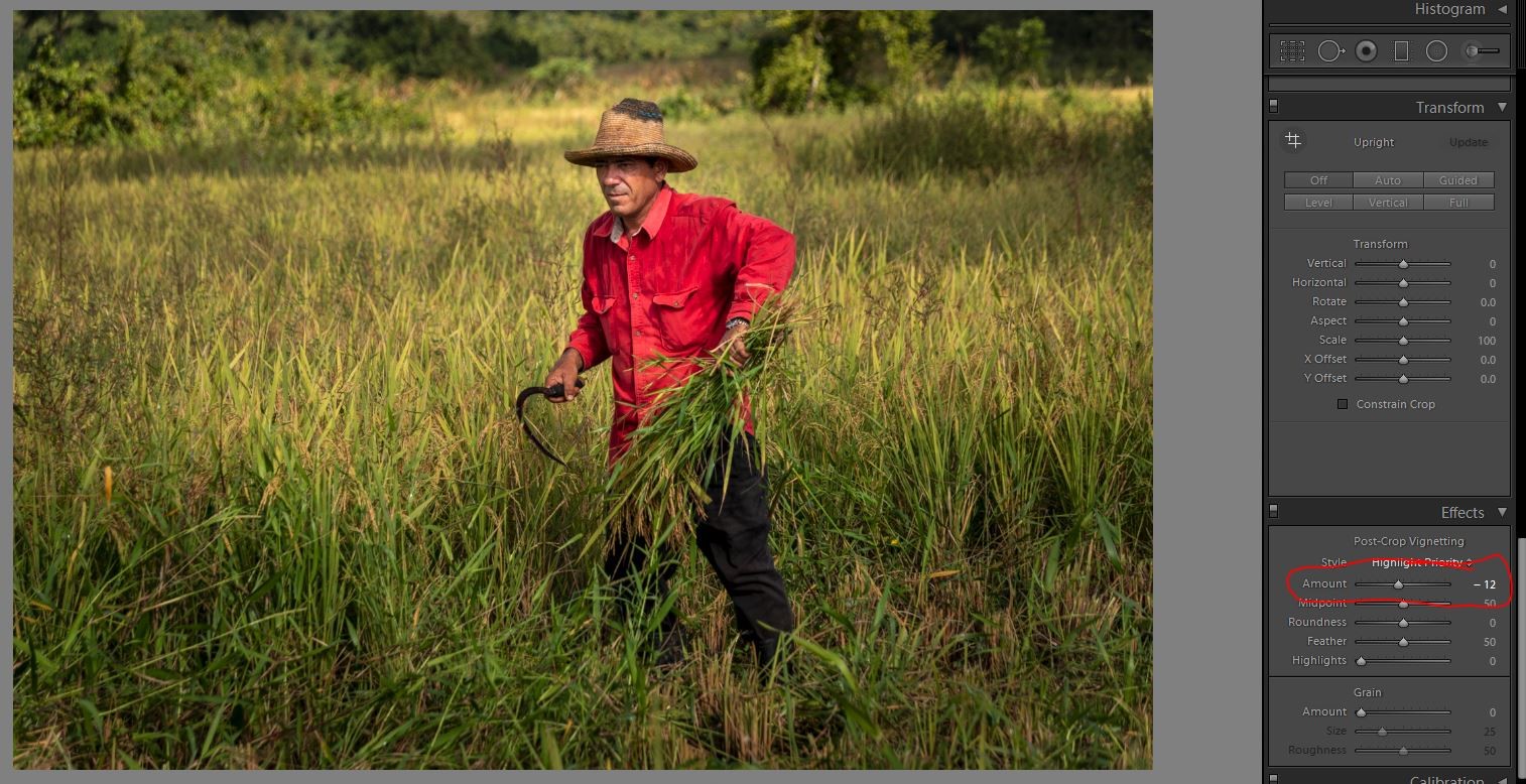
As a last touch I’m adding a slight vignette at -12 to darken all of the corners just slightly. The vignette should be so subtle that it’s hard to see where it begins and ends. It should never be as extreme as my bad example below.
So here is the original image straight from the camera, and then the final edited version. Hopefully you’ll see the difference in how your eye is drawn to the farmer.
In this second picture, my goal is still to draw the eye to the two farmers, but I’ll have to use the radial filter a bit differently.
The original image was a bit flat and the farmers are dark and don’t attract your eye. Here I’ve done the basic tone edits of exposure contrast, and set higlights and shadows and white and black points and added vibrance. Notice I’ve made the overall exposure a bit dark, but you’ll see why when I use the radial filter in the next step.
Now I’ll use the radial filter to highlight our farmers. By default, the radial filter darkens everything outside of the selection, so if I try to highlight one farmer, I darken the other.
So I made my overall exposure a bit dark, and used the radial filter to lighten the farmer on the left. But to make this work I checked invert, and raised the exposure within the selection rather than the usual darkening.
I’ll repeat the effect by right clicking on the radial filter and select duplicate. I can then drag this over to the second farmer, and resize it and now both farmers are highlighted equally.
Rather than use the vignette tool, I’ll use a large adjustment brush at -.70 to darken the foreground and left side of the image. The reason I chose not to use the vignette is that it would darken the sky in the upper right.
Now the image feels a bit dark overall, so I’ll go back to the basic panel to increase the overall exposure from -.36 to +.24.
As a final touch I’ll crop in a bit to position the farmers for more impact.
And here is the original image followed by the final edit. Again I hope you feel how the emphasis has shifted much more to the farmers.
In the bad old days of shooting film, we had no suitable means of backing up our images, and most importantly, making sure we got home with good images. We had no reliable way to ensure our camera was working properly or that our exposure settings were correct. Even if we shot everything perfectly, the film could still be lost or damaged in processing. Once it was processed, we had original negatives or slides, so backup meant making and storing prints or having duplicate slides made. Prints, slides, and negatives could all deteriorate if not stored properly. And of course, in case of fire or theft, everything would be lost if copies weren’t stored off-site. Now in the days of digital, we have the option of having important slides and negatives scanned into digital and stored in a safe location (keep reading.)
We are now in the digital age; we can see on the camera that everything is working and we have good exposure, and we don’t have all of those physical negatives, prints, and slides to store. We can store thousands of images on a single memory card and literally hundreds of thousands of images on a single hard drive. But that also means we could lose thousands or hundreds of thousands of images in an instant.
Protecting Digital Media in the Field
As Adam Jones reminded us at his Winter Wildlife Workshop, your most important job as a photographer is to come back with good images. It’s no fun to invest the time and money of going to a weeklong workshop or safari and have nothing to show for it.
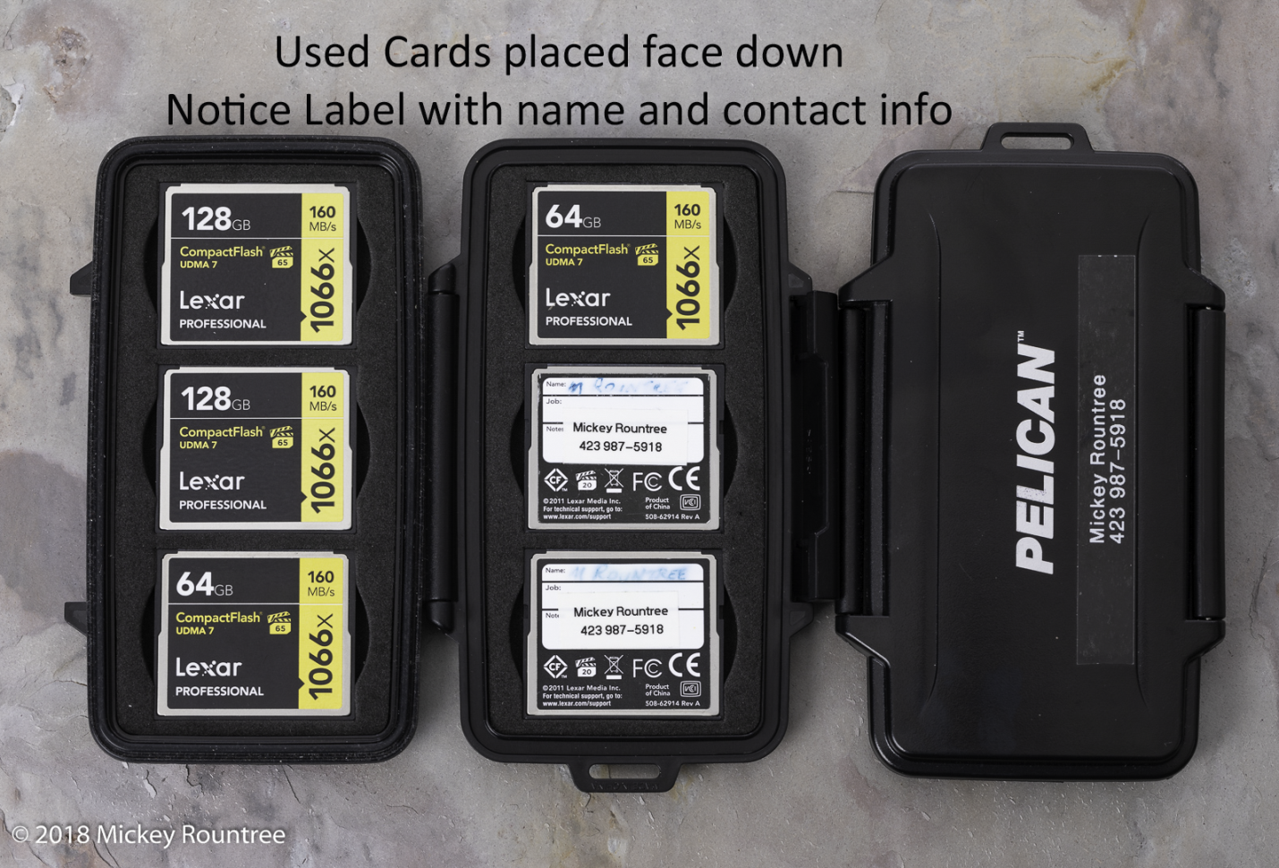
1) It is important to protect your memory cards, whether they are CF, C-Fast, SD, or micro SD. The SD and micro SD are a bit more delicate than CF cards, but you should handle them all with care. While I tend to use high-capacity cards, like 128 GB, I often use two cameras or change cards before they are full.
2) Store your cards in a protective case and not just loose in your pocket. I use Pelican card cases. They are a bit bulkier, but they are crushproof and waterproof. I trust them to protect my cameras, so why not my cards? Be particularly careful not to get dirt and finger grease on any exposed contacts, and be gentle when inserting or removing cards in the camera.
3) If you are shooting a commercial job or a once-in-a-lifetime event, don’t trust everything to just one card. Some cameras have two card slots and let you save images to both. It slows down your fast shooting speed, but it may be cheap insurance since you essentially back up as you shoot.
4) Place a label on each of your cards with a minimum of your name and phone number. If you misplace a card, whoever finds it has a way to contact you. Without that info, even the most honest person can’t help.
5) Have a system, so you know which cards have been filled and which are empty at a glance. I put ready-to-use cards face up with the manufacturer’s label showing in my case. Used cards are face down with my name label showing. Or use separate cases.
6) Always format a new card in the camera before using it, and reformat it in the camera, but only after you have downloaded the images, and they are stored in at least two places. I’m even so picky that I format each card only in the camera I’ll be shooting with. All of my Canon cameras use the same format, but why take chances. I also never swap cards that have images on them from camera to camera. Never format a card in the computer; always use the camera! Never format your cards until the images are in at least two different places. If you accidentally format a card that has not been downloaded, immediately set it aside. Do not shoot with it. You may be able to recover the images later with a recovery program.
7) Never go out shooting without an extra card or two. If you shoot more than you planned, or your first card fails, you can switch cards and keep shooting.
8) Never delete images from the card individually. It can be tempting to delete a bad image when you see it or delete images to make room when your card is almost full, but DON’T. According to one of the manufacturer’s reps, this is the leading cause of corrupted cards. Pretend that the delete button on your camera doesn’t exist. Change to a new card when it is nearly full and reformat the card in the camera only after it has been downloaded and is stored in two places.
9) Stop shooting with a card before it is full. I usually change cards when there are fewer than 100 images left. I have heard of cards being corrupted when trying to write an image when there isn’t enough room for it. Not only does the last image get lost, but the card may become corrupted, possibly losing hundreds or thousands of images.
10) Download a card recovery program for your computer and learn to use it. Recoverit, Puran File Recovery, and Recuva are free. Lexar cards come with a link to download their “Image Rescue.” An internet search will find several others. Have one on your home computer and on any laptops you travel with—practice recovering images from a card you have already downloaded and backed up. Format the card and run your recovery program. You may be surprised to see it recovering files from several past shoots. Recovery can be slow; a large card could easily take 12 hours or more.
After the Shoot
1) When traveling, carry a laptop and an external hard drive if possible. At the end of each shooting day, download your cards into the computer (I import mine into Lightroom) and copy them to the external drive. Now your images are in two places, and only then do you reformat your cards if you have to. Never format your cards until the images are in at least two different places. Keep the external drive and laptop separate, so if one is stolen or misplaced, you still have the other. Also, if you have a computer, you may create Lightroom catalogs and do some image editing. The disadvantage is you may do some image editing; you have to sleep sometimes. Also, there’s the extra bag, weight, and bulk when you fly; it’s less of an issue driving.
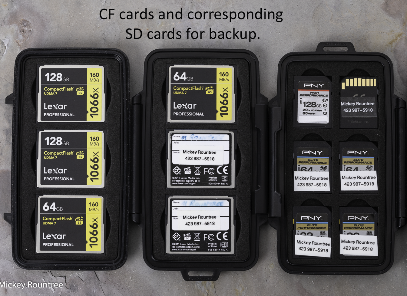
2) If you don’t carry a laptop, use a more portable system. My Canons have a CF card slot and an SD card slot. I can copy all of my images from the CF card to the SD card. Now my images are on two cards, and I keep them in separate places. When I’m traveling, one set of cards stays in my pocket. I also don’t reformat either card until I have downloaded them to my home computer and backed up. The disadvantage is that I have to have a corresponding size SD card for each CF card, and I have to carry enough cards to cover the whole event or trip. I usually don’t save to both cards in the field as this slows down my maximum frame rate and the number of shots in a burst.
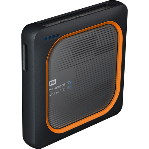
3) Western Digital makes an SSD backup drive with a built-in SD card reader and USB port if you don’t have two card slots. You can download images to it without a computer. It has a built-in battery that can last 10 hours and can be recharged when you have power available. And it has apps that allow you to set up a network with your phone or tablet to view or organize files. You still only have one backup, so I wouldn’t reformat my cards until I’ve downloaded and backed up. Never format your cards until the images are in at least two different places.
On The Computer
Remember two of the most important of Murphy’s laws: 1. Anything that can go wrong will. 2. If there is the chance of more than one thing going wrong, the one that will cause the most damage will happen. Also, remember that there are only two kinds of hard drives in the world- those that have crashed and those that are going to crash. Imagine if you were to lose all of your images, including irreplaceable family memories, due to drive failure. It happened to my stepdaughter. It just happened to one of my fellow photographers. One of the bands I played in worked for two months recording an album. We had all the basic tracks down and were about to add some overdubs when the hard drive holding all of the work crashed. Of course, there was no backup. A data recovery company said they could “probably” recover everything for $1200 upfront with no guarantees. Our producer/bandleader decided to walk away from the project, and we had nothing to show for literally hundreds of hours of work.
1) Always think worst-case scenario. You’ve backed up your data, but your backups are right there by your computer. What if your home burns or a burglar steals your computer and all of your external drives? Your backups are internal, but what if a lightning strike or power surge fries all of your drives.
2) Everything must be stored in at least two places. At the very least, this means on two different hard drives. This could be two internal hard drives, an internal and an external, or on two different computers. Never format your cards until the images are in at least two different places. Most experts recommend a 3-2-1 backup system. There should be three copies of your data, two copies onsite, and one copy stored off-site.
3) Have off-site storage to protect against fire, floods, tornadoes, burglars, electrical surges, enraged spouses, jealous ex’s, destructive pets…you get the idea. You could have external or removable hard drives that you back up to weekly and then store off-site with a friend, at the office, or in your safe deposit box at the bank. Each week bring them home, update your backup and get them back off-site ASAP. In a catastrophic situation, you might lose a week’s data, but that is better than losing everything.
4) Some photographers will consider backing up to DVDs or BlueRay. This is slow and tedious and requires storing and indexing a lot of disks. With a large image collection, it could be several hundred disks. And most importantly, disks are not archival or permanent. Disks deteriorate in storage even without being used, so they may not be usable when you need your backups.
5) Someone also asked me to address “Photosticks.” These are flash drives with incorporated software that searches for images and copies them to the flash drive when attached to a phone or computer. The largest I’ve seen is 256 GB, and that wouldn’t even cover a week of serious shooting for me. My current collection is over 7 TB and would require almost 30 256 GB Photosticks. It’s probably a good option for casual photographers or those who only shoot with their phones. Still, most serious photographers will probably have much larger image collections than a “Photostick” can handle.
6) Use an online or cloud-based storage service. I use Backblaze, my friend Bill uses Carbonite, and both are about $7/mo. I believe Apple has a cloud backup, but I’m not an Apple authority. When you first set the service up, you install their software, which runs in the background and copies your files to the server. This initial upload can take several weeks or even months if you have as many images as I do. That sounds intimidating, but those weeks are going to pass whether you back up or not. For me, it’s worth the peace of mind. Once that huge initial upload is complete, the software backs up at whatever interval you set. If you lose a few files, you can download them online. Most services can download your files onto a hard drive and ship them to you if you lose a whole drive. You can either install this drive or copy the files and return the drive for credit. The big advantage of the online backup services is that you don’t have to keep physically swapping drives, and after the initial download, your files are continually backed up. Even in a catastrophic failure, you only lose a few hours of work or none at all.
6) There are disk recovery companies that can retrieve data from failed hard drives. They remove the data platters from the dead drive and build a new drive with them. As I mentioned above, they can be costly, and there is no guarantee of success. This should be your last line of defense, and if you’ve planned and implemented a good backup strategy, you should never need this.
7) Here are some tips about ransomware since it seems to be in the news daily. Ransomware encrypts files on your computer and offers a solution to decrypt them for a fee. Sometimes this works, sometimes not. Ransomware will try to infect all of the files on your computer, so if both sets of images are on drives in the same computer or external drives that stay connected and turned on, those files may also be infected. The best practice is to have an “air gap” between drives to prevent the virus from seeing and infecting all of your files. The best protection against ransomware is not to get it in the first place. Malicious websites usually transmit it, and often a link to one of these websites is included in an email directing you to click on a link. If you get a suspicious email from someone you don’t know, or even from someone you do know with a message that doesn’t make sense coming from that user, DO NOT CLICK ON ANY QUESTIONABLE LINKS. Also, don’t download and install pirated software. Almost all pirated programs contain viruses, so it just isn’t worth the risk. On Windows 10, you can turn on “Folder Access Control” and make sure the drives or folders containing your images are protected. While they are less commonly attacked, Macs are not immune to ransomware, but I don’t know Macs well enough to recommend a preventive strategy.
Lightroom
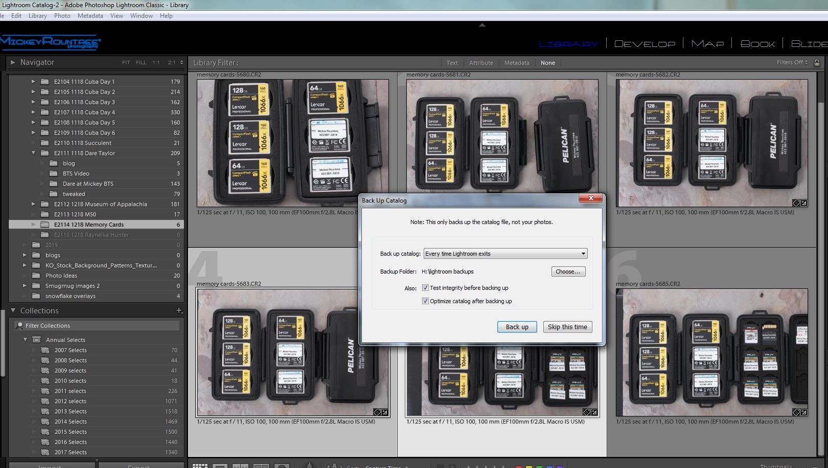
If you use Lightroom, all the information about your images and the development instructions are stored in the LR catalog (but not the actual images or previews). Make sure to back this up regularly and on a different drive than where your catalog is typically stored. I have my LR set to back up every time I exit LR. I don’t always choose to if I haven’t added images or made many changes, but I always back up at least every two days. I go to my backup directory regularly and delete all but the last two LR catalog backups. If your LR catalog becomes corrupted (it happened to me once), copy your backup to the location of the old catalog and rename it, and you’re up and running. You may have to re-import any images added since your last backup, but that beats creating a whole new catalog. By the way, backing up the catalog does not back up the LR previews, but you can have LR recreate them. Also, backing up the LR catalog does not back up your image files.
Summary
If you use all of these strategies, hopefully, your images will be around for years to come and be easily restored if or when disaster strikes. Some of these strategies may also make setting up a new computer quicker and easier.
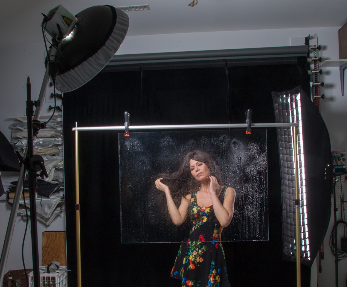
I’m going to start with the basics of how to create a rainy window shot that doesn’t require any editing tricks. If you get your exposure and lighting right your shots will look great straight out of the camera and need little or even no editing. Then I’ll get a little more advanced and show you how to kick it up a notch in Photoshop.
The Basic Setup
This image starts with a thin piece of clear plastic or Plexiglas. I used the plastic from an old, cheap 30×40 inch frame. I wouldn’t use anything valuable because of the mess (see below), and using actual glass is potentially just too dangerous. I use large A-clamps to hang my plastic from a background support stand, but you could use a rope or clothes line to clamp to. I also used a black velvet background to get the dark background that makes the second part of this work. But for the basic shot almost any background could work.
The first time I tried this I used a spray bottle (any cosmetic or cleaning sprayer with an adjustable nozzle will work) of water to mist droplets onto the plastic. The problem with water is that it quickly drips and produces long drips and runs that are always right in the wrong place. A much better solution is to use a mixture of equal parts of glycerin and water. The glycerin makes the drops adhere to the plastic and not run. Glycerin is available at any drugstore. It’s also best to start misting lightly and add more spray as you go along.
I should say a bit about cleaning up the glycerin when you get through. Glycerin is gooey and slimy and will probably require a couple of cleanings with a glass cleaner. Do your cleaning immediately after shooting, or the plastic will be almost impossible to clean after the water evaporates. Also, empty the sprayer, rinse it with hot water and spray with the hot water until the tubing and nozzle are clean. Otherwise the sprayer will be hopelessly gummed up.
Lighting
The main light is a small softbox about 45 degrees above and 45 degrees to camera left. The higher angle prevents the light from glaring back into the lens. I used a strobe with a beauty dish and diffuser, but any softbox or small shoot-through umbrella would work. You could also use a speedlight, or even a daylight balanced CFL or LED light. It’s not totally necessary, but I used a strip box with a grid about 45 degrees behind my model for some extra separation since she has dark hair.
Shooting
You’ll find it much easier to position your light(s) and adjust your exposure before you begin misting the plastic. Also you may find your autofocus wants to lock onto the droplets rather than the model, particularly if you have a heavy mist or large drops. Be careful to look at your focus and adjust manually if needed. I also shot at f/11 to help with depth of field. And after giving you all of these warnings, I still deleted some shots that weren’t perfectly in focus.
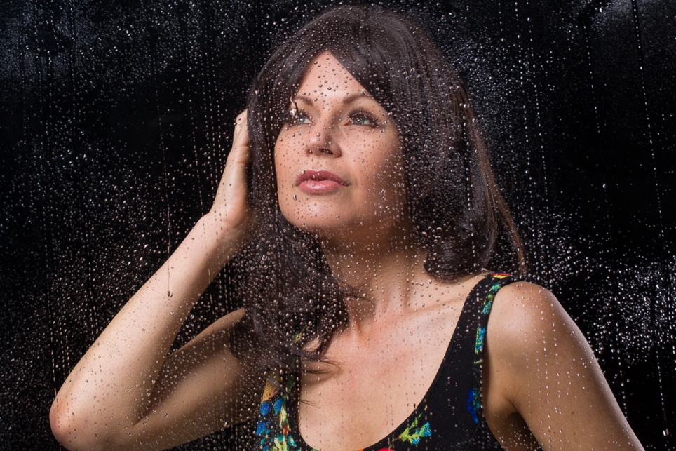
These will probably be head and shoulder shots, so use a lens in the 85-135 mm range on a full frame camera or 50-85 mm on a crop sensor. With good lighting, exposure and careful focus you should have some shots that are good with little or no editing. You can see the basic effect below.
Kicking Things Up a Notch (If you have Photoshop, you know you want to)
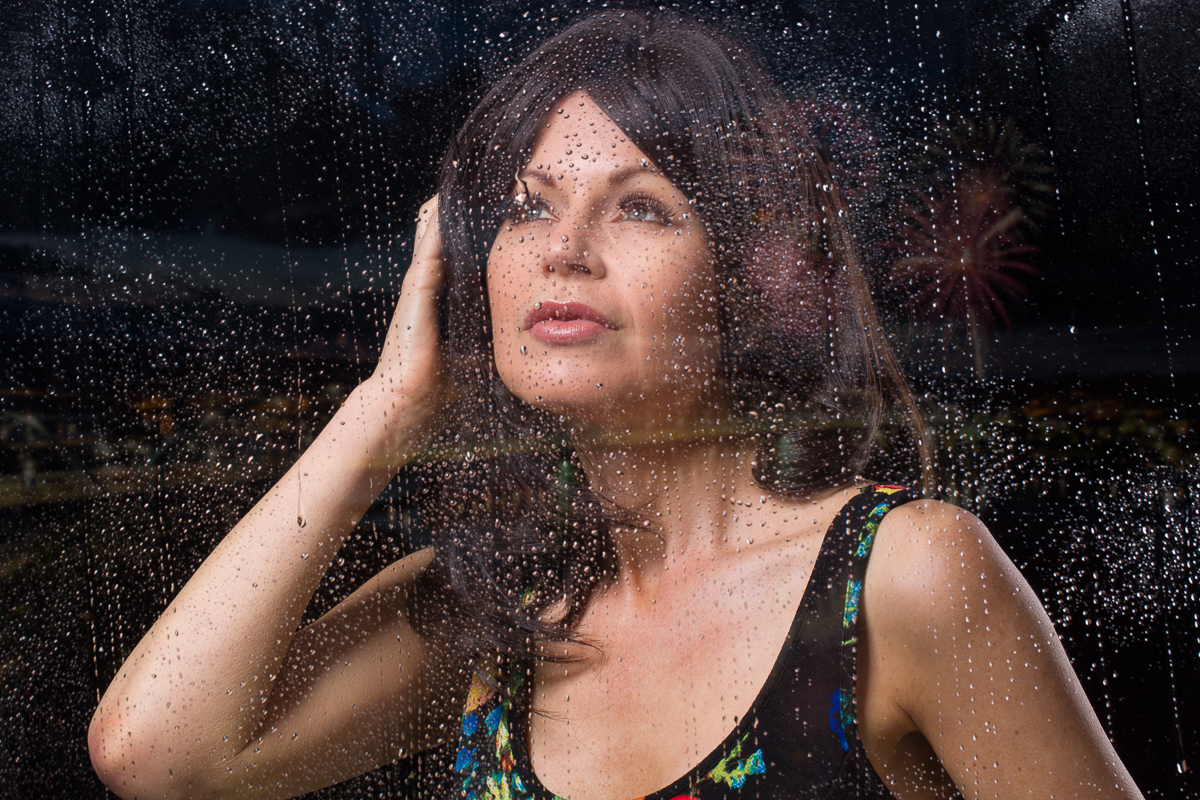
This next process is subtle, but creates the illusion of lights of the city (or neon lights, or car lights, etc) and helps sell the illusion that this was actually shot through a window at night. It doesn’t work well at all if you shot your model against a light background.
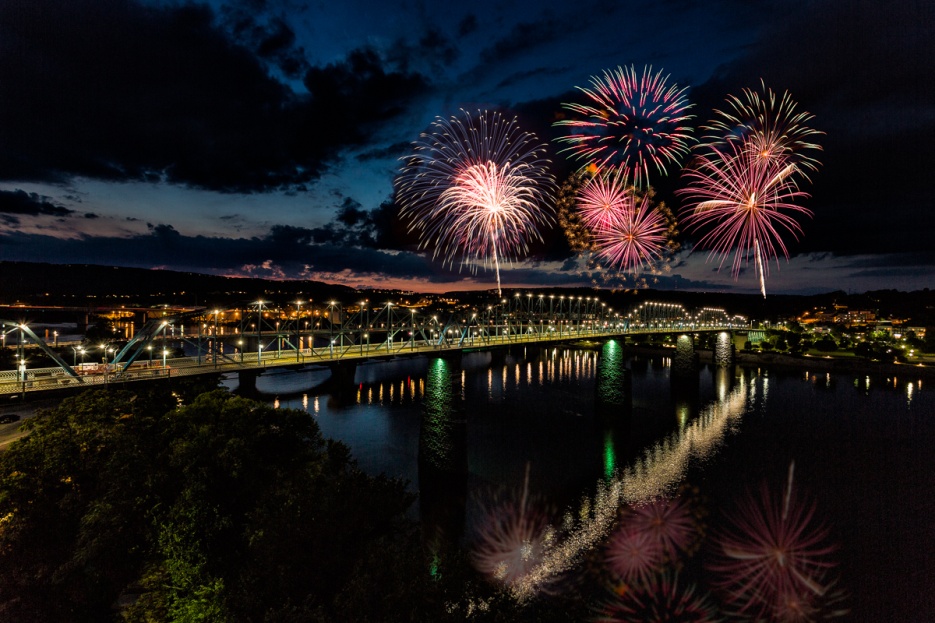
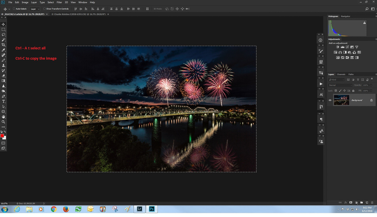
Start by selecting a predominantly dark night scene with some colorful lighting. I have a lot of night images, and a collection in Lightroom that helps me find them. So for this example I picked one of the shots of Chattanooga to which I had added fireworks (see the April 2018 newsletter). Open both the window image and night shot in Photoshop.
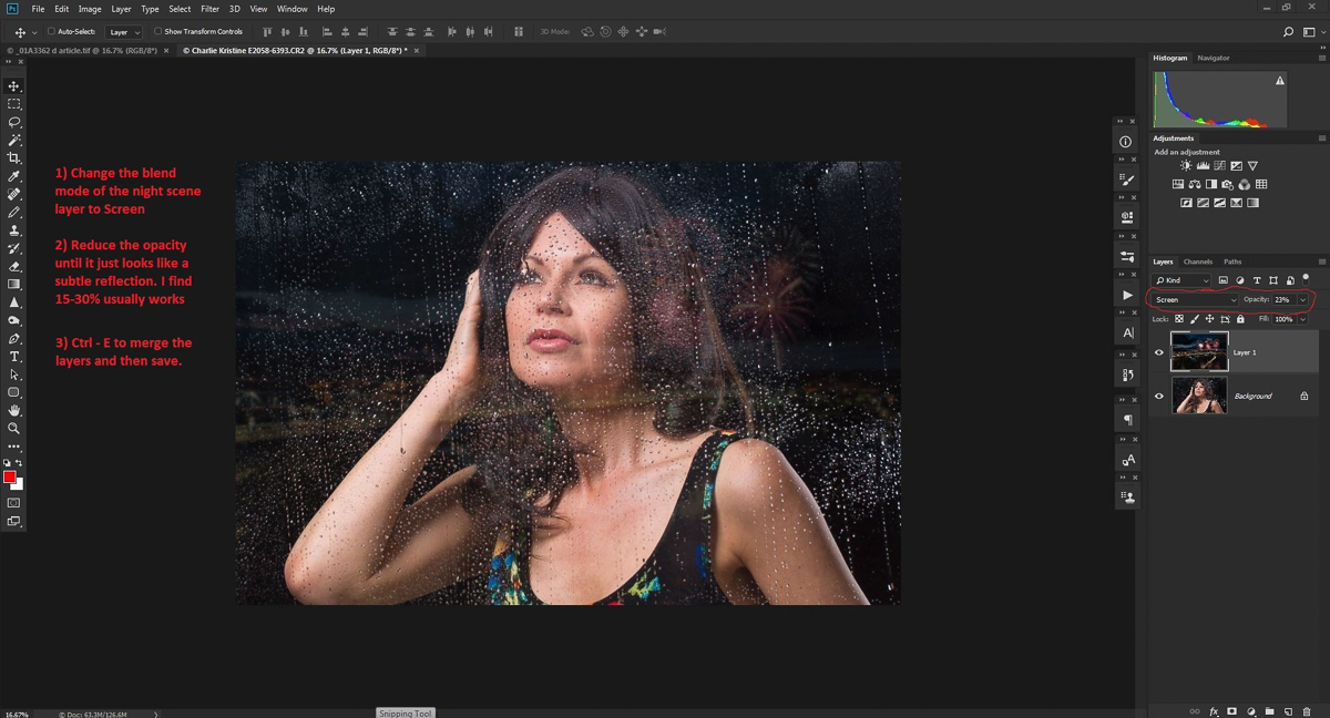
With the night image open in Photoshop, use Ctrl-A to select all of it and Ctrl-C to copy it.
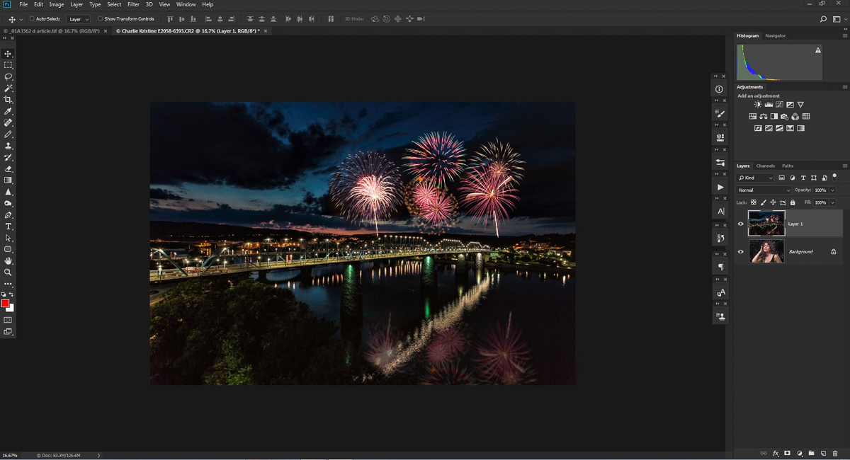
Then open your window image and use Ctrl-V to paste it as a layer over your window image. You’ll see that it completely hides the base image but we’ll fix that soon.
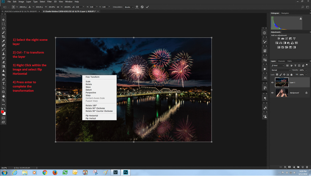
Even though it’s likely that no one would notice, reflections in windows are reversed and so reversing ours will add a little more realism. To do that, select the night image layer. Enter Ctrl – T to edit in free transform, right click inside of the selection and choose “Flip horizontally”. Hit enter to complete the transformation. While you are in free transform you may also drag out the corners of the image to make it larger, and allow some extra space to move it around when we put it in the window scene. Here the image is open in Photoshop and free transform is open.
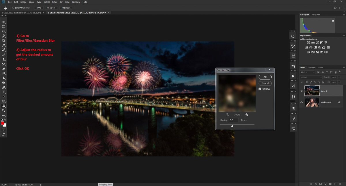
A reflected image wouldn’t be very sharp, so we’ll blur it with Gaussian blur. With the night image layer still selected, go to the filter menu, select blur and then Gaussian blur. I find between 8 and 20 usually works, but every image is different and your tastes may be different from mine. By the way, since we’re blurring anyway, you don’t have to start with a tack sharp original.
Now for the two things that really make this effect work, we’ll chage the night image blend mode to screen, and decrease the opacity until the effect is visible, but very subtle. I usually find something between 18-30% opacity works, but you may like more or less. If the night shot is too strong over key parts of your model, add a layer mask to the night image. Use a very soft black brush at about 30% opacity and paint on the mask over the areas where the night scenes needs to be more subtle.
And this is what the completed image looks like.
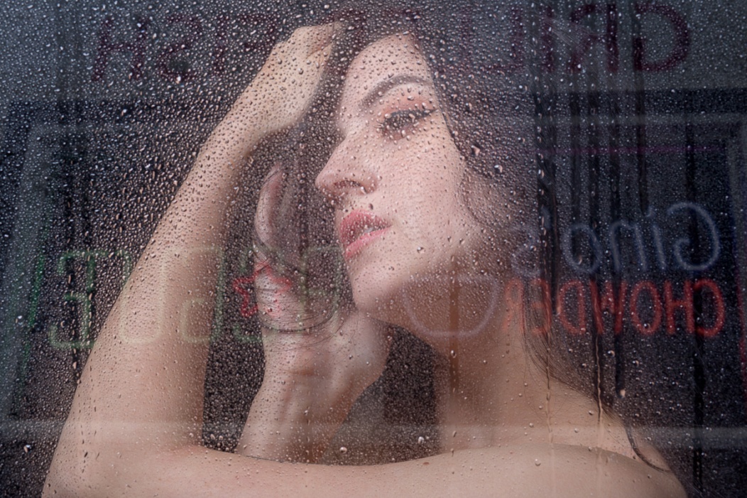
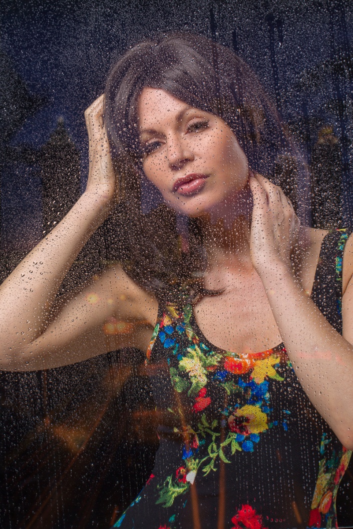
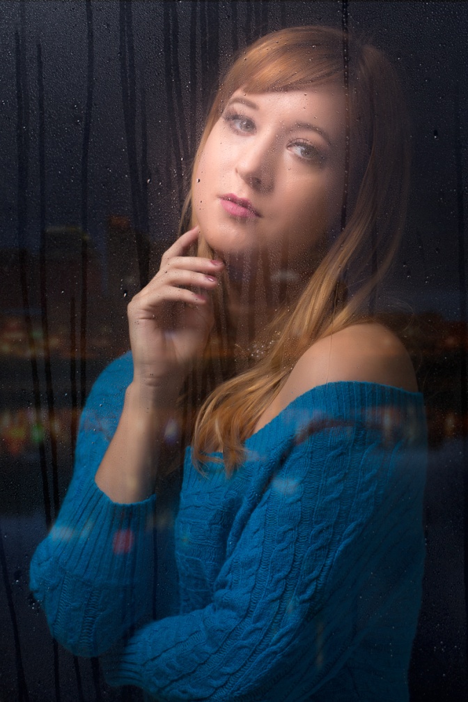
And here are a couple of other examples. The image of the girl in the blue sweater was my first attempt using plain water and you can see how badly it ran.
This is another article that is a bit beyond basic, because it makes use of layers and layer masks in Photoshop. Other editing programs that allow the use of layers and masks such as Photoshop Elements would also work. My workflow starts in Lightroom, but it’s possible to load the images directly from Photoshop.
Shooting the Images
This technique works best with your camera on a tripod. You could hand hold your camera if you resist the temptation to follow and track the action. But since you already know all of the advantages of a tripod, why wouldn’t you use it? I prefer to use a shutter speed that freezes (or almost freezes) the action. So my camera is usually set either to shutter priority or manual mode so that I am in control of the shutter speed. Set your camera to its highest frame rate, frame up your composition and then hold down the shutter through the whole action sequence.
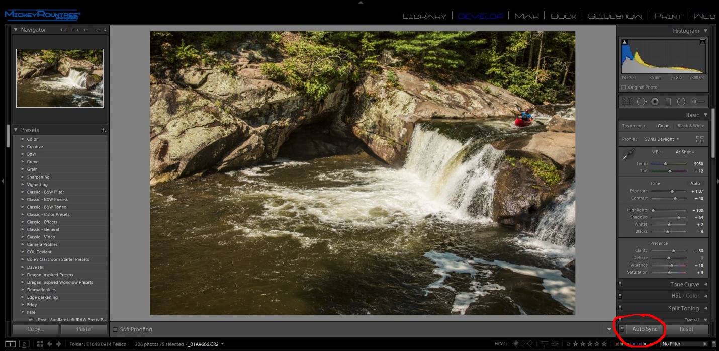
I shot this sequence of a canoe going over Baby Falls, which is just up the road from Bald River Falls in Tellico. My settings were 1/800 sec, f/8, ISO 200, 10 frames/sec, 35mm with a 24-105 on a Canon 7D Mark II. And of course I was using a sturdy tripod.
Selecting the Images
At ten frames/sec, I had way too many images and that would create more image overlap than I like. If your camera has a lower frame rate this may not be much of a problem. Or you may decide to use every other or every third image. Here is my original sequence and I chose to use the five images marked in yellow. Depending on your subject and frame rate, you may choose to use more or fewer images.
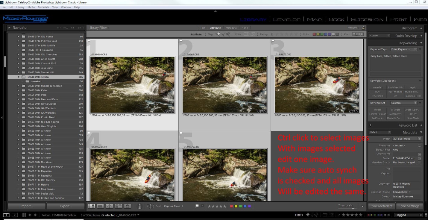
Select your images by ctrl-clicking (cmd clicking for you Apple fans) each image that you want to use. At this point go to the develop module, make sure that auto synch is on and edit your picture and the edits will be applied to all images. If you edit each image individually they may not look consistent when blended into the final image.
Getting the images into Photoshop
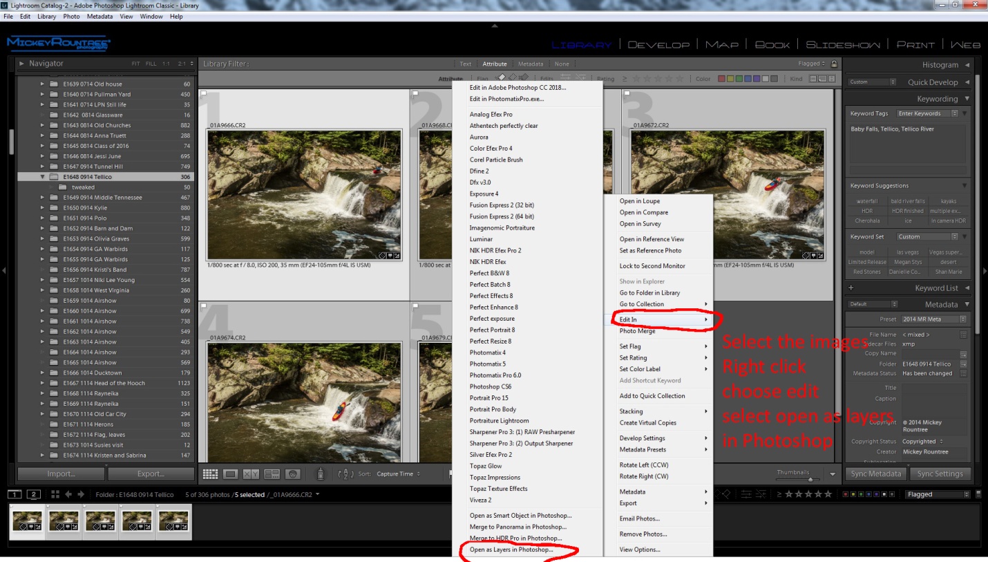
With the images still selected return to the library module and right click, select “edit in” and then choose “open as layers in Photoshop”.
Creating the Composite in Photoshop
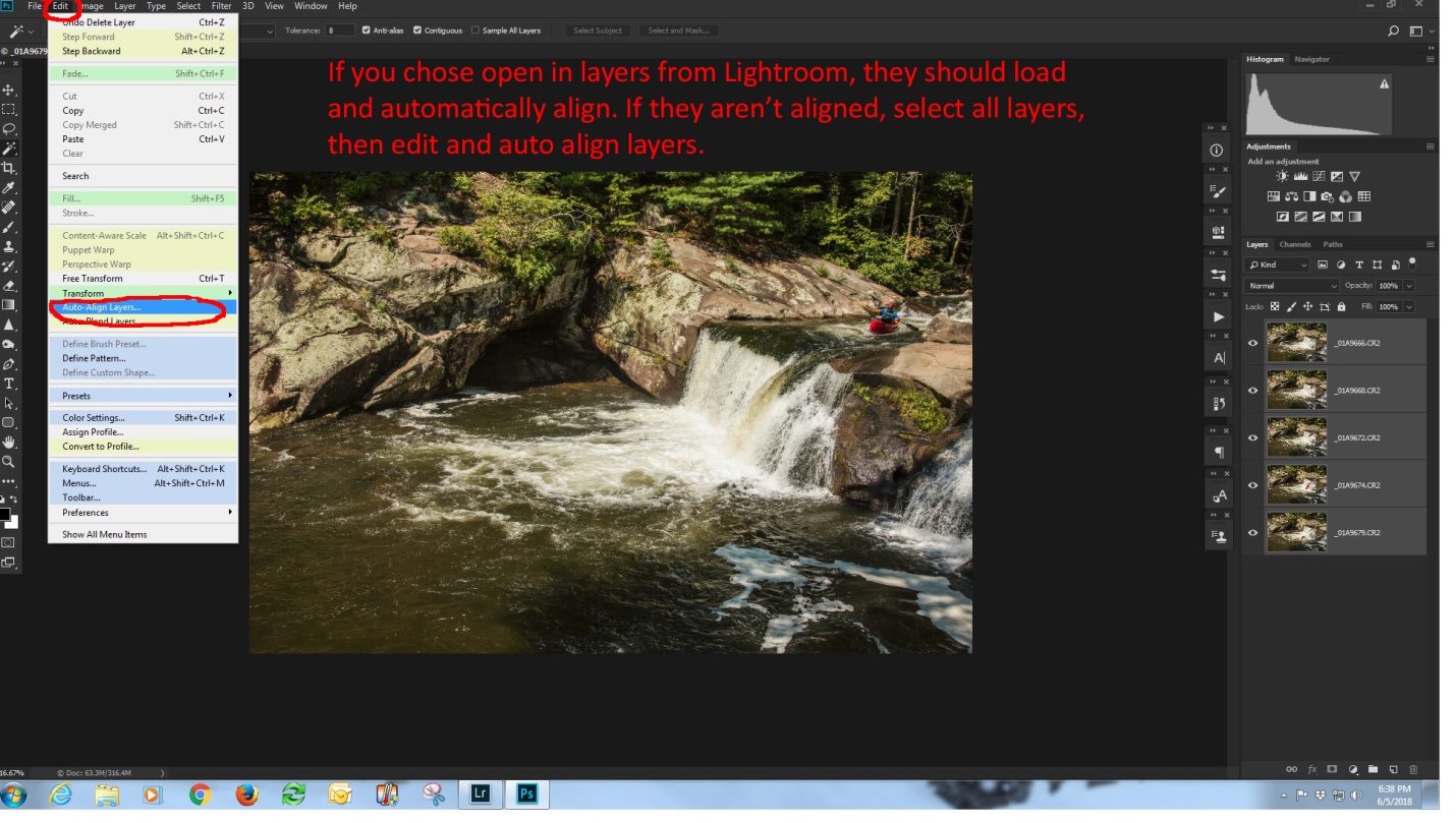
At this point, all of the images should be open as layers in Photoshop and if you used a tripod (you did, didn’t you?) they should be perfectly aligned.
If you didn’t use a tripod (Oh the shame of it all), then ctrl (cmd) click on each layer, choose “edit” and then choose “Auto align layers”.
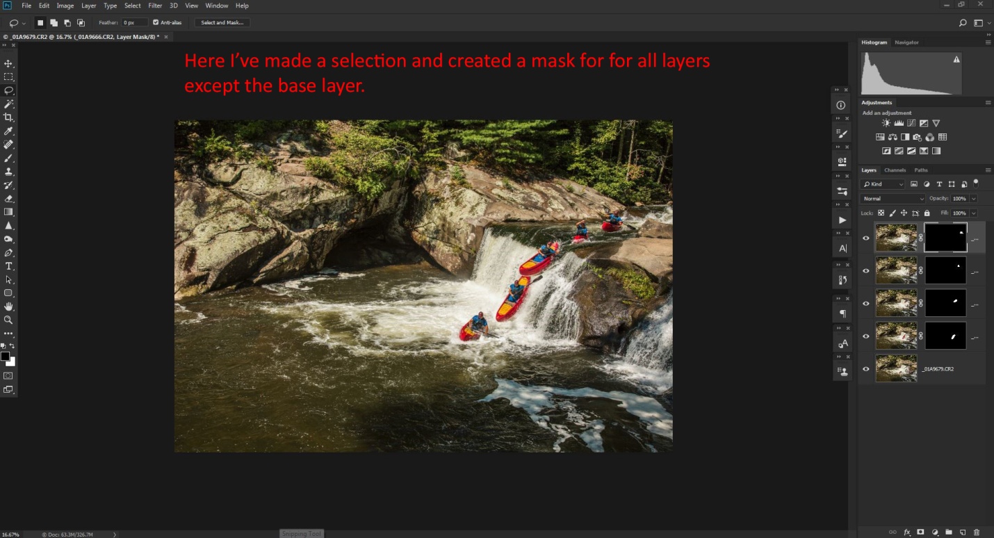
Creating the layer masks
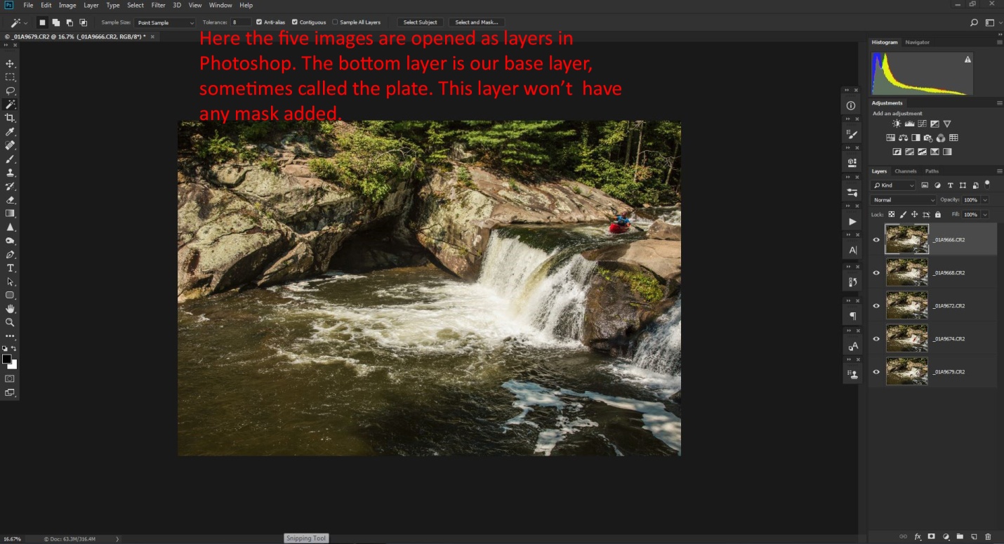
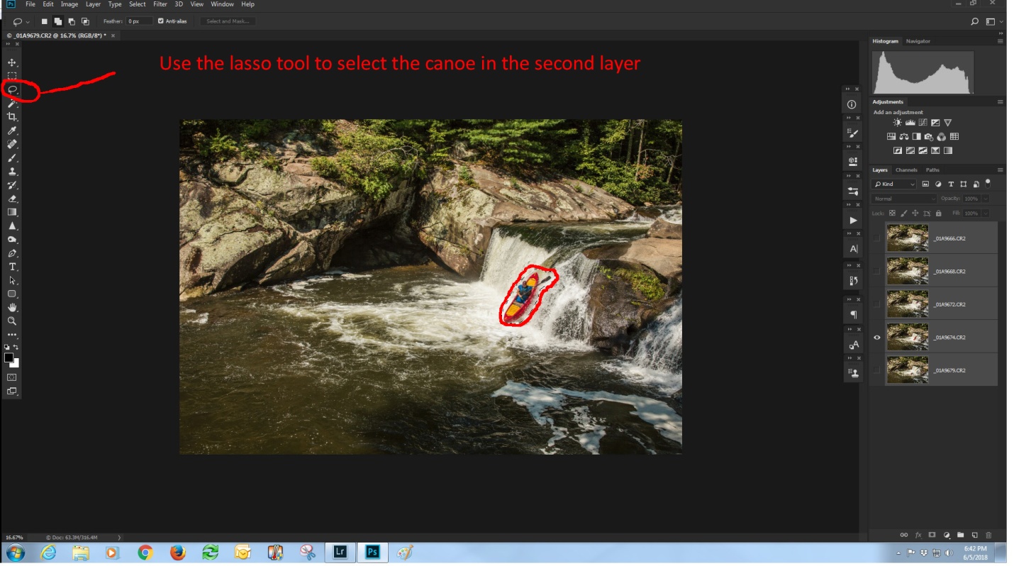
The bottom layer is our background layer, also called the “plate” in compositing. This layer contains one canoe image and our entire scene. We won’t be masking this layer at all. Uncheck the “eyeball on all of the layers except the second layer. Select the lasso tool and draw a fairly tight selection around the canoe.
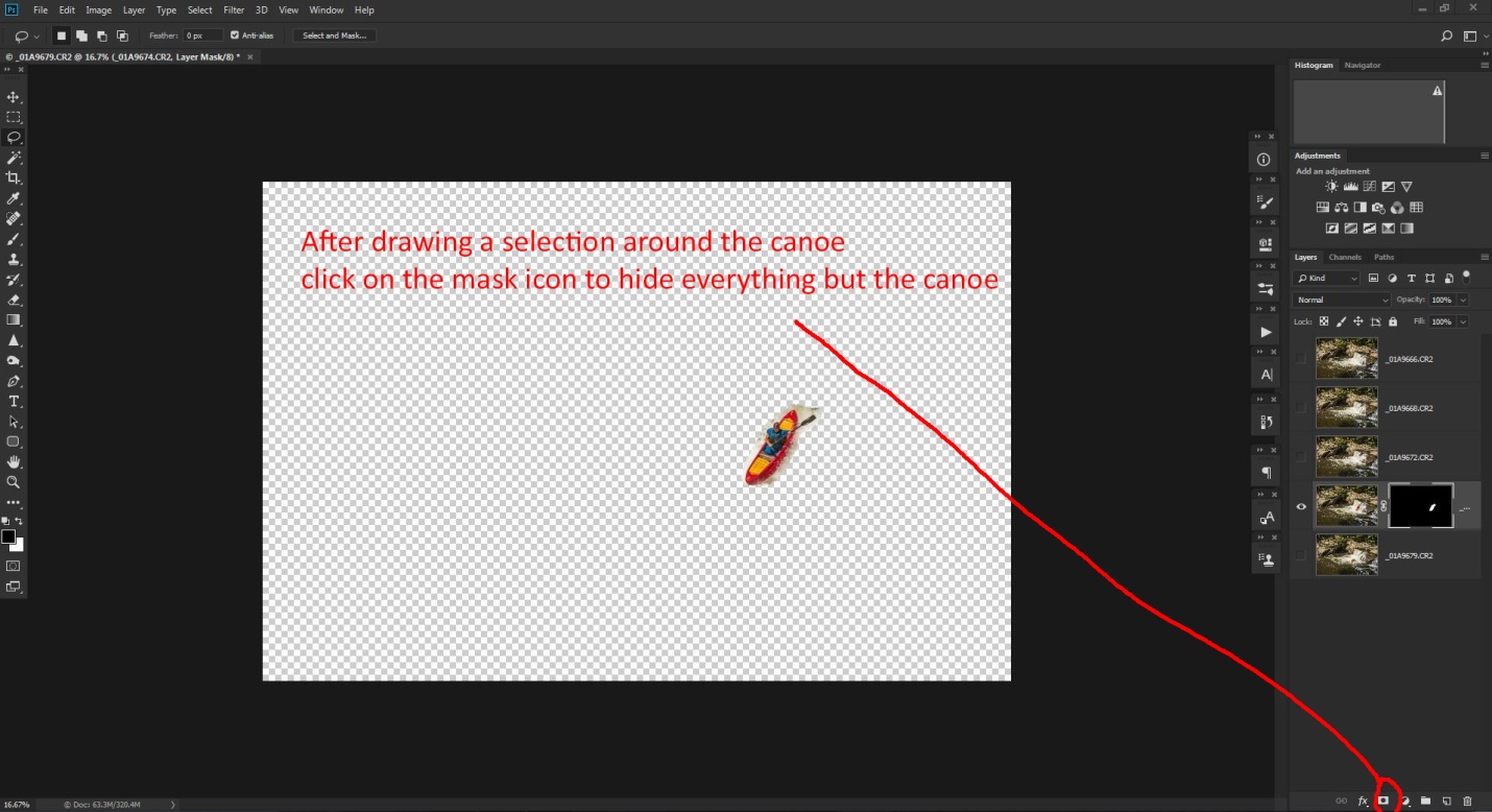
With your selection in place, go to the bottom right and select the third icon from the left to create a layer mask. You will see the mask is all filled in black, except your selected area. With just this layer turned on, everything but the canoe is transparent (indicated by the checkered pattern).
Repeat the process with each succeeding layer. After creating the mask for each layer, check all of the “eyeballs” to make all of the layers visible. If you need to hide part of a layer, paint on the mask with the brush set to the color black and 100% opacity. If you don’t want to completely hide something, set the brush to about 20% opacity and paint in black to make the area transparent. Each new brush stroke will increase the transparency. If you need show more of the image in a layer, paint on the mask with a white brush.
When working with masks, remember “White reveals, black conceals.”
Flatten the image by selecting “layer” and “flatten image”
Finishing the Image
I improved the contrast by using NIK Color Efex 4 and then the tonal contrast filter, using the “standard” setting. I then flattened the image.
At this point, the image felt a little dark, so I opened the Camera RAW filter (ctrl-shift-A) and increased the exposure, increased shadow brightness, and decreased highlights slightly.
And here is the final image with all of the edits.
With a little imagination, you will think of many other uses for this technique. It would work well for track and field sports like pole vaulting or hurdles, or even for doing a multiple image portrait with your subject in different locations within the image.
This article is actually a little beyond “basic” as it involves Photoshop CC rather than Lightroom, Photoshop elements or Nikon or Canon image editing software.
In my last article on composition, I mentioned that cropping could be used to improve composition. Most of the time you would think of cropping as the removal of unwanted areas from the periphery of a photograph to remove an unwanted object or irrelevant noise from the periphery of a photograph, or to change its aspect ratio, or to improve the overall composition. In other words, we’re cropping in.
However about a year ago Adobe quietly added a new feature named “content aware cropping” to Photoshop CC. This new feature actually allows us to crop out, not just in, and it generates new image to fill in the blank areas. I’ll show you a couple of examples so you can see what it does and how to use it.
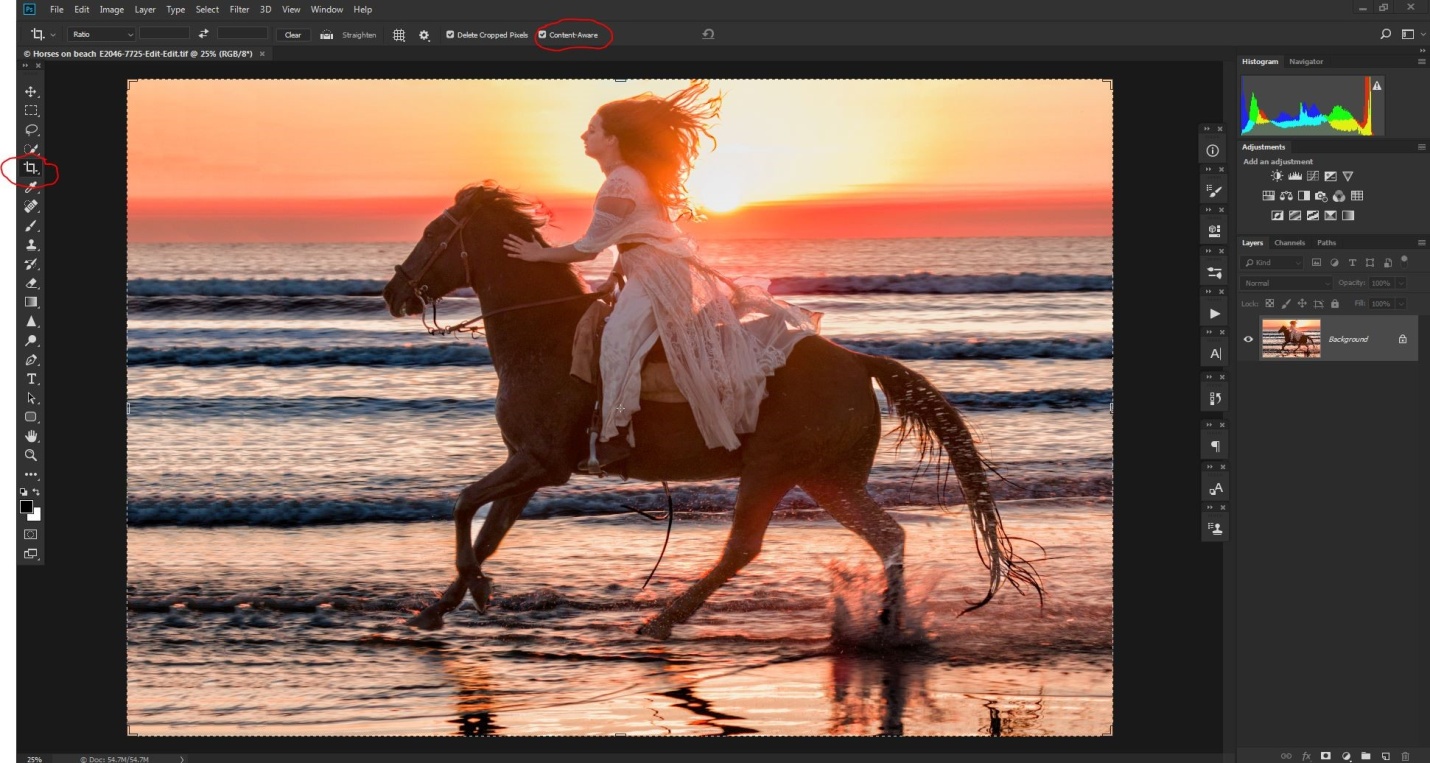
Here’s an image shot at Photofest 2018. There are a couple of problems with the image; the rider’s hair is touching the upper border of the image, and there should be more room in front of the horse and rider. A couple of years ago this image would have either been deleted or required a lot of tedious cloning to salvage it.
Here I’ve opened the image in Photoshop, and selected the crop tool, and most importantly checked the content aware option (circled in red).
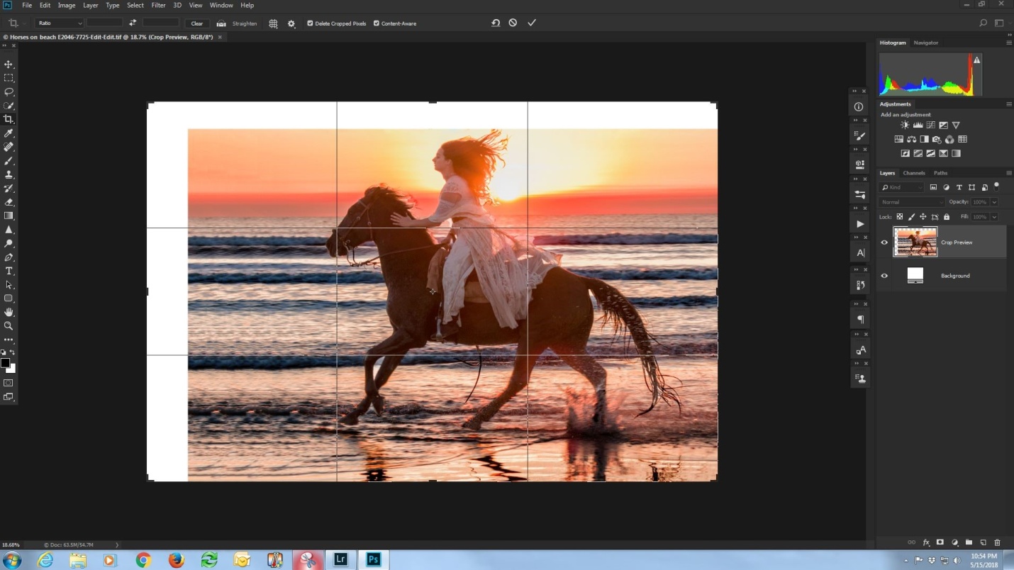
In the shot below, I’ve dragged my cropping borders up and to the left. In the bad old days, the white areas would have remained white. But now, press enter, and prepare to be amazed.
Using some really powerful math, Photoshop evaluates the area next to the areas to be filled, and generates new image to fill the blanks areas. Sometimes it is perfect or almost perfect, and sometime we did need to do some touch up work with the clone tool. How well it works seems to depend on how much extra space is added, and how much detail is in the surrounding areas.
In the shot below, content aware has done a pretty good job, but it has copied some extra hair above the rider, and it has repeated a series of highlights in the waves in front of the horse’s hooves.
Below I’ve done my cloning to remove the extra hair and the pattern in the waves. It’s not necessary, but I always clone into a new blank layer. That way I can turn the layer on and off to see my results, and if I really mess up, I can just delete the layer and start over. If I cloned on the image layer, I might have to quit without saving and lose any other edits I had already done.
Below is the final image with all changes. By the way, as I said earlier just a few years ago, this image might have been deleted. When you have an image that is good, but not quite perfect, don’t be too quick to delete it. You never know what new features may be coming in the future that will make it possible to fix the image.
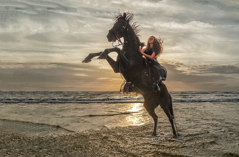
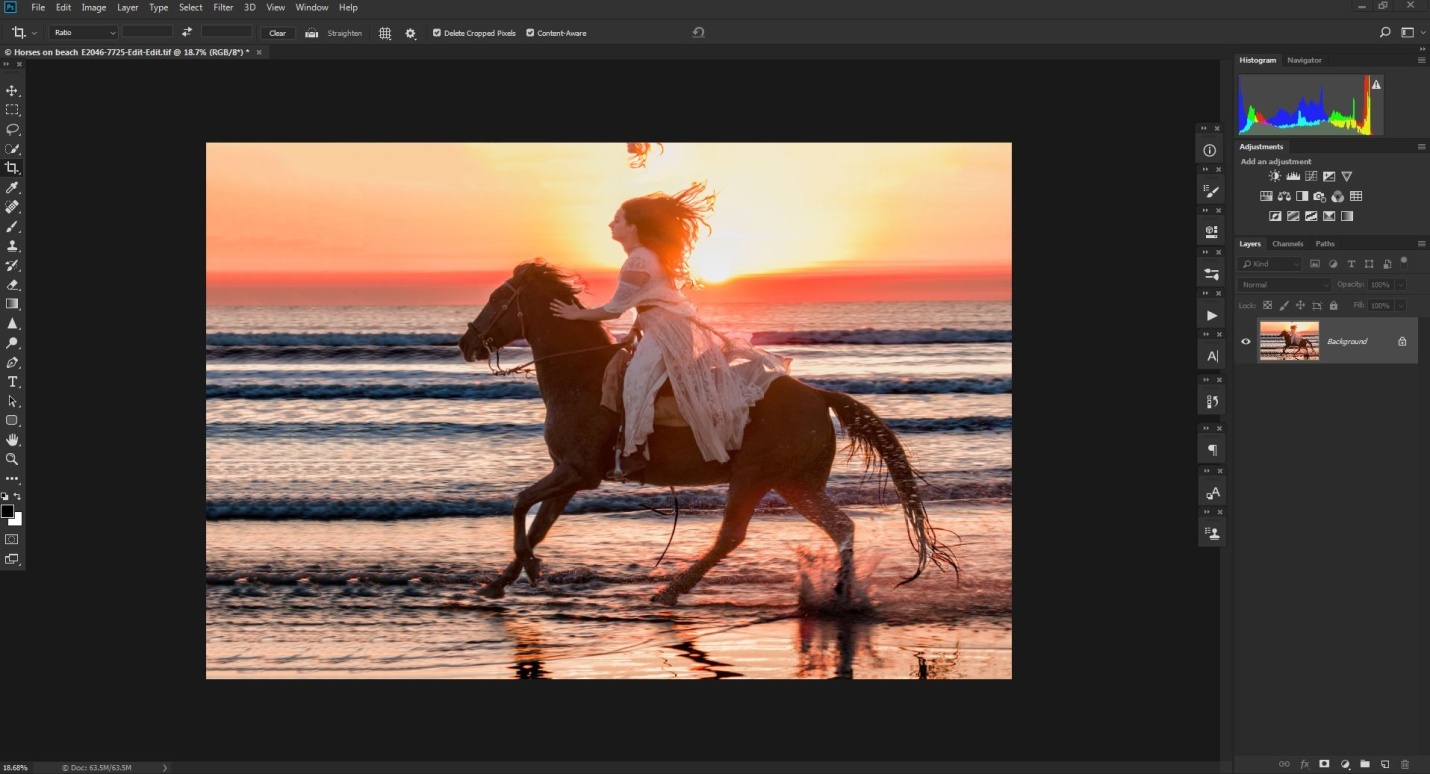
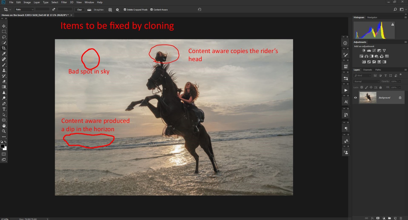
Here is another image from Photofest 2018 which has several problems that can be fixed with content aware cloning. Here the horse’s mane is clipped, there needs to be more space in front of the horse and rider, and the horizon is way beyond crooked. In my defense, this happened quickly, right beside me while I was shooting in another direction, and I barely got turned around in time for two quick shots at the wide end of my zoom lens. With the horse up in the air (and a little too close for comfort), I didn’t have time for perfect composition and leveling the horizon.
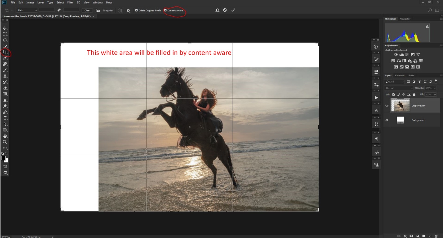
First I’ll add some extra space above and in front of the rider. I was generous in adding space, because I’ll need it in a later step. Again I selected the crop tool, and made sure content aware was checked on the option bar.
Again, content aware did a pretty good job, but it added a copy of part of the rider’s head, a bad spot in the sky and a dip in the horizon.
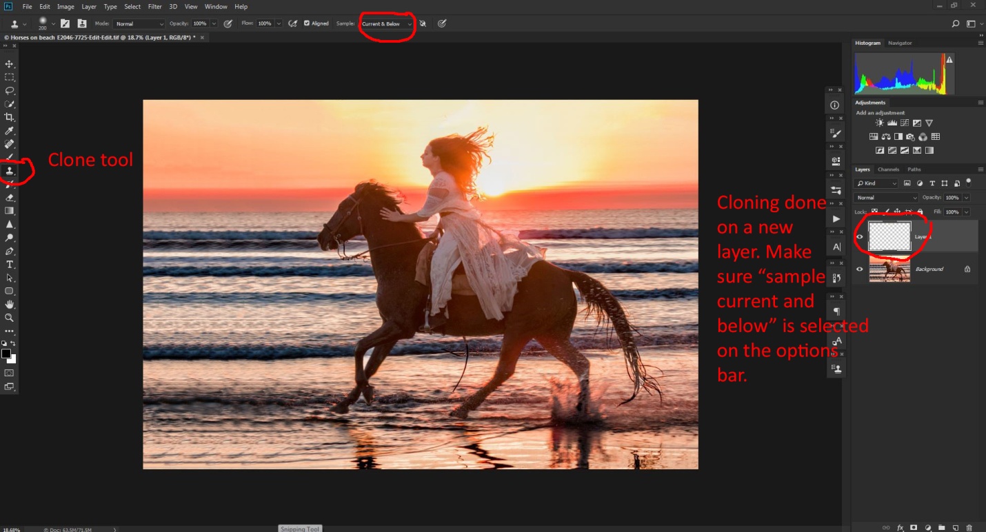
Here I cloned out the extra head and the bad spot in the sky. I decided to wait until after the next step to fix the dip in the horizon. I added the tip of the horse’s ear and extended some of the mane hair so that it didn’t look clipped. Again I did my cloning on a new blank layer.
To fix the crooked horizon, I selected the crop tool, and then selected the straighten tool on the option bar. I dragged this along the horizon line and the image was rotated just the right amount. With content aware checked, the white areas will be filled with computer generated image. If this isn’t checked, Photoshop will crop the image down to remove the white areas.
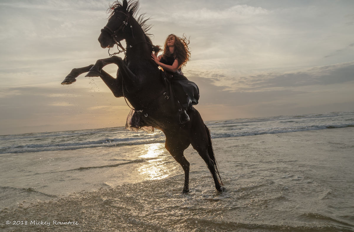
And here is the final image with all of the cropping and straightening done. I also applied NIK Color Efex 4 Tonal Contrast filter to the sky and water.