
Photography Basics
By Mickey Rountree
Photography Basics – Photographing the Palouse
by Mickey Rountree
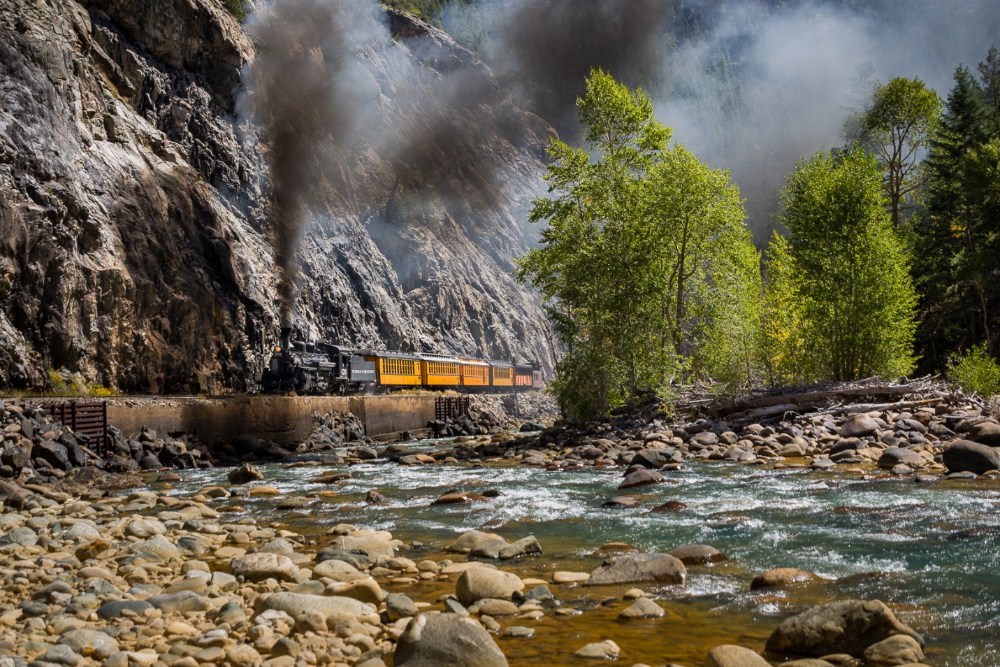
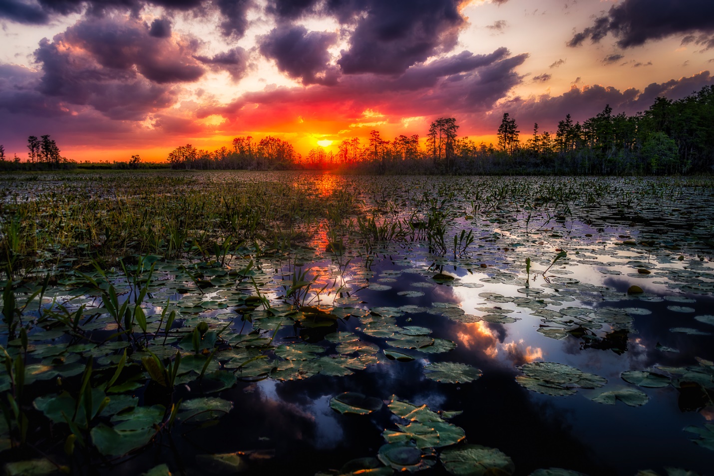
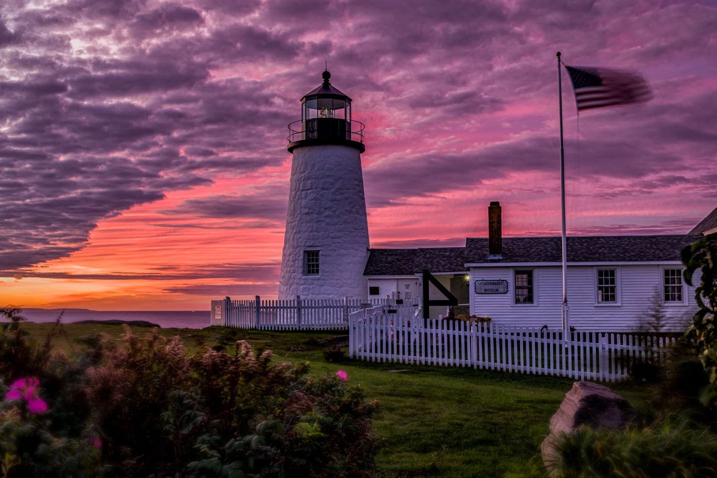
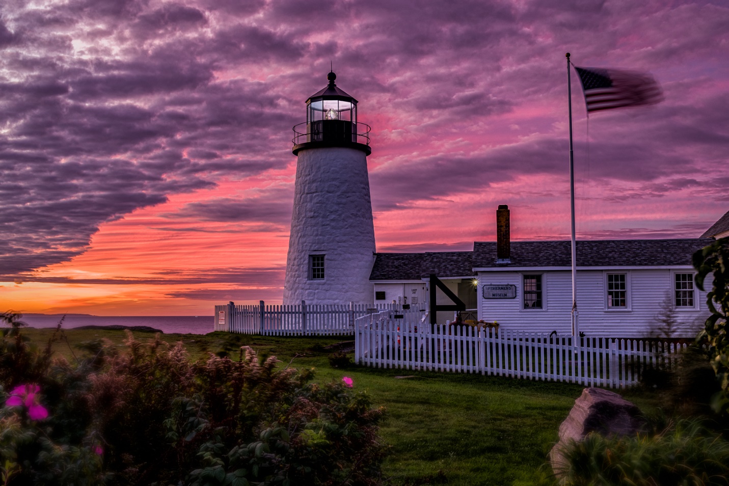
The Palouse is a region of rolling hills and deep soils located in southeastern Washington and parts of Idaho. The hills are composed of wind-blown loess soil. This loess cover spans over 50,000 square kilometers across the Columbia Plateau. The unique landscape is a result of wind-blown silt and dust deposited over tens of thousands of years. The Palouse is a major agricultural region, known for its high wheat production. Other crops grown in the area include canola, lentils, barley, and chick peas. The fertile soil and semi-arid climate make the region ideal for these crops.
There are three main “Towns” in the Palouse area. I stayed in Colfax which is about 65 miles south of Spokane, the best airport to fly into. Pullman is only 14 miles southeast of Colfax and has much more to choose from. You’ll probably drive a hundred miles or more each day, mostly on gravel or dirt roads. If you’re renting a vehicle be sure to get an SUV or pickup for ground clearance. 4WD is optional, but we used it a couple of times on steep muddy hills.
When these articles are converted to PDF and sized for the newsletter, the resolution and quality of the images is seriously degraded. If you would like to read the article and see the images as I did, you can see this article on my website at this link.
https://mickeyrountree.smugmug.com/Articles/Basic-Photography-Series/
Research and Planning
I searched for photographers who have photographed the Palouse and looked at their work to see what images are possible and if they have any recommendations. You will find several photographers offering workshops at different times of the year.
Teri Lou is a photographer who has created a detailed set of six maps showing points of interest throughout the Palouse area. These maps will save you a lot of time and frustration.
(https://palousemap.blogspot.com/) 
I was also able to find a website where a photographer listed his favorite 25 locations, including GPS coordinates. Before I left home I had all of these plugged into GPS so we immediately had some places to shoot as we drove out of Spokane. (https://muralipix.com/2020/06/28/my-top-25-spots-in-the-palouse-as-of-june-2020-2/)
I used Weather Underground to check historical records for the month of May going back several days. As my departure date approached I was frequently checking the ten-day forecast to get an idea of what clothing to pack.
Where to Stay
I stayed in Colfax because it is in the center of the Palouse. It has two motels, three restaurants, a grocery store and a gas station. Except for the gas station, it’s like a time warp to the 60’s.
Pullman Washington is about 14 miles south of Colfax and has more Restaurants and Hotels since it’s a College town (Washington State University)
Moscow Idaho is in the Southeast part of the Palouse and has lots of hotels and restaurants, but it is at the extreme edge of the Palouse and that means more driving.

When to go
Late May to mid-June is planting time and the fields will be green with new crops. Late July and August is harvest time and fields will be golden with ripe wheat. In October you will see some Fall Color, but keep in mind that there aren’t a lot of trees in the Palouse. November through March are likely to be snowy and very cold.
Important Rules
There are not many convenience stores or restaurants in the small towns, so carry snacks and a cooler with drinks.
Sleep when you can, and maybe nap midday when the light isn’t great.
Get gas when you can. Many of the “towns” in the area don’t even have a gas station
GO WHEN YOU CAN! See Above. Carry some TP
SHOOT IT NOW! Things move from day to day or light changes.
Respect the land, the farms and the farmers. Don’t trespass or walk through plowed or planted fields. Don’t go into barns or other buildings (even abandoned buildings) unless you are invited. Remember you’re the visitor here; for them it’s their livelihood. Bad mannered photographers have left bad impressions and given photographers a bad reputation, so DON’T BE THAT GUY.


(Slightly Beyond) Photography Basics – Creating a Pencil Sketch Effect
Mickey Rountree
As I usually do, I’m calling this article Beyond Basic because it involves Photoshop and layers. If the idea of layers frightens you, just follow along step by step and you can make this work.
When these articles are converted to PDF and sized for the newsletter, the resolution and quality of the images is seriously degraded. If you would like to read the article and see the images as I did, you can see this article on my website at this link.
https://mickeyrountree.smugmug.com/Articles/Basic-Photography-Series/
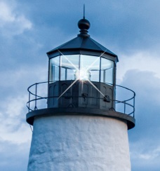
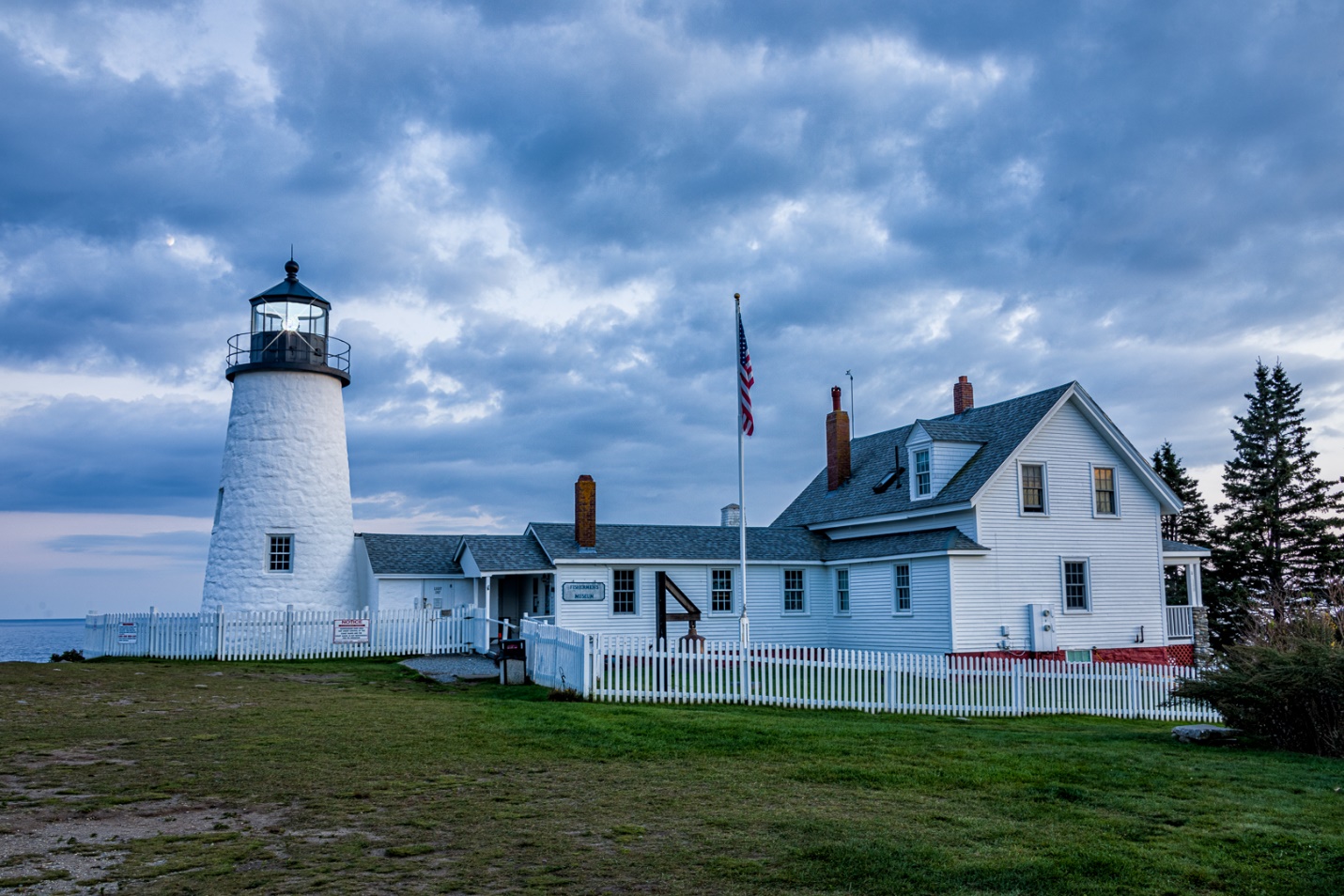
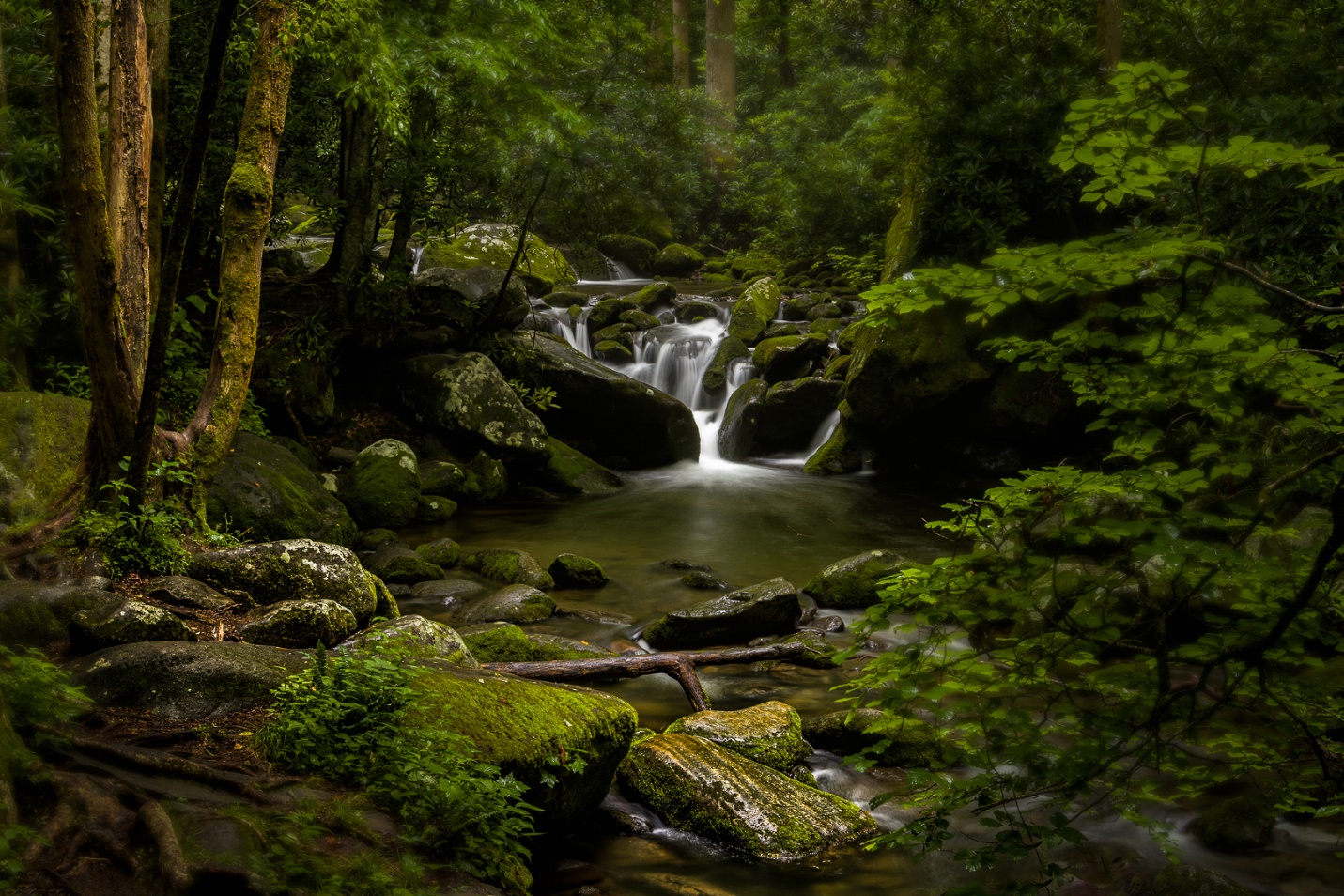
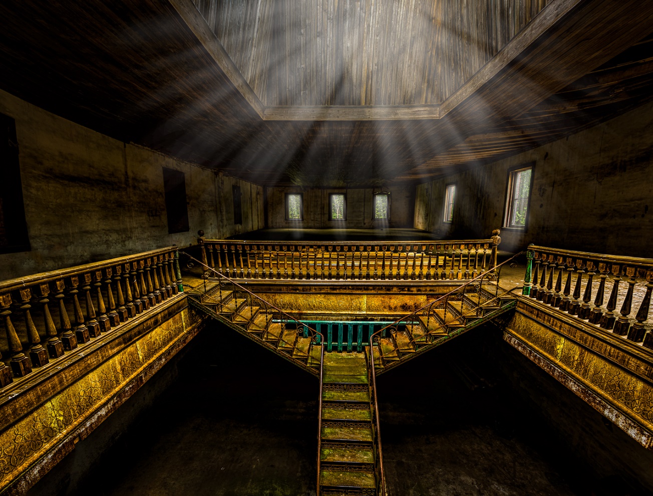
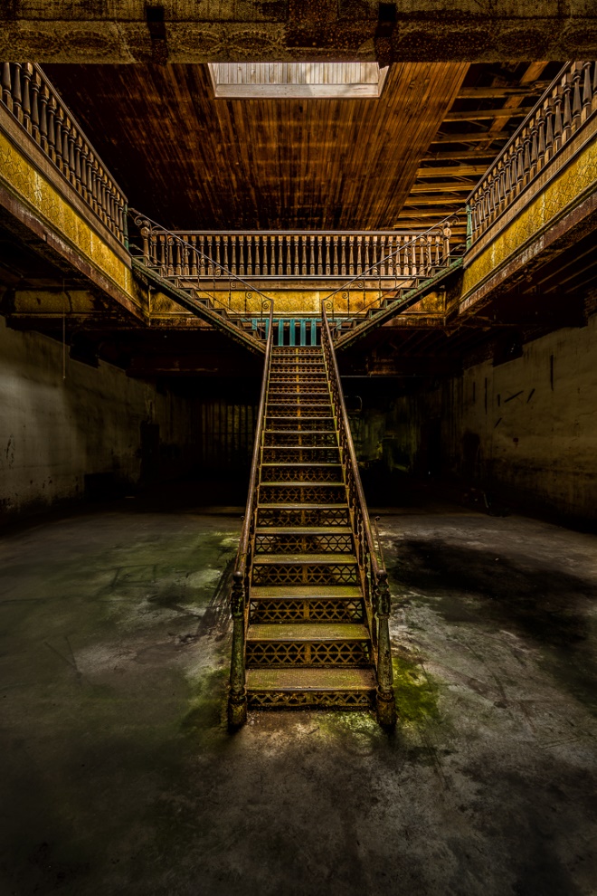
We are going to take the normal photographic image below:

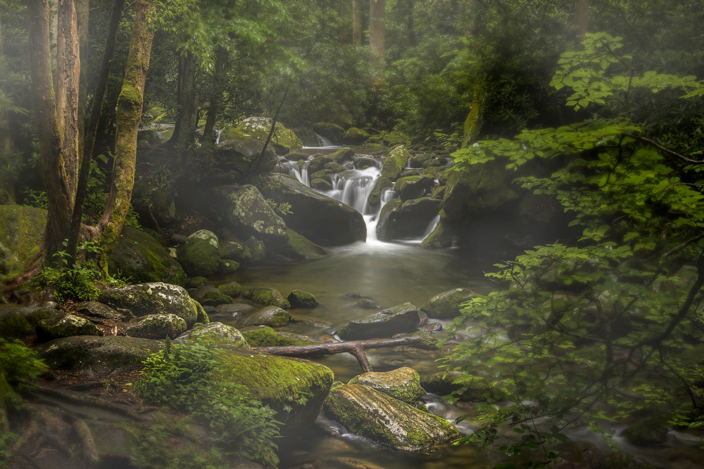
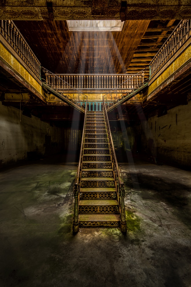
And turn it into the pencil sketch below.

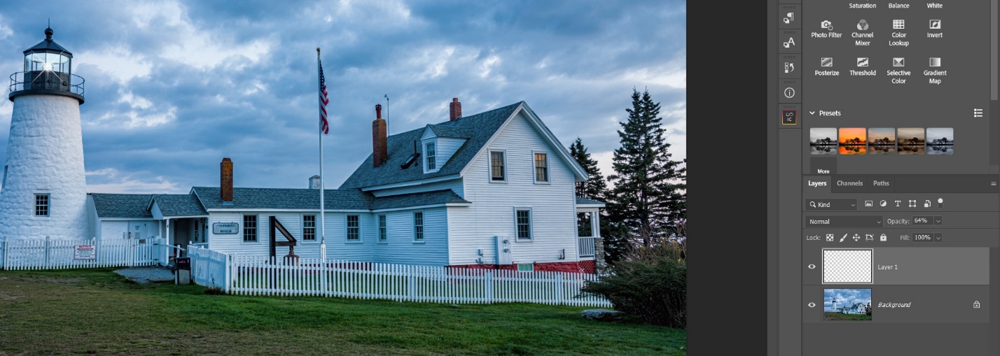
Start by opening an image in Photoshop or by sending it to Photoshop from Lightroom. This will be our background image.
Duplicate this layer by entering CTRL J (CMD J if you use a Mac)
Enter CTRL U (CMD U) to desaturate this image. This will bring up the adjustment panel below. Drag the saturation all the way to the left or -100 and hit OK. We now have a Black and white layer.

Duplicate this layer by entering CTRL J (CMD J)
With this new layer selected enter CTRL I (CMD I) to invert it.

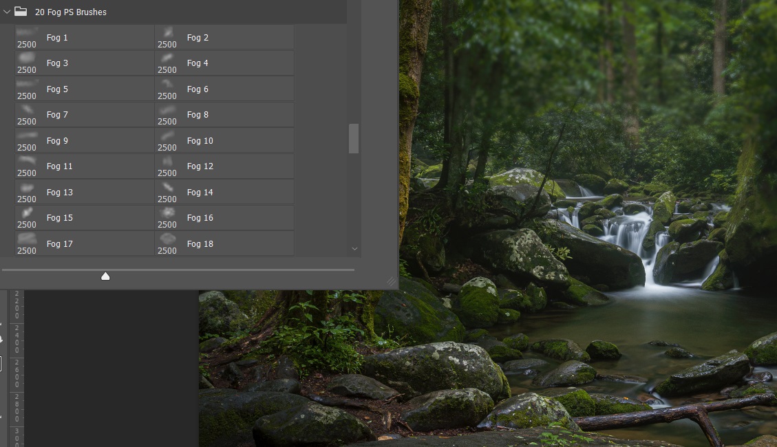
Right click on this layer to the right of the thumbnail and select convert to smart object. What this does is allow us to come back to the filter we apply next and change the value until we get the effect we like.


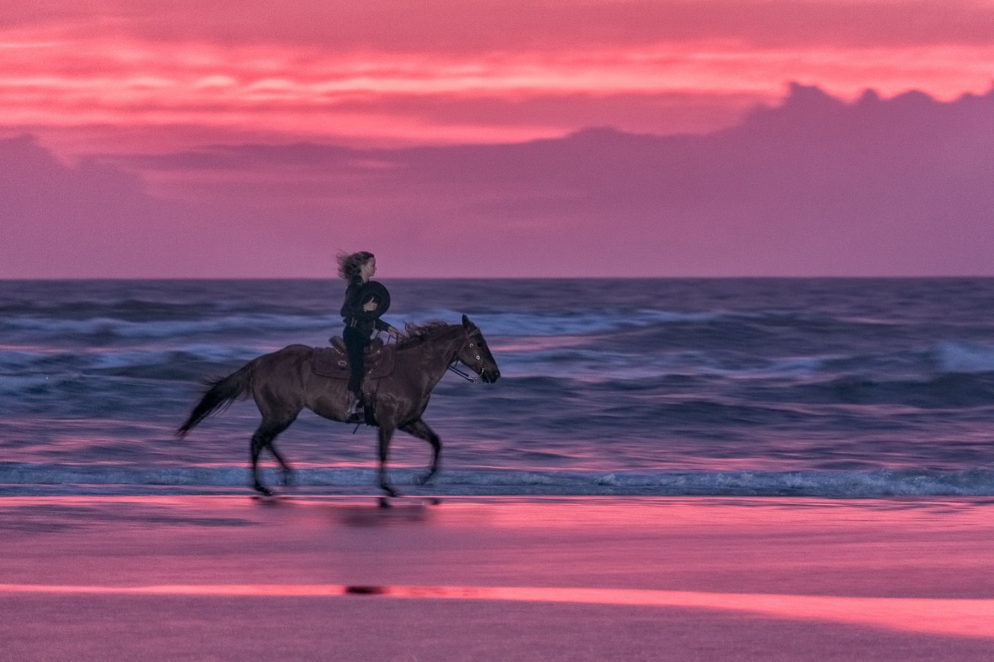
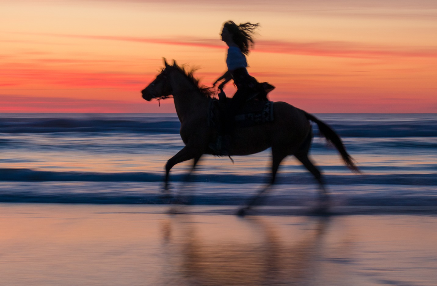
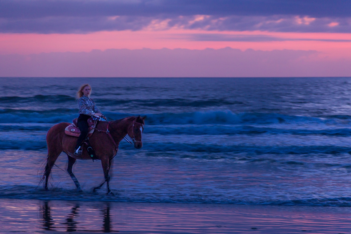
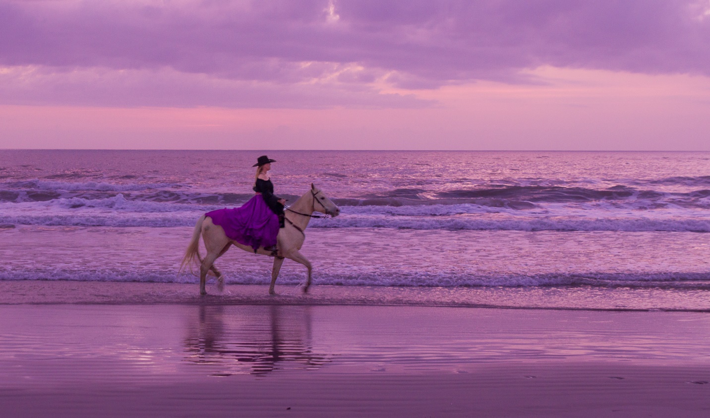
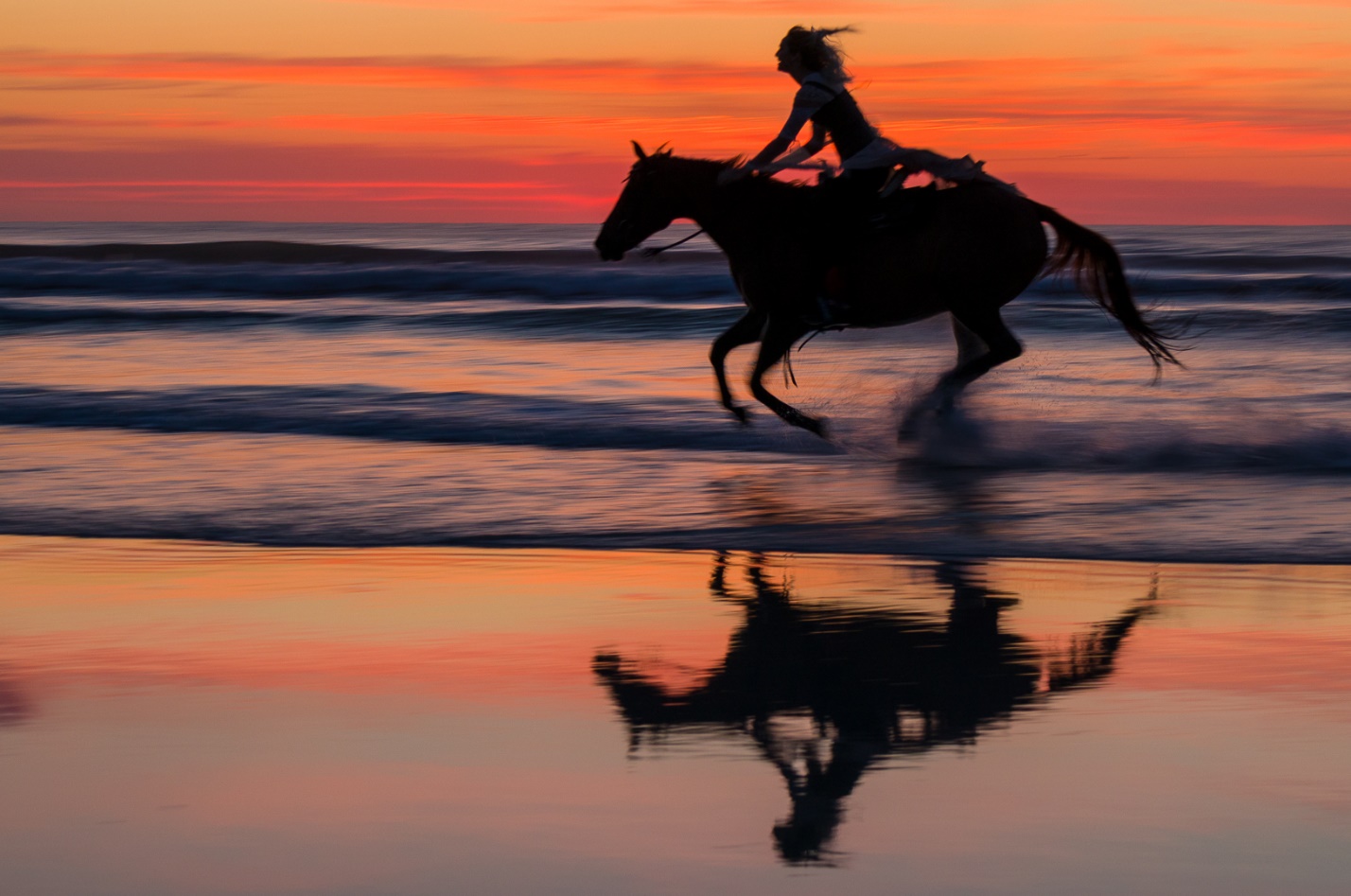
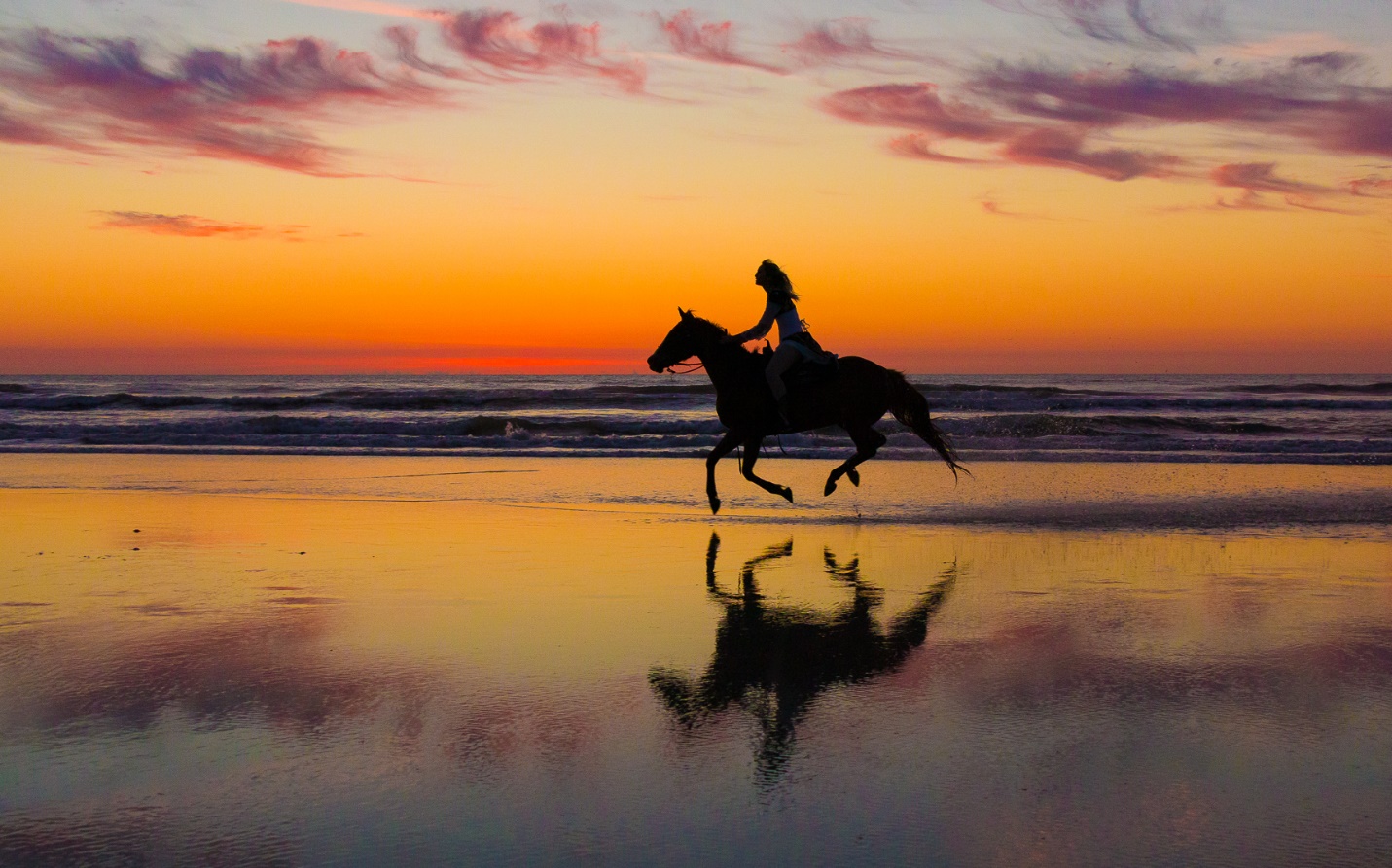
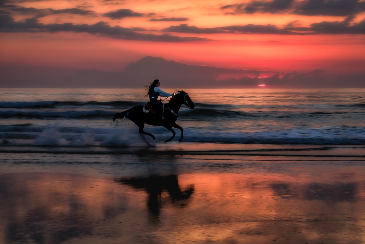
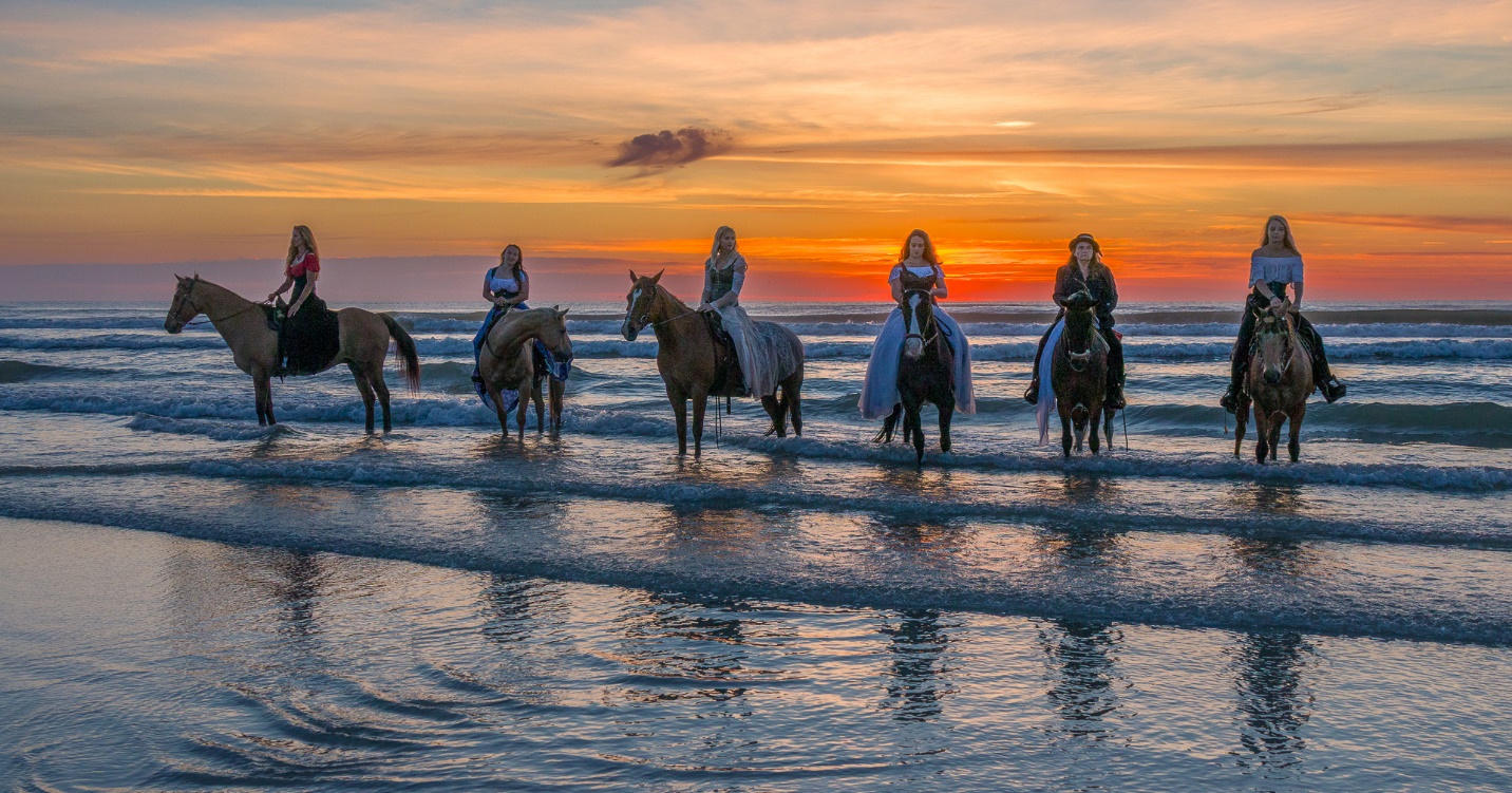
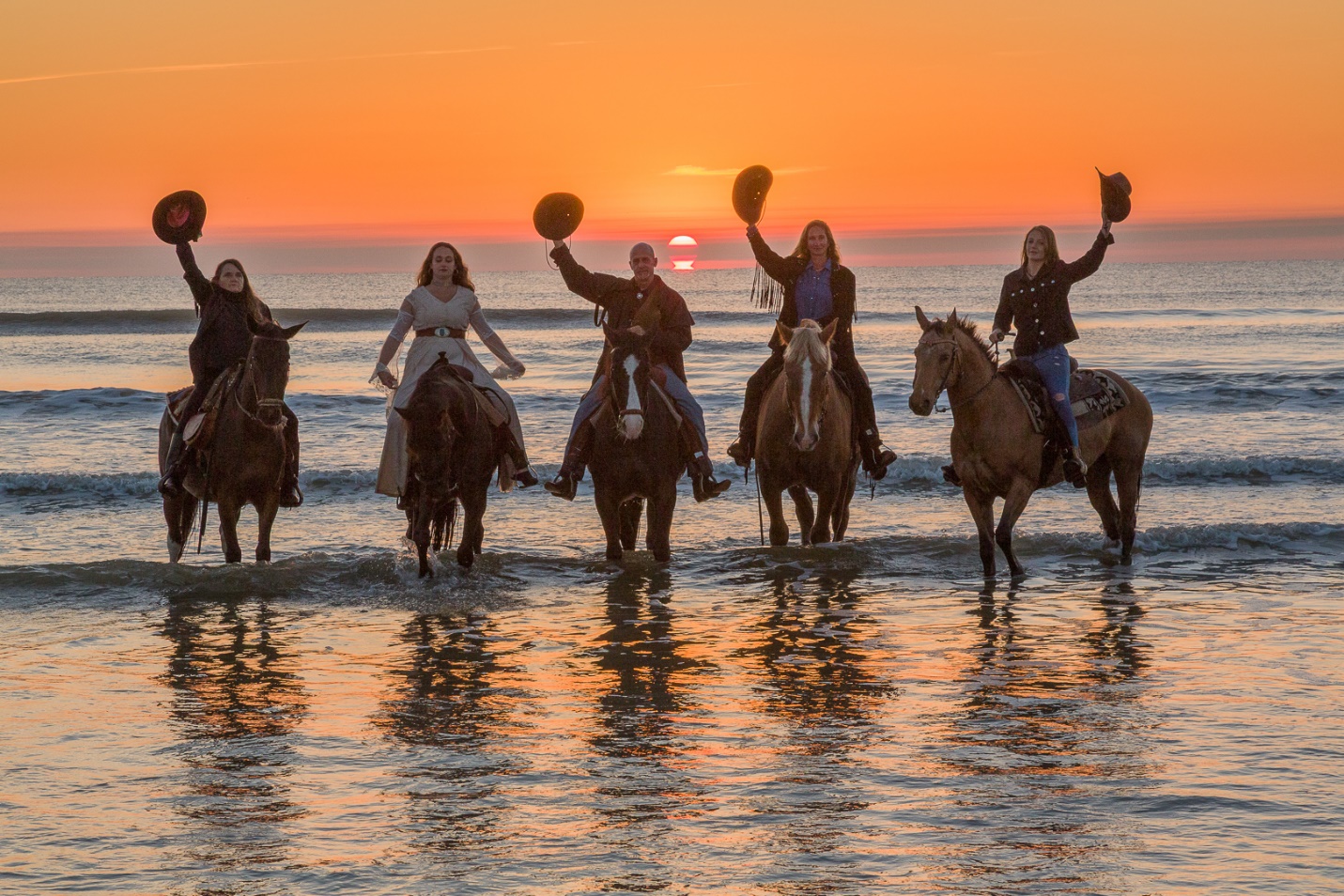
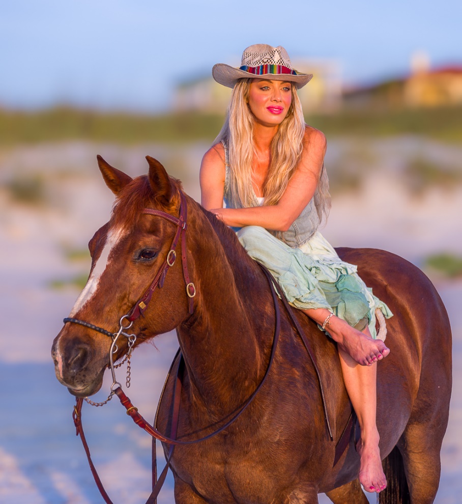
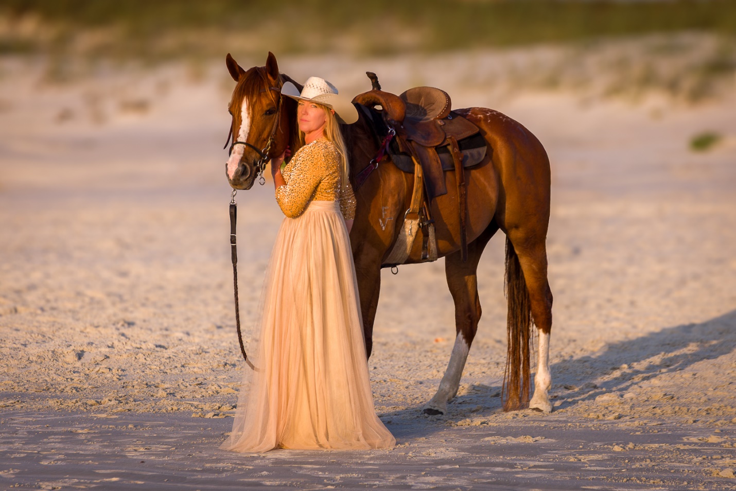
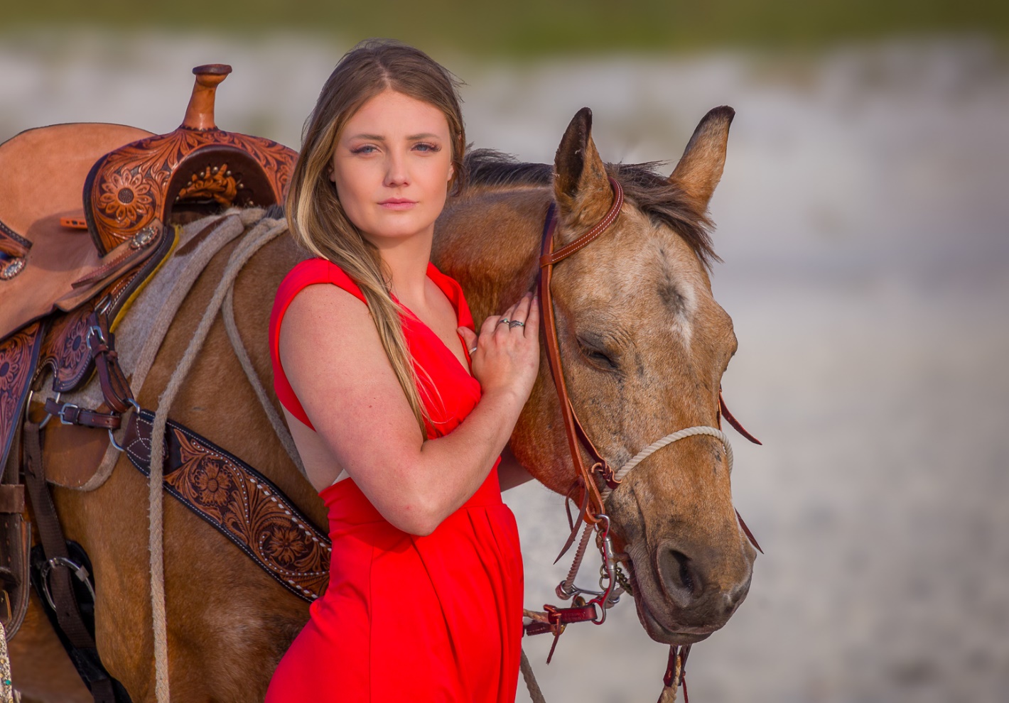
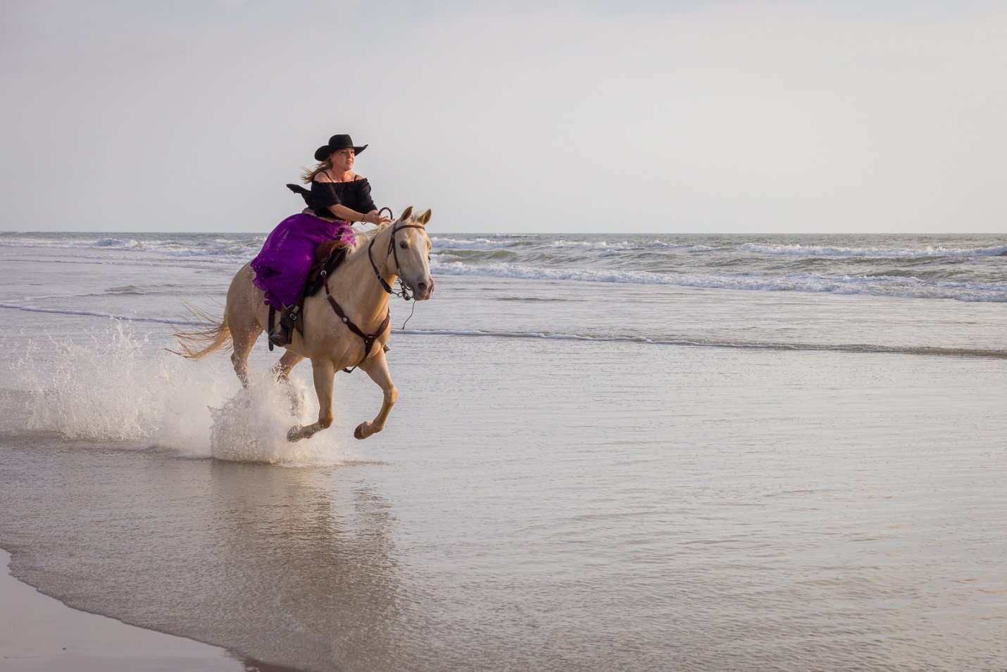
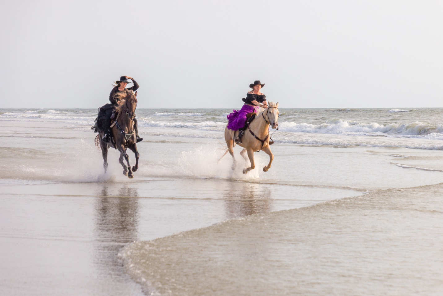
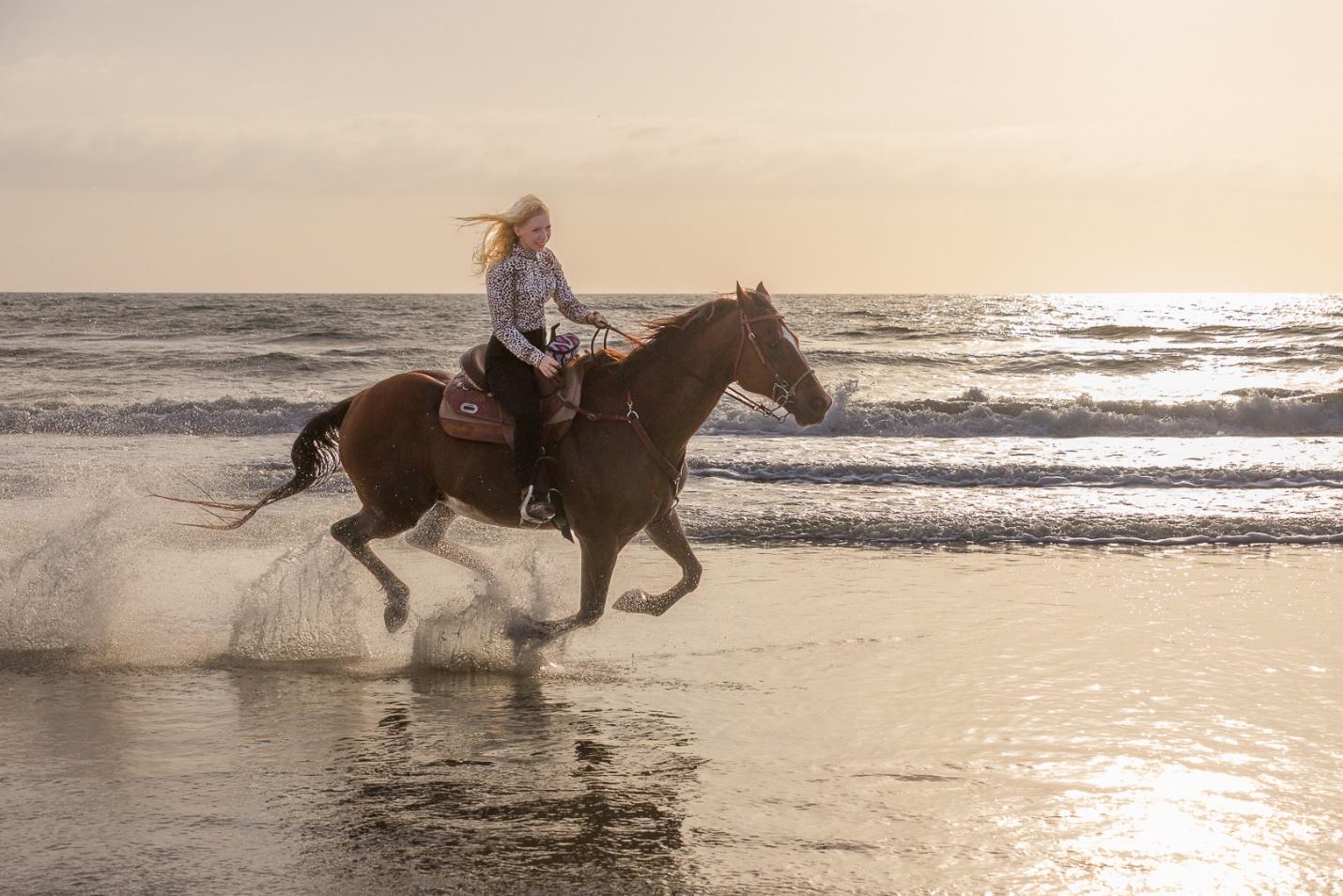
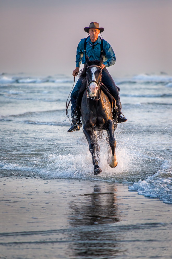
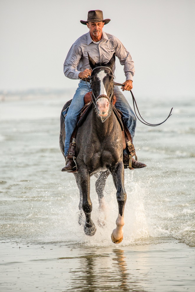
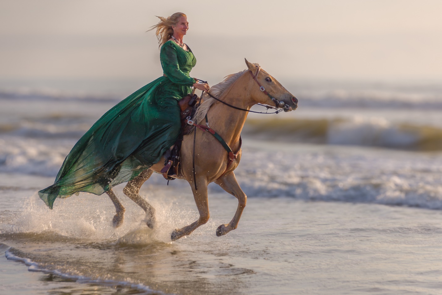
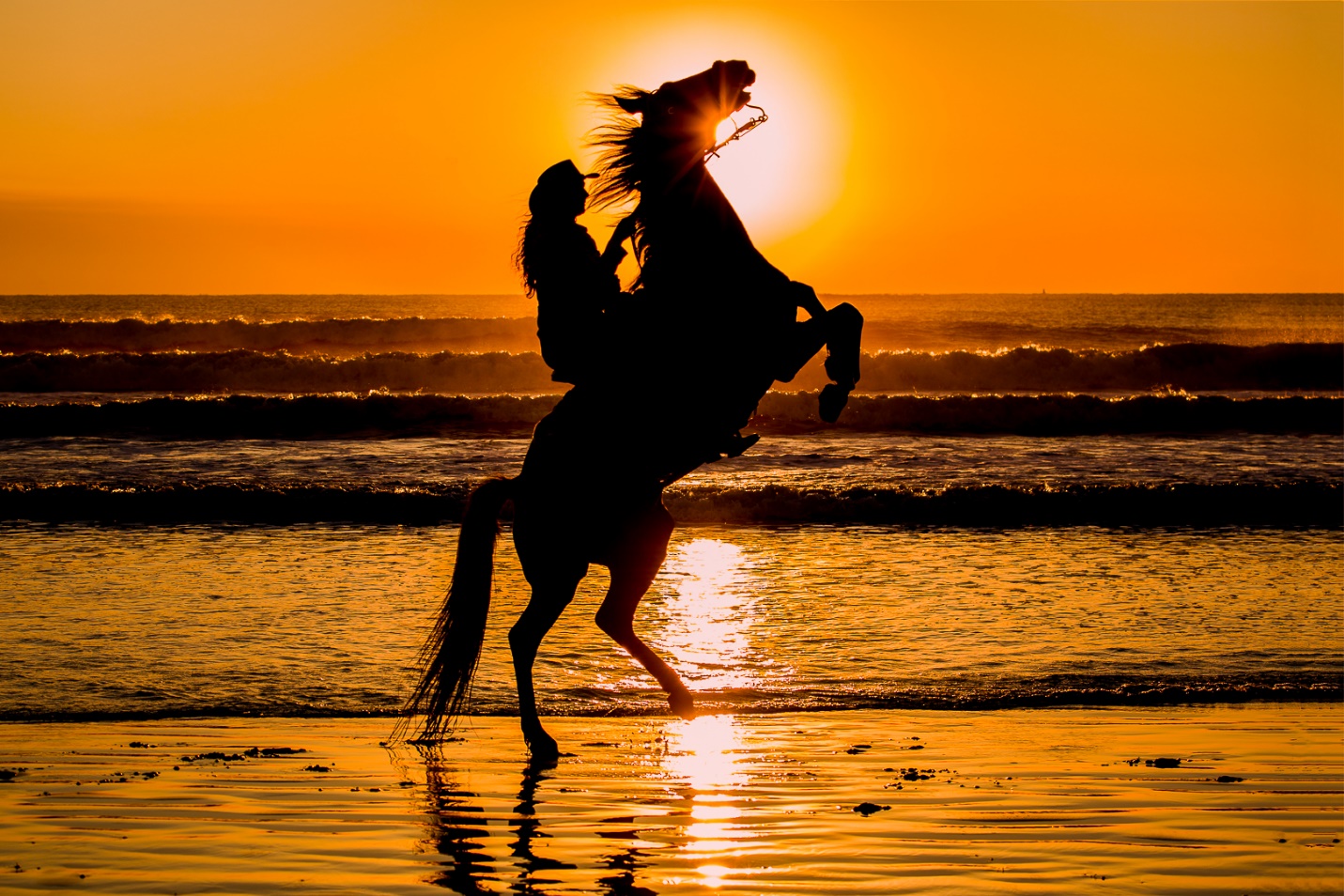
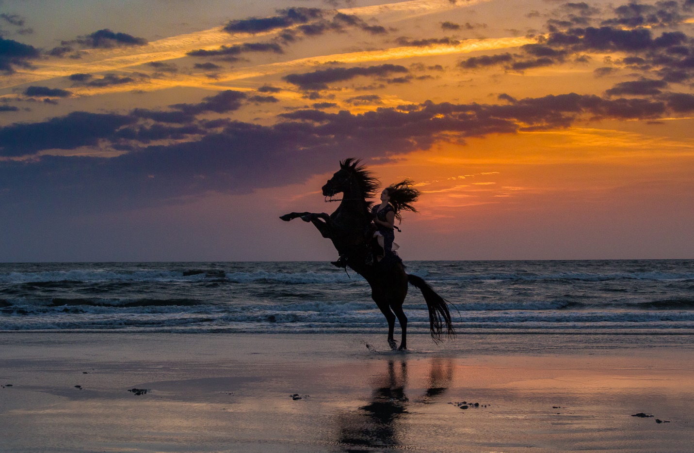
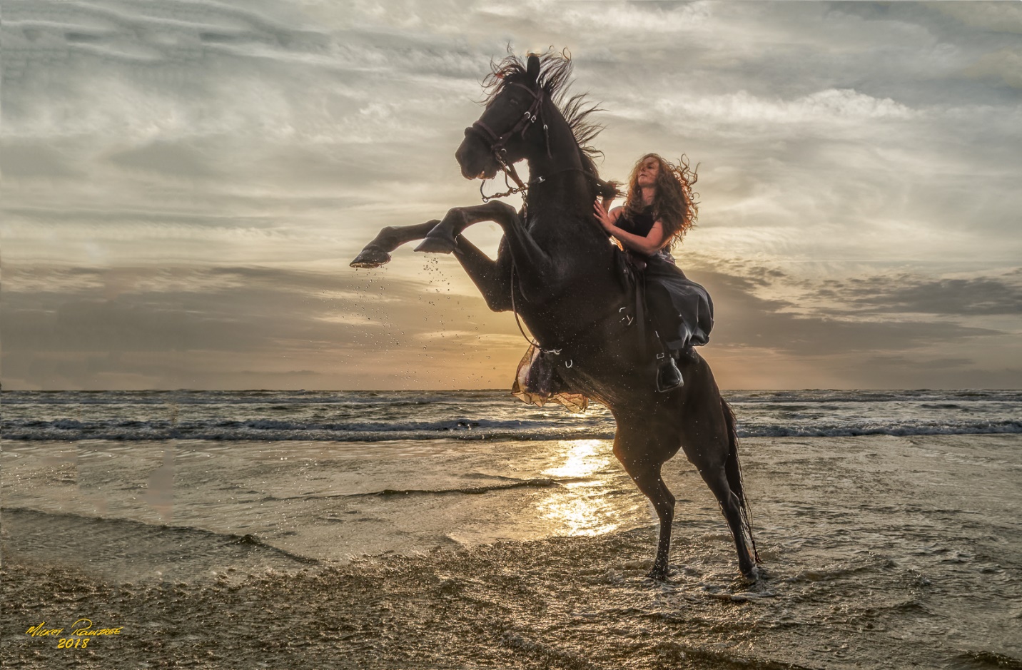
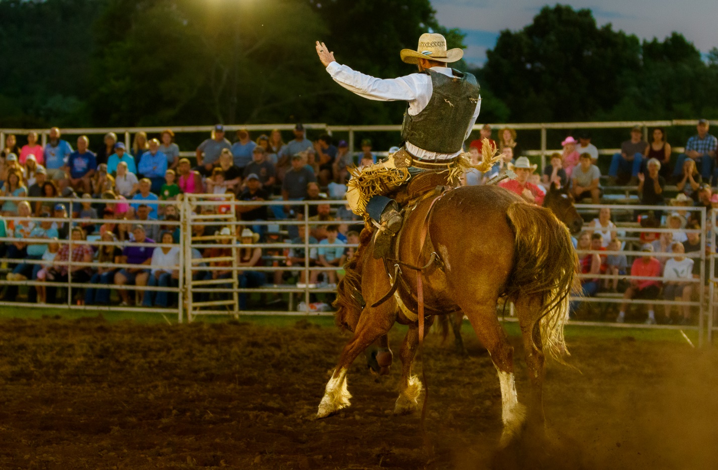
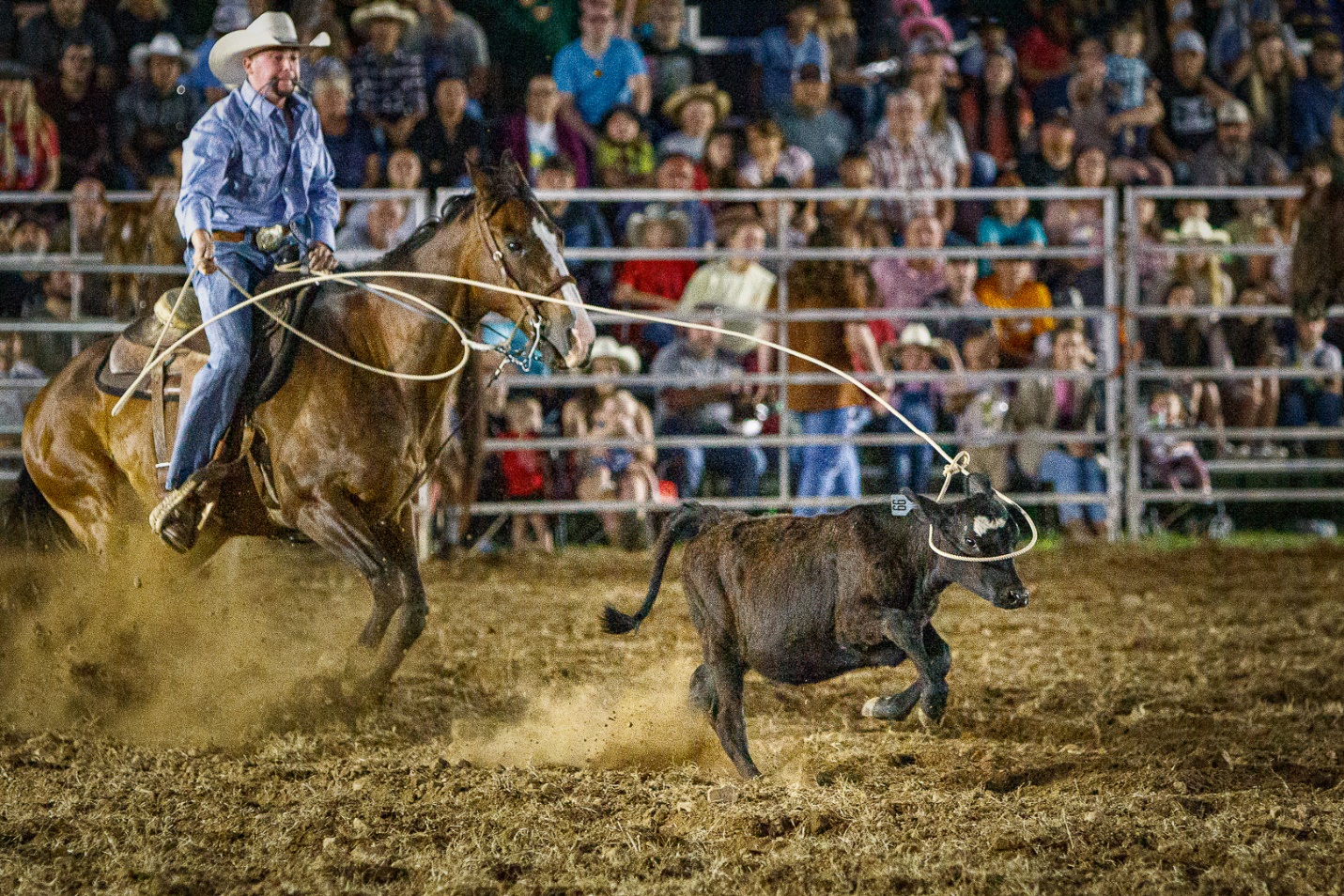
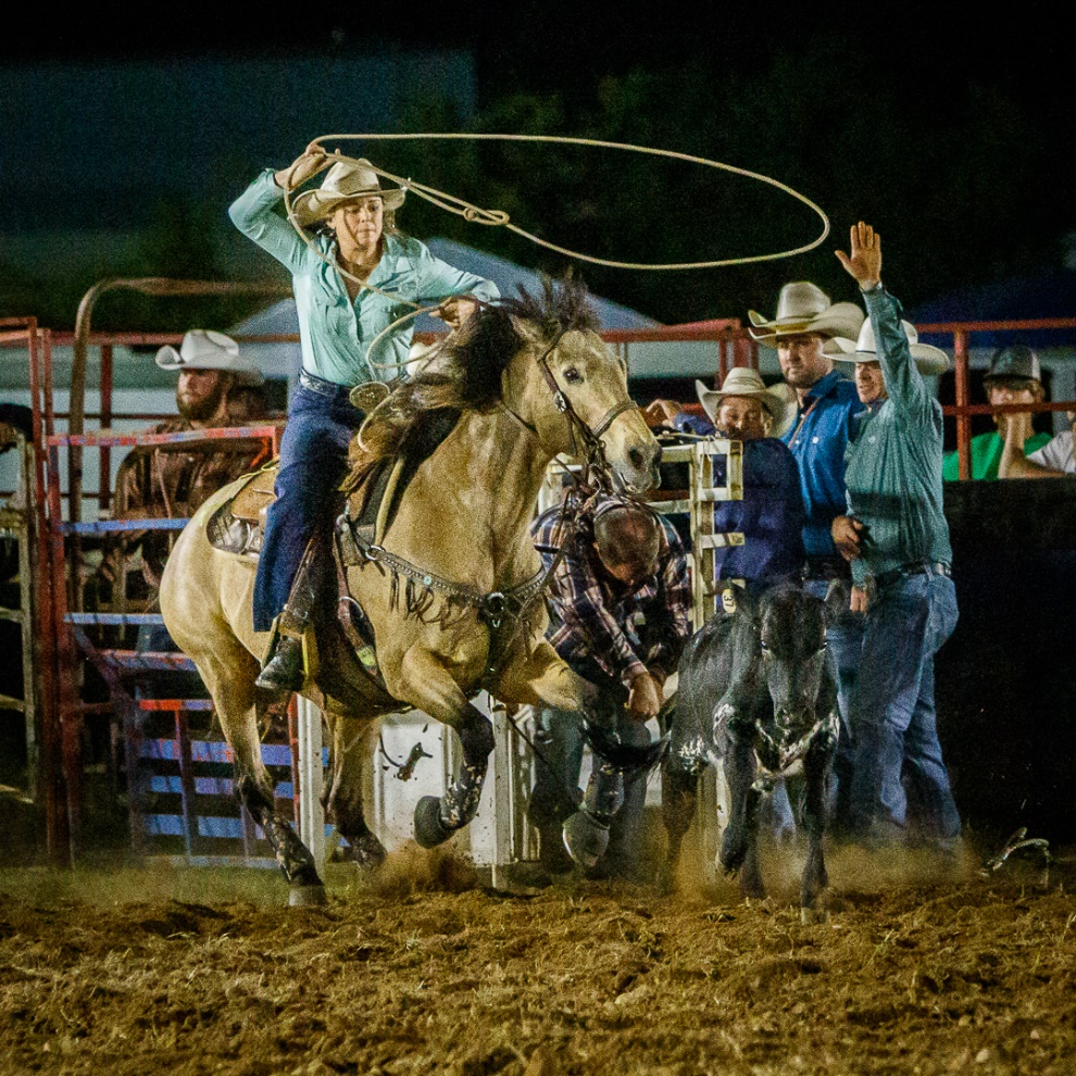
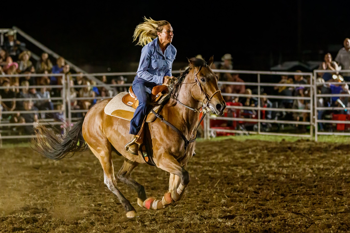
Photography Basics – Photographing Horses on the Beach
by Mickey Rountree
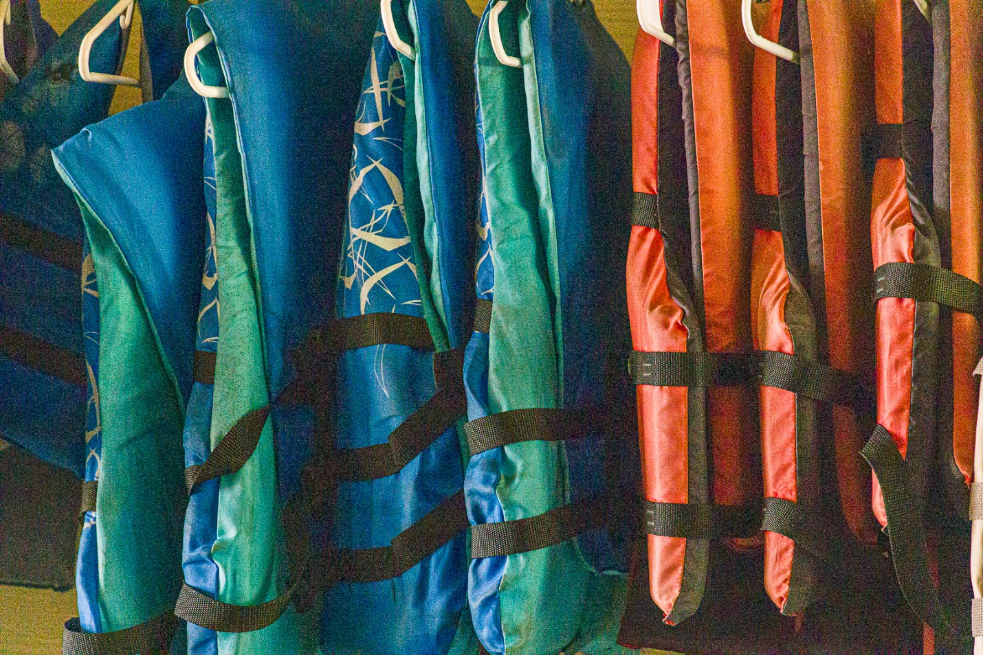
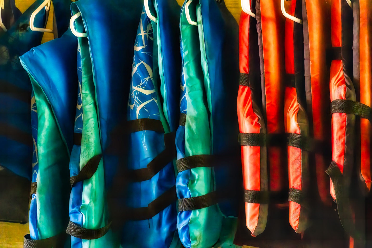
Back in 2016 Milton told me about the Birding and Photo Fest in St. Augustine, Florida, and in particular about photographing horses on the beach at sunrise. I’ve shot horses in Tennessee, but we’re short on beaches, so it sounded so unique I signed up for the 2017 Photo Fest and three sunrise shoots with horses on the beach among other lectures and workshops. After those shoots I was in love with this unique photo op and I’ve shot 14 times now; in 2017, 2018, 2019, and 2024 and 2025. There was no Photo Fest in 2020 or 2021 due to Covid and I didn’t get to go in 2022 due to eye surgery (blowing sand and recent cataract surgeries didn’t seem like a winning combo) and 2023 due to schedule conflicts. I usually try to sign up for all of the sunrise shoots they offer. Why? Well the weather, light and clouds, riders, costumes, surf and number of riders are different each time. Some shoots are better than others, but the more shoots I go to, the better my odds of getting something really good or unique. I’ve been rained out twice, and while they usually have a make-up day scheduled, I usually have already scheduled something else.
Photofest is usually around the third week in April from Wednesday through Sunday. There are lots of lectures and other workshops available and vendor exhibits each day. Their Website is:
https://www.floridasbirdingandphotofest.com/
When these articles are converted to PDF and sized for the newsletter, the resolution and quality of the images is seriously degraded. If you would like to read the article and see the images as I did, you can see this article on my website at this link.
https://mickeyrountree.smugmug.com/Articles/Basic-Photography-Series/
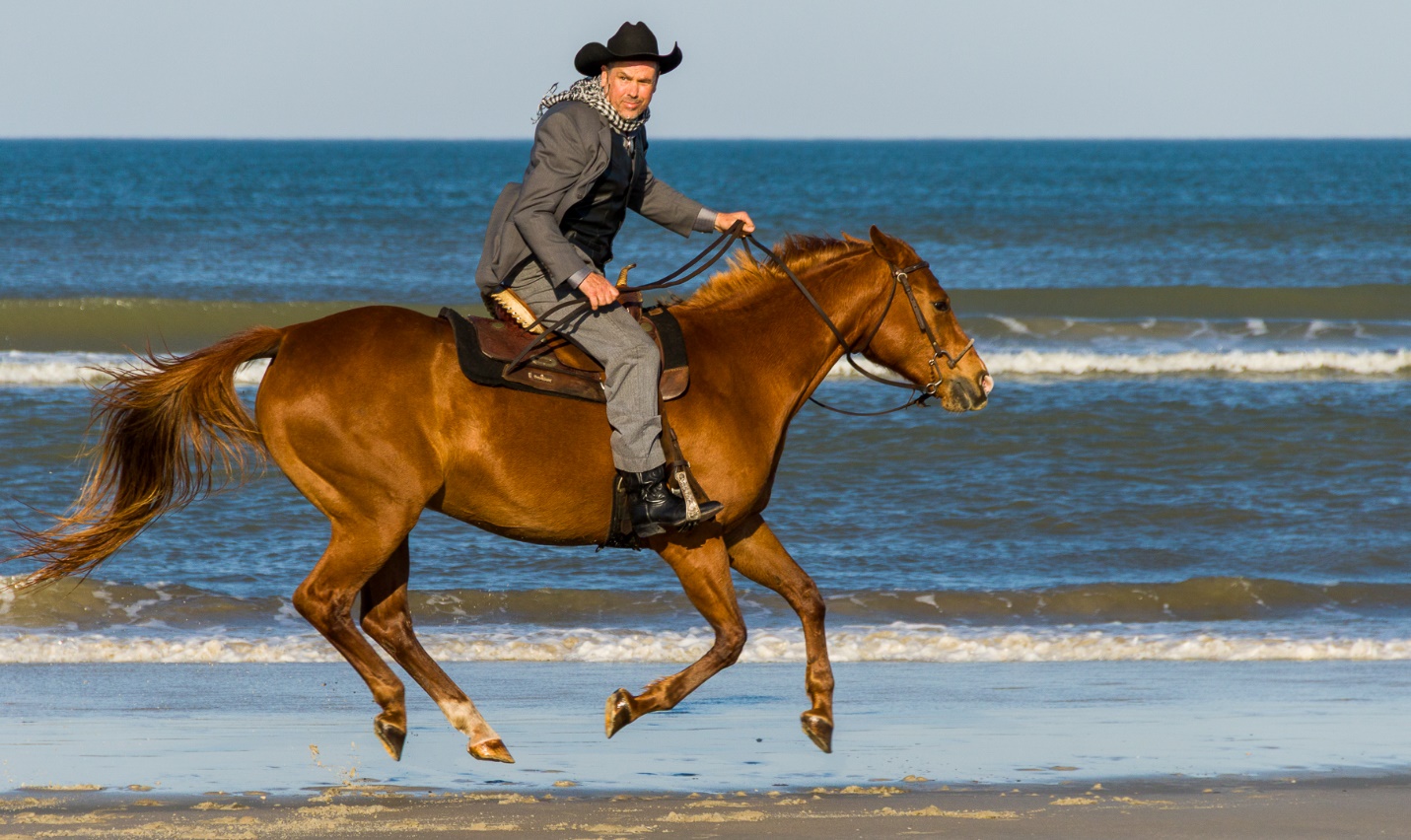
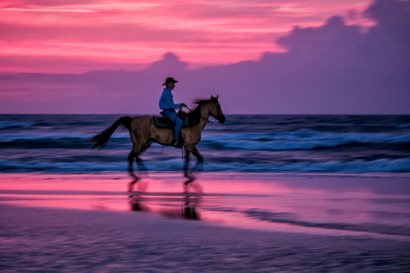
In the past there have been evening shoots as well, but I don’t find the light and color as pleasing. It’s hard to get slow shutter speeds to pan and the riders are squinting into the sun or wearing sun glasses. But especially if this is your first horse shoot it may be a good intro and technically a bit easier. And if you like tack sharp high shutter speed frozen action, you may prefer an evening shoot.
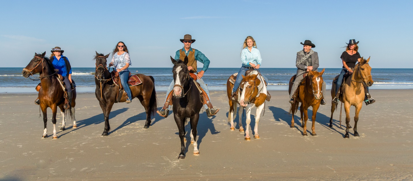
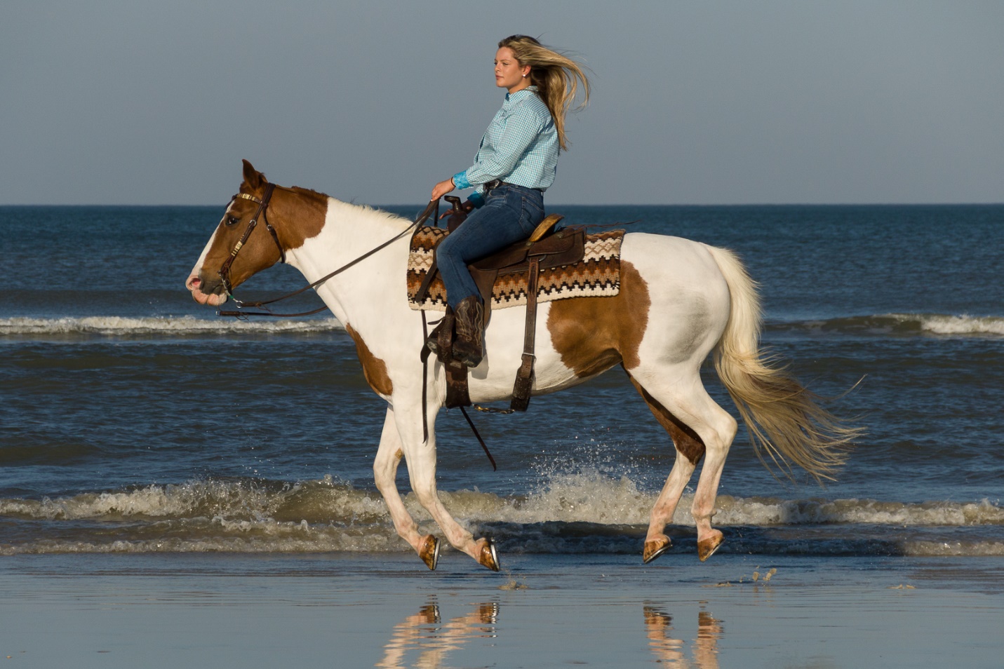
Each sunrise shoot has a workshop leader, and the shoots may vary a bit with each leader’s personality and style. Most of them control the group well and the photographers usually work well together. It’s rare but unfortunately I have seen some rude, self-absorbed photographers who think nothing of walking in front of everyone. Sunrise shoots meet around 6AM and we’re on the beach shooting by around 6:15. Actual sunrise is around 7AM and we’re usually done by about 8:15AM.
Photography Basics – Using Auto ISO
by Mickey Rountree
The exposure controls on any camera are shutter speed, aperture, and ISO. In manual mode we set all three to obtain our proper exposure. We have total control, and the only disadvantage is the time it takes the photographer to evaluate and make adjustments.
In aperture priority we set the aperture and ISO, and the camera selects the shutter speed to set exposure. As light decreases, the camera selects slower shutter speeds. The problem here is that the camera may select shutter speeds that are too slow for handholding or to freeze subject movement.
In shutter priority, we set the shutter speed and ISO and the camera selects the aperture. As light decreases the camera selects a wider aperture, and as light increases it selects a smaller aperture. The problems here are that as the camera changes aperture, the look of the image mage change considerably, and once the camera has reached the smallest or largest aperture it has no way to make further exposure adjustments and images may be over or under exposed.
Sometimes there are situations where the light is changing so quickly and drastically and photographic opportunities happen and then disappear so quickly that we may exceed the useful ranges of shutter speed or aperture, or we just don’t have time to change settings. This is when Auto ISO can come to the rescue. With Auto ISO set, the camera will change ISO as needed to maintain proper exposure.
Once we set Auto exposure, there are some additional settings we can make to assure our shutter speed doesn’t become too slow, or our ISO doesn’t go too high. The issue of high ISO is less important than it once was. My earliest digital cameras were pretty terrible above ISO 800. Also in my early days of digital, we didn’t have the software tools to reduce the noise of high ISO. Most cameras made in the last few years are pretty good up to ISO 3200 or even 6400. Images shot at even higher ISO can be more than acceptable with any of the good noise reduction software available. The important thing to remember is that it is better to have a sharp image with noise than to have a low noise image blurred by camera or subject movement.
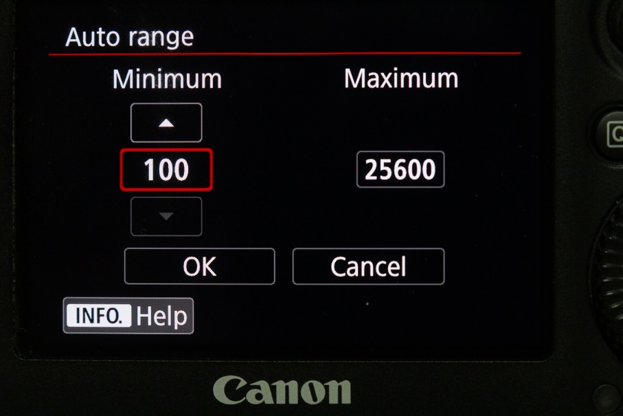
I’ll be showing examples of how to use Auto ISO on Canon cameras, since they are what I’m familiar with. If you use another brand Auto ISO probably works similarly, but the menus to set it will be different. Check your camera manual, or go to YouTube and search your camera model and Auto ISO and most likely you’ll find a tutorial.
Set Auto ISO either with the top camera controls or through the menu.
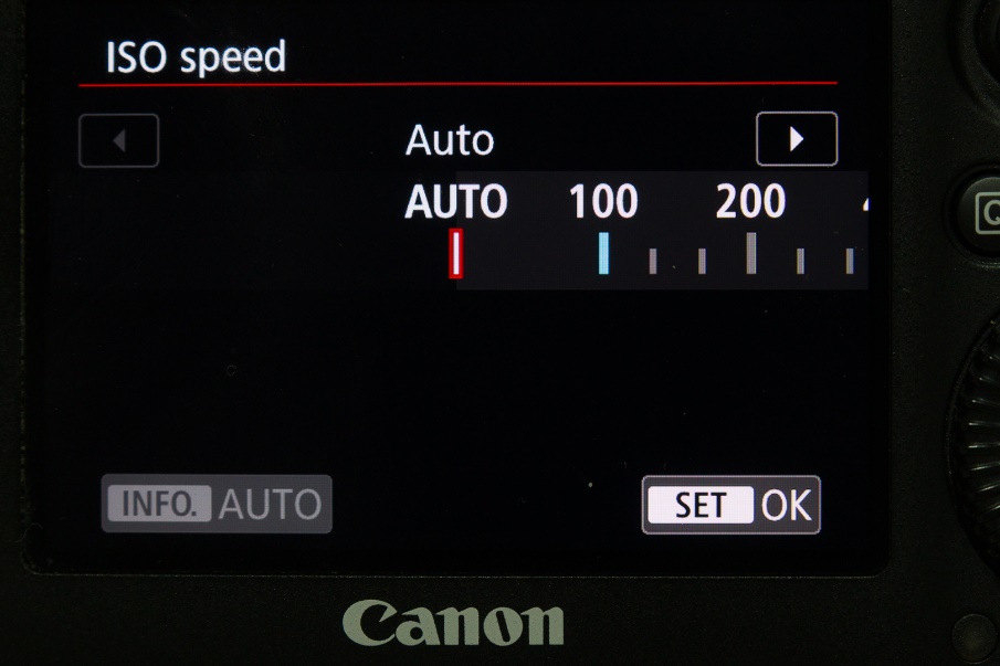
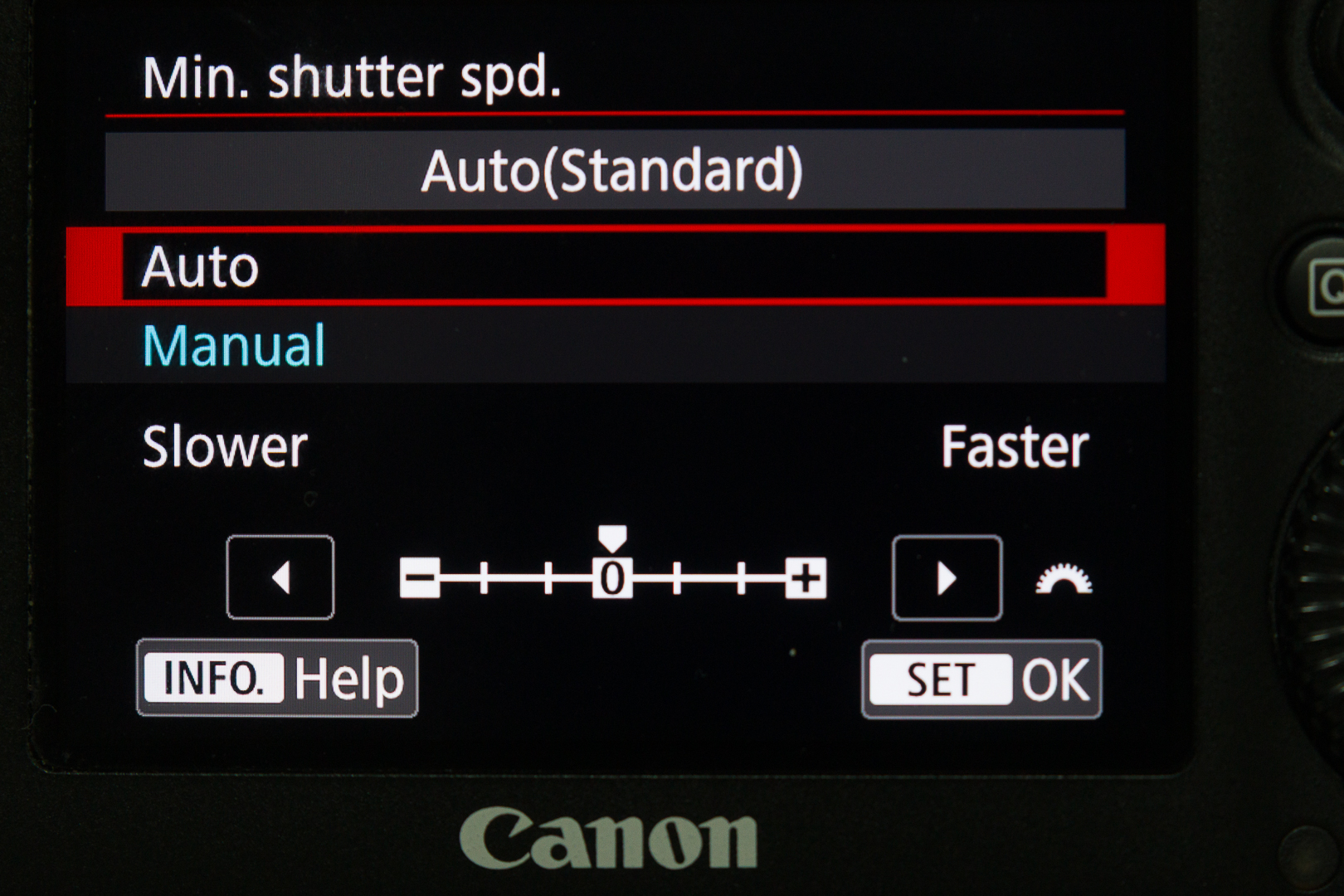
In the menu go to Auto ISO Settings and set the highest and lowest ISO you want the camera to choose from. I’m not afraid to go as high as 51,200 in dim light with moving subjects.
In Aperture priority the camera will lower shutter speed down to a shutter speed you select or automatically based on the focal length you are using. I prefer to set it manually and usually set the minimum at 1/250 sec because I can usually hand hold most of my lenses at that speed. I might set higher if I have fast moving subjects. Once it reaches this shutter speed it will increase exposure by increasing ISO. In Aperture priority you can still dial in exposure compensation as you normally would.
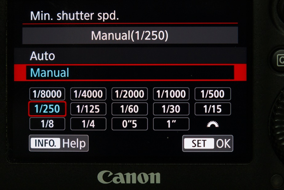
If you choose to let the camera select the minimum shutter speed automatically it will select the reciprocal of the focal length. So with a 100mm lens, it would select a minimum shutter speed of 1/100 sec. At least on my Canon, you can fine tune this to select faster or slower shutter speeds.
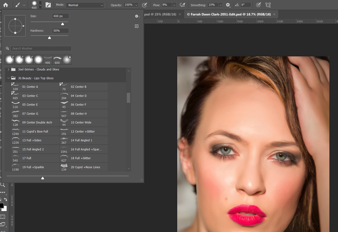
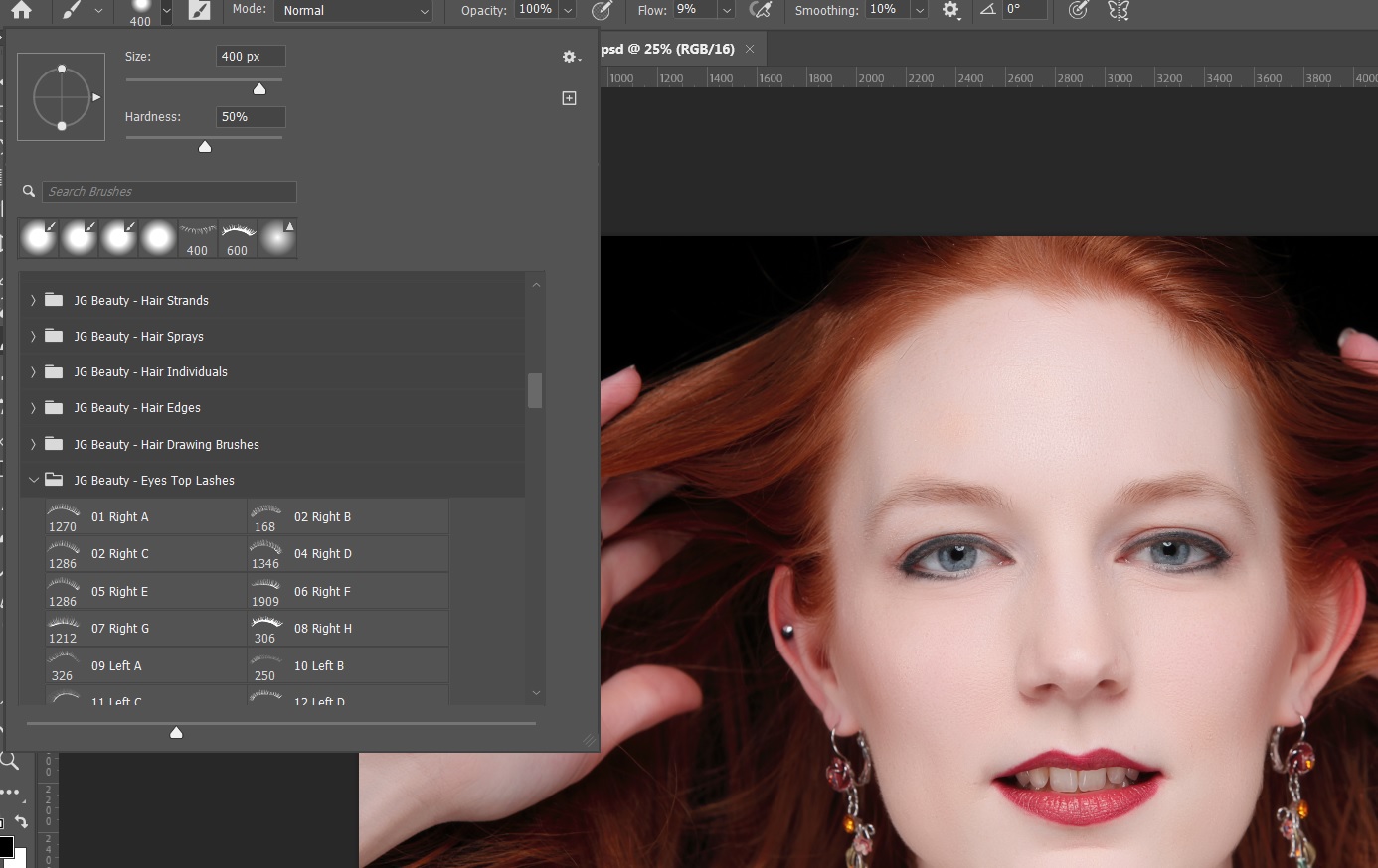
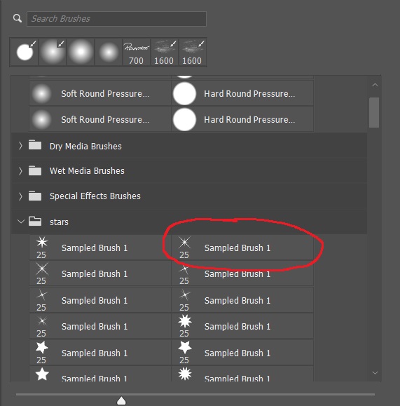
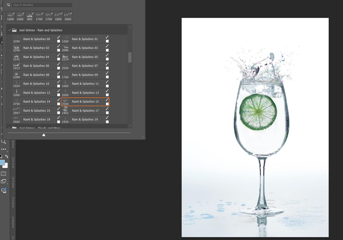
Slightly Beyond Photography Basics – Intro to Photoshop Brushes Part 3
by Mickey Rountree
As I usually do, I’m calling this article beyond basic because it involves Photoshop rather than Lightroom or other basic editing programs.
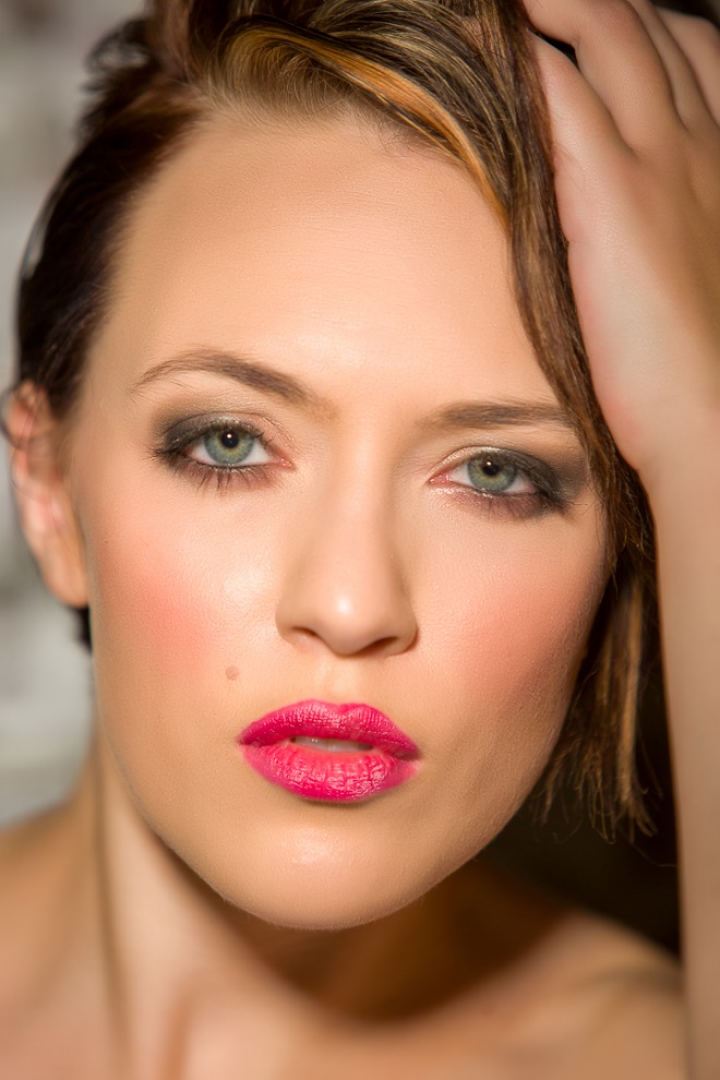
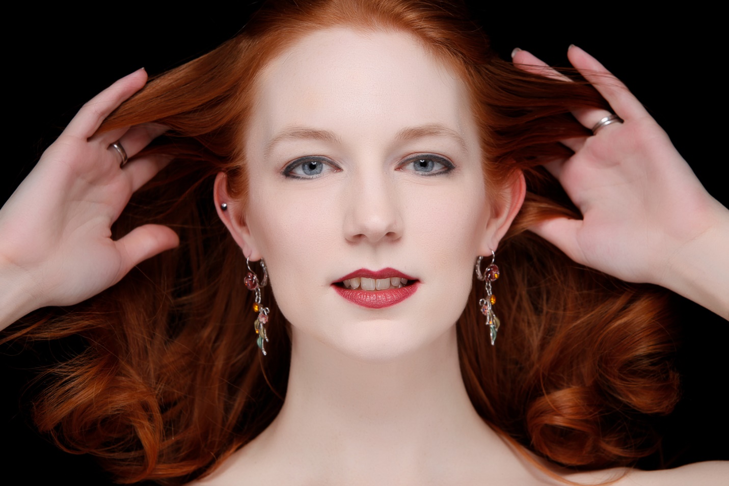
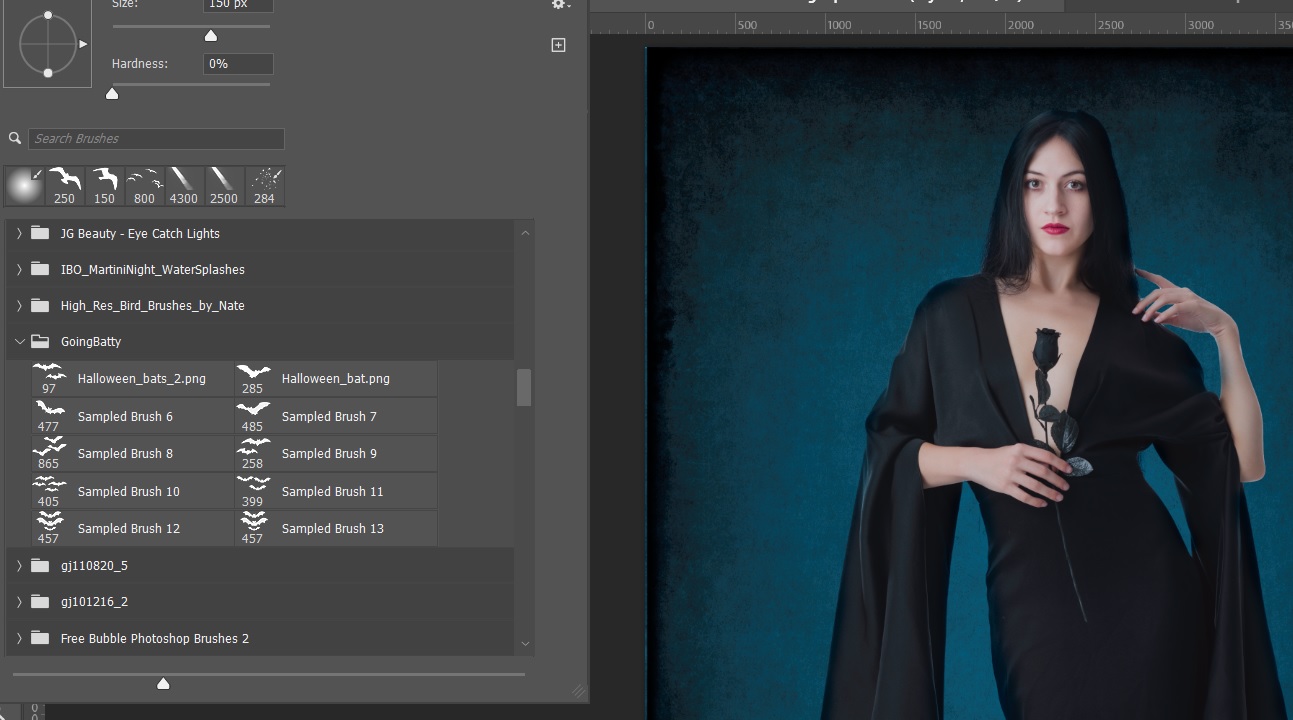
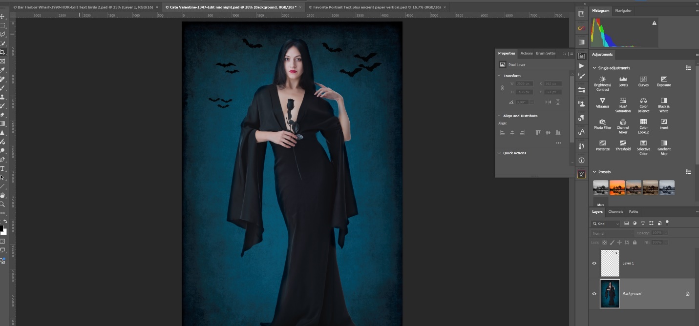
I’m going to let you in on a little known secret. When you see your favorite celebrity on a magazine cover or online image, it’s almost surely retouched; probably a lot. Shocking isn’t it? Besides all of the usual skin smoothing and reshaping, here are a couple of things you might not know could be done with a Photoshop brush.
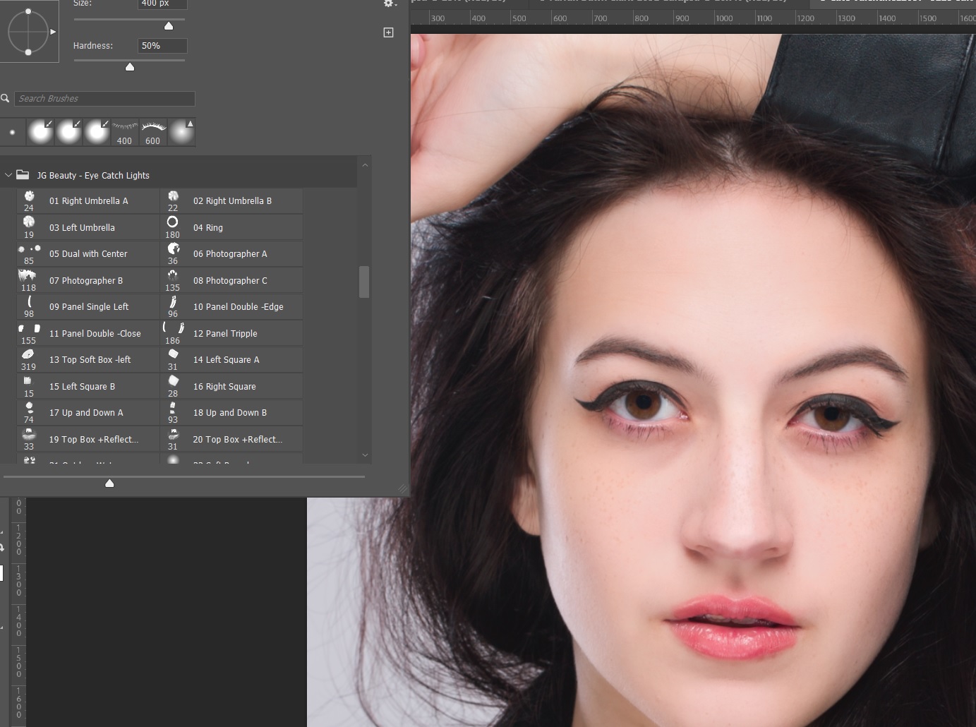
Catch lights – It’s been said that the eyes are the window to the soul, but without catch lights that create that sparkle, the eyes look lifeless. Here the model moved her position so that the light no longer lit her eyes. Notice how dull the image looks.
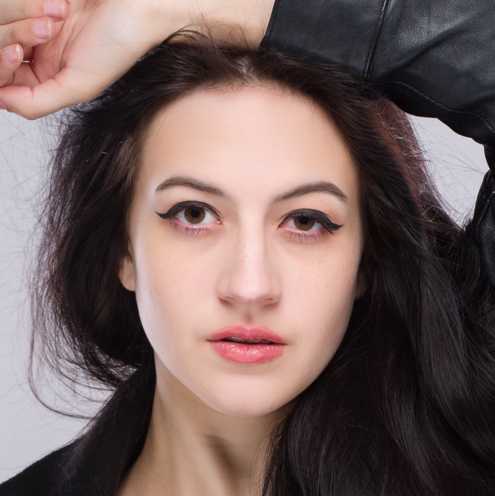
I could just paint with a small round white brush to create catch lights, but I opened a group of catch light brushes that simulate common lighting tools and used one that simulates an umbrella light. Again they are on a separate layer so I can control opacity.

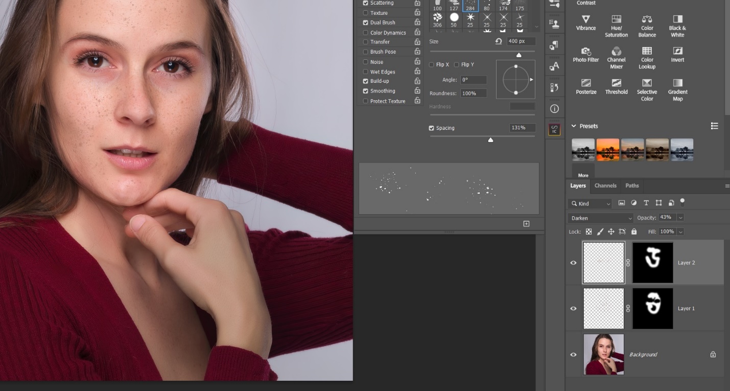
Freckles – This model has really nice freckles that add to her look, but my normal skin retouching pretty much removes them.
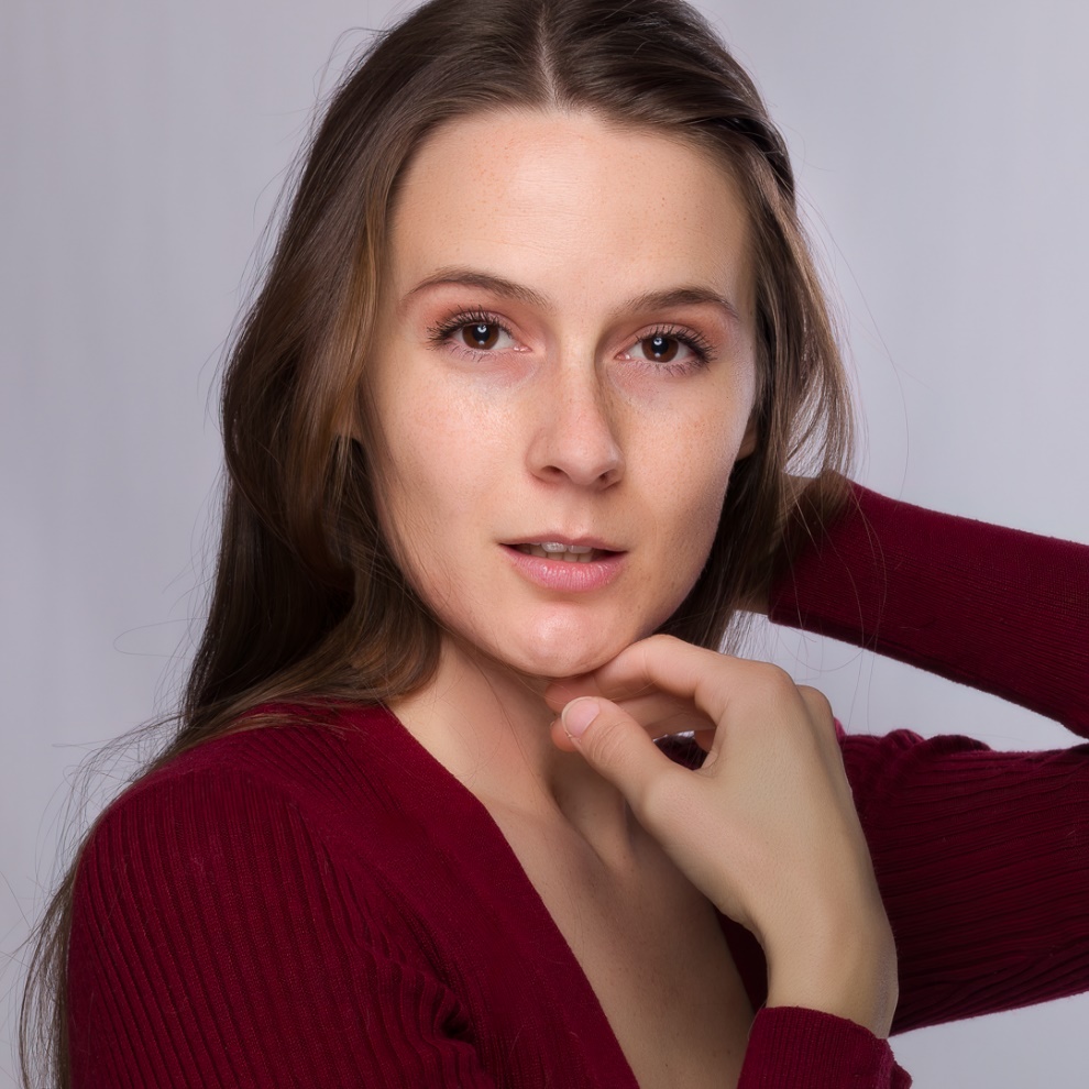
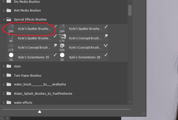
There is no “Freckle Brush” that I’ve found, but there is a spatter brush in the Special Effects Brushes that come with Photoshop. If I remember correctly, they don’t install by default, but you can import them. So I selected the spatter brush and resized it.
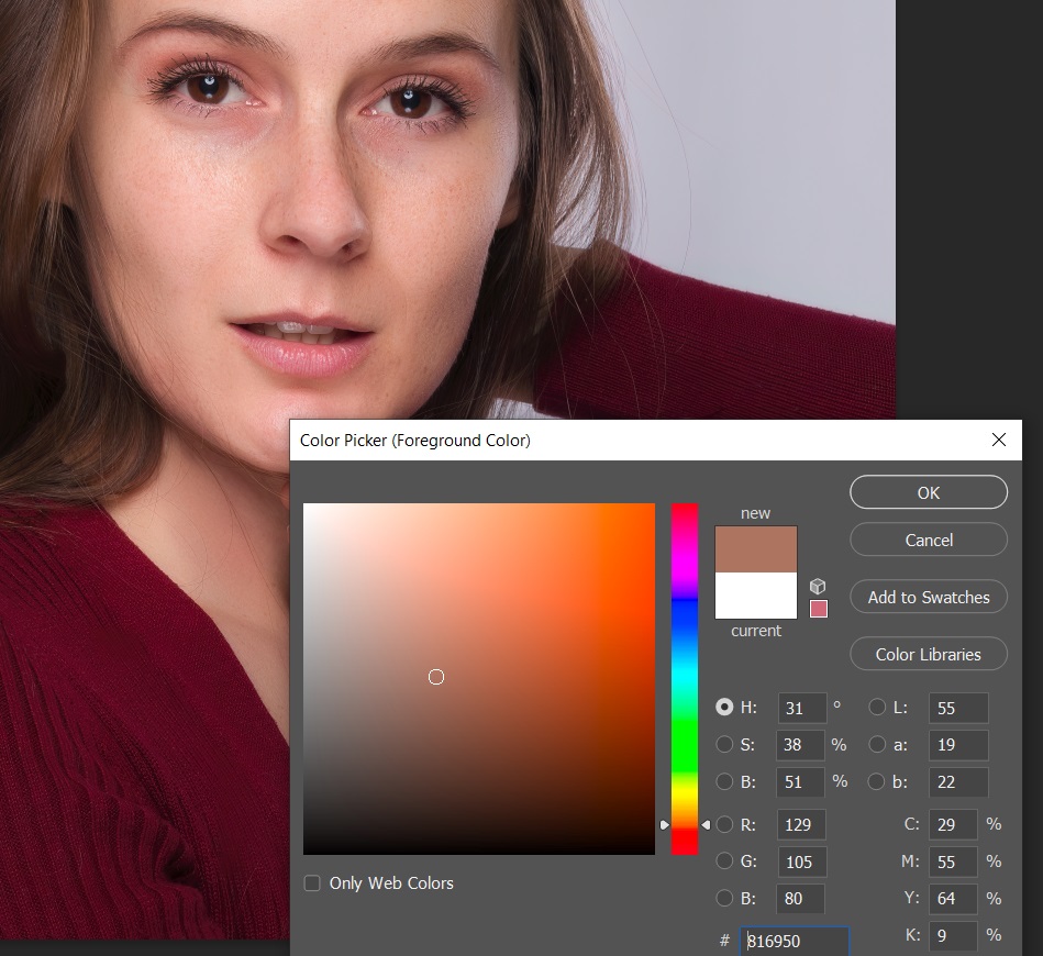
To get the right color for the freckles I alt-clicked on her face to bring up her skin color and then moved my cursor straight down to get a darker version of her skin tone.


Slightly Beyond Photography Basics – Intro to Photoshop Brushes Part 2
by Mickey Rountree
As I usually do, I’m calling this article beyond basic because it involves Photoshop rather than Lightroom or other basic editing programs.
So, as I mentioned in the last article, one of the great things about Photoshop brushes is the ability to add new brush sets, often for free.
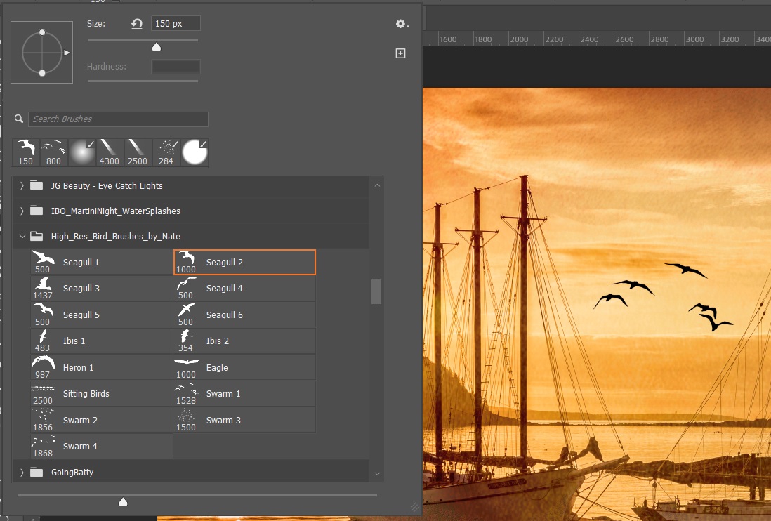
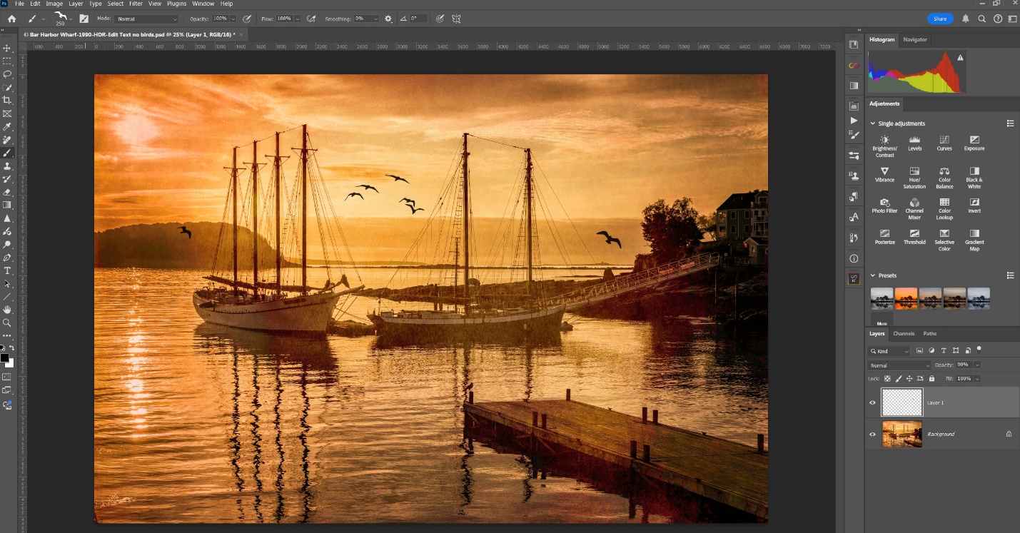
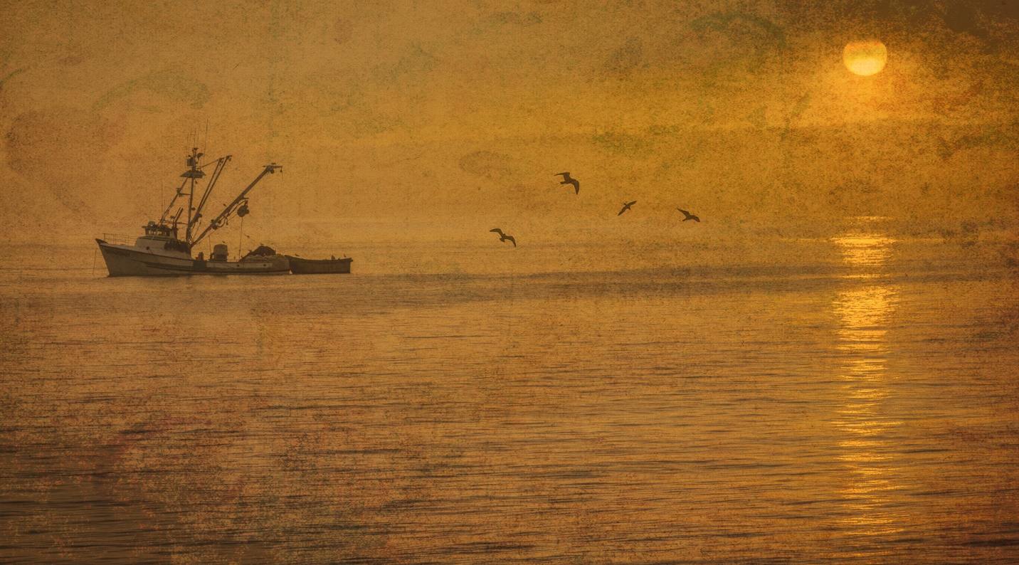
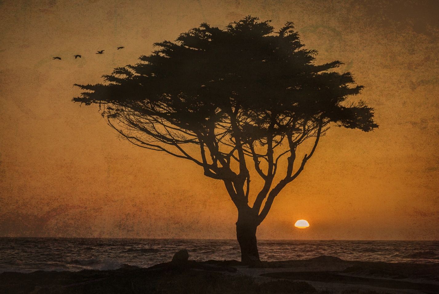
Birds – Sometimes you just want some birds in the sky to add balance, fill blank space or just add visual interest.
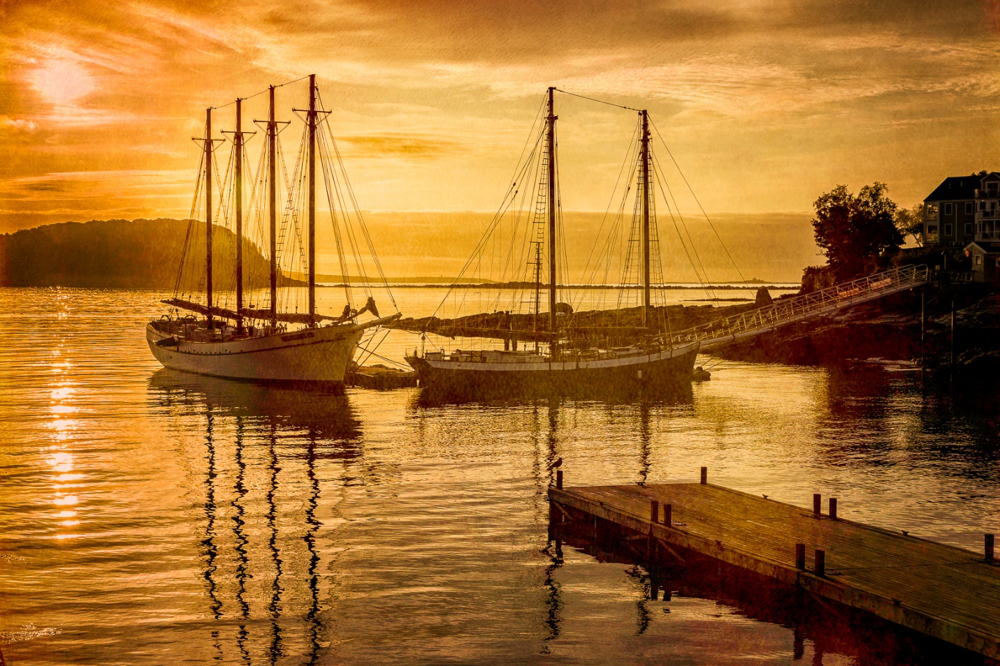
Here I used several different bird brushes with individual seagulls and flocks of gulls. You can adjust the size of the brush to suit the image. I also usually put each bird on its own new layer. That way I can move each bird or group of birds around, or use Free Transform to change the size and angle later on. You save the image with layers, but when everything looks right to me I usually flatten the image before saving.

Here is another before and after.

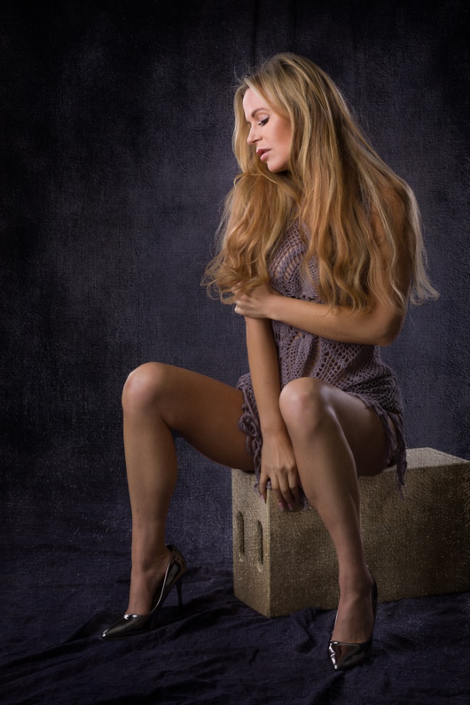

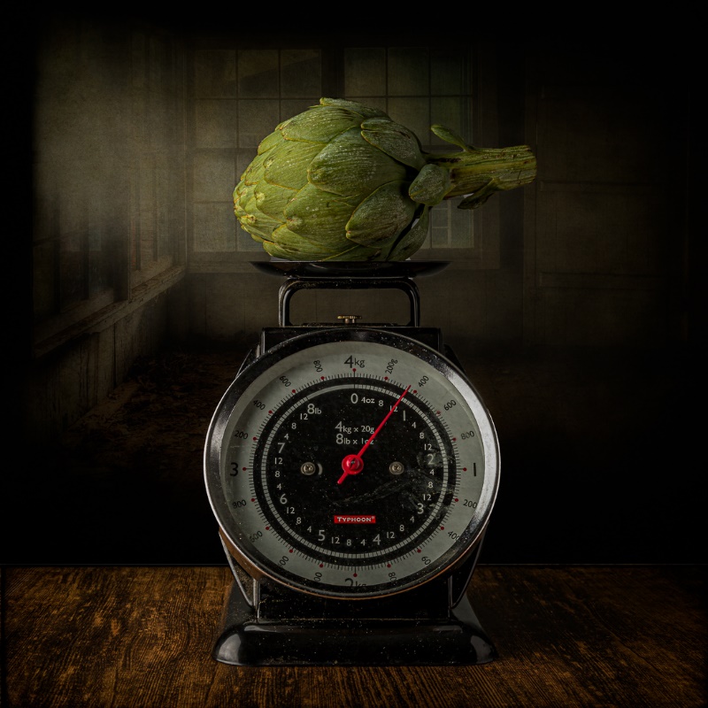
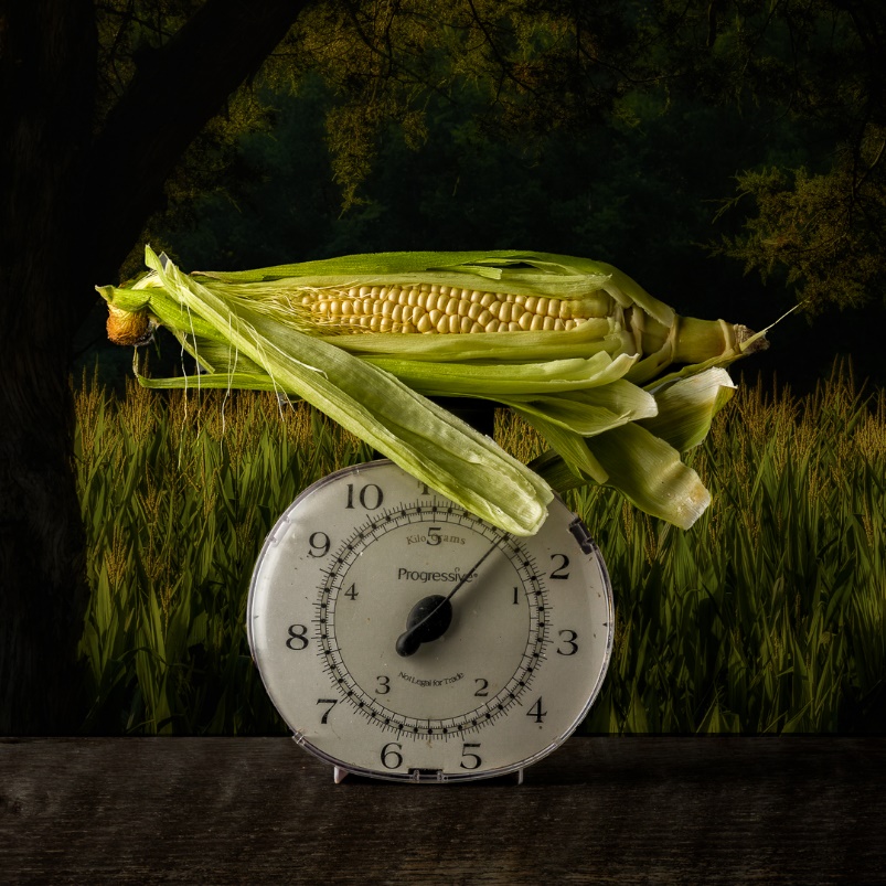
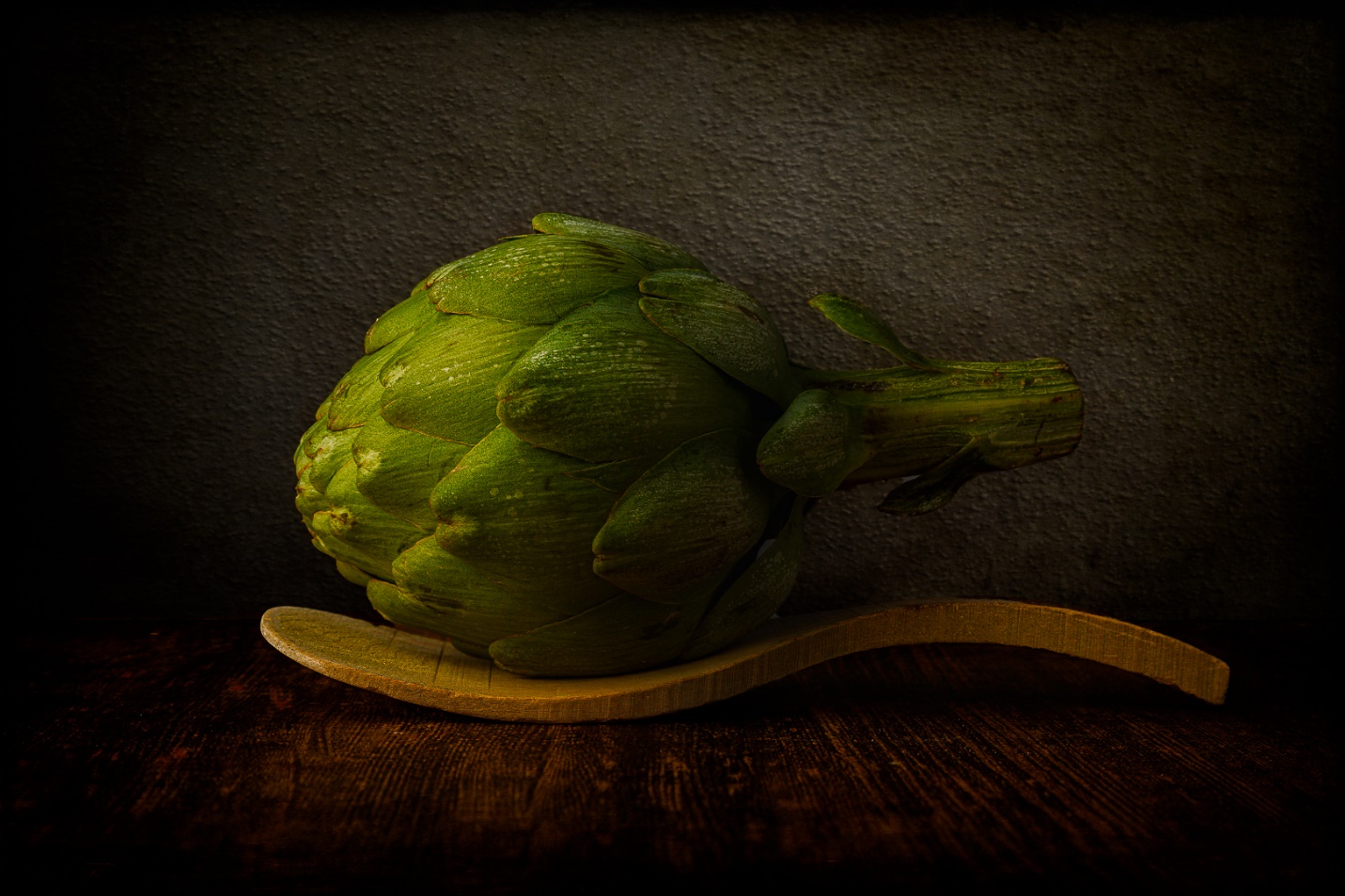
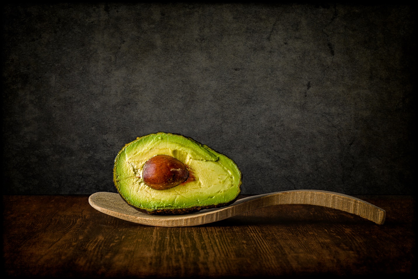
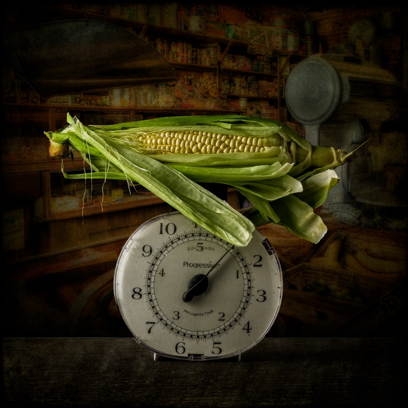
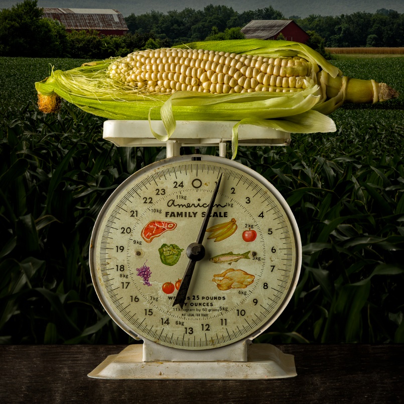
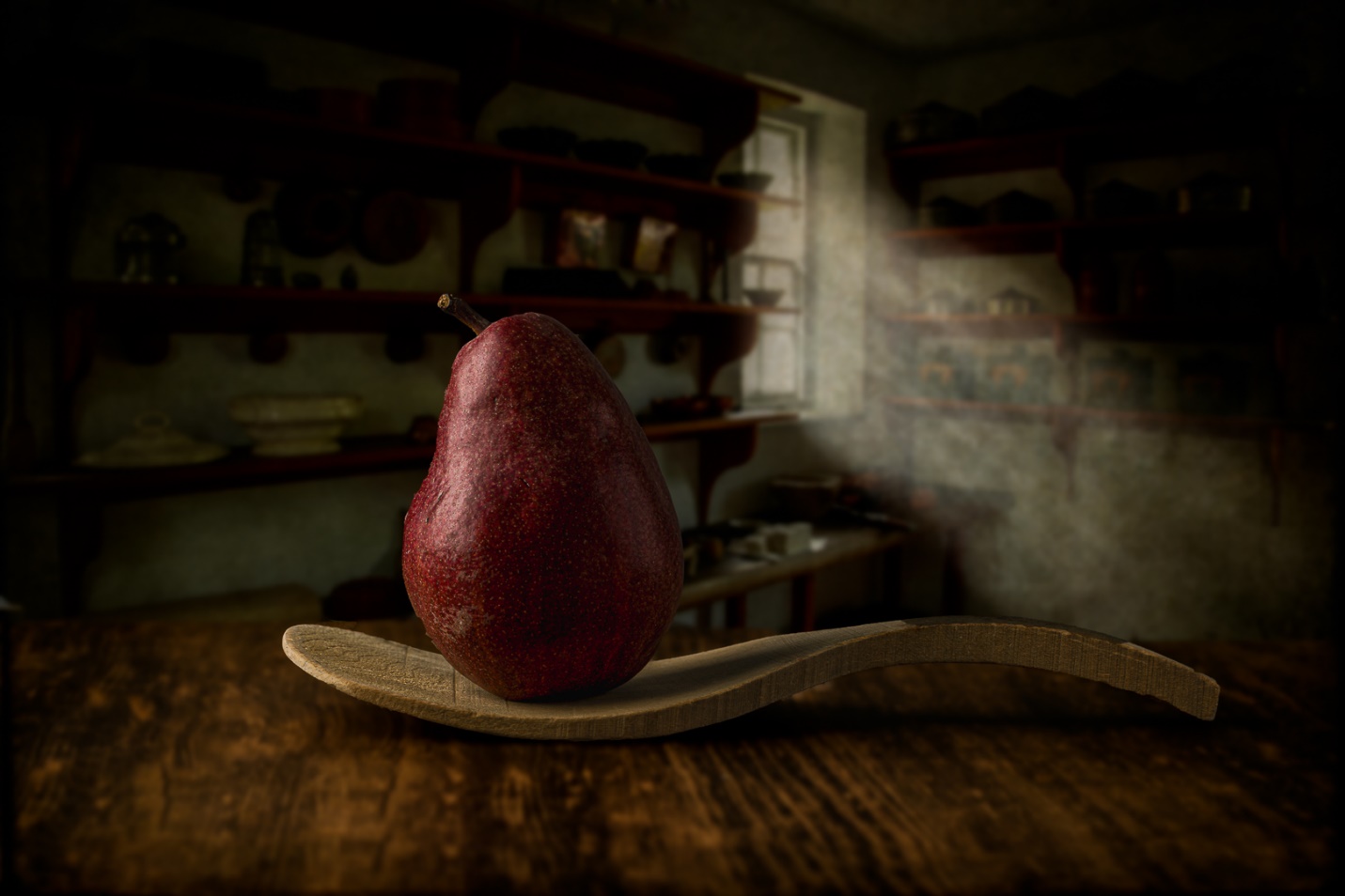
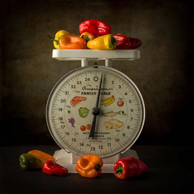
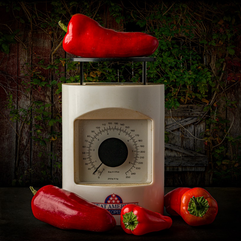
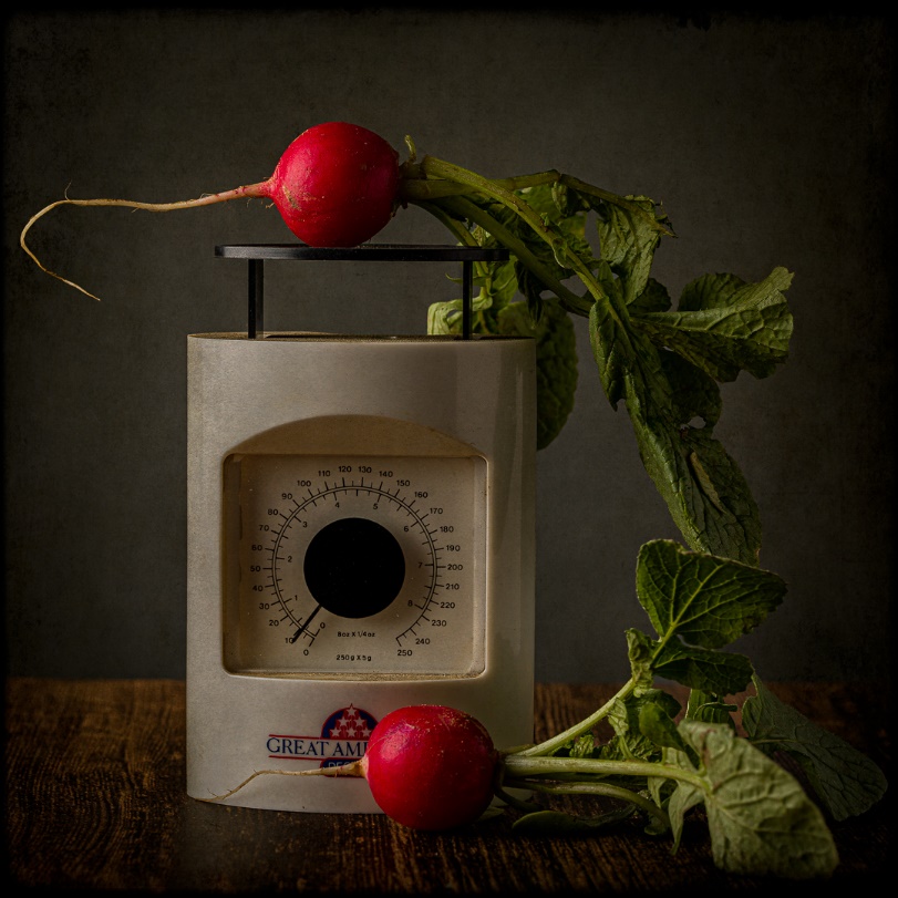
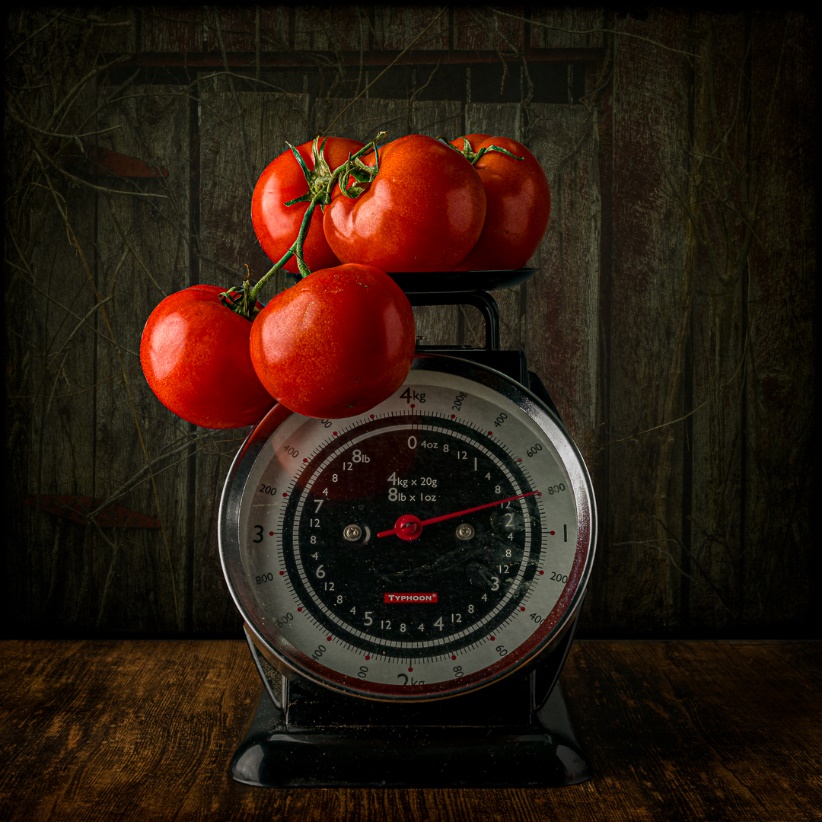
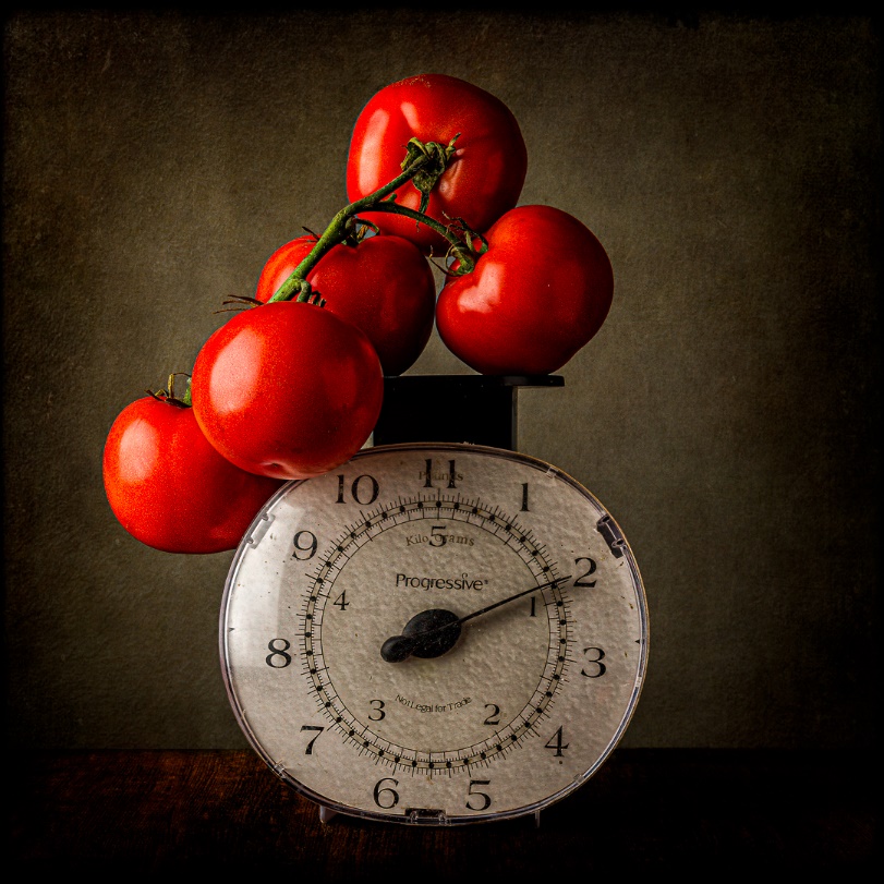
Photography Basics – Themed Still Life Project
by Mickey Rountree
I recently worked on a project of studio still life images. While I shot 7 subjects, there are many more I have in mind for future shoots, so I don’t consider this project finished. The original concept came from a video by photographer Joel Grimes, and I put my spin on it.
There are several reasons for shooting a themed series of still life. One reason is to practice lighting techniques. Another is to produce a number of images, that while different, have a cohesive theme that allows them to be presented as a group, either as a print with multiple images, or as separate images that can hang together. Another reason is to work on processing techniques to create artistic images with a consistent look or to try varied looks with similar subjects. I shot with the intention of using multiple textures on each image, and to experiment with using scenic images as textures/backgrounds.
My basic setup was just a table top with either a black or wood grain foamcore board as a base, with a medium gray seamless paper background. Lighting was just a medium softbox and strobe camera left and a white reflector camera right. Once the proper exposure was determined only minor lighting adjustments were needed with each subject.
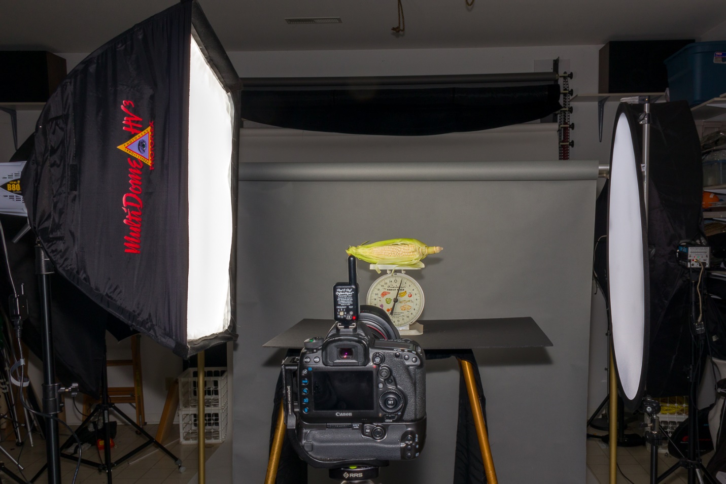
Probably the hardest part of the project was finding props. I had planned to use three kitchen scales as a unifying prop for the series. I wound up with four scales, one from a local thrift store and three from eBay. I also found a wooden butter scoop and a large wooden spoon. The rest of the props were fresh vegetables from the grocery store. I only bought one vegetable at a time, took a day or two to shoot and edit and then bought my next subject. This kept the food (and the photographer) fresh and kept me from having to shoot all of my subjects in a hurry to keep them from spoiling. By the time you read this, you may have seen some of my images in the PSC Gallery.
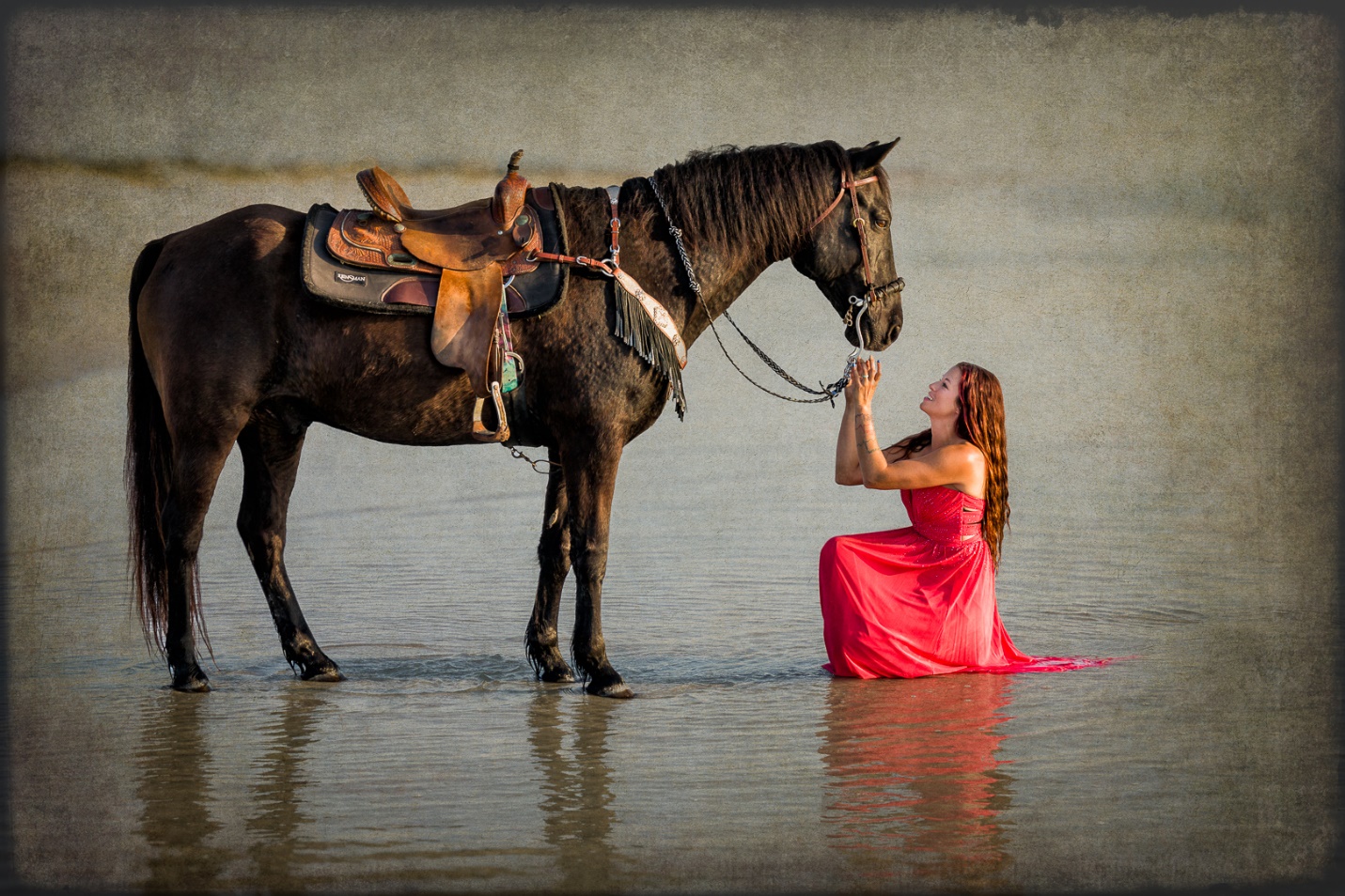
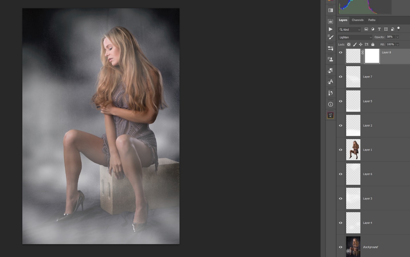
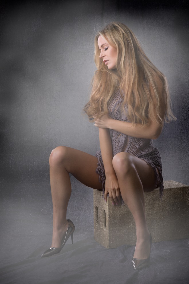
Slightly Beyond Photography Basics – Intro to Textures
by Mickey Rountree
As I usually do, I’m calling this article beyond basic because it involves Photoshop rather than Lightroom or other basic editing programs.
In this article, I’m going to touch on the basics of using textures, but more importantly I want to encourage you to try adding textures in your own images. By now I’m sure there are whole books on using textures and hundreds of videos on the web, so if this sparks your interest, there are lots of resources out there.
There is no real mystery to using textures; it’s just adding one or more images in layers over your main image, adjusting blending modes, opacity and masking until you get a look you like. On the other hand, I went to two different full day workshops on textures, and still took years to actually start using them in my own work. And when I first started, I used a Topaz Texture Effects, which is no longer available, for essentially a one click way to add textures. Now I’m much more adventurous and have hundreds if not thousands of images in my textures file.
When these articles are converted to PDF and sized for the newsletter, the resolution and quality of the images is seriously degraded. If you would like to read the article and see the images as I did, you can see this article on my website at this link.
https://mickeyrountree.smugmug.com/Articles/Basic-Photography-Series/
Below is just part of one folder of my textures.

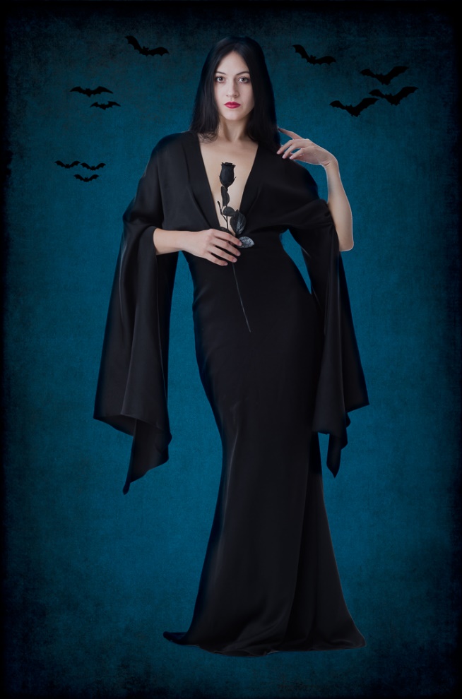
Part of what really makes the use of textures work is the blending modes used for each texture, as well as the ability to mask and vary the opacity of each texture layer. It’s worth trying several blending modes to see what you like best, but there are some general guidelines and modes you will use more frequently. For adding a texture to a white or light background Darken and Multiply work well. For adding texture to a mid-gray background Softlight and Overlay work well. And for adding a texture to a black background Lighten or Screen work best. If you use multiple textures, you can use different blend modes for each texture.
Here are a few reasons to use Textures.
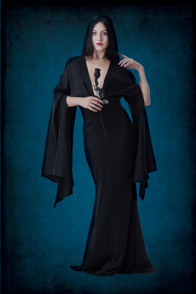
PORTRAITS For years I shot portraits on a white background. It works, just look in any magazine. It draws you right to the face, but after a while all of those white backgrounds get boring. Same shot with two textures shot in Chattanooga. I think it’s more interesting.


Obviously from the example above textures can work on white, but I feel I have more options on a medium gray, so I started shooting subjects on a gray background. If white is boring, gray is even worse. But textures work wonders.


